
- PowerPoint design / PowerPoint productivity
- Comments: 18
By applying some key principles of presentation design, you can make your PowerPoint design really standout and deliver both a more ‘popping’, but also more effective presentation.

Your organization needs a functional PowerPoint template. “We already have a PowerPoint template” I hear you sigh! Well, problem solved.
Or is it? It’s highly likely that the people creating your corporate PowerPoint template don’t really understand it. They’re probably amazing marketing strategists, or powerful print designers, or really really good at marcoms. But PowerPoint? That ain’t their thing at all.
Without a proper PowerPoint template, presentations can be a bit of a mess. The colors in the template might not be the right ones. The font might not be your corporate font or may not be formatted correctly. The title, the logo, and all the other background elements might jump all over the place slide to slide. Page numbers come and go as they please… While you need your audiences to focus on your presenters, they’re actually distracted by all the random changes that are undermining your content.
And as things scale, the problems get more acute with rogue design in one department, file bloat in another, and one team communicating exclusively in GIFS (actually, that’s not something a decent template can fix – sorry). Throw in a rebrand or two and issues can increase exponentially. All the good work your marketing department does in making sure your message is communicated clearly and cohesively is lost in a puff of poor PowerPoint template smoke.
So how do you fix it? You start by having a well-considered, well-constructed PowerPoint template that makes developing presentations much easier.
Prefer to listen to our pearls of PowerPoint wisdom rather than read? Watch our on-demand Templates and Masters video resource.
Fair warning – PowerPoint templates and masters can be pretty complicated (that’s why they can go wrong so easily!). There are some really great in-depth resources out there if you’re serious about getting to grips with them, like Echo Swinford and Julie Terberg’s comprehensive book. But, if you’re raring to get started on your own then we admire your chops and this post is for you.
There are three main elements to a PowerPoint template: the canvas, the color theme, and the font theme. Let’s start with the canvas.
Setting up the canvas
The first decision to make is what size the slide will be in your PowerPoint template. It’s a fairly easy decision to make. We’d recommend 16:9 over the more traditional 4:3 as 16:9 fills screens better and gives you more space to play with.
To set the slide size, go to the Design tab then Slide Size. You can easily flip back and forth between Standard (4:3) and Widescreen (16:9). You can also select Custom Slide Size… which can be helpful if you’re using PowerPoint to create posters, social media posts, etc. For a presentation template, it’s best to stick to either 4:3 or 16:9.

Once you’ve chosen the slide size don’t change it! If you change slide size once your slides have layouts or content, it can cause all sorts of weird formatting and scaling problems. So, make a decision then stick to your guns! If you need a less standard slide size, read our guide on how to change the slide size in PowerPoint.
Setting a Color Theme
PowerPoint gives you the ability to add 10 different theme colors to your template. You can view the existing theme colors in the drop-down menu you see when changing the color of any element.
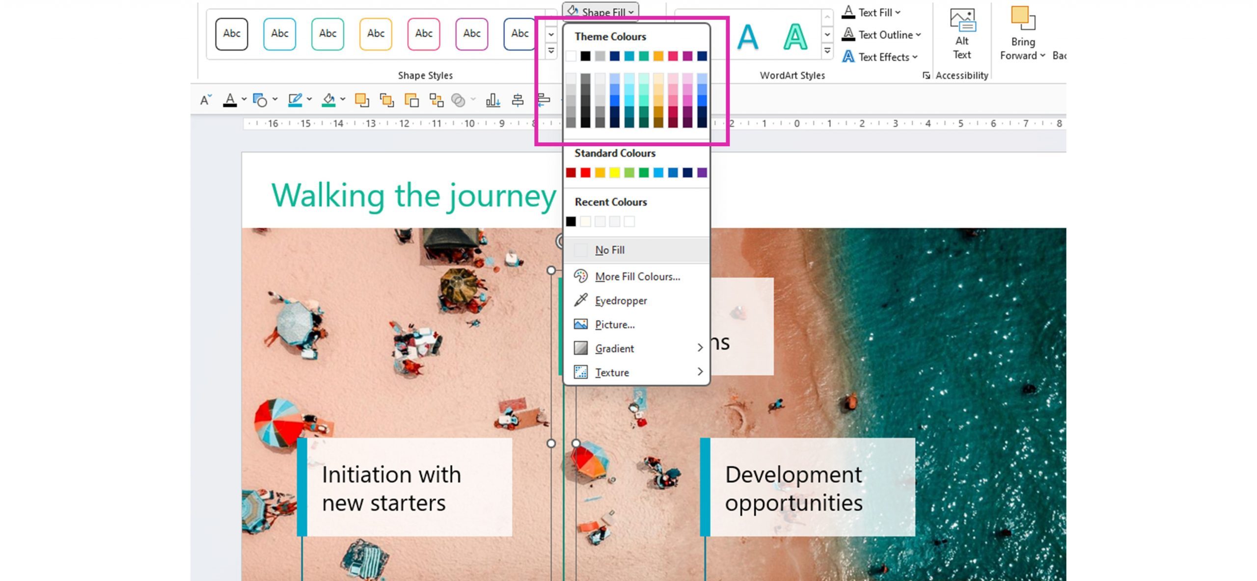
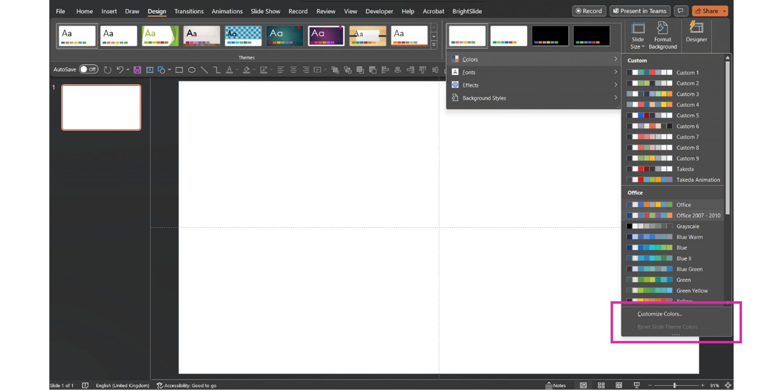
To edit theme colors, go to the Design tab, select the drop-down arrow on the Variants panel, then select Colors. At the bottom of the provided color options, select Customize Colors.
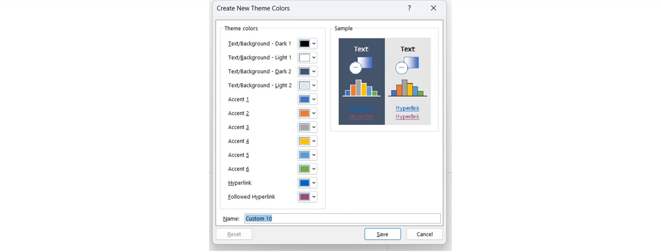
When you’ve got the Customize Colors pop up open, you can add 4 different text and background colors, 6 accent colors, and 2 hyperlink colors using RGB or HEX codes. The first 10 on the list are those visible in the Theme Colors menu. If you’ve got a corporate color palette, don’t make your primary color one of the top four colors as those are reserved for text/backgrounds. Instead, pop your primary colors in the accent slots. Accent colors are used for graphs and Smart Art. A couple of things to think about here:
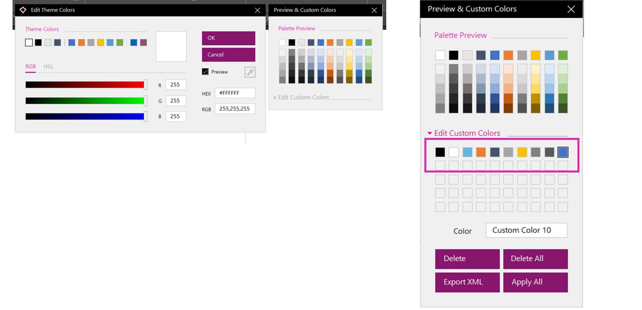
If you’ve downloaded BrightCarbon’s free PowerPoint add-in BrightSlide it’s even simpler to set theme colors. Head to the BrightSlide tab and under the File & Master section select Theme Colors. The Theme Color editor will appear allowing you to set colors based on HEX, RGB, or HSL values or using a color picker. It also gives you a live preview of the palette and allows you to import and edit spot colors.
For a more detailed rundown of PowerPoint theme colors – head to this blog post.
BrightSlide also makes it easy to add custom colors. Now, these aren’t an essential part of a PowerPoint template but can come in handy if you need more control over what colors people have access to. With custom colors, you can add up to 50 additional colors into the palette which appears below the Theme Colors.
At BrightCarbon, for our own branded presentations, we ignore the Theme Colors because we don’t like the tints and shades PowerPoint automatically generates. Instead, we use custom colors so each color in the template aligns to a color in our brand guidelines. Learn more about custom colors in PowerPoint here.
Setting Theme Fonts
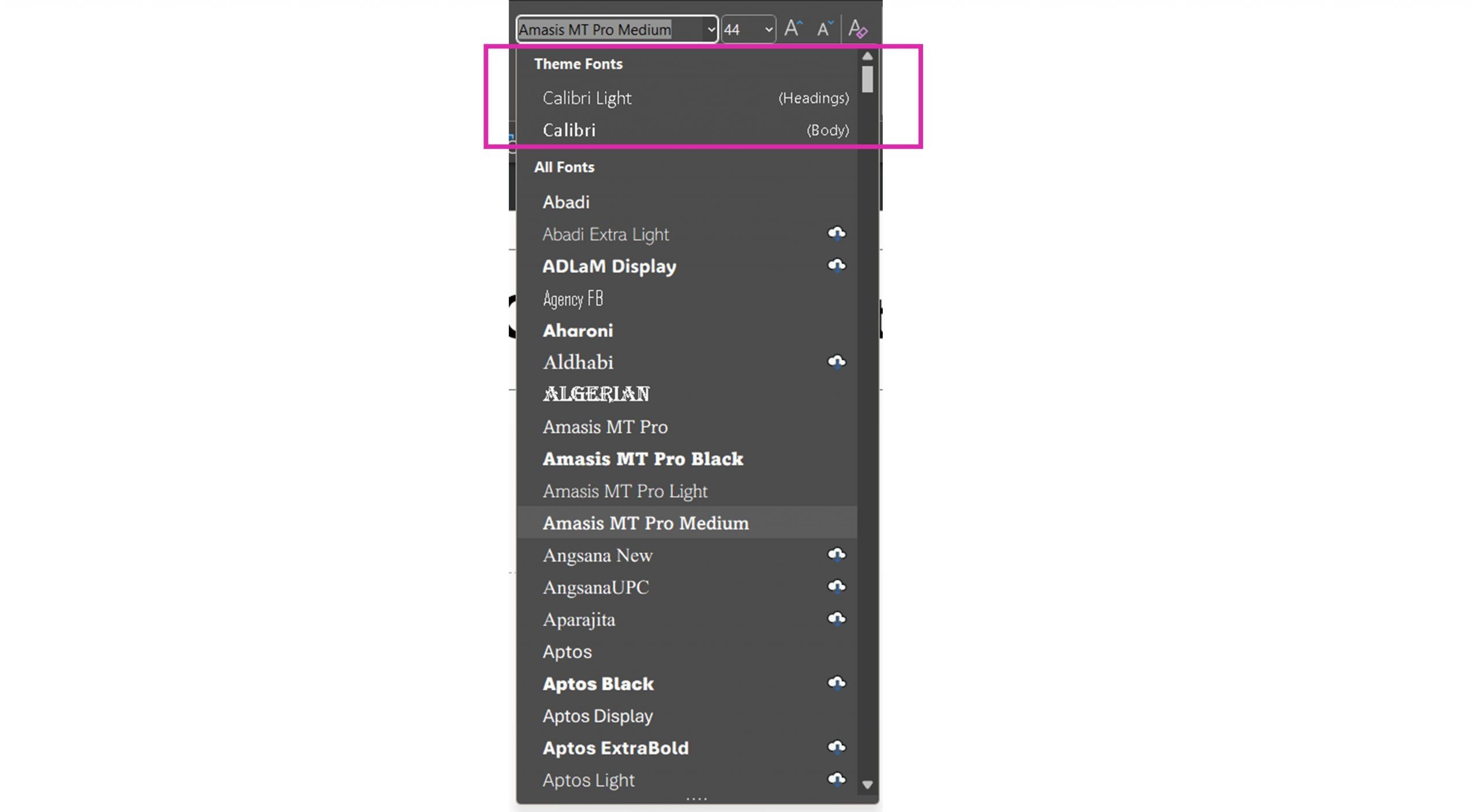
You don’t have as many font options as color options in PowerPoint. If you look at the font list in your PowerPoint file you’ll see two fonts at the top under Theme Fonts – one labeled Headings and one Body.
These fonts can be the same font or a nice pairing of two of your corporate fonts. We recommend using system standard fonts, , in a corporate PowerPoint template as then you know they’ll display as expected on every device. You can set custom fonts, but they’ll only appear correctly on devices with that font installed. This is okay for a one-off presentation, but not for a corporate template used by hundreds, if not thousands, of people.
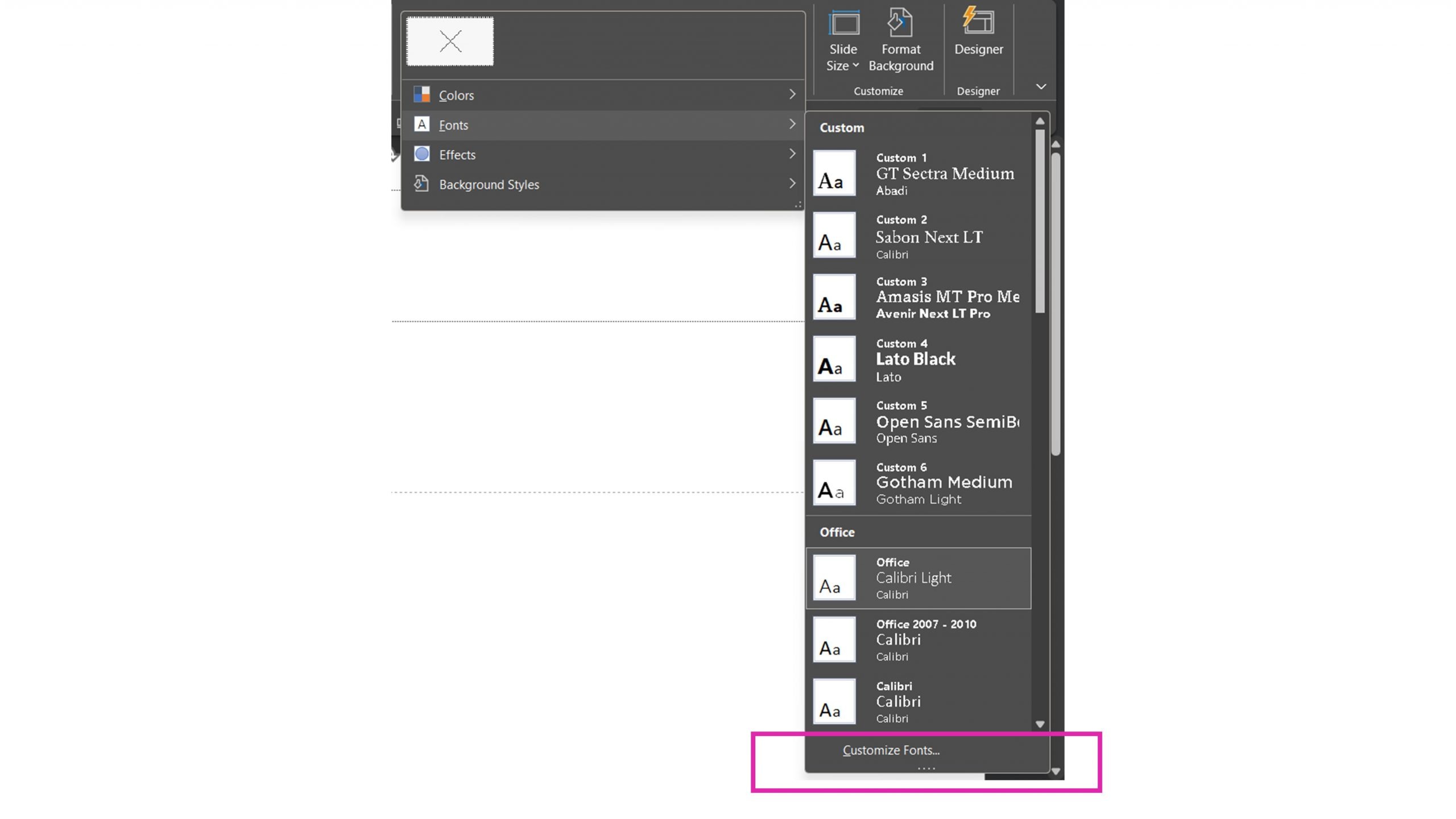
To set your fonts head back to the Design tab, then under Variants, select Fonts, Custom Fonts.
Using theme fonts means that when you change the theme fonts your text will switch font automatically; you don’t have to change each text box or use replace fonts. This doesn’t always work perfectly, but that’s the idea!
Feeling indecisive? We’ve got a few resources on deciding which fonts to use and replacing fonts.
Once you’ve got your canvas, colors, and fonts set up you can dive into the wonderful world of the Slide Master.
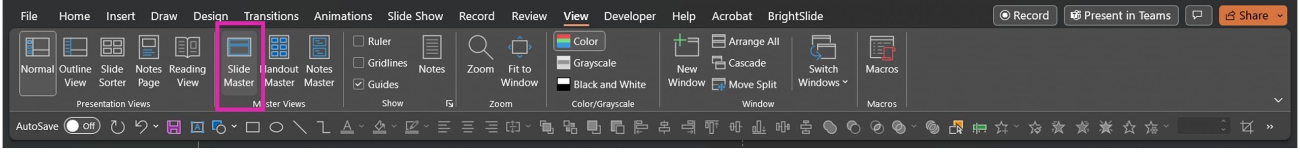
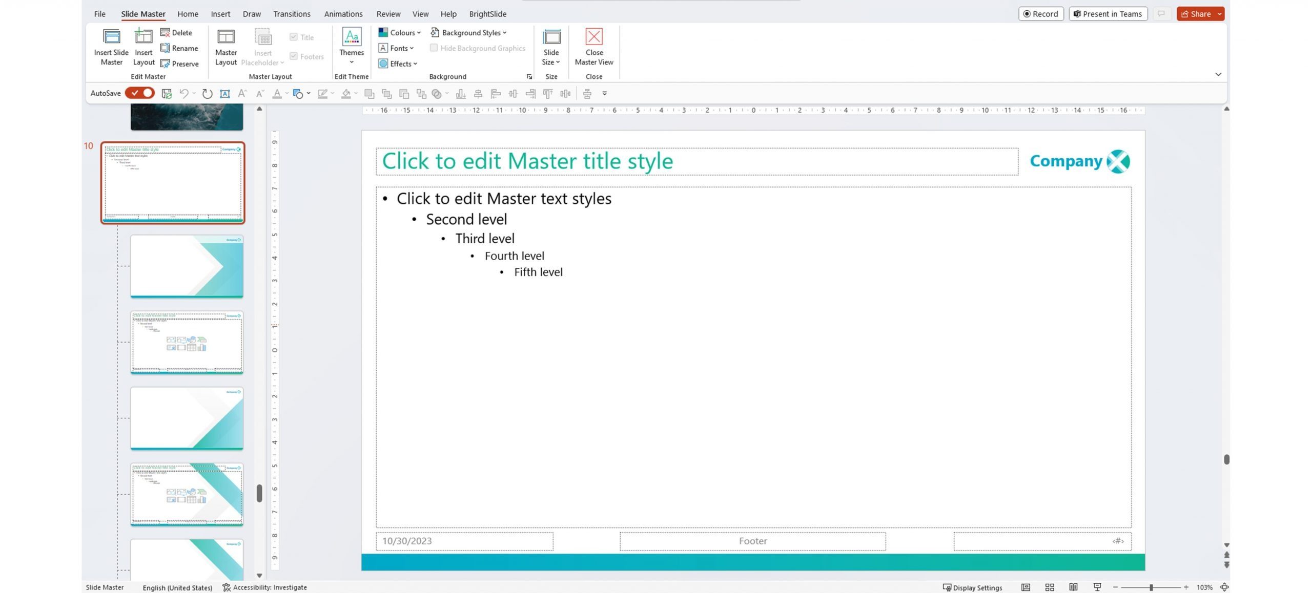
When you click on New Slide in PowerPoint you can see the slide layouts available in the template. In a standard PowerPoint deck, there are 9 options. They are all controlled by a main slide master that isn’t visible in your standard PowerPoint view. You can access it by going to the View tab then selecting Slide Master.
Now you can see the layouts and, at the top, the all-important slide master. We typically think of this slide as the parent slide and the layouts below as child slides.
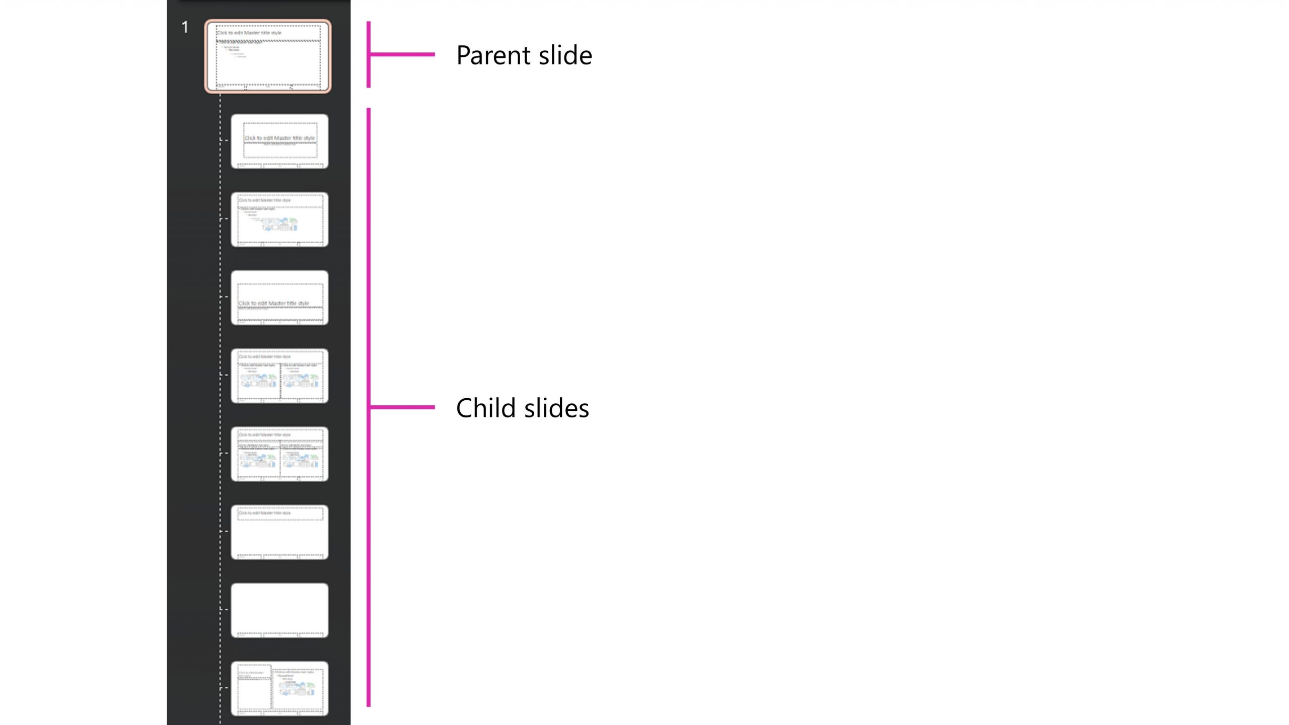
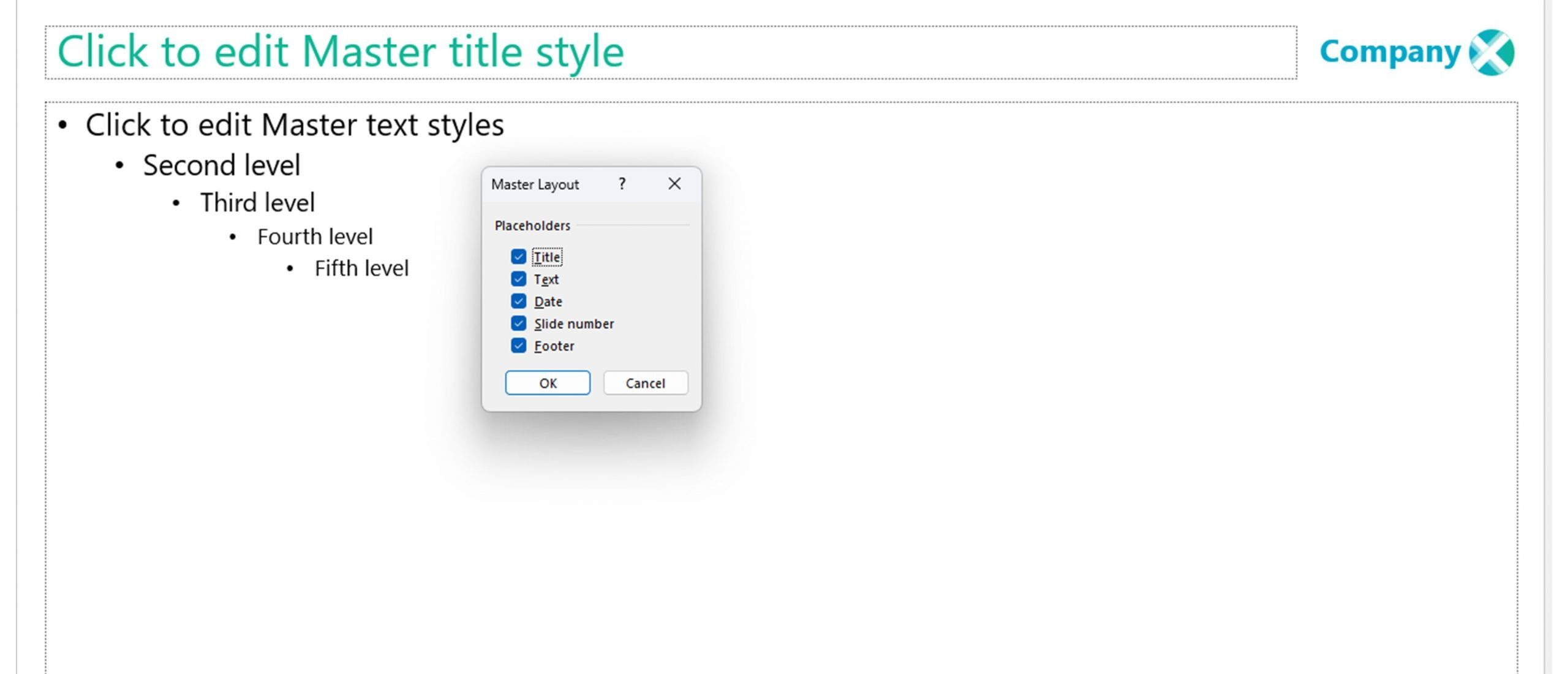
It’s really important to know that whatever you do to the slide master (the parent slide) will be reflected on all the layout slides. So, you need to set up your slide master before touching the layouts below. There are 5 things you can put on it by default: title, textbox, date, footer, page number. You can add or remove these in the Slide Master tab under Master Layout.
We recommend you keep all these elements on the parent slide, even if you don’t think you’ll use them. If other people in the organization want to use a footer or add the date and you haven’t set the formatting and position on the master slide, PowerPoint doesn’t know how to treat them. The formatting won’t match the rest of the template and will be inconsistent from deck to deck.
So, edit the title and content placeholders to make sure they’re in the position and are the size that you want. And, if there are any graphics you want to add to appear on every slide e.g., a logo or branded graphic, now’s the time to add it.
Once you’ve set up your parent slide, turn to the layout slides and start to make changes. One change you may want to make is to remove background graphics from certain slides. You can find this option in the Slide Master tab.

This can be useful if you want a fully blank slide and to make room for custom designs on title slides or segue slides. You can also change the background color of layouts to give users a bit of variety. Right click on the slide in the slide sorter and select Format Background.
You can insert new layouts, by heading to Insert Layout or by selecting an existing layout and pressing CTRL+D to duplicate it. Rename these new slides by selecting Rename in the Slide Master tab. Clear layout names can help your users understand how to use the template appropriately.
Don’t delete any of the PowerPoint default layouts as, when a user pastes a slide into a new template from another deck, PowerPoint will try (key word being try…) to map the slide to the same layout. ‘Blank’ slide to ‘Blank’ slide. If you delete the core PowerPoint layouts, the mapping won’t work and either the slide formatting will mess up or an extra incorrect layout will be added to the template.
One thing you can do to help tackle the common PowerPoint template problem of rogue layouts sneaking their way in, is adding a final layout to the end of your template with a big box on that says something like “DO NOT USE LAYOUTS PAST THIS POINT”. This makes it easy for users to see which layouts have been copied in from other decks (everything past that slide) and avoid using them.
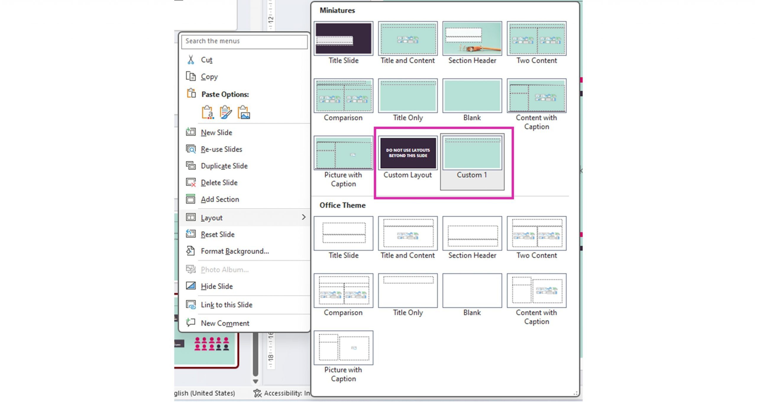
If someone has really messed with your template by deleting default layouts and generally causing chaos, then simply adding a new layout and calling it ‘Title and Content’ won’t actually replace the original ‘Title and Content’ slide and fix everything. There is a way to restore default layouts and, of course, we have a step-by-step guide.
Looking for info on Google Slides themes and layouts? Look no further!
A word in defense of grids
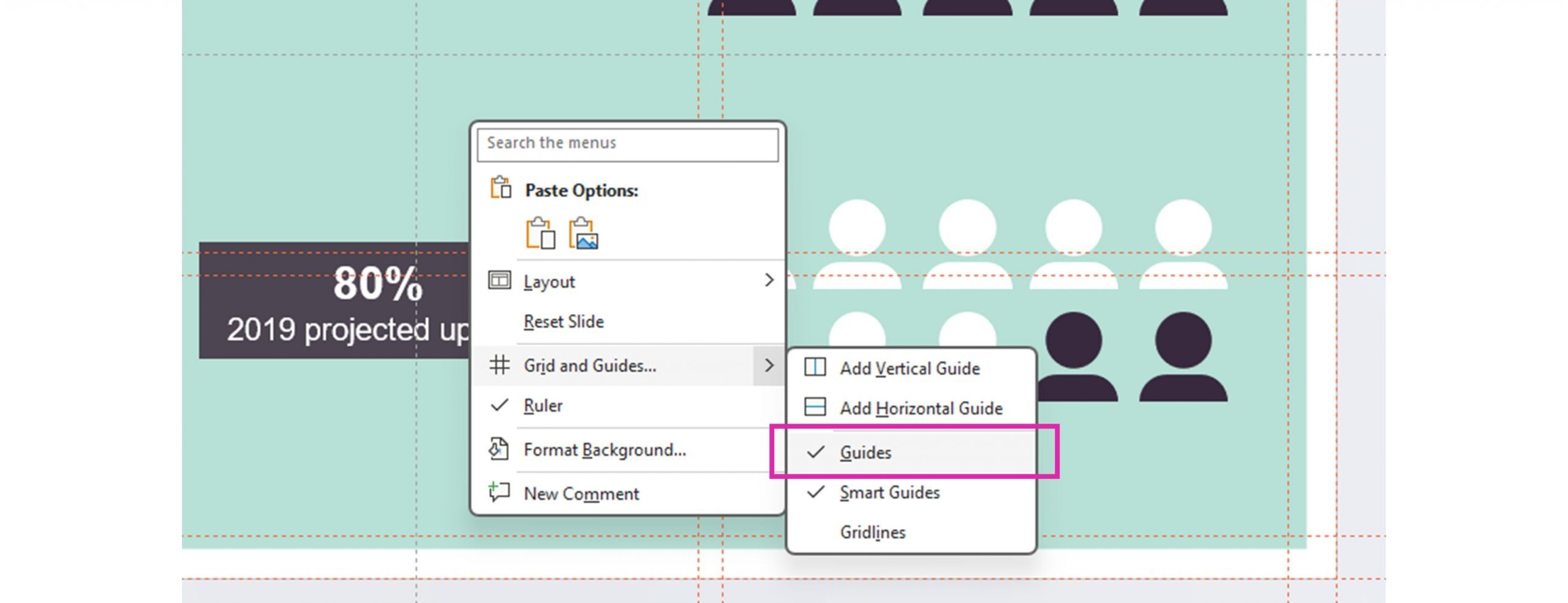
If you’re creating new layouts or editing existing ones, we highly recommend that you use a grid structure. This will help you space and align your placeholders and help your users make sure any custom content they add looks great too. You can view any existing grid by right-clicking on a slide, selecting Grids and Guides… then Guides.
It’s super fiddly to set up an accurate custom grid in PowerPoint. To blow our own trumpet, by far the easiest way is to use our add-in BrightSlide.
Go to the Bright Side tab, Files and Master, then Guides. Select Add to Master or Add to Layout. This means people won’t be able to accidentally move the lines around when they’re creating their content in the normal view. If you add different guides to the Slide Master and the layouts, make sure to keep the working area and margins the same to prevent too much variation from slide to slide.
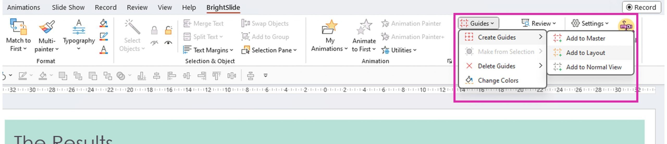
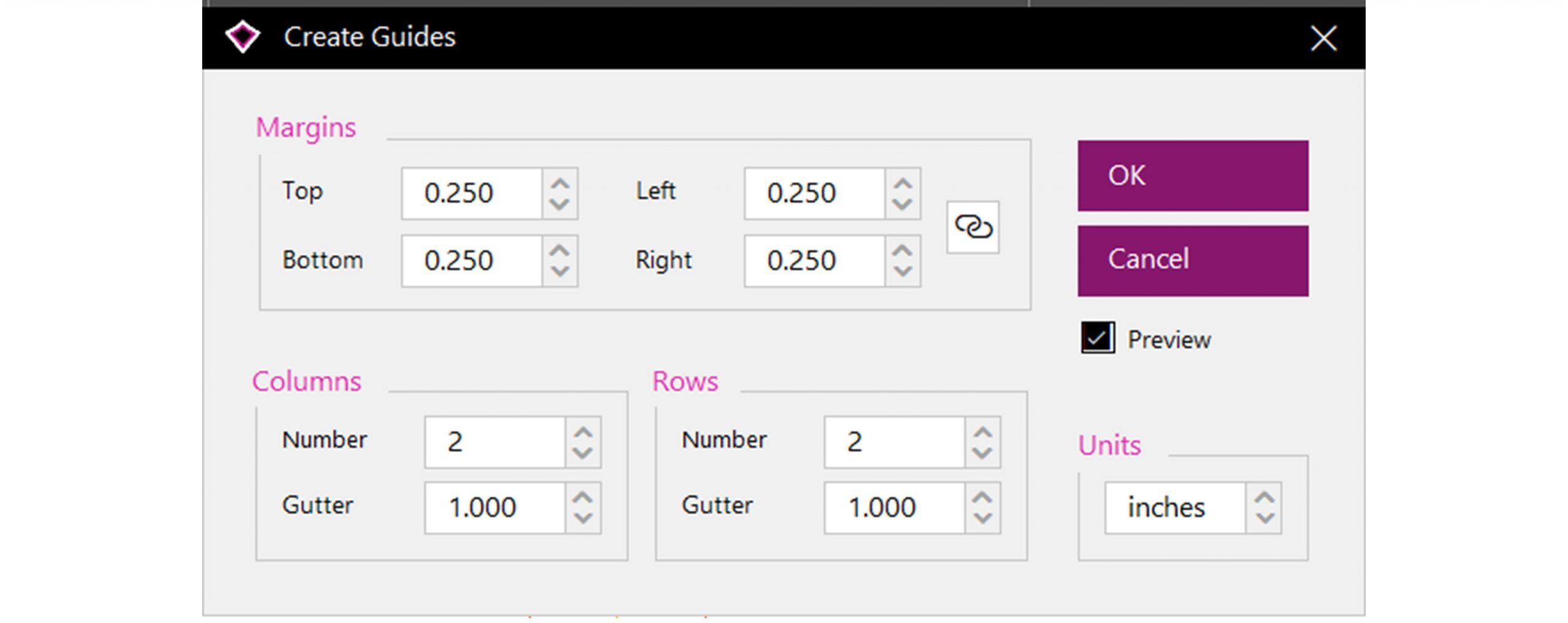
Don’t make the grid too complex as it will be overwhelming for the average user. A 3×3 grid with margins is enough.
If this is all new to you, learn more about why guides are important in slide design here: Advanced PowerPoint grids and guides.
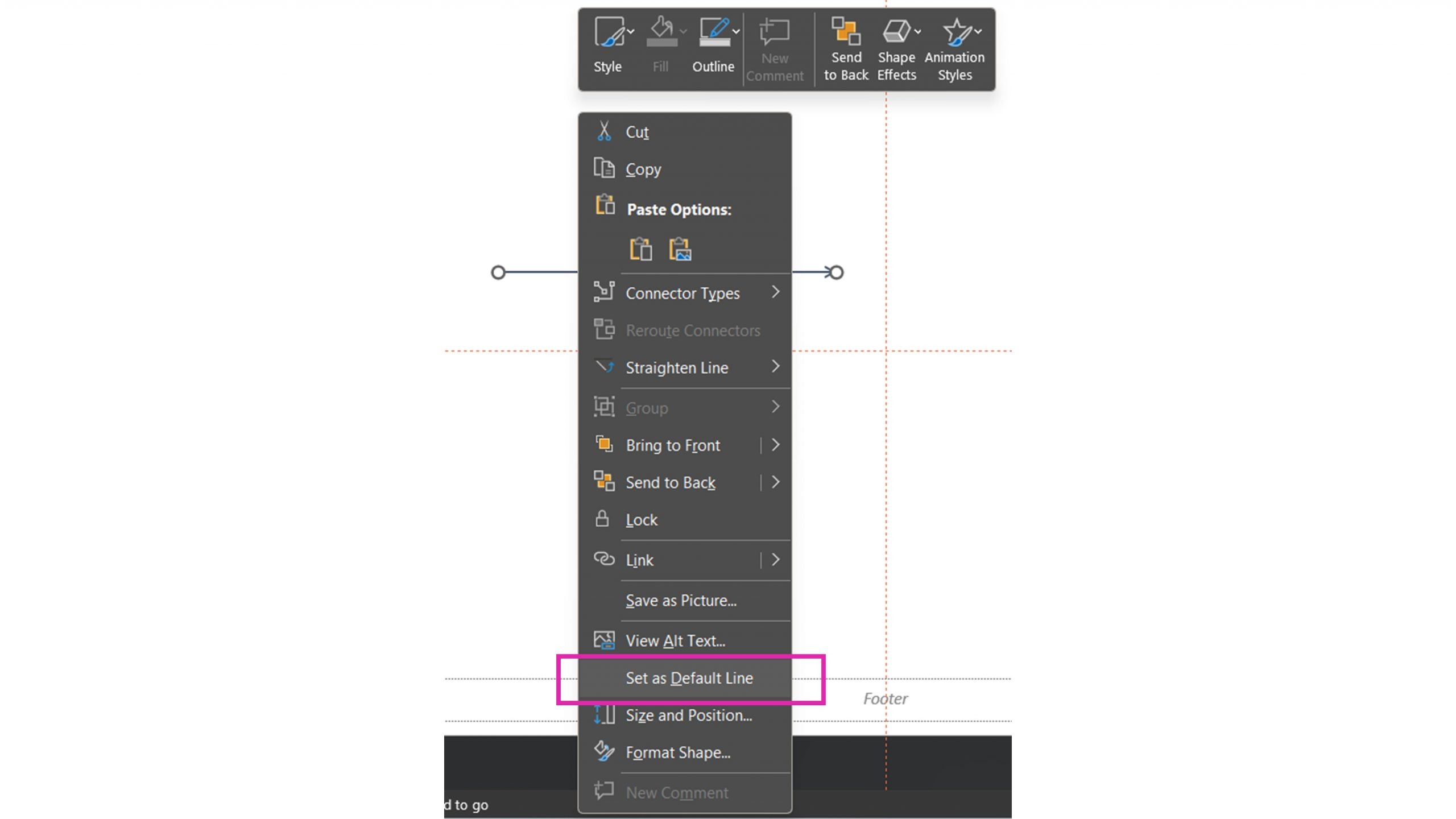
So, you’ve set up the template and your slide master. The next step is to set the default formatting for your shapes, lines and text boxes. Once you’ve done that, every time anyone using the template inserts a shape or draws a line it will be the same format, reducing inconsistency from presentation to presentation.
Setting up default styles is very easy. Simply go to a normal slide, draw a line, shape and text box, and format them in whichever way you want. Then, right click on each element and choose Set as default shape/line/text box. Once you’ve done that, every time anyone places a new object using your template, PowerPoint will follow those default styles. This can be important for making sure that there’s appropriate contrast between text and shape color and that the font is an appropriate size. Learn more about setting presentation font size and color contrast here.
While you’re here, it’s a good time to set textbox properties. You may have noticed that text boxes can behave in a few different ways in PowerPoint. Your options are:
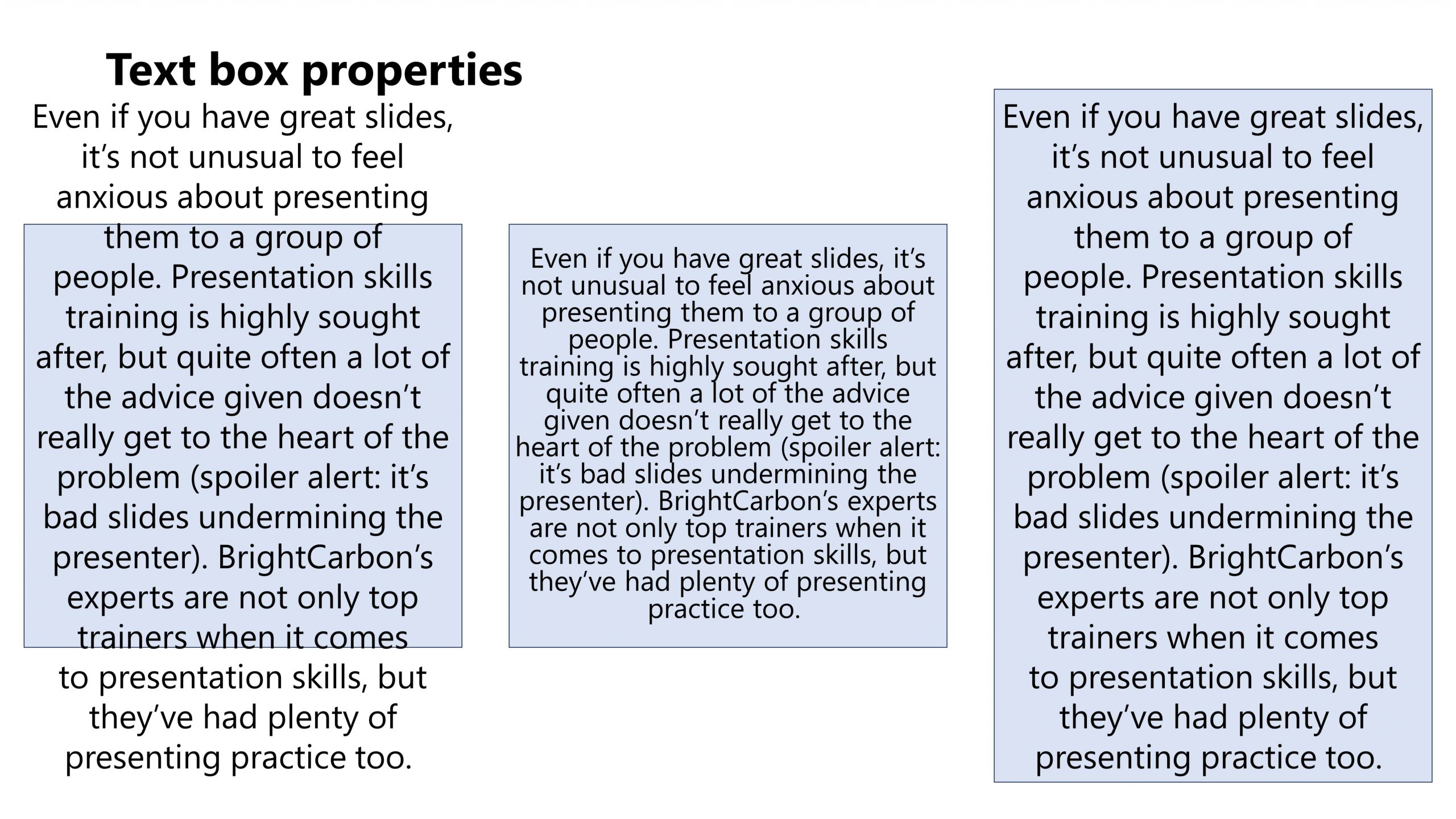
Here’s the same shape and text with those three options applied (all three also have Wrap text in shape selected). We’d suggest using the first, Do not autofit. Though this looks the messiest, there are a couple of advantages: it doesn’t change the font size, so you don’t end up with a mix of random font sizes in your deck and it doesn’t alter the shape size, potentially ruining your design.
Note: It’s also possible to set Chart Themes. This means setting certain rules about how your graphs and charts look. The process is slightly different so, if you’re interested, check out this post: How to consistently brand graphs and charts across Microsoft Office
When you’re happy with your template, save the file as a potx and check the file size. PowerPoint templates should be small as a heavy template file can slow down PowerPoint and make working in the deck really frustrating. Aim for no bigger than 2-3MB. If it’s above that consider removing some of the extra layouts and compressing any images in the template or removing them and adding image placeholders instead.
Finally, before you share the template with the world, check the color contrast on different devices, what works on a high-def screen might not work on a projector.
There are other masters hidden in a PowerPoint file, the Handout master and the Notes master. Aaaand, to be honest we wouldn’t bother with them! If you want to create fancy handouts, there are better ways of doing it. If you do want to print your PowerPoint with notes, then of course we already have a guide on working with the Notes Master to do that and do it with style.
The eagle-eyed and the cynical amongst may have noticed that I began this article by saying that a well-constructed template was the start of fixing your organization’s PowerPoint issues. A proper corporate PowerPoint template will solve many problems, but people are people. Even with the best of intentions, users create slides that aren’t on brand, add extra layouts causing file bloat and generally run riot in PowerPoint. All these small problems replicated at scale cause losses in time and resources and undermine brand. Many companies don’t even realize what’s causing the issue.
That’s why our incredible product team developed BrandIn. Designed for large organizations, BrandIn has features like Brand Check where your users can check for – and fix – common mistakes (colors, fonts, shape formatting, legal marks and more). BrandIn also eliminates template chaos allowing companies to manage masters and layouts, control file sizes, and ensure accuracy. And all this is designed to fit seamlessly into the PowerPoint experience your employees are used to.
Get in touch with us or watch this short video to learn more about BrandIn and figure out whether it’s the solution to your PowerPoint headaches.
And believe it or not – though it’s a strong start, this post hasn’t actually covered everything there is to know about PowerPoint templates. If you’re already overwhelmed, get in touch. We can chat about your current template and dive deeper into the process of creating PowerPoint templates that really work.
Leave a commentBy applying some key principles of presentation design, you can make your PowerPoint design really standout and deliver both a more ‘popping’, but also more effective presentation.
Most presentations are a cascade of text-heavy Death-by-PowerPoint slides. Online learners suffer the torture of brochures converted to click-through-eLearning. Most people now recognize that using visuals is the way to go. But how do you make visual presentations and eLearning that work? We think there are six steps you need to follow.
What’s the secret for how to print multiple PowerPoint slides on one page? We've got a few solutions up our sleeves, from simple and quick to completely custom!
Join the BrightCarbon mailing list for monthly invites and resources
Tell me more!We delivered this to over 100 people today, and everyone LOVED the presentation and story. We have received wonderful feedback, and have four opportunities already.
Sarah Walker Softchoice


Its nice
Thank you