
30th Oct 2023
How to create PowerPoint templates that work
- PowerPoint design
- Comments: 2
Without a proper PowerPoint template, presentations can be a bit of a mess. Here are the building blocks for developing a PowerPoint template that works!

PowerPoint color themes are key to make your presentation look consistent and professional. Using theme colors correctly also makes it easy to change colors and branding later. And understanding how they work means that you can avoid the annoying way that slides change and get messed up when you copy them from one deck to another. Keep scrolling to find out how you can create your own color theme in PowerPoint, and apply it across Office.
Watch my video tutorial for the full Technicolor demonstration, or read on for the analogue version with extra bonus tips.
First up, what is a PowerPoint color theme? The color theme sets the colors you find in the PowerPoint color palette, under the fill color or text color options. The main colors are set by you, and then PowerPoint creates the various shades underneath each one.
How do you change theme colors in PowerPoint? To choose your color theme, go to the Design tab on the ribbon, and under Variants, select Colors, which will show you a range of options built into PowerPoint.
If you don’t want any of the pre-set color themes, you can choose the Customize Colors option down at the bottom of the list, which brings up a pop-up box that allows you to alter any of the colors. Select any of the color scheme options, and then More Colors at the bottom, which allows you to choose anything from the color wheel, or input your own RGB values, which may be useful if you want to use your brand colors in your presentation.
Once you’ve chosen the colors you want, you can save the theme with any name you like. That saved theme can be applied to any other PowerPoint deck, but will also be accessible across all Office programs, so you can set the same color themes in Word, Excel, or Outlook.
You’ve got to love the way the same thing is hidden in so many different places! Maybe they’re like horcruxes, or something?
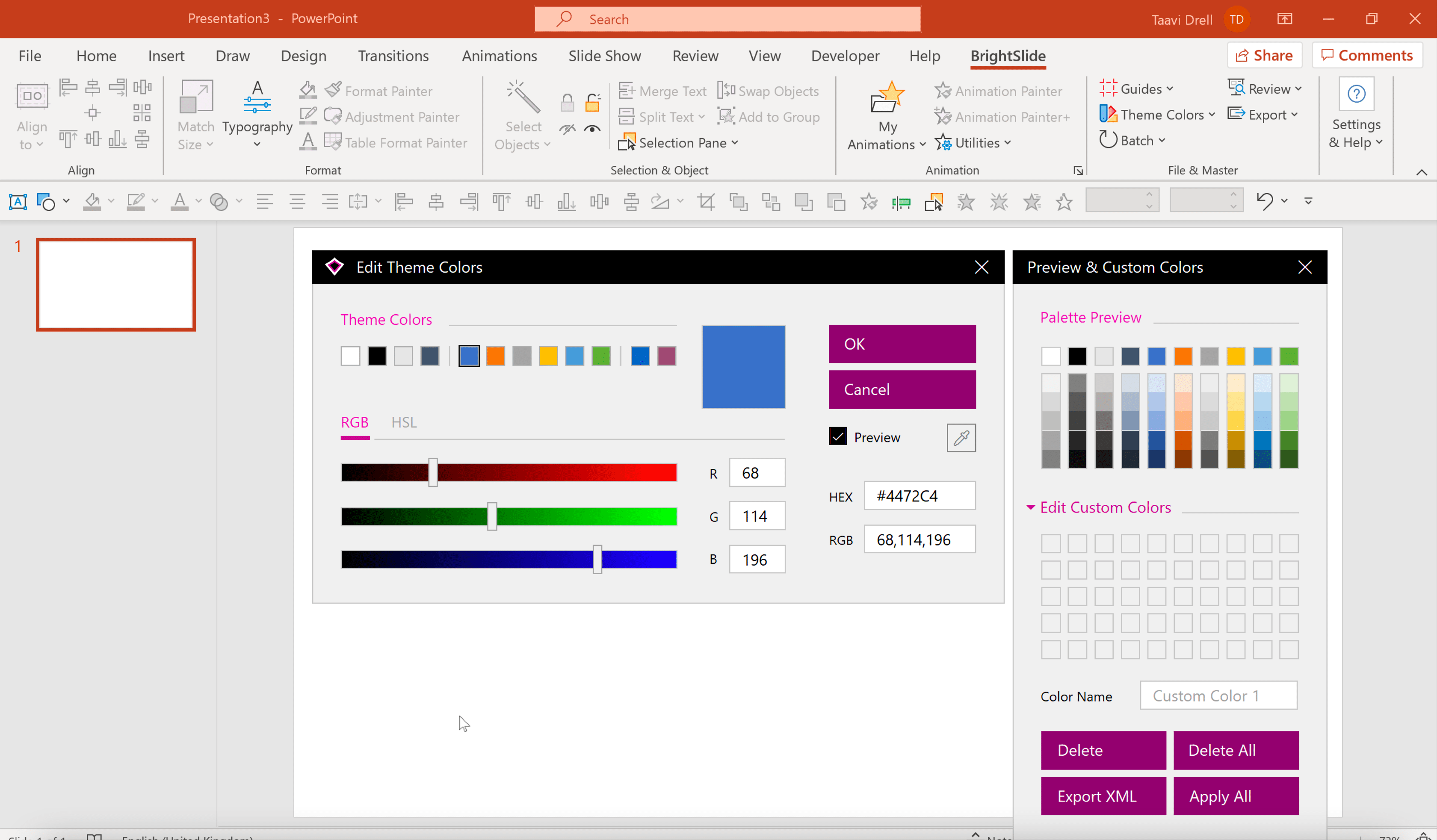
If you’ve downloaded BrightCarbon’s very own free PowerPoint add-in BrightSlide it is even simpler to set theme colors. Head to the BrightSlide tab and under the File & Master section select Theme Colors. The Theme Color editor will appear allowing you to set colors based on HEX, RGB or HSL values or using a color picker. It also give you a live preview of the palette and allows you to import and edit spot colors.
Accent colors: The six Accent colors are the ones that are most useful in the PowerPoint color scheme. These are the main colors you’ll use in your presentation, and all Charts and SmartArt will be created using these colors by default.
Text/Background colors: The four options here don’t have to be dark and light, as the name suggests, but it’s recommended, as PowerPoint will use these colors as the background color for charts, and the text color for labels, assuming that you’ve chosen dark and light colors. It’s changing these to colors that are too dark or too light that can cause problems with poor contrast ratios, so try to keep them light and dark colors as appropriate, which will help with your overall PowerPoint color scheme effectiveness and accessibility. You’ll also be able to access these four colors in the theme colors menus.
PowerPoint hyperlink color: If you want to choose a special PowerPoint hyperlink color, and a color for links that have been clicked, you can, but the colors won’t appear in the theme color menus anywhere, so don’t think you can sneak another two colors into the PowerPoint color palette for general use.
Selecting specific RGB spot colors can be tricky, but using a color picker really helps – either to ensure you’re perfectly matching your brand colors, or picking colors from an image, webpage, or document that you like. A color picker tool will provide the precise RGB value for any color you can find, which you can then input to create your new presentation color scheme. There’s the PowerPoint color picker – built into the program – available from Office 2013 and later, which you can find by selecting an object (anything works for this), then going to the Home tab on the ribbon, over to Shape Fill on the right-hand side, and then selecting the Eyedropper option half way down the menu. Irritatingly, this PowerPoint color picker only works to pick colors within the PowerPoint slide window, so if you have an object on the slide already (like a logo), or can paste an image into it, then it’s fine.
If not, there are plenty of great separate color picker tools that will allow you to pick up the RGB value of any color on your screen. There are loads of them, from incredibly feature-laden, to super simple pick a color, get an RGB code. Simple generally works for me, so things like Pixie and Color Cop are both good.
Now that you’ve set your theme colors, use them. Consistent use of the same family of colors makes your presentation look better and not too garish, which your audience and branding department will thank you for. It also means, as mentioned before, that if you change the theme colors, then all your content will change automatically to match. Not just on a single slide, but through your entire presentation. So if you change brand, or need to repurpose slides to fit a different theme, say for a conference, using the main theme colors, and all the various shades, will save you a lot of time.
If you copy and paste your slides into a different deck, with a different presentation color scheme, then your slides will also change to match the new PowerPoint color scheme, making everything consistent, with no additional effort. Incidentally, if you’ve ever copied slides into a new deck and wondered why everything has changed, this is why.
The standard colors are different to the PowerPoint theme colors, in that they’re fixed, and won’t change automatically when you apply a new theme or copy slides into a new deck. This can be advantageous. Say you want to use color to convey meaning – using red for negative and green for positive is a common combination. Here, you’d want to use the standard colors, rather than theme colors, as the colors won’t change, and your meaning won’t get lost if things alter in the future.
The same is true with spot colors. Sometimes you may want to add a specific color into the slide. This might reflect another brand in the deck for instance. In any of the color menus, you can choose More Fill or Outline Colors from the drop-down menu, which reveals the same color options pop-up as before, allowing you to choose anything from the color wheel, or a specific RGB value. Again, these spot colors won’t change if you alter your color theme, so just be aware of any overuse.
My colleague Amy put together some thoughts on how to use color to make presentations more effective, which is also worth considering.
The presentation color scheme also applies to the many other formatting effects in PowerPoint. If you choose a theme color for a shape, and then make it semi-transparent, the shape will change color if you apply a new theme in the future. Likewise, if you add a gradient fill using only theme colors, then the gradient will change if the theme is altered. Other effects like glow and the shadow functions, or the change fill or font color emphasis animation effects also use the theme colors by default (although you can select spot colors).
In general, we recommend using the PowerPoint theme colors wherever possible to promote consistency in everything that you’re doing. But it’s worth noting how far the color theme reaches, so that if it changes, and something goes wrong with your slide, you can more easily identify why.
Try creating your own PowerPoint color scheme. And, while you’re at it, you can download a free PowerPoint toolkit from BrightCarbon, all of which is programmed using a rather nice color theme, which you can use, or alter, and watch as all the objects change color to suit your tastes.
Leave a commentWithout a proper PowerPoint template, presentations can be a bit of a mess. Here are the building blocks for developing a PowerPoint template that works!
By applying some key principles of presentation design, you can make your PowerPoint design really standout and deliver both a more ‘popping’, but also more effective presentation.
Most presentations are a cascade of text-heavy Death-by-PowerPoint slides. Online learners suffer the torture of brochures converted to click-through-eLearning. Most people now recognize that using visuals is the way to go. But how do you make visual presentations and eLearning that work? We think there are six steps you need to follow.
Join the BrightCarbon mailing list for monthly invites and resources
Tell me more!Great work combined with amazing service, gracias Team BrightCarbon!
Mila Johnson InComm


Fantastic, tutorial. Brilliant again! 👌🏽
Thanks Mike! Much appreciated. Glad you liked it.
Thank you so much.
Thanks for sharing the information. I really appreciate it.
This is EXACTLY what I have been searching for, thanks Richard! I have been trying to get my SmartArt colour changed for hours now. Thank you
Really useful thank you.
Is there a way to share defined themes – so that other people can import/use the same theme rather than everyone having to set it up themselves?
Hi Toby, yes you can, using either a Template or Theme file. In PowerPoint, do all the adjustments you want, then go to File > Save As, and then under the file name box, in the drop down menu (which by default says ‘PowerPoint Presentation (*.pptx)’, choose either ‘PowerPoint Template (*.potx)’ or ‘Office Theme (*.thmx)’. Both of these save all the colour/font settings you’ve made and can be opened as a blank presentation or applied to an existing presentation.
If you open the file as a new presentation, there are some differences:
Office Theme – this will save all the colours/fonts/styles and slide masters/layouts.
PowerPoint Template – this will save everything the Office Theme does, but also any custom slides you’ve made in the presentation. So it can be a good starting point for a deck if you always use the same core set of slides.
If you want to apply either to an existing document:
In PowerPoint – Go to the Design tab > Themes > Drop down arrow > Browse for Themes
In Word – Go to the Design tab > Themes > Browse for Themes
In Excel – Go to the Page Layout tab > Themes > Browse for Themes
P.S. One day I’ll teach Joby all this. 😉
thank you Richard – that’s really helpful!
i’ll use the office theme as that will (presumably) apply to Word, Excel and PPT…which is just what we need!
Good luck with Joby though…i think that will be a lot harder to do than creating a bespoke colour palette. haha
I wish I understood this:
If you want to apply either to an existing document:
In PowerPoint – Go to the Design tab > Themes > Drop down arrow > Browse for Themes
In Word – Go to the Design tab > Themes > Browse for Themes
In Excel – Go to the Page Layout tab > Themes > Browse for Themes
When I browse for Theme (to pick up the new Theme with new colors put out by the brand dept), it just imports the master pages from the Theme doc (and the colors), rather than making the new color palette available to the existing pages. But all the existing pages still have the old theme/masters applied. I hope I don’t have to re-apply masters to hundreds of pages! To avoid that, right now, it looks like I need to rebuild the colors in the existing masters, I can’t seem to get the new color palette into the old masters. 🙁 That’s all I want! I can’t seem to find exactly how to do this one arcane thing anywhere on the web! And who knows, maybe it’s because I’m on Mac. There are so many features in PPT that are not available on Mac.
Hi Richard,
I’ve encountered something in PowerPoint I never have before, and I wondered if you ever saw it yourself … I program the colors to the brand appropriate rob/hex & when I go back into it I see the color values have been adjusted to a similar mix, but it’s not what I specified. Do you have any insight?
I LIKE MY FRIEND RICHARD!
?? Why so difficult ??
1 click with one of the 28 free features of the free iSlide PowerPoint add- in!
Just check it out here : https://islide-powerpoint.com/en/support/tips-ideas/15-minutes-en
Actually, personally I think this tool should be mandatory for everyone!
Or even better, bought and integrated by Microsoft itself!
This website was… how do I say it? Relevant!! Finally I’ve found something which helped me.
Appreciate it!