
30th Oct 2023
How to create PowerPoint templates that work
- PowerPoint design
- Comments: 2
Without a proper PowerPoint template, presentations can be a bit of a mess. Here are the building blocks for developing a PowerPoint template that works!

I’m often asked how to make presentations more effervescent. How they can have more fizz. Or, worst of all, “Can you make my presentation pop?” Well, the answer is yes. By applying some key principles of presentation design, you can make your PowerPoint design really standout and deliver both a more ‘popping’ – but also more effective – presentation.
I’ve split this out into a couple of topics, across two broad categories. One is presentation design, which is really the core graphic design principles that work across any form of visual communication. The other I’ve classed as PowerPoint design, which is a little more specific to using PowerPoint as a tool to create or deliver content. All the ideas have practical applications in PowerPoint, but I thought this breakdown was potentially useful.
Watch the video for a summary of all the tips and tricks I cover in my tutorial:
What if I told you that your presentations could look like these examples?
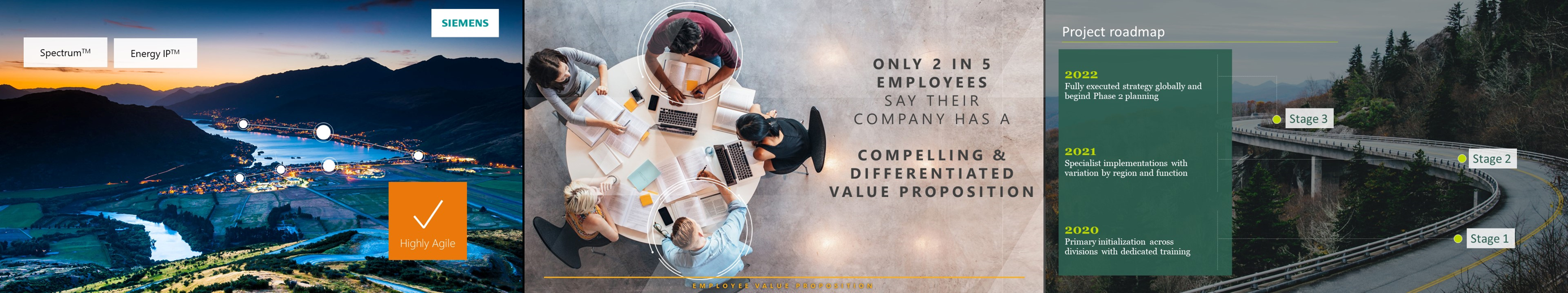
They’re all using images to enhance your PowerPoint design, both by looking good, but also contributing to the story and helping your audience understand your messages. We’ll get more into the visual storytelling aspect of this later, so for now, just think about the quality of your images. All of these come from one of my favourite free stock photo sites, Unsplash, which gives you royalty free images for commercial use, and they’re all beautiful.
But even beautiful images can’t save a slide like this: 
So, it’s not just a case of dropping nice images on the slide. You need to understand how to lay them out well, and use the crop, colour, and artistic effects tools in PowerPoint to treat the images appropriately, and give your presentation a professional look.

To see how we’ve created these kinds of slides, check out the image crop, and crop to zoom and full bleed step-by-step guides. Simple, but considered use of the crop tool can work wonders with your PowerPoint presentation design.
Big, bold, flood fill images are great, and an easy way to make your slides stand out. But it’s not all about pictures and Presentation Zen; inevitably you’ll need to place other content onto your slides, whether that’s facts, figures, charts, or even dare I say it… bullet points. This is where the use of white space in presentation design becomes crucial.
White space is not about purely adding ‘white space’ onto your slide. This one has plenty of it, but it still looks terrible:

It’s about creating areas of contrast, with clear focal points to draw your attention to the important parts, and even create a flow and hierarchy across your slide.

This example gives you that luxurious feel of the full bleed image, but crops it so that the focal point – the watch – is off to one side, leaving plenty of white, or ‘negative’ space around the arm for your content. The two sections work nicely together, and we’ve anchored the text in a content placeholder and given it some structure too, by actually reducing the size of the text to give it more room. Again, we’ve got a full tutorial on how to incorporate white space like this here.
Grids are pretty much design 101, and to be honest, I’m surprised that we’ve got this far into presentation design without me having brought them up. You’ll likely be familiar with grids from magazines and newspapers – these mainly use column grids. The page is divided into columns and then content is designed to sit across these columns in any combination, which balances the content.
Well, the same thing applies to PowerPoint presentation design: a grid system helps to lay out your content in clear, easy to follow areas.
You can use a grid to create distinct sections, such as telling the start, middle, and end of a story. It’s much easier for your audience to follow, as everything is better organized.
And, it helps bring text into line – if you have any – which is important as it minimizes distractions for your audience when trying to read.
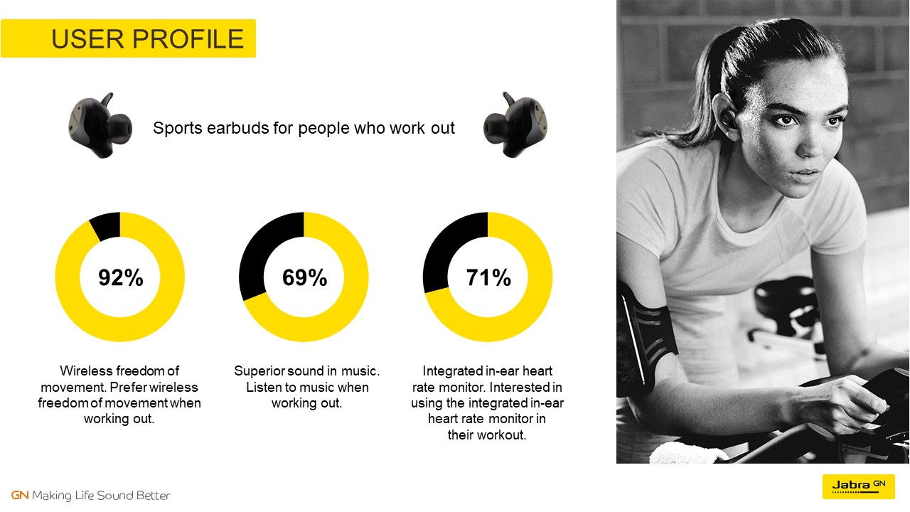
Using a grid also helps you decide where to position content, as there are only so many places that you can put things. Here, for example, one third of the slide has been taken up with the supporting image, so we’ve created a grid within a grid to lay out the three pie charts, which helps to create a feeling of harmony and sophistication:
And don’t think that your divisions have to be straight along the gridlines. Here’s an example that doesn’t apply the rule exactly, but still works really well.
Also, by using a grid, you achieve a consistent feel across all your slides for overall presentation design cohesion.
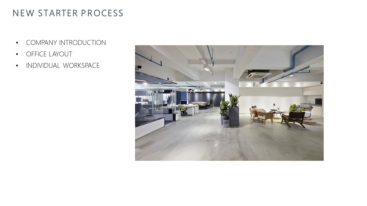
What does all of that mean? Well, you can transform a slide like this:
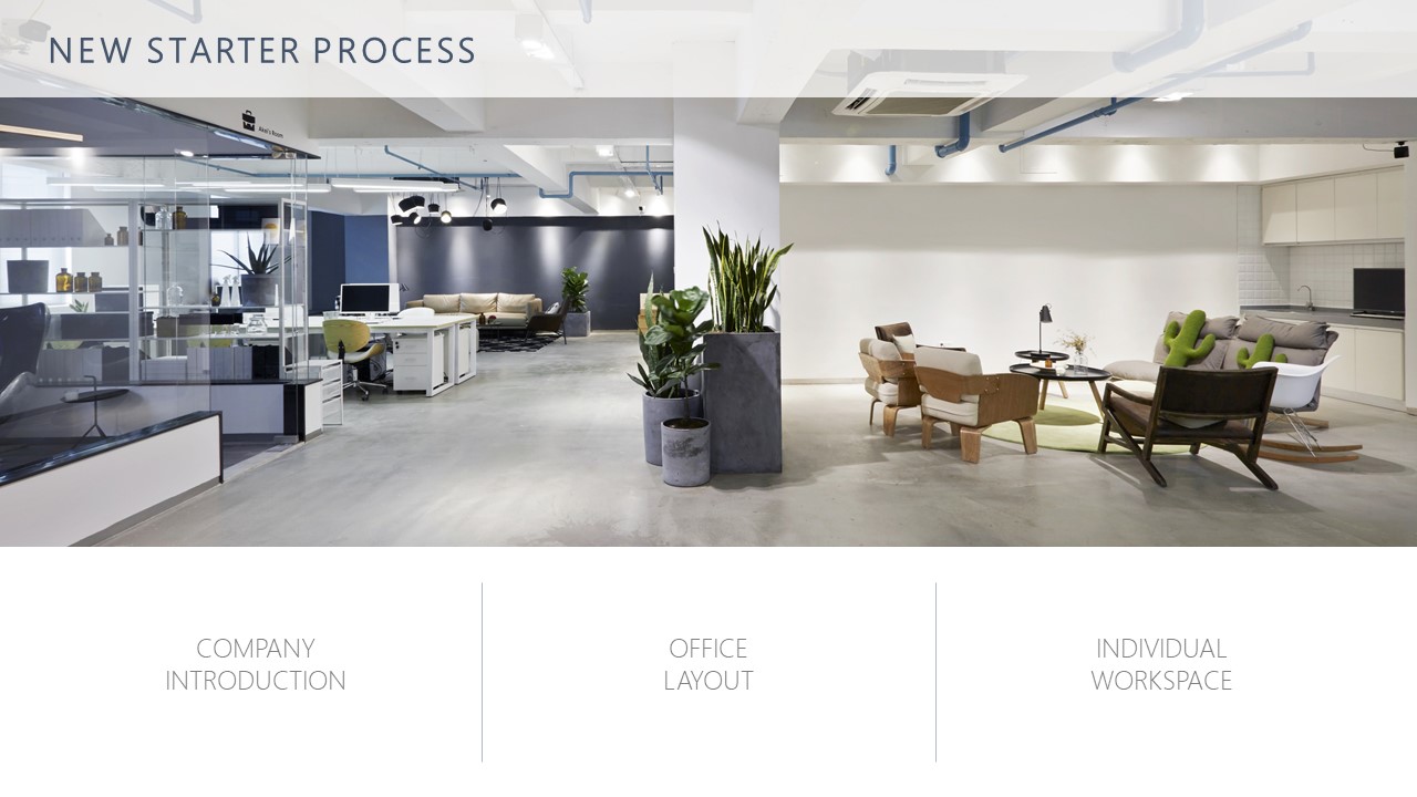
Into this!
It’s really quick and easy to do in PowerPoint too, and you can see our tutorial on using grids and the guide tools in PowerPoint to bring your presentation design up a level.
Another key presentation design principle is colour. Setting the right colour palette is essential, as it gives everything a consistent feel, allows you to adhere to your brand, and can give you the ability to assign meaning to specific colours to help your audience understand things. The best way to handle colours in PowerPoint is to set your template correctly and use a colour theme. You can find out how to change your PowerPoint colour theme here. It’s really quick and easy to do. Once you’ve done it, the theme will save with the file (or template), so you don’t need to worry about it again.
Once set, you can use colour in interesting ways to convey meaning.
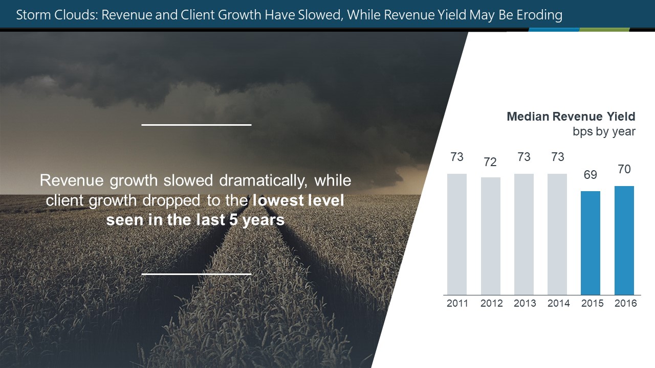
For example, a heat map is a great way to show data ranges, like metrics, using a scale, rather than just plain numbers. That’s more helpful to your audience, as it allows them to immediately see both the absolute and relative values, rather than having to spend time deciphering it.
You can also use colour to focus attention.
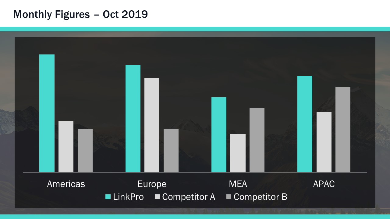
In complex data sets, using contrast colours can help to highlight primary datasets. Here, for instance, you can clearly see the main data series, compared to the ‘everything else’ data series.
Again, once you’ve set your colour theme, using these techniques as part of your presentation design is pretty easy, and you can find more specific guidance on how to manipulate colours in PowerPoint here.
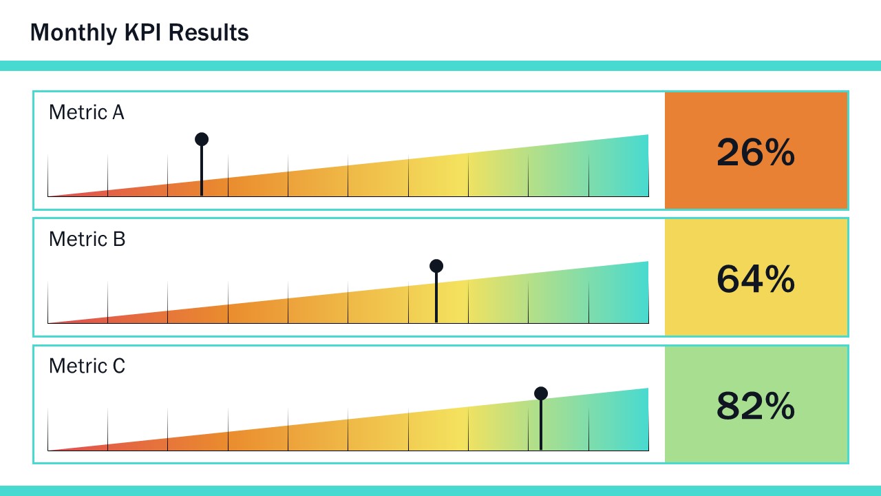
With your grids, colours, and white space considered from a high-level presentation design perspective, you now get into the specifics of creating slides in PowerPoint. As much as you, I, and your audiences, love presentations that make use of effective visuals, we know there are always going to be slides that are stuffed to the gills with boring text and even boring-er bullet points.
But, by applying the presentation design techniques already mentioned, you can fairly easily transform your text-heavy slide into something that’s far easier on the eye:

By using grids, appropriate colour, and white space, your PowerPoint slide design could look like this. Breaking out the text with decent paragraph spacing helps your audience parse the content more efficiently. Everything is easier to follow with consistent fonts and the use of colour highlighting. And the white space around the content actually gives the slide greater impact – particularly the use of the large margins around the text, created by the contrasting placeholder. There are a great many more options, and for ten in-depth typography techniques, check out this post. But if you’re just looking for nice fonts to use, this rundown of ten of our favourite fonts for presentations is a must-read.
As you’ve probably come to expect by now, this is something you can do using only PowerPoint, and you can see how in this tutorial on text formatting.
While it’s not Photoshop, PowerPoint has some neat tools to manipulate images.

What if I were to tell you the picture you see here had been constructed out of this…

PowerPoint design tools for images are all found on the Format tab on the ribbon. There are plenty of options to choose from, but only some actually enhance your design. For PowerPoint design tools, you should really focus on the left-hand side of the ribbon. The good features include the Remove Background tool, which does what its name suggests. The Color section allows you to put a colour wash over everything, but also, at the bottom of the menu, you can choose Set Transparent Color, which will remove a single colour from any image, which is how I’ve cut out the phone image in this example. Artistic Effects are generally terrible, except blur (which is great for changing focus on an image) and the Transparency tool – newly available in Office 365 – which makes pictures transparent. For a full tutorial on making the above example image, watch this short video.
And finally, my favourite thing is to use these design techniques as part of visual storytelling, which helps dramatically improve your presentation.
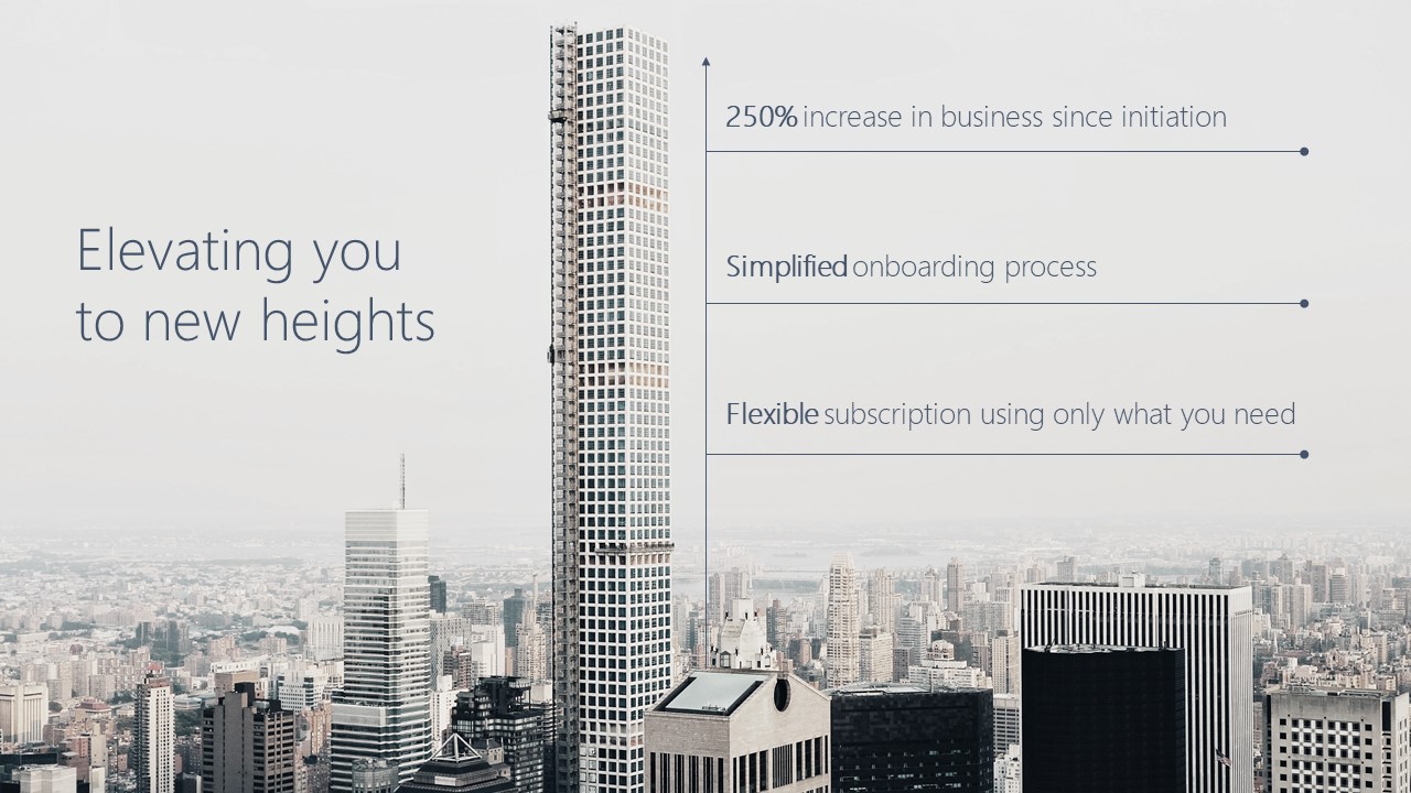
Think about how you can use an image to convey meaning, as well as provide aesthetic appeal. For instance, you could use a skyscraper being constructed to show elements that are taking you higher, with labels up the building showing the key metrics:
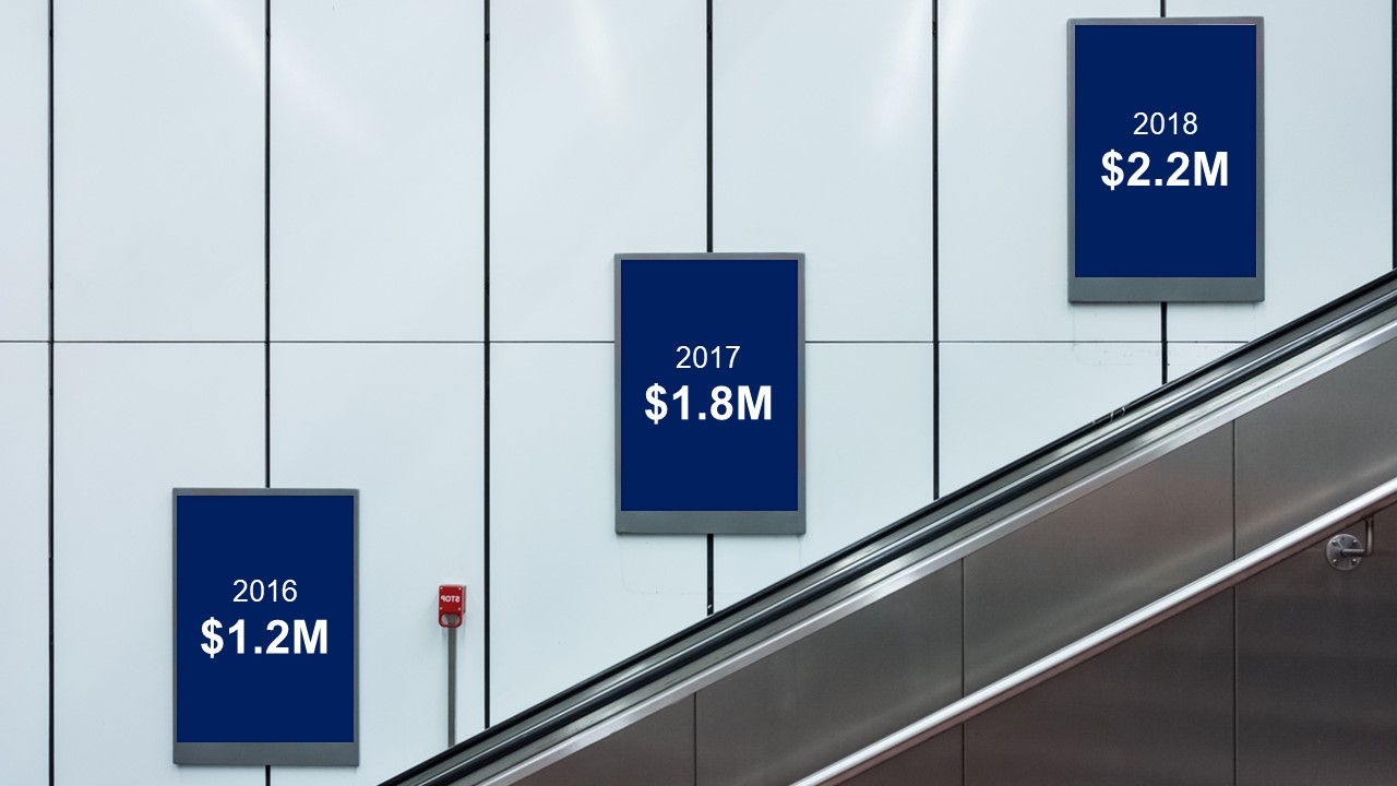
Or use a common sight from underground stations – the advertising boards on escalators – to show a data series increasing. The image also gives the figures room to breathe:
It doesn’t need to be complicated, and this example has been constructed from an image, some text, and an arrow, to show the 20% of business highlighted on the office photograph:

And of course, we have a short video tutorial to show you exactly how to do it. Sometimes, just finding the right image can be a real help coming up with the right PowerPoint design ideas, but you may also want to look to other design resources for inspiration.
The main thing to remember about effective presentation design is that you probably don’t have the time to create a totally new concept each time, or a mood board for your work. These ideas, especially the PowerPoint design ideas, are all about helping you create beautiful and effective presentations quickly, with minimal effort. A solid basis in design principles – coupled with a few PowerPoint tricks -will set you on your way. So, hopefully next time someone asks you to make a presentation ‘pop’ you can uncork the champagne and tell them you already have.
Leave a commentWithout a proper PowerPoint template, presentations can be a bit of a mess. Here are the building blocks for developing a PowerPoint template that works!
Most presentations are a cascade of text-heavy Death-by-PowerPoint slides. Online learners suffer the torture of brochures converted to click-through-eLearning. Most people now recognize that using visuals is the way to go. But how do you make visual presentations and eLearning that work? We think there are six steps you need to follow.
What’s the secret for how to print multiple PowerPoint slides on one page? We've got a few solutions up our sleeves, from simple and quick to completely custom!
Join the BrightCarbon mailing list for monthly invites and resources
Tell me more!You guys are amazing! Looks awesome, and works great. Perfect!
Mila Johnson InComm


LOVE LOVE this . .. so helpful and fun to work with. .
Your design concepts and tips were highly recommended by BiancaWoods.weebly.com and after downloading a template and reading your articles – now I see why.
Impressive resources!
Brilliant, thanks so much! Bianca is pretty awesome too. Glad that we’re all able to share with the community.
Nice way of explaining the information
Wonderful
Richard I have been following you since I met you at an ATD regional conference. You have always responded generously with the best in class PowerPoint tutorials and aids. Thank you for your excellence.
You’re most welcome, thanks so much!
Really useful and inspiring presentation.
It’s helped me see how to go beyond the mechanics of what PowerPoint can do towards creating a compelling and coherent design and story
This was really engaging, beautiful and extremely useful. Looking forward to using ideas into my slides.
The way you showed the Before and After is fantastic.
Fantastic!
Very useful read .short video of 7 minutes on presentation is great to improve our presentation skills
Very creative and inspiring! You continue to amaze me with the quality of your desin6!
Really nice ideas – solid information. Thanks.
Amazing tutorials. Thank you for so generously sharing your skills, tips, and creativity!!
very interesting topic and very well presentation,thanks for this blog
very interesting topic
Excellent session as usual.
Thank you Richard for your amazing presentation! Very helpful.
I’m loving all these tutorials. I don’t know why I thought PPT was dying. I was wrong!