At BrightCarbon, we know that visual presentations improve audience engagement and help to get your message across, and we apply this theory to the sales presentations, training presentations and eLearning that we create. However, there are sometimes instances where text has to be used to convey your message. If you’re new to the world of presentation typography, never fear! Let’s walk through 10 tips and tricks for improving the way you use typography in your sales presentations and other design projects.
1. Match your sales presentation’s mood
It can be stressful to find the right font for a sales presentation if you haven’t got professional brand guidelines to help you. Every font has its own mood or personality, and choosing the correct one for your presentation is an important part of communicating your message. Fonts broadly fall into three categories: serif, sans serif, and display fonts. Understanding the differences between these will help you to narrow down the options for your sales presentation font.
Serif fonts have little strokes called serifs attached to the main part of the letter. Their classic look makes them a good choice for conveying tradition, heritage, and formality.
Sans serif fonts don’t have those extra stroke. Hence the name, which is French for “without serif”. This style is considered more clean and modern than serif fonts, and it tends to be easier to read on computer screens, including smartphones and tablets.
Display fonts come in many different styles, like script, blackletter, all-caps…and just plain fancy! Because of their decorative nature, display fonts are best for small amount of text, like titles and headers.
The biggest mistake that people make when choosing a font is assuming that serif and sans serif fonts are boring. This causes them to pick a display font because it feels more unique and interesting. If you are taking your first steps in the typography universe, remember that the first two styles above are not boring: they are popular for a reason! They are great looking typefaces that have been professionally designed to make you, and your sales presentation, look good, and that’s exactly what they do.
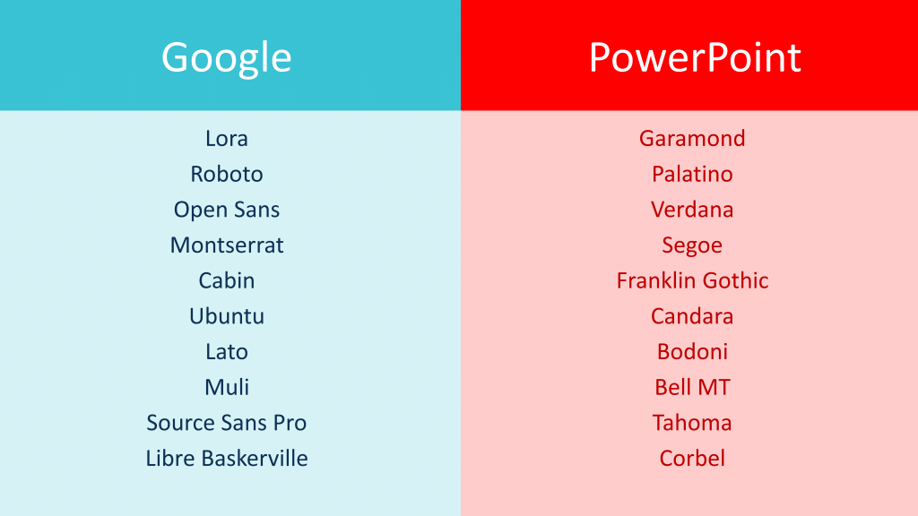
2. Use a standard font
We’d recommend picking a standard system font for your presentation typography, to preserve compatibility and make edits easier. Our team have listed our favourite PowerPoint fonts and Google fonts for you, so you can make an informed decision. If you want to bring more personality to your presentation, there are many professionally designed fonts available from sites like OpenFoundry – which has a range of free downloadable fonts for professional use. Or, look to Google Fonts for more than 800 font families; they are open-source and 100% free for commercial use.
3. Just pick one
Successfully using two fonts in a layout requires a deep understanding of the chosen fonts and confidence that they are complementary. In general, you want to avoid using two fonts of the same classification. For example, it’s best not to use two serif fonts together; the contrast may not be strong enough to look like an intentional design choice. Your audience might get the impression that your slides are messy and inconsistent! To avoid issues like this, we’d advise sticking with one font in your sales presentations, until you achieve mastery of font pairings.
4. Justify left
Many of us tend to instinctively centre align all the text on our slide. Somewhere in life we learn that if something is centred, then it is balanced and – therefore – better. In reality, centre alignment is the weakest, least legible alignment and should be used very selectively.
When in doubt, set your type flush left, ragged right (left edge is hard, right edge is soft). Why? In Western culture, people read from top to bottom, left to right. By justifying type to the left, your audience’s eyes are able to find the edge and read copy much more easily. For this reason, you should also avoid indenting the first line of a paragraph.
5. Create levels of hierarchy
Hierarchy is used to guide a reader’s eye to the most important element on a page or slide. It shows them where to begin, and where to go next, by using different levels of emphasis. Establishing hierarchy in your sales presentation typography is simple: just decide which elements you want the reader to notice first and make them stand out.
How do you do this?
Skip a weight: Fonts come in different weights, with common variations including light, medium, bold, and extra bold. The key to great design is contrast; subtle differences in font weight make it harder for the audience to notice the contrast between them. For example, a medium weight and a bold weight may not look distinct enough for the contrast to be clear. It might actually look like you’ve just made a mistake. Instead, combine light with bold, or medium with extra bold font weights. Try using heavier weights for the slide title and headers, and lighter weights for the body copy for greater contrast in your sales presentation.
Double point size: A good rule of thumb when it comes to setting the size of different fonts in your slide is to double or halve the point size. For example, if you are using 30 pt. for the slide title, use 15 pt. for the body copy. You could even increase/decrease point size by 3x or 4x for something more dramatic.
6. Avoid vertical text
Roman letters are designed to sit side by side, not on top of one other. Stacks of lowercase letters are especially awkward because the ascenders (those with a vertical line that extends above the body of the letter, like h, t, l) and descenders (those with a vertical line that extends below the body of the letter, like j, p, y) make the vertical spacing appear uneven. Plus, the varied width of characters makes the stacks looks precarious.
Simply rotating a horizontal text box to make it vertical isn’t a good solution, either. While this preserves the natural affinity among the letters sitting on a line, your audience will have to crane their necks to make sense of the words.
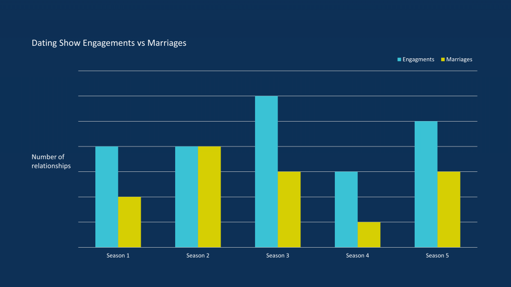
To keep things legible, avoid vertical text in all its forms and leave yourself plenty of space to fit horizontal text around – for example – graph and chart axes.
7. Use lines to group text boxes
If you have a lot of disparate text boxes on your slide, use lines (or in design speak, rules) to group related blocks of information. This will also make text boxes of varying sizes appear much more orderly.
8. Leave a bit of space
Don’t place text right up to the edge or corners of a slide, unless you are deliberately cutting elements off for a effect.
Negative space is a good thing: let your design breathe! This is also important to prevent a badly set-up projector or monitor cutting off key information.
9. Check for clashing colours or backgrounds
When considering presentation typography, you need to ensure good readability. So, it’s important that the text has sufficient contrast with the rest of the slide. But there are a couple things that can hamper this:
Clashing colours: If you’re applying colour to your typography, make sure it complements other elements in the design, including the background. Colours that are too different or similar can be hard on the eyes. Tie the text colour in with an existing colour scheme for a harmonious look, and use contrast checker tools to ensure text is legible. This is especially important for audience members with vision impairments or colour blindness, which we cover more extensively in this post.
Busy backgrounds: A background with a lot going on can make any text hard to read. You don’t want to frustrate your audience with a design that makes it hard to find the information they need.
Instead, try changing the text box from transparent to a simple fill colour. You can add a hint of transparency so that the background image still shines through. Do this in PowerPoint by right clicking your object, choosing Format Shape from the dropdown, and in the Shape Options clicking Fill and then Solid Fill. The slider will let you adjust the transparency. Set it to around 10-20% to increase readability and while maintaining a stylish slide.
10. Break the rules
Presentation typography, like life, is governed by rules. This is not necessarily a bad thing. Even if a lot of graphic design relies on images, illustrations and photography, type on its own can be manipulated creatively to lend a more expressive air to design, and create a great impact. Once you’ve mastered the basics, don’t be afraid to play with your type and have fun!
Now that you’ve got the basics down, be sure to check out our guide to advanced PowerPoint typography. And if you’ve got any top tips to share, pop them in the comments below!
We’re calling out one of the major injustices of corporate rebrands across the globe – PowerPoint falling to the bottom of the rebranding checklist. We discuss why it's a problem and how to fix it!
A PowerPoint template is the foundation on which polished and professional presentations are built. We interview BrightCarbon’s new Templates Lead, Gemma Leamy, and pick her brains on the ideal process for creating robust PowerPoint templates.
Great article! I never knew about the ability to manually adjust symbols like the @ and ( in order to be more evenly aligned with text, so thank you for the nice typography tip~
I think it’s important to note that if you select a unique font that everyone does not have loaded on their computer, you have to be careful about who is viewing or presenting your PPT. Anyone viewing or presenting your PPT must have the fonts you use loaded onto their computer.
It is, quite simply, the best deck we have. I did a nice presentation with it yesterday and would like to do the same next week... I am sure it will get a lot of use. The visual impact and flow are compelling!


Great article! I never knew about the ability to manually adjust symbols like the @ and ( in order to be more evenly aligned with text, so thank you for the nice typography tip~
I think it’s important to note that if you select a unique font that everyone does not have loaded on their computer, you have to be careful about who is viewing or presenting your PPT. Anyone viewing or presenting your PPT must have the fonts you use loaded onto their computer.