- PowerPoint design
- Comments: 3
Learn how to automatically generate total values for your graphs and charts using PowerPoint’s Combination Chart option.

PowerPoint does many things well, but typography isn’t one of them. I’ll walk you step-by-step through techniques to get it to play ball. Be warned – SERIOUSLY advanced PowerPoint functionality follows.
If you want the lite version of BrightCarbon’s typography expertise, then have a look at this article, but I’d recommend you stay with me and we delve into the deep stuff.
2019 addition here! We have recently released our brilliant, totally free PowerPoint add-in BrightSlide. It comes with a bunch of design and productivity tools created to supercharge your workflow in PowerPoint! These tools include live character and line spacing, speeding up some of the intricate kerning business we talk about below. Simply download BrightSlide, select the text you want to edit, right click and select Live Character Spacing or Live Line Spacing. Check it out!
Read more about BrightSlide’s features here.
Now, back to regular programming!
Leading is the technical term for the spaces in-between lines of text, the word originates from the days of manual typesetting when they used a strip of lead to alter the distance between lines of metal type. PowerPoint has a range of line-spacing defaults from 1.0 (single) to 3.0 (multiple x3), unfortunately PowerPoint’s single line-spacing option is often still too big. In order to tighten up those lines a bit there is a way to adjust the leading by point size.
1. Select the text box you wish to edit and then select the Home
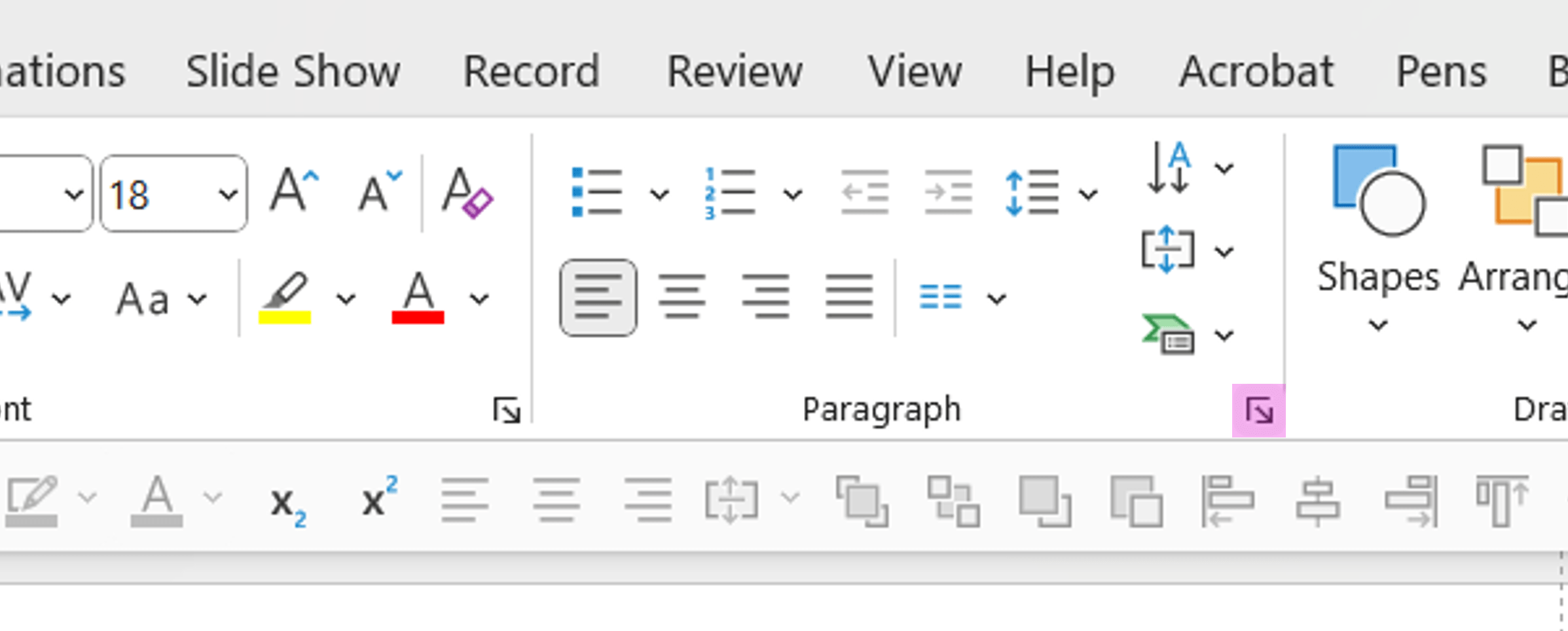
2. In the Paragraph section click on the dialog box launcher. This should open up a small window with various options.
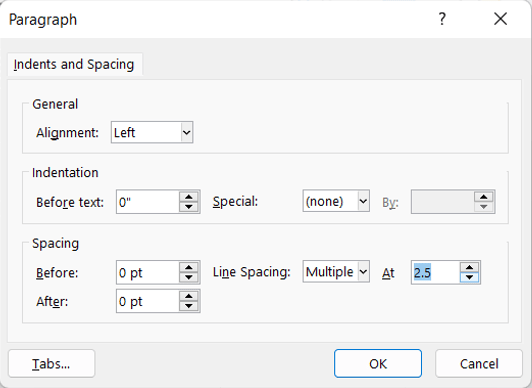
3. Click on the line spacing drop down menu and select Multiple, the second menu option will now have a number in it, by default this will be 3. I always like to knock it down to between 0.85 – 0.95, how much depends on which typeface your using and what you’re trying to achieve. Selecting Multiple rather than Exactly means the line spacing will be relative, therefore if you increase or decrease the font size the line spacing will increase or decrease accordingly. As a general rule avoid overlapping characters.
Tracking and kerning are both terms that relate to the space in-between individual characters, tracking refers to the character-spacing of a body of text, whereas kerning refers to the adjustments applied to individual characters. Once again the default settings available in PowerPoint are not the most useful; they range from Very tight through to Very loose, I find Normal to be slightly too loose and Tight to be too tight, so if you’re like me and you’d like to be slightly more precise, then follow these steps.
1. Select the text box you wish to edit and then select the Home
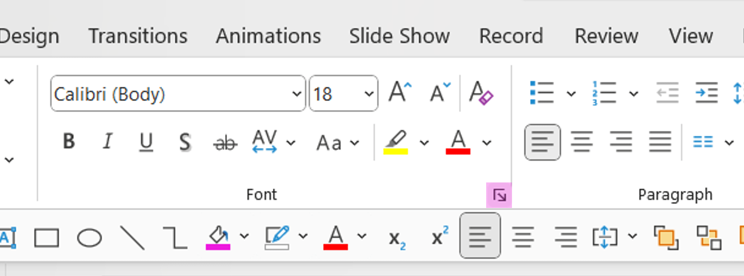
2. In the Font section click on the dialog box launcher. Again this should open up a small window with various options.
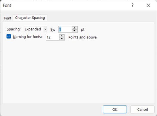
3.Select the Character Spacing
4. Click on the spacing drop down box which will probably be set to Normal, you’ll see the other options available are Expanded and Condensed. If you want to increase the character spacing select Expanded and define by how much (default is 1pt). If you want to decrease the character spacing select Condensed and define by how much (default again being 1pt). The amount you condense or expand the text varies with font size, the bigger your text the more you need to condense/expand it by.
It’s important to note that typefaces have been designed for use at small sizes like 10 and 12, when you increase the size of text the white space increases proportionally but this can look a little odd, often there appears to be too much space. If you are using larger sizes of text then it is more important to spend a bit of time tweaking the character spacing.
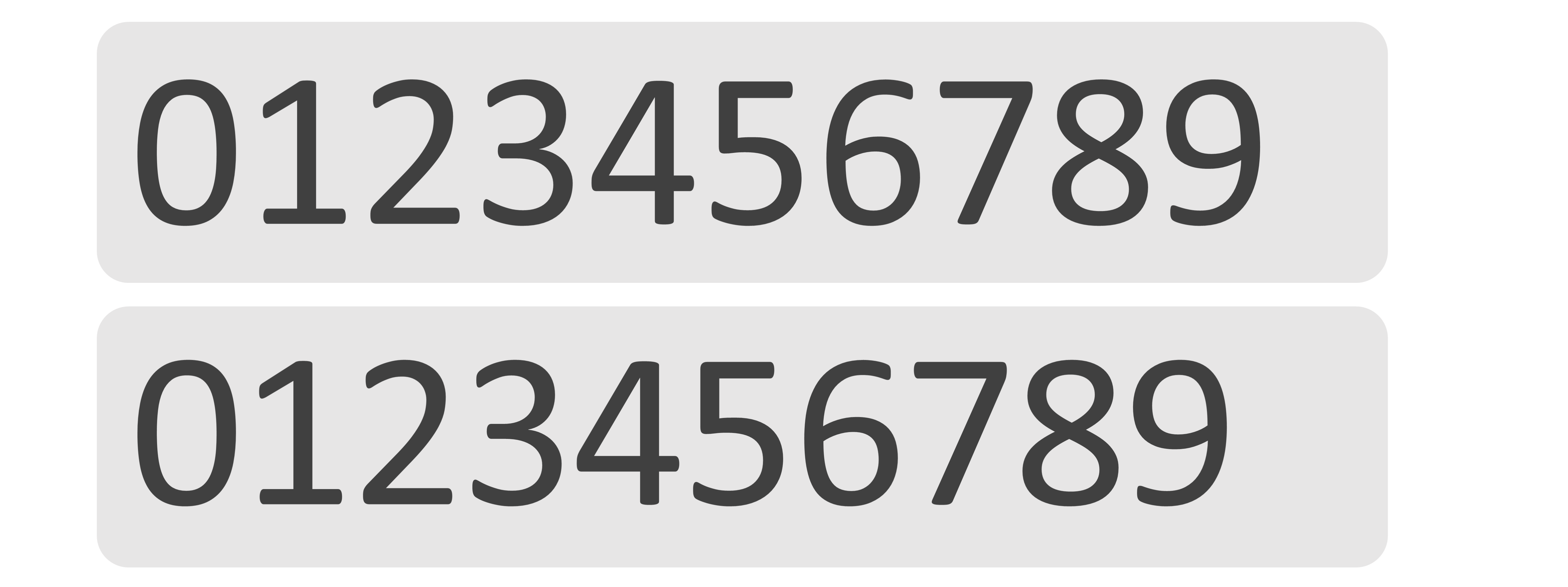
If you do tighten up the tracking you may notice that some letters overlap, this is when it’s important to adjust the kerning (Individual Character Spacing). If you’d like to adjust the Kerning then follow the same steps as before but you just need to select the letter to the left of the space you’d like to alter. Kerning is particularly important with the numbers 0 and 1. If you create a textbox in PowerPoint with numbers ranging from 0 to 9 you’ll notice that the gaps around the 0 and 1 are much larger than the rest. Just a quick adjustment to the kerning will tidy things up and make it look that little bit neater.
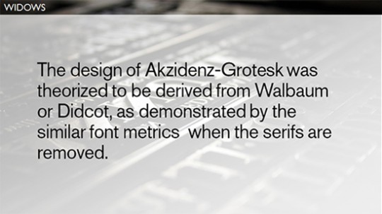
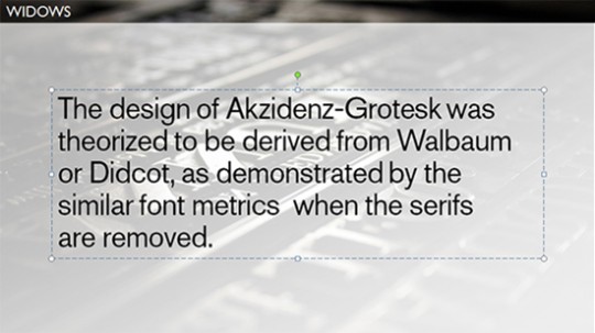
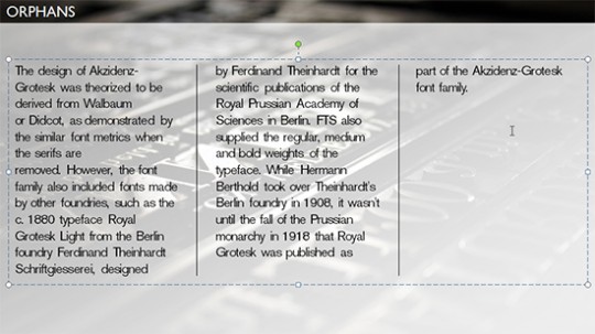
Don’t be alarmed by the title of this section, these two words represent two situations commonly found throughout all written material. The first situation highlights a paragraph of text with a widow in it. As you can see the last line of text only has one word on it and it’s this word that is known as a widow, pretty obvious really. This however is generally considered bad practice, and can often look pretty unsightly if the preceding line is particularly long. The best thing to do is to knock down a word or two from the previous line by pressing enter.
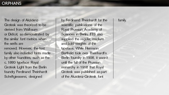
This second situation highlights an orphan, very similar to a widow, but instead of being a single word found on the next line it is found alone in the next column or even the next page (not applicable to PowerPoint). If you find yourself with an orphan just knock across a line and a word or two from the preceding column.
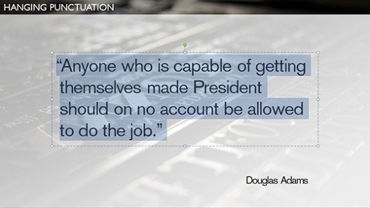
Hanging punctuation is a technique for typesetting punctuation marks so they don’t disrupt the flow of text. It applies to punctuation such as bullet points and quotation marks; it involves aligning all the rows of text slightly to the right of the punctuation mark. This is commonly the default setting for bullet points in PowerPoint; however quotation marks need to be set manually, to do this please follow these steps.
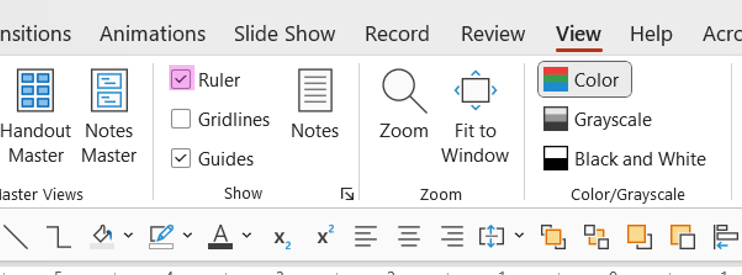
1. Select the View tab and in the Show section tick the Ruler box on.
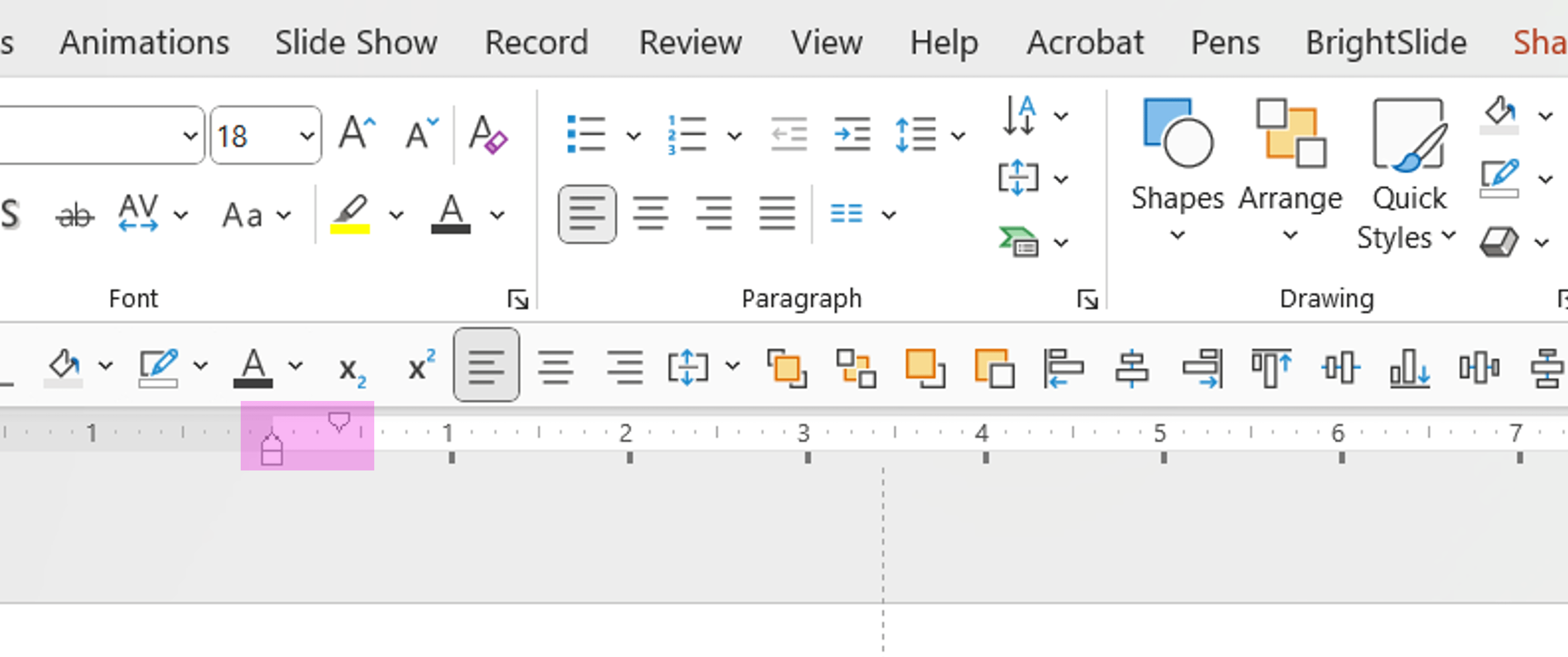
2. Now your rulers are turned on; click inside the textbox you wish to edit and on your top ruler you’ll notice two arrow markers. The top arrow marker adjusts the indentation of the top line of text, whereas the bottom arrow marker adjusts all the subsequent lines of text. Adjust the bottom marker so it aligns all the lines of text and leaves the quotation mark slightly to the left.
Parentheses or brackets are set to cover the height of the lowest descender to the highest ascender; the height range of numerals and capitals is usually much smaller, they only range from the baseline to the cap height. Therefore if you solely use numbers or capitals within the brackets, the brackets can appear too low. Raising the parentheses in PowerPoint is a pretty convoluted task, but for anyone who’d like to know here’s how it’s done.
1. Select one of the brackets and then select the Home tab.
2. In the Font section click on the dialog box launcher.
3. This should open up a small window, in the Effects section at the bottom tick the Superscript box on and change the Offset to 7%. This will make the bracket slightly smaller, and crucially will raise it up slightly.
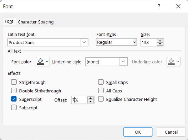
4. Now increase the font size of the bracket by 40%, therefore if your text is size 20 then change it to 28. This will increase the size of the superscript bracket to the same optical size as it was before, only now it is at the correct height. The adjustments stated here are only meant as a guide; they work perfectly for Arial, but may need tinkering with for different typefaces.
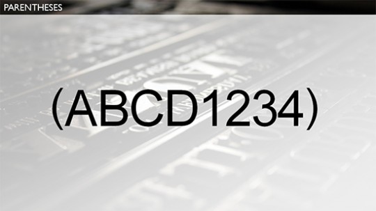
As well as parentheses being set too low for certain characters, in a lot of typefaces the commercial at (@) symbol can be set too high, the baseline of the ‘a’ should align with the baseline of all the other characters. This can be achieved in a similar way to the parentheses.
1. Select the @ symbol and then select the Home tab.

2. In the Font section click on the dialog box launcher.
3. This should open up a small window, in the Effects section at the bottom tick the Subscript box on and change the Offset to -7%. This will make the @ symbol slightly smaller, and crucially will drop it down a little bit.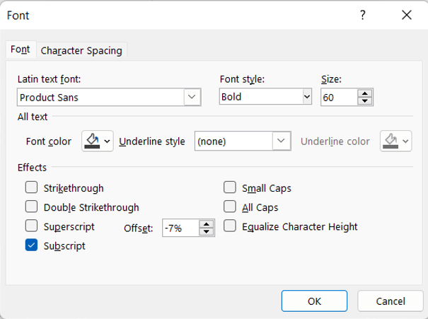
4. Now increase the font size of the @ symbol by 60%, therefore if your text is size 20 then change it to 32. This will increase the size of the subscript bracket to the same optical size as it was before, only now it is at the correct height. The specific adjustments stated here are only meant as a guide; they work perfectly for Calibri, but may need tinkering with for different typefaces.

So, there you go: not for everyone, but hopefully useful for some. PowerPoint can do a lot more than people give it credit for. Taking time to perfect a presentation’s typography is really worthwhile when you’re looking to add that extra layer of polish. Hopefully some of these guides will help you do just that. It’s just a shame Microsoft didn’t make it a little more straightforward!
And as a reward to getting this far, here’s a great resource we found with 20 free fonts to practice on.
Leave a commentLearn how to automatically generate total values for your graphs and charts using PowerPoint’s Combination Chart option.
February 14th is around the corner, so the BrightCarbon team have crafted three bespoke Valentine's day cards: all built in PowerPoint!
Some presentations require the exact same chart, graphic, or image on multiple slides. A new feature of PowerPoint 2016 is zoom links. With this feature, you can work around the issues of having multiple versions of a graphic throughout a presentation: PowerPoint will do the updating legwork for you! Read on to find how to make the most of this new feature.
Join the BrightCarbon mailing list for monthly invites and resources
Tell me more!BrightCarbon creates compelling visuals and storylines, helping us to convey value in a fiercely competitive marketplace.
Neil Davidson Deltek

Very useful info and something I’ll apply to future work. Thanks for taking the time to put this together.
Thanks for fantastic article and tutorial
One of the best i have ever seen
Will refer to it often
Very helpful! Thanks!
Great thank you. Was struggling with trying to find a way to apply a baseline shift. Realise now that it’s a convoluted workaround in Powerpoint (like many other things in said software!) but worth it for neater text.
By the way, regarding knocking text down onto the next line (for e.g. widows) I’d recommend a ‘soft return’ rather than a hard return – on a Mac press shift-return – I guess on a PC it would be shift-enter. This means that the knocked down text won’t be affected by any paragraph spacing amounts that you may have in your text.
Excellent tools, which got me thinking, I should (and will) one day sit and discover what every selection button does. We are too busy using it and do not spend enough time learning it. Time spent learning will save so much of it when applying / using it.
“unfortunately PowerPoint’s single line-spacing option is often still too big”
Actually this is something that you can’t blame PowerPoint (or Word) for as it is a property of the font. Every font has a default leading, which is applied when the ‘Single’ spacing option is selected.
Some people incorrectly assume that single spacing is 120% (10/12) of the font size. This stems from the default leading of Times New Roman, which is 120%. But the default leading for most fonts is closer to 110% (10/11).
Klasse und hilfreiche Zusammenfassung für Einsteiger und Nicht-Profis. Gut und leicht verständlich formuliert.
Hi! You all have great tutorials. I have taken a few and learned new tricks. Do you know if the setting for how PP auto adjusts line spacing can be changed? I use 0.84 as default in my slide master. Some of my slides are a bit wordy because they are reference material for accounting policy. If a side is full, PP will change the 0.84 spacing to 0.74 and then to 0.64 (which is ridiculously tight). I then have to manually change a bunch of slides. I want to change the behavior of the auto adjustment so that it goes from 0.84 to 0.80 to 0.76 (and NO tighter). I would rather change the font size or the slide layout instead of letting the line spacing become so tight that the line touch. Thank you for your thoughts!
This was super helpful, thanks so much!
Great info on how to shoehorn PPTX to function closer to real design software 😉 Thank you!
I didn’t see an option to change text kerning in a manner similar to changing font and font size, like from the Change Theme Fonts box via Slide Master. Can this be done to affect all inserted text boxes for the whole presentation at the outset, or after the fact, or would it need to be done with a macro (go through all text boxes and convert all text kerning to X)? Kerning for fonts >12 pnts is not so great in PPTX when a lot of font sizes exceed that.
Hi Katherine and thanks for the question. If you download and install our free BrightSlide add-in for PowerPoint you can use our live character spacing (kerning) tool to set the kerning on one text box and when you’re happy, click the … icon and you’ll see two options to “Apply to Same Font & Size” for (1) this slide (2) all slides. That should do what you need. This changes to kerning for text that’s found to have the same font as size as your current selection. If you have different typefaces and/or font sizes then that would need a macro.
If i install the BrightSlide add-in for PowerPoint. When I share the presentation, the presenter needs to have the add-in installed as well? Thanks
Hi Carolina, no they don’t have to have the add-in installed. It allows you to work more efficiently, but the resulting file looks the same to everyone.
This article has a lot of great information, but I was surprised to read this about avoiding widows: “The best thing to do is to knock down a word or two from the previous line by pressing enter.” Absolutely not! For one thing, if extra leading is being used between paragraphs, that will lead to an ugly space above the last line; and if the text ever changes, you could end up with a bad line break. A soft return (as suggested by commenter James) avoids the first problem but not the second. In my opinion, the best option is to use a nonbreaking space right before the last word.
In the 2023 version of Powerpoint the ‘Multiple’ option has gone!
‘It’s important to note that typefaces have been designed for use at small sizes like 10 and 12’
– no, they haven’t. this is just plain wrong.
‘when you increase the size of text the white space increases proportionally but this can look a little odd’
– again, nothing to do with the typeface, everything to do with one of the biggest shortcomings of ppt, and that is it’s inherent inability to correctly handle typefaces. it basically makes a mockery of any typeface, pretty much all typesetting in ppt looks horrendous. unless you want to spend countless hours tweaking every single letter, there’s nothing you can do about it.
Hi! Most fonts’ ® (registered trademark) symbol looks awfully big in PowerPoint. Is there a way to make them all X% of the font size and maybe shift Baseline up to X% (applied to all texts larger than X point size)?
I tried writing a script for that, but it got stuck on the Baseline shift command. If this could somehow be implemented into BrightCarbon it would mean the world! (I’m talking about an automation here, it would take hours and hours to do it manually on every slide)