Wonky alignment and badly proportioned slides can easily distract your audience. In the best-case scenario, they’ll lose focus for a second, wondering whether you put this presentation together on the train that morning. In the worst, your audience completely loses interest in your message, your professionalism is compromised, and you fail to meet the goals of your presentation. Human beings can’t help judging a book by its cover – or the content of your presentation by how it is designed. However, help is at hand! Let me show you how to make PowerPoint grids and guides your secret weapons, using them to create effective layouts that not only look neat and professional, but actually leverage proportions to better communicate with your audience.
Why are grids important?
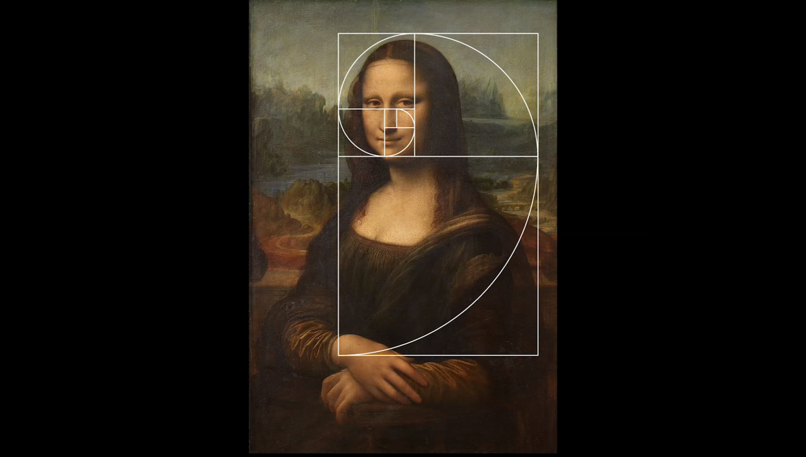
Fans of Renaissance art and/or geometry – I know you’re out there! – might have heard of the golden spiral. Based on the golden ratio, the golden spiral can be found in some of the most famous artworks in the world. Famed polymath Leonardo da Vinci incorporated the mathematics of this ratio into his paintings. See how Mona Lisa’s mysterious face lines up with the golden spiral:
Though people are still debating why the golden ratio is so visually pleasing, most assume that it’s because it seems to appear everywhere – from the arms of galaxies to the spirals of shells to this photograph of typical New Year’s Eve celebrations in the UK.
Professor of mechanical engineering Adrian Bejan argued that our brains find objects that fit the golden ratio beautiful because our eyes can interpret them faster. He believes cognition and vision have evolved together in a way that increases the efficiency of information flowing from the world into our brains. Writing about the golden ratio he said: “Shapes that resemble the golden ratio facilitate the scanning of images and their transmission through vision organs to the brain…When we see the proportions in the golden ratio, we are helped. We feel pleasure and we call it beauty.”
But what has all this got to do with PowerPoint grids and guides?
Well, the golden ratio, also known as the divine proportion, shows how powerful proportions can be; they draw the audience in, create pleasing sensations in their brains and draw their eyes to the important areas of an object – the Mona Lisa’s enigmatic smile, for example. Now, I’m not suggesting that you attempt making your slides look like a Renaissance painting. Proportion and balance are clearly an important part of good design, and using PowerPoint grids and guides will help you create well-balanced designs that look and feel good to your audience, so you can successfully meet your business objectives.
Types of Grids
Let’s start with the basics: the three most useful types of grid. If you set up your grid correctly, you can easily create alignment and balance in your design.
A manuscript grid is the most basic grid. It simply is a single rectangle that defines the margins of the format.
A column grid is typically used in presentation design, as well as in web and user interface (UI) design, books, magazines, and newspapers. The number of columns used is defined by the format; a small book may use one or two and a newspaper six or eight. Magazines often use several different grids within the same issue, varying the number of columns to suit the layout of each individual page.
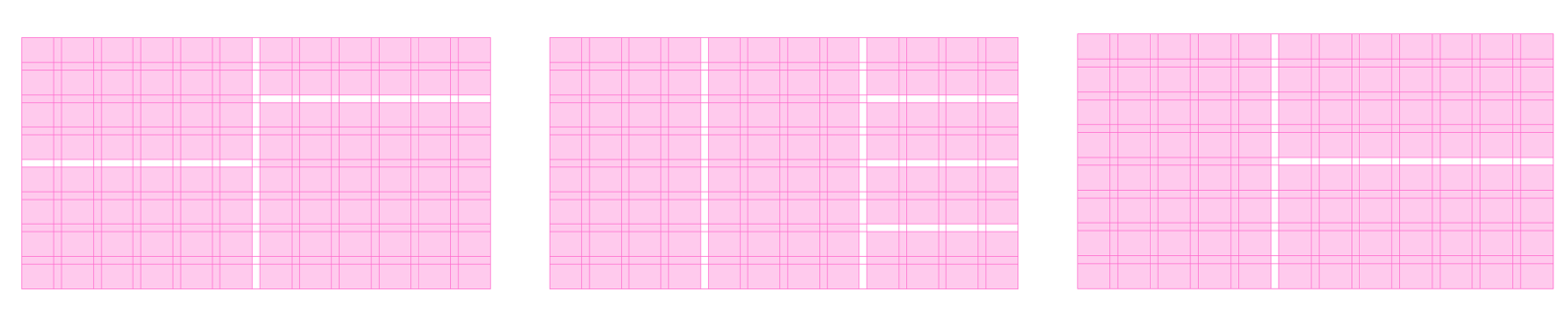
Like a column grid, a modular grid has columns, but it also has rows, providing further divisions of space.
Though these grids might seem limiting, a simple grid actually gives you a lot of variety when positioning your content. You can use the sections as a basis for larger content areas. This is easier to explain with visual examples. Here are a few ways to divide up a modular grid to create well-proportioned and interesting layouts:
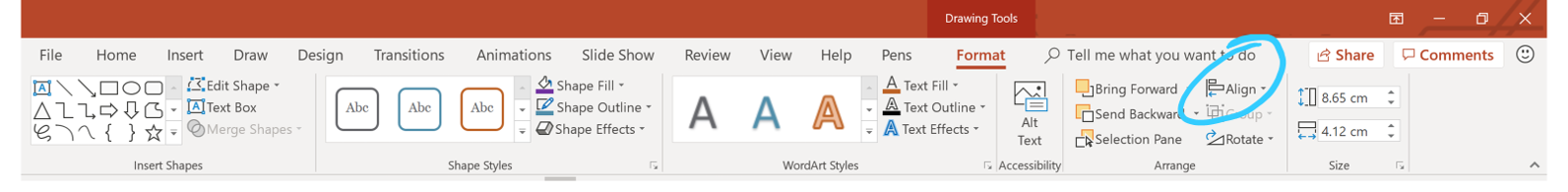
Adding guides in PowerPoint
So, how do you create your own grid? PowerPoint’s default gridlines are dotted. To view the default PowerPoint grid, right click your slide, select Grid and Guides and check Display grid on screen. You’ll see that you can adjust the default grid by changing the spacing.
Though this default grid may help you keep things aligned, I’d recommend creating your own custom guides in PowerPoint to fit your needs. This is because the default PowerPoint grid has fixed margins; drawing your own grid lets you define your margins’ size.
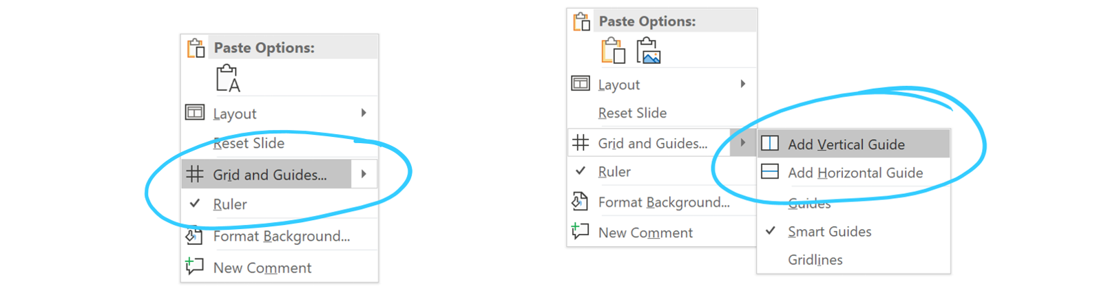
To do this you will need to add multiple guides. To display guides in PowerPoint, right click on a slide, select Grid and Guides and check Display drawing guides on screen. This will bring up one vertical and one horizontal guide.
To add more guides, you can either:
Right click and under the Grid and Guides menu select Add Vertical/Horizontal Guide or
Hold down the Ctrl key and drag the line you want to duplicate
To remove a line, right click on that guide and select Delete.
Setting up a custom PowerPoint grid
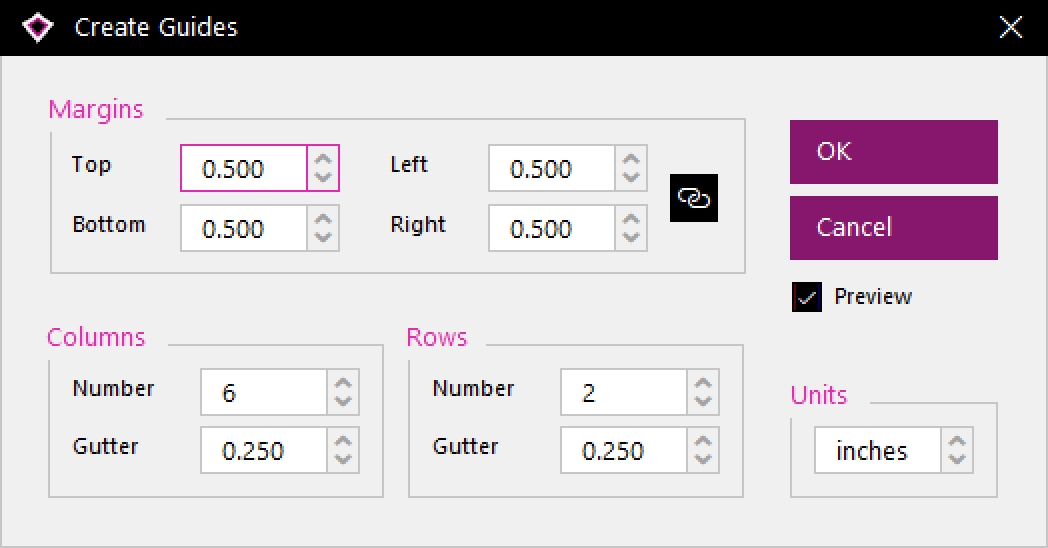
Setting up a custom grid is really easy with our BrightSlide add-in. This has an Adobe Creative Suite style interface that creates guides in PowerPoint automatically:
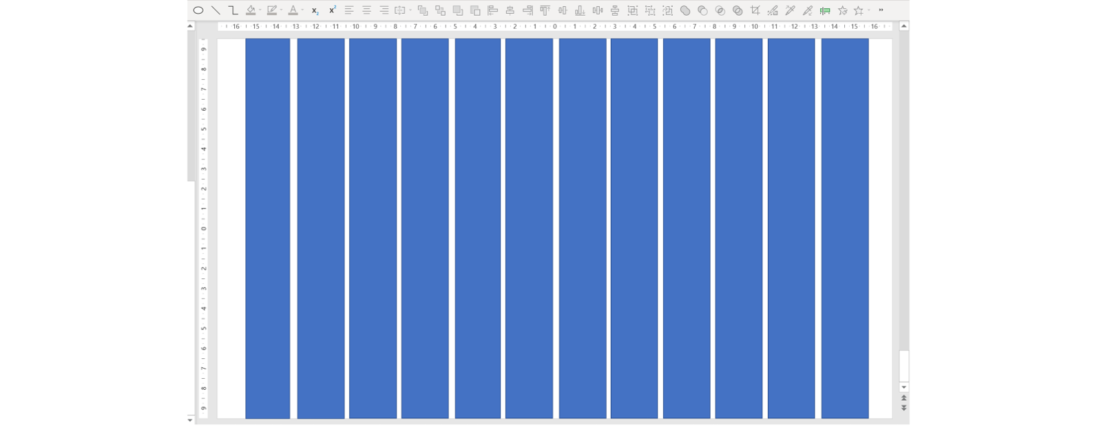
If you don’t have access to BrightSlide for some reason (did we mention it’s free?), you can mimic this result by creating rectangles on your slide using the Shapes tool and, using the alignment and distribution tools, making sure they’re evenly spaced and perfectly aligned.
You need to leave a space in between the columns – this is called the ‘gutter’. Your slide might look something like this:
I’d recommend using the Ruler function to keep things precise – you can find it by right clicking on your slide.
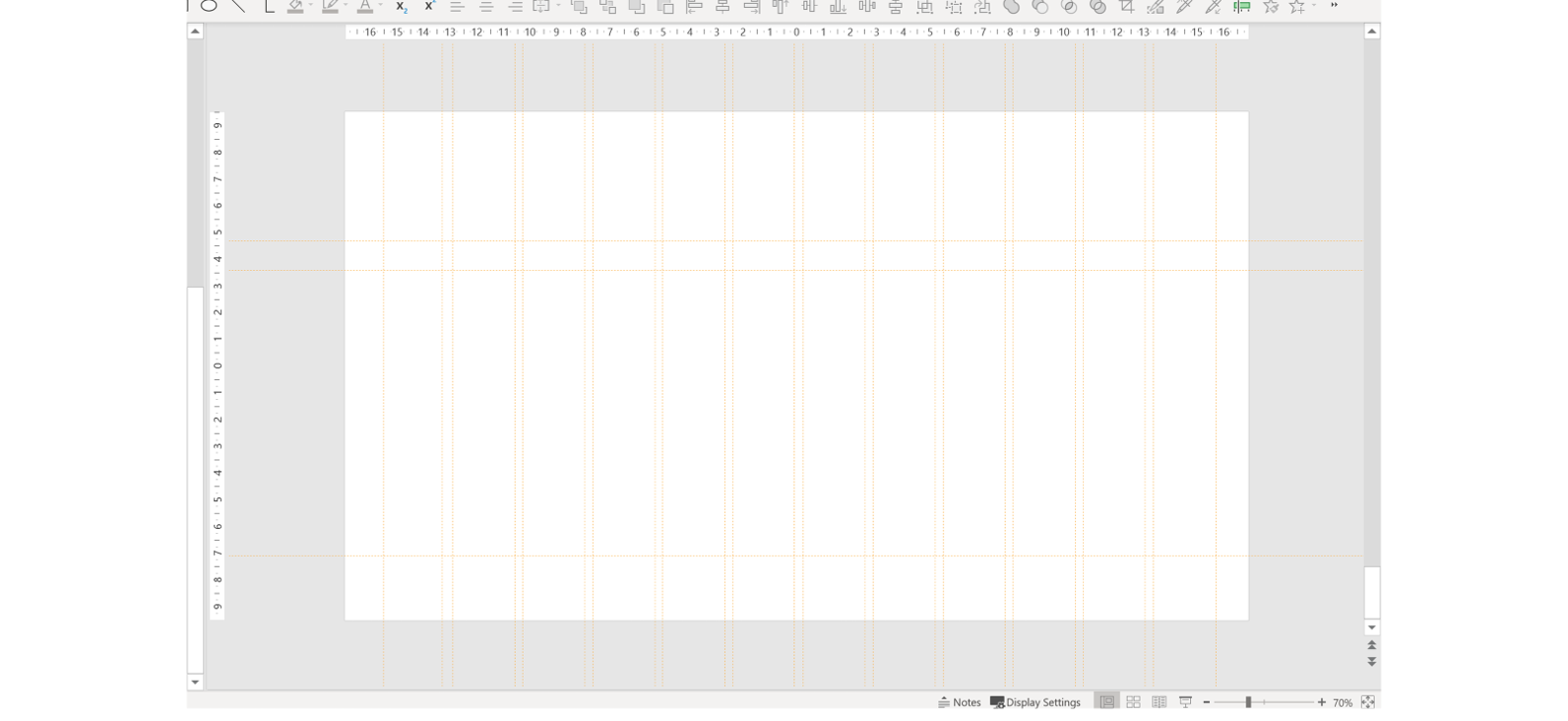
Add your guides by following the steps above, then manually position them along the edges of the rectangles. You might find it useful to change the colour to something that stands out.
Next, delete the shapes. You will be left with your custom grid. In this example, I created a 12-column grid with small margins at the sides and space for a title and footer.
On widescreen slides – as in, slides with a 16:9 ratio – a 12-column grid works best. You can easily divide a 12-column grid into six, four, three and two columns. This gives you lots of design flexibility!
If you’re not confident creating your own PowerPoint grids, heave a huge sigh of relief! We have created a PowerPoint deck with a custom 12 column modular grid all set up and ready to go. All you need to do is download the BrightCarbon Guides Example and follow the steps above to display the grid. Happy designing.
Using your PowerPoint guides
The great thing about setting up your own guides in PowerPoint is that you can ensure consistency across multiple presentations. By creating a grid that clearly defines space for logos, disclaimers, page numbers, main content and whatever else you need, your slides will look well-balanced and consistent.
Here is an example of a range of different layouts created using a 12-column grid; there is variety, but the overall design is consistent.
And finally, does using PowerPoint grids and guides limit creativity?
You might be concerned that using guides will limit how creative you can be with your slide design. Remember, guides indicates where content should be placed to create balanced, neat and consistent layouts: it doesn’t restrict how creative that content is.
Now you are ready to create PowerPoint designs worthy of the great Leonardo himself. Go dazzle your audience with beautifully balanced slides!
A PowerPoint template is the only brand element you put in the hands of the whole organisation – regardless of computer literacy, or design skill: it has to be robust enough so that it can’t be broken, but strong enough to carry your brand voice into every meeting, or leave-behind, or proposal it gets used for. Read on for a list of the essential elements every PowerPoint template needs to have.
Designing content to be accessible doesn't have to mean you compromise on vibrant design, or your brand guidelines. In this article you'll learn more about colour contrast and how you can preserve colour vibrancy without having to sidestep WCAG accessibility guidelines.
It's Christmas! After a late night with too much eggnog and brandy snaps we set ourselves a challenge to see who could come up with the wildest PowerPoint Christmas card! So it's the day after the night before, and through blurry eyes we can reveal our efforts...
For a non professional it’s always great to a have a simple rule – 12 column grid – to apply.
What it’s intrigue it’s the position of the title and subtitle, at what distance from the top should I position the title, and the subtitle? And if I don’t want a subtitle should I reposition the title?
There is no definitive rule as to the distance from the top of the slide your title should be. As a general guide to creating a comfortable margin you could take the height of the title font and use that as a minimum distance to place the title from the top and left hand edges.
We would advise to keep the position of the title consistent throughout, whether the slide has a subtitle or not. Having this in the exact same position on each slide helps both the presenter and the audience to navigate.
Hey John, which feature do you mean specifically? On a mac, it’s exactly the same as Windows, you can access guides by right clicking on a slide and going to the grids and guides options. If you’re referring to our BrightSlide plugin, i’m afraid that’s only available on PC (at the moment). Thanks, Shee
John and Shee Juma, I’m also on a mac and do not see the “grids and guides” options when I right click. The only thing I can think of is that the program is different due to an employer agreement of version/license (it’s my work laptop). When I search “Grid” under the help tool, I read this response: ‘The default horizontal and vertical gridlines make a grid of one-inch squares. You can’t change that grid size. You can change the spacing between the dots that comprise each gridline by using the SPACING option.’ However, it does not say how to access spacing and a help search does not return results.
Thank you so much, now I can work in PPT without wanting to off myself every 5 minutes. This plugin is all I needed in my life. And free even. You are saints 😭
Thanks Tobi! I’m not aware of any tools for mac that could help you with this in particular. Until we’re able to develop a mac version of our BrightSlide plugin i think your best option is to use objects and the alignment/distribution tools to help set up your grid, as outlined in the blog post. Hope that helps! Shee
The point – using a grid is essential to create effective layouts that look neat and professional. The function of a guide – is that they allow objects to snap to them. Using several guides together allows you to create a grid which will help you to align multiple objects for a clean, neat and professional look. Hope that answers your questions! 🙂 Shee
Hi there, this query is about Powerpoint in general, not your wonderful add-in. Is it possible to somehow select ALL guides at once? The default colour is too dark for my liking, so I prefer to change them to a lighter grey. Trouble is, as far as I can tell, they have to be right-clicked on individually and then changed, which is a veritable pain in the pipe, especially if you have many columns!
Hey Adam! You’re right, the only way to add additional guides in PowerPoint 2010 is with the ctrl + drag method. Glad you managed to figure it out. Shee
BrightSlide is available for Mac, but unfortunately limitations in PowerPoint on Mac mean we aren’t able to support setting up custom grids with our add-in. As soon as we can, we will.
Thank you so much for conducting our advanced PowerPoint training workshop. We will definitely use BrightCarbon in the future – we really think that we would be hard pressed to find anywhere better!


Thanks Olivia for sharing your expertise.
For a non professional it’s always great to a have a simple rule – 12 column grid – to apply.
What it’s intrigue it’s the position of the title and subtitle, at what distance from the top should I position the title, and the subtitle? And if I don’t want a subtitle should I reposition the title?
Thanks again,
Miguel
Hey Miguel,
There is no definitive rule as to the distance from the top of the slide your title should be. As a general guide to creating a comfortable margin you could take the height of the title font and use that as a minimum distance to place the title from the top and left hand edges.
We would advise to keep the position of the title consistent throughout, whether the slide has a subtitle or not. Having this in the exact same position on each slide helps both the presenter and the audience to navigate.
Shee (Senior Design Consultant, BrightCarbon)
Awesome! So informative and useful. Thanks so much.
You’re welcome Steph! 🙂
is this feature available in power point for Mac? I can’t find it
Hey John, which feature do you mean specifically? On a mac, it’s exactly the same as Windows, you can access guides by right clicking on a slide and going to the grids and guides options. If you’re referring to our BrightSlide plugin, i’m afraid that’s only available on PC (at the moment).
Thanks,
Shee
John and Shee Juma,
I’m also on a mac and do not see the “grids and guides” options when I right click. The only thing I can think of is that the program is different due to an employer agreement of version/license (it’s my work laptop). When I search “Grid” under the help tool, I read this response: ‘The default horizontal and vertical gridlines make a grid of one-inch squares. You can’t change that grid size. You can change the spacing between the dots that comprise each gridline by using the SPACING option.’ However, it does not say how to access spacing and a help search does not return results.
Thank you so much, now I can work in PPT without wanting to off myself every 5 minutes. This plugin is all I needed in my life. And free even. You are saints 😭
You’re welcome Jim! 🙂
Great resources! What tools would you recommend on a Mac to make the grid and presentation building easier?
Thanks Tobi! I’m not aware of any tools for mac that could help you with this in particular. Until we’re able to develop a mac version of our BrightSlide plugin i think your best option is to use objects and the alignment/distribution tools to help set up your grid, as outlined in the blog post. Hope that helps!
Shee
Can you get to the point?
Can you just say what is the function of guides?
Why do you keep talking about grids under every “guides” title?
The point – using a grid is essential to create effective layouts that look neat and professional.
The function of a guide – is that they allow objects to snap to them.
Using several guides together allows you to create a grid which will help you to align multiple objects for a clean, neat and professional look.
Hope that answers your questions! 🙂
Shee
Hi there, this query is about Powerpoint in general, not your wonderful add-in. Is it possible to somehow select ALL guides at once? The default colour is too dark for my liking, so I prefer to change them to a lighter grey. Trouble is, as far as I can tell, they have to be right-clicked on individually and then changed, which is a veritable pain in the pipe, especially if you have many columns!
Cheers,
Ray
Forget that, found it in your add-in, duh!
Couldn’t find a way of adding custom guides in PowerPoint 2010. Ctrl+click+drag of a pre-existing guide saved the day. Cheers Shee!
Hey Adam! You’re right, the only way to add additional guides in PowerPoint 2010 is with the ctrl + drag method. Glad you managed to figure it out.
Shee
Very useful and exhaustive! Thank you so much.
Hi! Any plans to make it work on Mac OS?
Hi Ilya.
BrightSlide is available for Mac, but unfortunately limitations in PowerPoint on Mac mean we aren’t able to support setting up custom grids with our add-in. As soon as we can, we will.
Feature comparison is here – https://www.brightcarbon.com/brightslide/brightslide-features-on-windows-and-mac/.
How to make a simple design for MAC OS?
This is a brilliant addition to my PowerPoint toolbox. Thank you so much for sharing this.
It’s often helpful for a layperson to have a straightforward rule to follow, like the 12 column grid.
The title and subtitle’s placement—specifically, how far down from the top they should be is what has me intrigued
This awesome, thanks for this! I hope I can apply this.
Great resources!
This is awesome I will add to my PowerPoint toolbox. Thank you!!
Dear brightcarbon.com admin, You always provide useful links and resources.
Very helpful content! I highly recommend getting the BrightCarbon PowerPoint add-in. It’s literally a game changer.