Conference presentations are really hard to get right compared to day-to-day decks. What makes a conference presentation unique is the fact they tend to take place on a big stage in a big hall with a larger, more general audience than presenters usually face. And with higher opportunities, there are also higher stakes. Getting your conference presentation right can have a massive impact on your business, delivering a flop can do serious damage.
The reason that so many people get these kinds of presentations wrong is because they don’t think about the format of conference presentations while planning and creating their slides. And if you go in with the “it’s just like any other presentation” mindset, you’ll end up losing your audience in the general convention hubbub and you’ll have wasted your time, and your audience’s.
Now, thankfully, you’ve come to the right place. This article covers three simple concepts that will help you keep your audience engaged and leave them a memorable message to take home.
Broadly speaking, the aim of any presentation is to persuade your audience to get from point A to point B. That could be as nuanced as persuading them to change the way they think about a certain topic, or it could be as clear cut as encouraging them to purchase your product.
The danger is that it’s common for people to get over enthusiastic and cram lots of information, data, and details into their conference decks. An over-stuffed presentation muddies the waters and can hide your message. To keep your conference presentation focused follow this framework:
Establish the context
Pick a simple message
Take small steps
It’s much easier to create an engaging set of slides built on a well-structured outline than it is to develop engaging slides first and turn that into a compelling story.
Establish the context
As we said, in any presentation you want to get people from A to B – whether that’s persuading them to buy from you, change their behaviour, or change their minds. You need to be persuasive. At a conference you have a specific challenge. The audience is likely larger and broader than you may be used to. There’s a wide spectrum of backgrounds in the room making it more challenging to think about the story from an audience perspective. For example, even in a room full of technical experts, their expertise will be different, and in a room full of company leaders some will have been doing the job for 30 years and some for 6 months.
If you’re going to take the audience on a journey through your presentation, you have to make sure that everyone starts from the same place, and this level setting is what the first section of your presentation is for. Think about what base level knowledge you expect everyone in the room to have, what challenge everybody in the audience is facing, or what opportunity they’re missing, and take some time filling in any gaps. This important context will make sure your audience stays with you throughout your journey.
Pick a simple message
Now you have everyone on the same page, you need to deliver one simple message. It could be that a certain industry needs more regulation, that a piece of technology is going to revolutionize a process, or that your research has unexpected implications for the people in the room. Whatever your message, make sure that it’s relevant to the audience and not self-focused. You have to show them why they should care. Keeping your message simple and relevant makes it much more likely that the audience will remember it, even after the networking drinks later in the evening…
Another consideration is what the purpose of the event is. The individual sessions that make up an event should contribute to that theme, including your presentation. You can use the event and event goals as a springboard for your content. Figure out how your specific expertise fits into the bigger picture – rather than just rolling out your favourite presentation yet again and hoping it will resonate!
Take small steps
Finally, take small steps to get to your conclusion. Often in conference presentations you may find that you’re taking longer to say less. This is okay. If you cram your slides with content, lean too heavily on jargon, or take big leaps in your logic then you’ll likely lose people along the way. Instead, take small logical steps towards your key point and resist the urge to detour! If you want to learn more about writing a persuasive presentation, check out our article on storytelling in presentations.
Design for the space you have
Once you have a good idea of what you’re going to say, it’s time to start thinking about the slides.
When designing for a big event, it’s important to think about the room you’ll be presenting in. The absolute first thing to consider is that you’ll likely be in a large room, with a very large screen. If the background of all of your slides is white (or any other light colour), not only will your audience’s eyes get fatigued by the brightness of the screen, they also won’t be able to see the presenter.
So, our first piece of design advice for conference presentations is:
Use a dark background
Using a dark background not only saves your audience’s eyes, it’s also a great way of differentiating a conference presentation from your usual brand style. Most standard corporate templates have white or light backgrounds so using darker colours like grey, navy blue, dark green etc. can give your slides a more prestigious “conference” look. It also means your audience will be able to see the presenters’ facial expressions and gestures and feel more connected to them.
If your organization presents at conferences often, then it will be worth investing in developing a dark version of your corporate template. However, you can change the background on individual slides really easily in PowerPoint by right clicking on a slide and selecting Format Background.
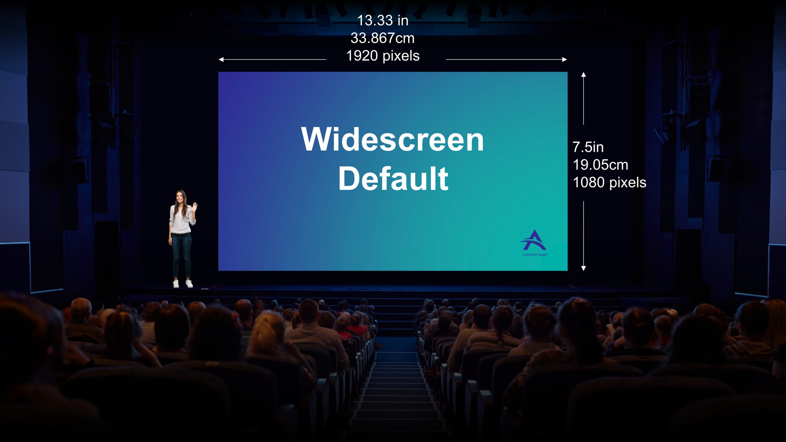
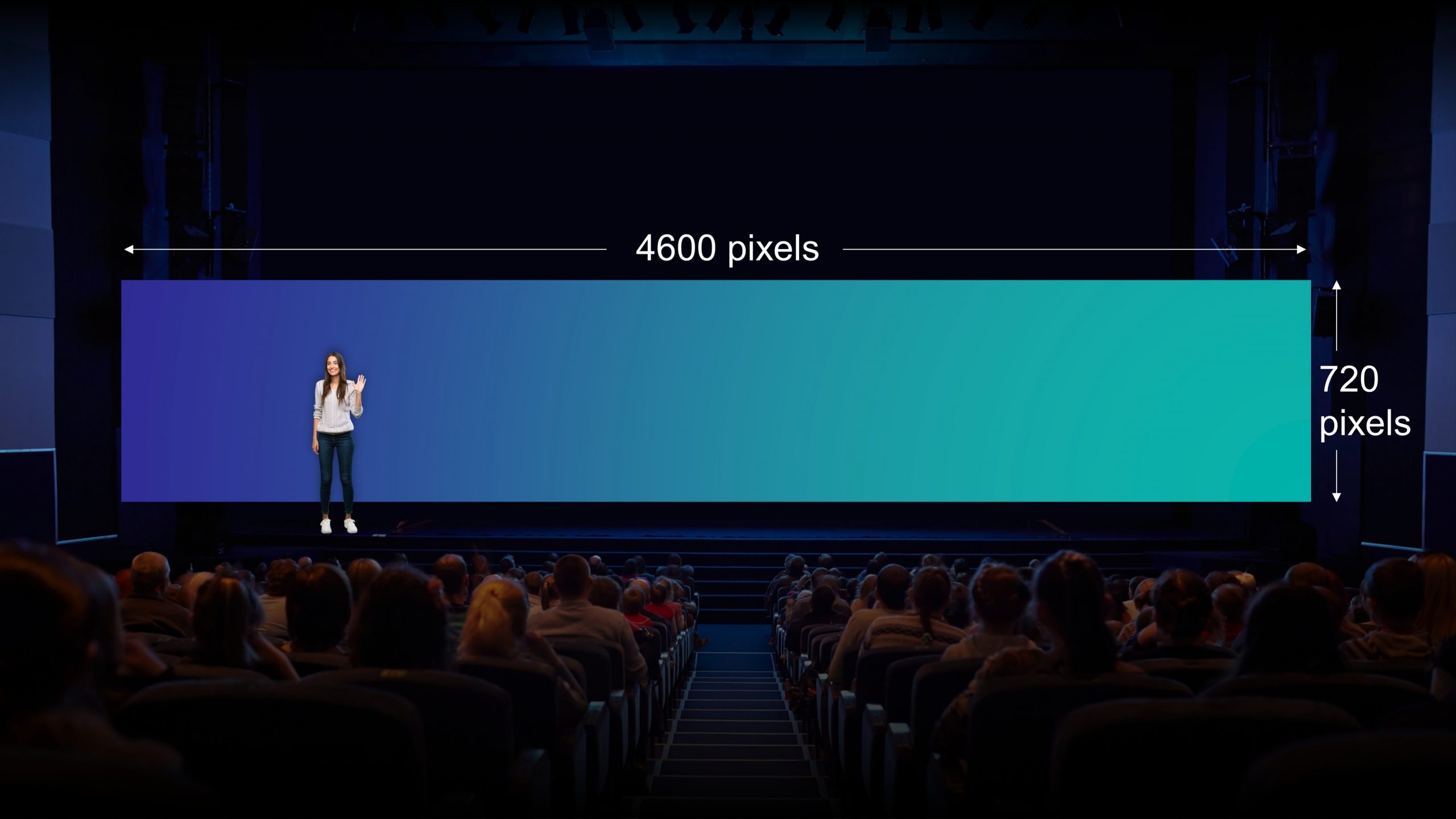
The second really important thing to consider is that most standard templates are in the widescreen default size (1920 px by 1080 px).
However, for conference presentations almost anything goes. The screen might be square, or ultrawide. You don’t want your story to be told in a tiny portion of the screen but to fill the space. So, before you start designing slides, change the aspect ratio of the slides in PowerPoint to match the dimensions of the screen. (We say to do this first as PowerPoint does weird things removing formatting if you change the slide dimensions with content already on the slides.)
To change aspect ratio in PowerPoint go to Design, Slide Size, Custom and then enter the correct details. To get these speak to the AV team and ask for the size of the screen in pixels and enter those details in PowerPoint with the units px. Taking the effort to do this will mean your slides look awesome in the space. Learn more about changing slide size in PowerPoint and in Google Slides.
Think about human obstacles!
There’s one other consideration you need to be aware of before you start putting content on slides and that’s obstacles, usually of the human variety! Remember, there are areas of the slide space that may be completely blocked because the presenter is standing in front of the slides, or the heads of the front rows of the audience pop up, or there’s some furniture onstage.
You need to block out those spaces to prevent putting important information where no one will see it. Here we’ve done it with a semi-transparent shape added to the slide master (this means it will sit behind your content).
We’re not saying nothing can ever go here as that would look a bit odd but you don’t want any key visuals or text there. When your design is complete you can remove the shapes from the master and they will automatically be removed from all your slides. This is also a useful technique if you know that there will be captions running across the bottom of your slides at the event.
Consider layout, flow, and transitions
So now you’ve got an overall story and you know what the opportunities and limitations of the space are. Next, let’s have a look at some ways to capture the audience’s attention in a conference setting. One of the first questions we hear is:
What font size should I use?
This is a really tough question to answer. It depends on the scale of the screen. Firstly, text point size becomes less meaningful when the screen is huge. So rather than thinking in point sizes, think about the ratio of the height of the text compared with the height of the screen – this will give you a better idea of legibility. We’ve done a bit of an investigation into the optimum font sizes for different use cases before and you can find that here: Presentation font size: dos and don’ts
Better still, only use text where it is absolutely necessary. Having lots of text on slides is not best practice during a normal presentation, because it’s distracting for the audience to try and read while listening to you speak. And, for a conference presentation, it’s an even bigger problem because you’re presenting in a massive room; people are easily distracted and though the text will be hard to read they will try anyway. Save yourself the trouble! Instead…
Think minimalist design: The key thing to consider here is not to place too much content onto the slides. If you’ve got lots of information on a screen it’s going to be really difficult for the audience to understand which bit the presenter is talking about. This is especially true if the screen is super-sized and the graphics the presenter is talking about are nowhere near them so they can’t physically point out what they want to highlight. Less is more.
Consider detail level: While you want to keep the content simple, you don’t want simple graphics. The standard ‘toilet door’ icons you see everywhere might be great when they’re small thumbnails, but look terrible when projected six feet tall. Use more detailed icons, high resolution images, (Pexels and Unsplash are two of our free favourites – even more suggestions here), or even the illustrations available in PowerPoint (Insert > Icons > Illustrations), as they pack a punch on the big screen and help keep things appropriately scaled.
Use negative space: Leaving empty space between elements on your slides helps create balance, making your slides look professional and cohesive. We’ve got more information on how to do this in this design guide: Working with whitespace.
Stick to a limited colour palette: There are often multiple brand colours options for you to use when developing assets on your slides, restricting them to just one or two and using different shades is a good way of making content feel modern and sleek. In some ways a minimalist design approach actually makes design easier, as there are fewer elements to think about.
Animations and transition
Now let’s talk about presentability. What is the magic touch that makes a conference presentation both easy to present and engaging for an audience? The answer lies with purposeful, polished animation and transitions.
Presentations that lack fluidity and cohesiveness can detract from the message you’re trying to get across. If you’re delivering a presentation at a big event you’ll likely have a lovely responsive clicker you can use to move seamlessly through your content. So, rather than having your whole slide pop up at once, you can stagger the flow of information to suit your delivery, keeping the audience with you every step of the way. We’ve got lots of tutorials on how to use animation well in presentations on our blog, so dive into those for inspiration and instructions. Our top timesaving tip is to make use of the free animation library in our PowerPoint productivity tool BrightSlide to animate your slides super quickly.
Animation helps you control the pace and flow of your presentation, but it’s slick slide transitions that can really make an impact. Smooth PowerPoint transitions can make a deck more aesthetically appealing and remove interruptions in the flow of information, which could otherwise give an audience an opportunity to tune out.
There are lots of ways to create lovely slide transitions but an easy one is using the Morph transition to automatically animate objects slide to slide. This can help you create sets of slides that don’t feel like your typical PowerPoint.
So now you know what ingredients go into a high impact conference presentation – if you’ve got an event presentation coming up and you need some expert guidance, get in touch!
The biggest source of event stress comes from this interesting conundrum: the success of the thing you poured your life and soul into for the last few months does not depend on you. It all comes down to your presenters conveying your messages in the right way, with the right amount of energy, and the audience – that you have absolutely no control over – engaging with those messages. Good news. There is a solution: and it’s just one solution to address both challenges. It's all about the science of audience engagement and presenter anxiety, and how the content you present can help both.
A PowerPoint template is the only brand element you put in the hands of the whole organisation – regardless of computer literacy, or design skill: it has to be robust enough so that it can’t be broken, but strong enough to carry your brand voice into every meeting, or leave-behind, or proposal it gets used for. Read on for a list of the essential elements every PowerPoint template needs to have.
Online presenting can be challenging. With more work and home distractions than ever, all competing for attention, no real-time audience feedback, it basically feels like you're just speaking into the void. But fear not. We’ve pulled together our 5 top tips for keeping your virtual audience engaged, present, and tuned in, so buckle up and turn your presentation nightmare into your presentation dream.
The video animation looks AWESOME! Thank you sooooo much. I am very happy and proud with the result; this video is really convincing. Really really well done.