Presentations that lack fluidity and cohesiveness can detract from the message you are trying to convey to your audience. Not only do smooth PowerPoint transitions make the deck more aesthetically appealing, but they also remove interruptions in the flow of information, which can give an audience an opportunity to tune out.
However, in a business context, there is right way and a wrong way to use PowerPoint transitions. Below I will discuss some transition techniques, from the fairly basic to the more advanced. Test some of these out on your next presentation and seduce your audience into a sweet spot of relaxation and attentiveness.
PowerPoint transitions: The simple fix
The transitions tab on the PowerPoint ribbon can be easily missed as it doesn’t contain any functions necessary to the construction of slides. However there are many different options within the transitions tab that can improve your presentations, and a few that can ruin it!
Applying some of the more basic PowerPoint transitions is a simple and fast way to make your presentation flow a bit better. Look at the examples below to see the difference a Fade transition can make. Without a transition, moving between slides feels like an unplanned glitch. Although it is a small touch, the transition makes things feel professional. You can even check “apply to all” to quickly add this effect to all the slides in your deck.
Speaking of professionalism, I’d be careful when using the other preset PowerPoint transitions effects. Even some that appear to be more basic, such as Wipe, can look funny when applied to branded templates. Not to say that you shouldn’t use them, but pay attention to how it affects any objects you may have on the top and bottom of your template. Some of the fancier ones may look cool on a slide or two if they have a specific relevance, but your audience is going to get sick of seeing the screen “shatter” or break into “random bars” if you use these effects throughout the presentation.
Remember, you want to look smooth and polished, not like a child whose just been given computer privileges in elementary school.
Advanced PowerPoint transitions
My personal favorite way to tie two slides together is to keep one (or more!) objects on screen from one slide to another. I like this because it forces you to use the same symbols to talk about the same topic, which facilitates understanding for your audience members. Also, it looks fancy! Below is a short presentation I’ve created to demonstrate some of these different techniques for you.
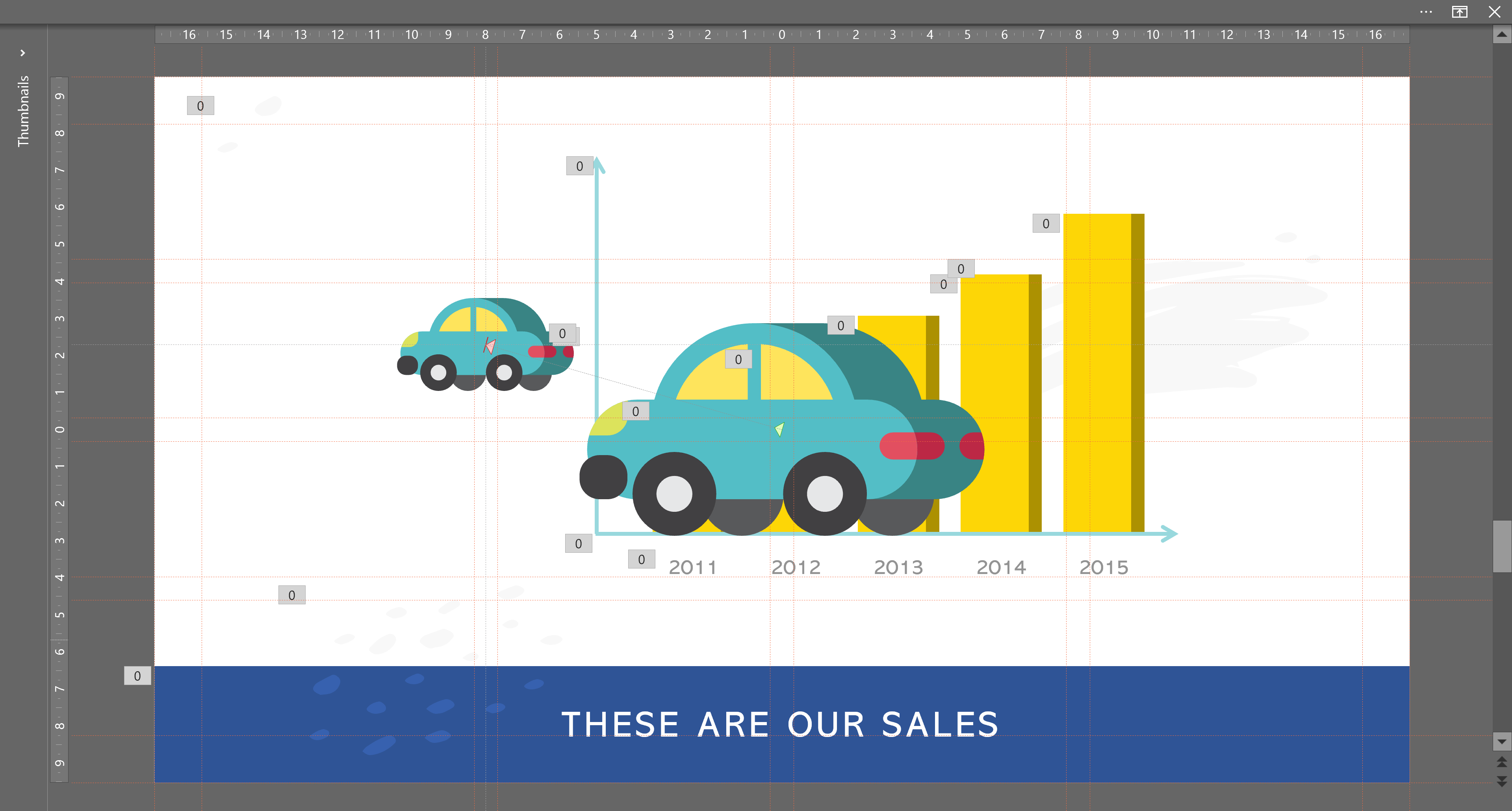
Slides 1-2
For this transition I kept the toy car from the first slide to the second slide, but I shrunk it and moved it over to the left so I could add information to the story.
Start out by copying the object from the first slide to the second slide. It should paste in the exact same spot from which you copied it. If this is giving you trouble for some reason, you can also duplicate the slide (by pressing CTRL + D while the desired slide is selected) and deleting out all unwanted objects.
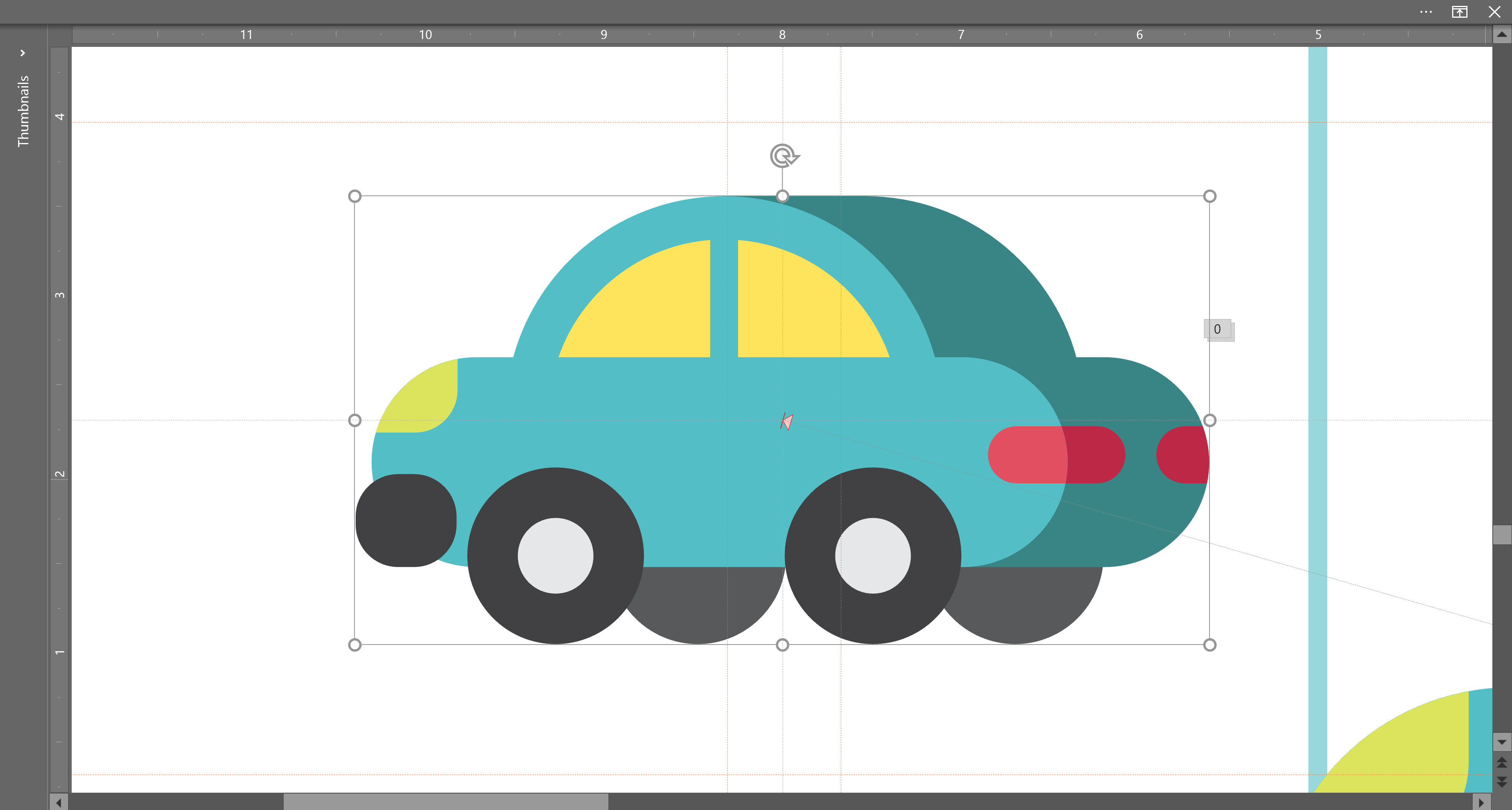
Now its just a case of manipulating the object to the right size and location. To shrink the car and move it over to the left, I used a simultaneous combination of a motion path and grow/shrink animation. In order to do this, copy the object again and adjust the new copy to the desired size and location.
Now is when those tiny little gray lines, also known as drawing guides, come in handy. When you select the newly copied image (the one which is the size and position you’re aiming for) four white boxes will appear around the edges. Line up the drawing guides so they are centered within these boxes. This will give you an exact center point of your object. Knowing this will make your life much easier in the next step, because motion paths start and end points are concerned with an object’s center.
Add a motion path animation that suits your needs (right, left, up, down, etc.). Now adjust the end point so that it is perfectly lined up with the center point that you’ve created with your drawing guides.
In order to add the shrink effect you’ll have to do a bit of math. Open up the format tab and compare the sizes of the two objects and calculate the percentage of size increase or decrease between them.
Now add a grow/shrink animation on the object you are manipulating, and right click effect options in the animation pane. Adjust the size change to match the proportions.
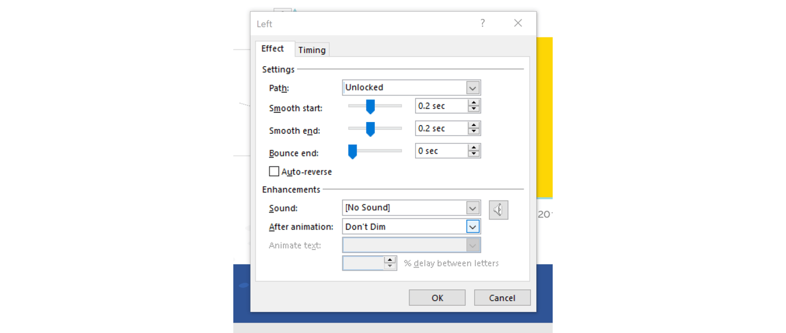
Finally it’s just a bit of fine tuning. Ensure that both the motion path and the grow/shrink are occurring simultaneously by right-clicking on the grow/shrink and selecting “with previous. With both the motion path and the grow/shrink selected, right-click and select “effect options”. Adjust the smooth start and smooth end so that it is the matches for both animations. How much of a smooth start and a smooth end you apply is up to you, but make sure it is the same for both otherwise the effect will look jerky.
For the transition between second and third slide, I used another motion path to shift the toy where I wanted it to be.
Slides 3-4
This transition is a bit different than the previous. Instead of manipulating an image I am manipulating what looks like the background. In reality it is a rectangle fit to the size of the slide. The rectangle hasn’t done anything up until this point in the presentation, but now I’m going to build in some graphics to create a lovely family scene.
Note: If you aren’t familiar with the “arrange” functions, this is where you go in order to play around with the layers in your slide. Draw your background rectangle and then go to arrange>send to back.
Start out with a slide that is completely blank other than your background rectangle. Then use a combination of animation effects (on my slide I used motion paths, fly in, and fade) to bring in your graphics.
These techniques help to make a simple PowerPoint presentation look more professional and polished. If you need help with these or any other PowerPoint questions, send us an email, or check through some of our other blog posts!
The National University of Singapore have developed an add-on software called PowerPointLabs. If you are an ambitious PowerPoint user who doesn’t have time to fiddle around with learning all the tricks that experts such as the BrightCarbon staff have figured out, then you may find PowerPointLabs to be very helpful.
Glisser is an online platform that allows you to create interactive presentations that can be used for marketing, training or any other type of events. The site has different functions available for presenters, attendees at events and event planners which all focus on allowing for increased presenter-audience interaction. Since creating engaging visual presentations is what we do, I decided to take a closer look at Glisser and see what it’s all about and how the various functionalities work.
Jamie Garroch puts the ‘power’ in PowerPoint add-ins. He’s written code for dozens of amazing functionality boosters, some for specific organizations and some available for all users, and he's joining the BrightCarbon team! Read on to learn about the experience that Jamie is bringing to BrightCarbon and how it will help clients and the presentation community use PowerPoint more effectively.


Great explanation and examples. Thanks!
Awesome help! Thanks!