Space: Vast – Unknowable – Useful? At BrightCarbon we’re big fans of taking a ‘less is more’ approach when it comes to text in presentations, instead letting your visuals do the heavy lifting. But once you’ve cut down your text and created those visuals, how do you make sure they look good on the slide? Not everyone’s a graphic designer (and it’s ok to admit that!) but everyone can borrow graphic design best practices to make slides really pop. This blog post explores how you can manipulate whitespace in presentations to create beautifully balanced slides.
‘But BrightCarbon!’ I hear you cry, ‘I can’t leave blank space on my slides, it looks weird!’. Don’t worry, there’s a trick to this. Careful use of whitespace in presentation slides can help draw your audience’s attention to important information and give your slides a more cohesive flow. Stick with us, and we’ll teach you how to make whitespace work for you.
Using whitespace for better layouts
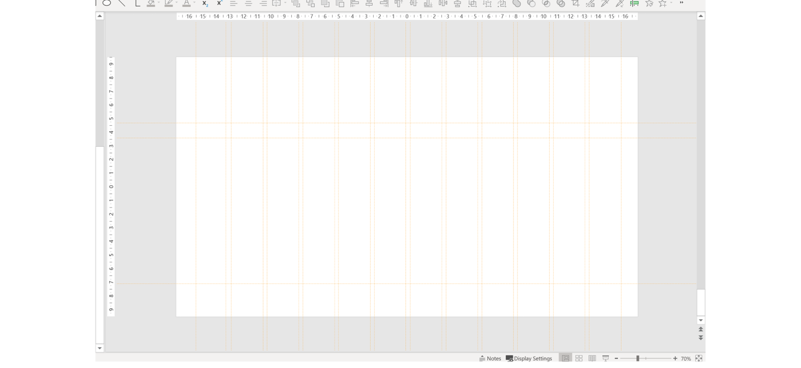
One easy way to create better presentation layouts using whitespace is by adding page margins and gutters to your slides. This makes sure that there’s plenty of breathing room around the elements on your slide.
You can read more about how to do this in PowerPoint, and the importance of grids and guides, in this blog post: Advanced PowerPoint grids and guides.
A grid is a good starting point but isn’t always helpful when you’re figuring out the space between objects on your slide. What can help is having a consistent measuring system that allows you to keep the empty spaces between elements the same size.
There’s an easy technique to this that helps with consistency and balance. Simply create two squares, one bigger and one smaller. Then use the squares as a guide for the space to leave in between elements. Make the bigger square the size of the space around the page/your margins and use the smaller one to determine spacing between the rest of the elements on the slide.
Get all your visuals and text on the slide first, then add your reference squares and copy and paste as needed. Place the squares underneath a text box or image or on a margin and adjust the content as required. By using these ad-hoc guides, you can keep all your content evenly spaced. Once you’re finished, delete out those reference squares and you’re left with a perfectly proportioned slide!
Using whitespace for better storytelling
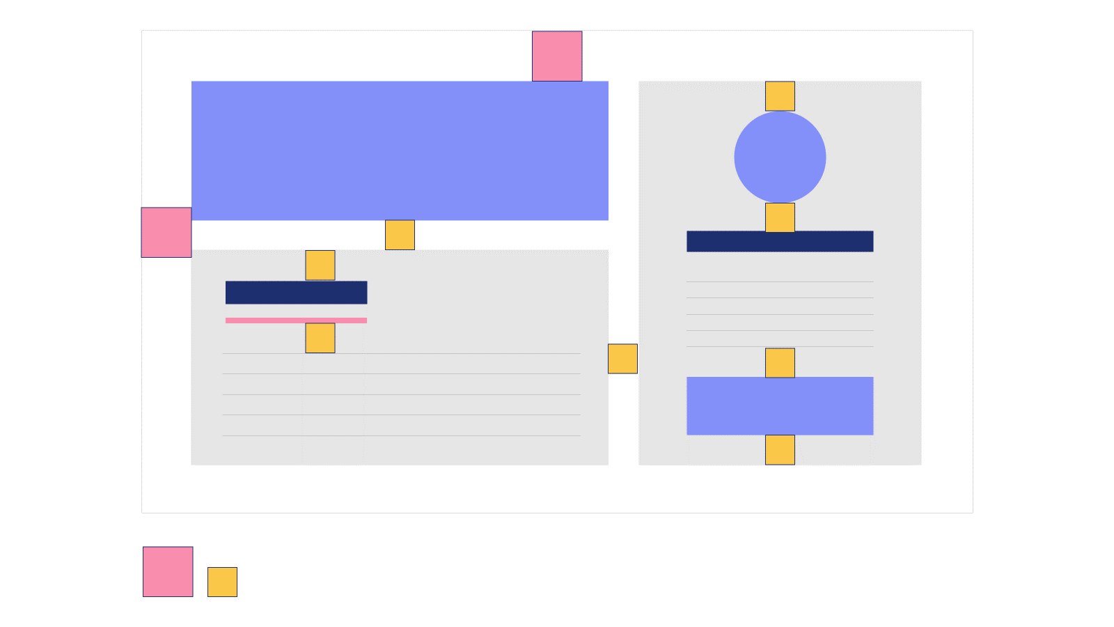
Although it can be an excellent tool when used correctly, poor use of whitespace in presentations can actually make it harder for an audience to understand a slide. You’ve probably experienced this yourself, even if you didn’t notice what was wrong specifically. If you’re looking at a slide where the content is all over the place, or even just a little off, it doesn’t only look odd but also disrupts the hierarchy and flow of the content. On the other hand, using whitespace well and laying out content in a neat and consistent way can (say it with me now!) help your slides do the work for you! One simple example is grouping. Subtle changes in how objects are placed on a slide give your audience an immediate clue as to how they are related. Look at the slide below:
The six squares on the left are grouped together with equal amounts of space between each square. This gives the impression that each object is equally related to the others, and of equal importance. On the right-hand side, the gaps between the squares form distinct columns which implies that there are 3 categories of object. Thanks to the use of whitespace, the audience immediately has more understanding of the slide content. Visual cues like this can help underline your point, without you having to spell it out over and over again. For more information on visual hierarchy, take a look at this blog post – 5 visual hierarchy tips for effective presentation design.
Using whitespace to draw attention
Let’s think about space (the outer- kind) – space may be an unfathomably vast vacuum with incomprehensible distances of emptiness (I’m not trying to give you an existential crisis, I promise), but what draws your attention when you look at it? It’s not what isn’t there, it’s what is. You’re drawn to the stars, the planets, the tiny pinpricks of light within that dark canvas. The constellations are miniscule compared to the backdrop, but they still grab your attention. You can use this effect on your slides – using emptiness to draw attention to what’s important.
One technique is placing a single statement over a full-bleed image, like in the slide below:
The image takes up the entire slide, so your attention is very quickly drawn to two things – the title, and, in this case, the hot-air balloon. Slides like this make effective title cards or section dividers and, if you carefully select your photography, they can help to tell your story.
Best of all, these types of slides are easy to pull off. You don’t need a degree in design to make a picture fill a slide! However, to make sure these types of slides are accessible you need to have good contrast between the text and the image. Read more here: 5 tips for more accessible presentations. Hopefully these examples show that you don’t need to be afraid of whitespace in presentation design and that whitespace doesn’t actually have to be white, but instead just part of the background that doesn’t pull focus away from your main content.
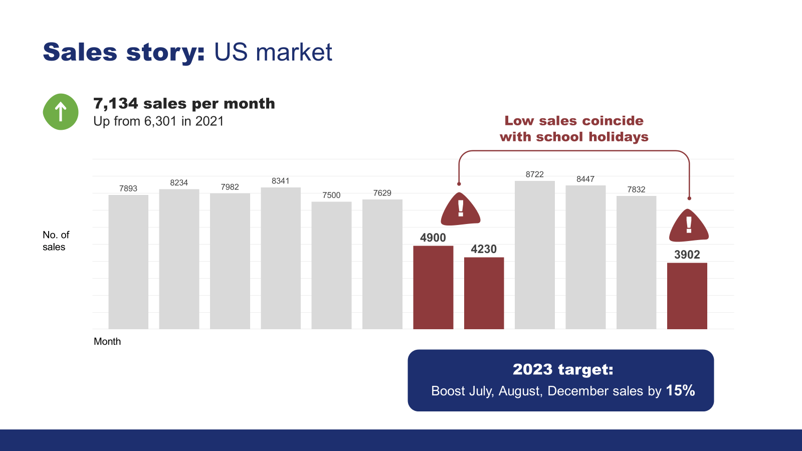
A key thing to remember, is that there’s no good reason to overfill your slides with content. Instead, split it out across several slides. This will help you pace your presentation and make it easier for the audience to follow along with you. If you want to draw attention to a particular object, make sure not to crowd it. Use whitespace to show the audience what you want them to look at! Give it room to breathe and make it the centrepiece. This can be a useful tool when presenting data. In this example the graph is squashed in and the data isn’t easy to read.
But in the slide below, that graph is given lots of lovely space to itself, making it the main focus and allowing the audience to actually interpret it – the rest of the text can be moved to a different slide or, even better, to the speaker notes.
Paying attention to whitespace doesn’t only apply when you’re thinking about graphic elements, it’s something you should consider when playing with text and typography too. If you’re developing something more text heavy than a presentation, such as an article, a handout, or training – then intentional use of whitespace can make text easier to digest.
People tend to just skim a block of text that has no internal spacing – so if you lay it out like this, no one’s going to read it properly, and all your hard work will have gone to waste.
But with a bit of careful spacing, the text can seem far less daunting.
There are a few ways to add whitespace to text in PowerPoint, but not all are equally useful. One thing you should try to avoid doing is using your Enter key to create more space in between bullet points because it’s time consuming and actually makes your text more difficult to edit. So, what are your other options?
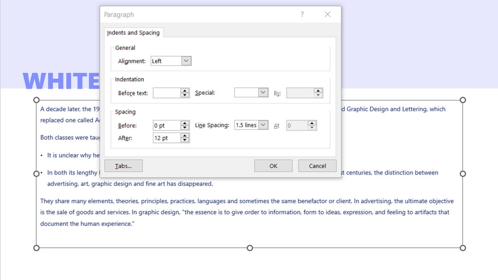
Your first option is PowerPoint’s paragraph spacing settings. To open the settings, select the small arrow in the Paragraph section of the PowerPoint ribbon. By increasing the spacing before or after your paragraph, you can create more space between your bullet points.
As well as space between paragraphs, you also need to make sure there’s enough whitespace between the lines. Though you can adjust line spacing using the pop up above, your options are limited in PowerPoint. This is where our free BrightSlide plug-in comes in handy. With the live paragraph spacing feature, you can format your paragraph and line spacing in one place, see changes live instead of having to wait until the formatting window is closed, and have more granular control over spacing.
With all this in mind, be intentional about how you place objects on your slide and aware of how it can influence your audience. Use whitespace in your presentations to draw attention to key points, use the space between objects and text to highlight your content, and use the layout to maximise the impact of your slides! So, get out there and start leveraging that space!
If you’ve used BrightCarbon’s guides before, we have no doubt that you can make your content look incredible. But something you might not have dabbled in yet is changing up the slide background in PowerPoint. The right presentation backdrop can do a lot, from keeping everything on brand to adding…
A PowerPoint template is the only brand element you put in the hands of the whole organisation – regardless of computer literacy, or design skill: it has to be robust enough so that it can’t be broken, but strong enough to carry your brand voice into every meeting, or leave-behind, or proposal it gets used for. Read on for a list of the essential elements every PowerPoint template needs to have.
Online presenting can be challenging. With more work and home distractions than ever, all competing for attention, no real-time audience feedback, it basically feels like you're just speaking into the void. But fear not. We’ve pulled together our 5 top tips for keeping your virtual audience engaged, present, and tuned in, so buckle up and turn your presentation nightmare into your presentation dream.
First of all the deck looks great, once again you guys have done an outstanding job. Second, I’d like to comment on the quality of the training provided by your colleagues - quite simply it was exceptional. I have spoken to the whole team and that view is unanimous. Please pass this on.