More accessible presentation slides can be the difference between your audience fully engaging with your content and your audience tuning out and missing out. And, if your audience miss out you miss out! Luckily, there are some easy steps you can take to increase the accessibility of your slides.
There’s a lot we could cover under the umbrella of more accessible presentations – how you present, the language you use, distracting/flashing animations, presenting online, how you share slides and more. In this guide, we’re focusing on visual design considerations.
Creating more accessible slides doesn’t only remove barriers for users with obvious disabilities, it also unlocks your content for those with invisible or poorly understood impairments. Your audience may have different needs at different times and, with the rise of remote working, you don’t have control over their environment. Your audience view your presentation on different devices and in different lighting conditions. So, ensuring your slides are more accessible will improve the effectiveness of your presentation for everyone.
Use legible fonts
Using a clear, familiar font will help your audience understand your slides effortlessly, especially those with visual impairments or cognitive impairments such as dyslexia which affects 9-12% of the population.
Avoid using overly stylised, condensed or cursive fonts, and instead pick a commonly used, sans serif font with distinct letters such as Arial, Calibri, Verdana, Tahoma, and Century Gothic.
Different font weights affect the contrast of your text and poor contrast means poor legibility. Light and thin font weights can be more difficult to see, so using regular, medium or semi-bold font weights can improve contrast and readability, especially at smaller font sizes.
Unhelpfully, there are no hard and fast rules about font sizes.
The best font size depends on your content and the environment you’ll be presenting in. BrightCarbon has done some experimenting and, for sales and training presentations using PowerPoint’s default widescreen slide size (19.05cm x 33.86cm, or 7.5”13.33”) and Arial – one of the most commonly used fonts, our team recommends the following font sizes:
Text type:
Aim for:
Titles
28pt or larger
Headers
20pt or larger
Copy
16pt or larger
Callout labels
18pt or larger
Take this guide with a pinch of salt. It’s always a good idea to test your slides on the screen you’ll be presenting on to make sure your font is legible, even from the back of the room!
Whichever font you chose, it’s also best practice to avoid using all caps or italics for blocks of text, and instead use bold to highlight information.
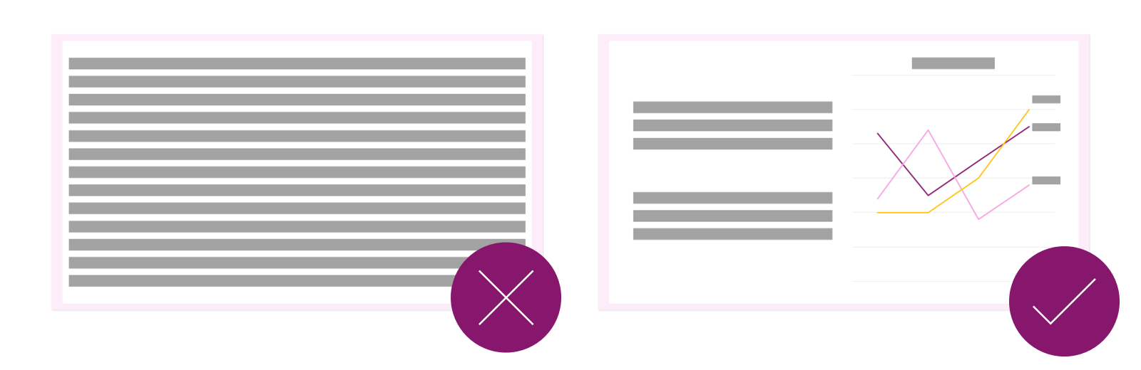
Avoid big blocks of text
Cutting down text is for everyone’s benefit, especially yours!
Large blocks of text may be indecipherable for dyslexic audience members and audience members with certain visual impairments may take longer to read the text than you anticipate. Your audience is likely to end up feeling excluded and frustrated if you move on too quickly. What’s more, they’ll be working so hard straining their eyes to read what’s on the screen that they’ll ignore you entirely. Instead, minimise the amount of text you use and opt for more compelling and visually engaging ways to tell your story to make sure you have your audience’s attention from start to finish.
When your slides do include text, make sure they have clear visual hierarchy with larger and/or bolder headings and subheadings.
It’s also important to have plenty of white space around text as it makes it easier to read. To create this whitespace, break up blocks of text into small chunks and use shorter line lengths rather than running sentences across the whole slide. You can also create space between lines of text – we recommend setting line spacing between 1 and 1.5. Don’t be shy – Split your text up over multiple slides if you have to!
Our final text formatting tip is to left align your text to prevent unnecessary eye jumps. Only use centre alignment for very short snippets of text, such as labels, and completely avoid justifying text.
Explore PowerPoint’s Accessibility tab
PowerPoint has some native accessibility tools that you can use to make your slides more accessible. These are particularly helpful if you plan on sharing the file itself.
To open the Accessibility tab, select Review then select the drop-down menu under CheckAccessibility. Here’s a whistle stop tour of your options:
Check Accessibility: Inspects your presentation and lists accessibility issues (PowerPoint checks a range of things including reading order, alt text, slide titles). When issues are identified you’ll see a warning and a recommended action to help you fix it.
Alt Text: Helps users access visual content if they’re visually impaired or have certain cognitive disabilities. If alt text is present when someone is navigating a presentation using a screen reader, the screen reader will narrate the description to users. If you don’t include any alt text all users will hear is the word “image”. This can lead to them missing a big part of your presentation and creates a very frustrating experience.
You can access and edit alt text in PowerPoint in three ways:
1) Click Alt Text on the Accessibility tab, then click on the object you want to create alt text for.
2) Right click on an object then select Edit Alt Text.
3) Click Reading Order Pane on the Accessibility tab and select an object. Click on that object again to open a text edit box and add your alt text.
When writing alt text keep it simple. Include 1-2 sentences that describe the object and its context in a specific and succinct manner. You should write alt text for any visual objects that contribute to your story, such as pictures, graphics, videos, and charts/graphs. Decorative elements are objects that aren’t informative and/or are background elements. Instead of writing a description for these, mark them using the Mark as Decorative check box. For full guidelines on writing appropriate alt text check out this article here.
Reading Order Pane: Lays out the order that screen-readers narrate content in PowerPoint. To make sure a screen-reader user understands your slides, you need to create a logical flow through your content. Click and drag to rearrange objects in the reading order pane. Unchecked items are unnumbered and considered decorative.
Tip: If you group separate parts of one illustration or diagram together the screen-reader will read them as one object.
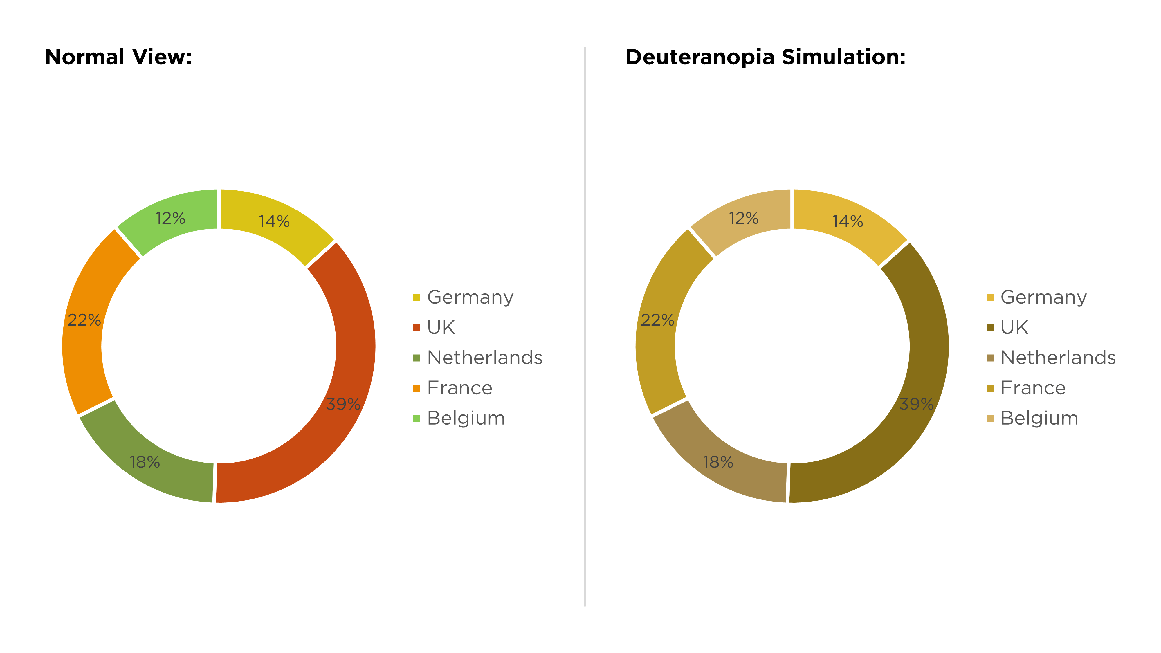
Don’t rely on colour alone to tell a story
Colour vision deficiency (CVD) affects around 1 in 12 men and 1 in 200 women. So, if you rely on colour alone to tell a story, your slides could leave a significant proportion of your audience behind.
This problem is common in data visualisation as colours are often used to highlight comparative data points. For example, green and red are frequently used to show positive and negative results. Though this is common colour coding, red and green is one of the most troublesome colour combinations for people with CVD.
A simple fix is adding ticks and crosses where you’ve used green/red colour coding.
However, a common misunderstanding is that people with red/green CVD only confuse red and green. In fact, they can confuse any colours with red or green in them (e.g., blue and purple may look similar). There are also multiple types of CVD involving different colour combinations so it’s not just red/green objects that you need to keep an eye on.
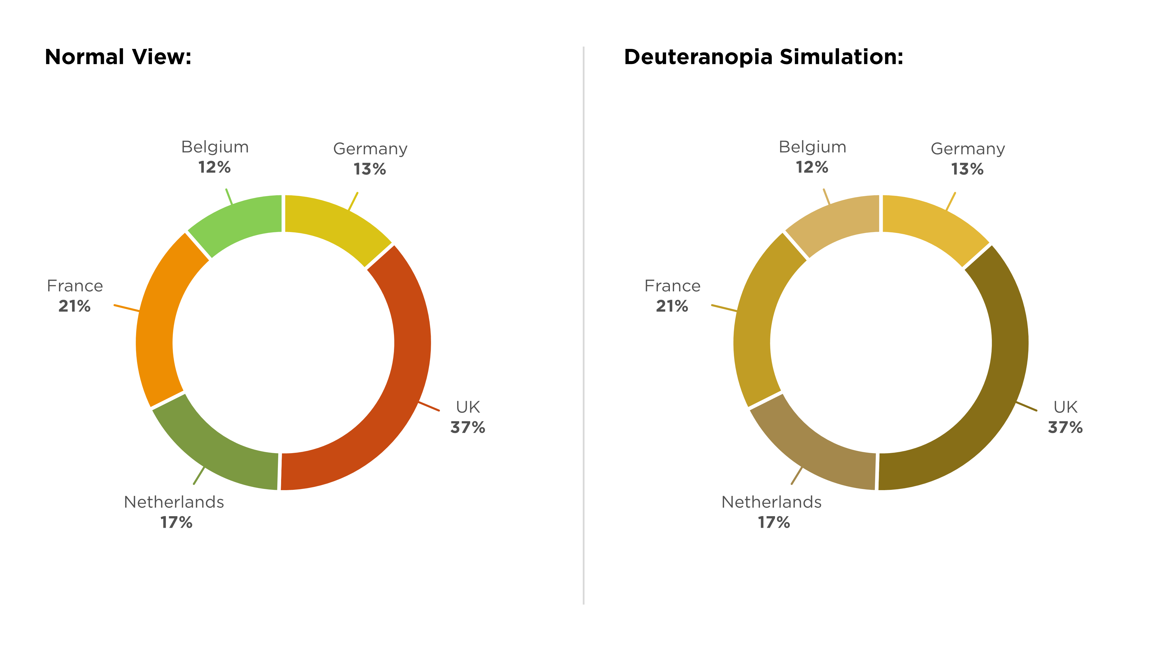
The chart below relies on the audience being able to differentiate the colours in the legend to understand the information. We’ve applied a simulation of one type of CVD, Deuteranopia, to the chart on the right and you can see how difficult it is to understand the information.
However, if you add clear data labels to each segment of the chart, your audience will still be able to understand the information, regardless of their access to colour.
That’s why using patterns, icons, shapes, text, and positioning and hierarchy alongside colour helps you create slides with a clearer message.
This is a great habit to get into as, if your presenting space has bad lighting or a dodgy projector, you might find the colours on your slides don’t look quite how they did on your laptop. In that situation, it won’t just be those with CVD struggling to understand your slides.
Check colour contrast
Colour contrast is an important aspect of accessible presentations. Poor contrast means poor legibility and poor legibility means your audience will struggle to access your slides.
A contrast mistake we see all the time is text on top of images. The image is distracting, and the contrast is often poor, making the text hard to read. There are solutions to this, and you don’t have to lose your image! First, add a dark overlay to the image, then change the text colour to white and, finally, add a shadow effect. You can also blur images to make text pop even more.
It’s not just imagery that can cause contrast problems. You need to be aware of the contrast ratio between text and the background throughout your presentation.
Text that is at least 18pt or at least 14pt andbold (a minimum ratio of 3:1)
Graphics that the audience needs to understand to understand the content (a minimum ratio of 3:1) There are exceptions, so you can find the non-text WCAG contrast guidance here.
Purely decorative text or text that is part of a logo (no minimum contrast requirement)
If this seems a bit confusing, as a rule of thumb we recommend sticking to a contrast ratio of at least 4.5:1 as a minimum for all text.
It’s easy to check colour contrast with our PowerPoint add-in BrightSlide. BrightSlide has a whole suite of useful tools designed to make PowerPoint easier to use and enhance its functionality including a colour contrast checker and colour contrast report.
You can download BrightSlide here. To access the contrast report, go to BrightSlide > Theme Colors > Color Contrast Report.
The report shows the contrast ratios for all the possible combinations of text and background colours based on your theme colours. You can use the report make sure all colour contrasts meet WCAG AA requirements.
And that’s it! By following these tips when you create your next presentation, you can take a step towards making your PowerPoint presentations more accessible.
Designing content to be accessible doesn't have to mean you compromise on vibrant design, or your brand guidelines. In this article you'll learn more about colour contrast and how you can preserve colour vibrancy without having to sidestep WCAG accessibility guidelines.
One of the most common mistakes, we see when it comes to accessibility in presentations is poor color contrast. When there isn’t enough contrast between the colors on your slides, your presentation becomes less accessible to a whole range of people. Luckily, while this is a common error, with BrightSlide's new color contrast checker, it's also a very simple thing to fix.
It is, quite simply, the best deck we have. I did a nice presentation with it yesterday and would like to do the same next week... I am sure it will get a lot of use. The visual impact and flow are compelling!