We’ve all seen presentations that make War and Peace look concise. We know text-heavy slides look bad, and deep down we probably all know that presentations like that are doing more harm than good to our sales prospects. But it’s difficult to put your finger on what is bad about the presentation design, or to know how to make the design more effective. So let’s have a look at the theory behind minimalist design, and then we’ve got some great tips to help you make it work for you in your presentations.
“Good design is as little design as possible.
Less but better, because it concentrates on the essential aspects and the products are not burdened with non-essentials. Back to purity. Back to simplicity.”
– Dieter Rams
When creating presentations it can be easy to go a little overboard. We feel like we need to cram in as much information as possible, creating slides with barely any blank space left bombarded with text, images and icons. While all three of these visual tools are important, it is crucial we use them sparingly and in the right manner.
Here are five tips to help you keep your presentation design simple and clean, meaning your presentations don’t distract but tell a powerful and effective message.
Limit colours
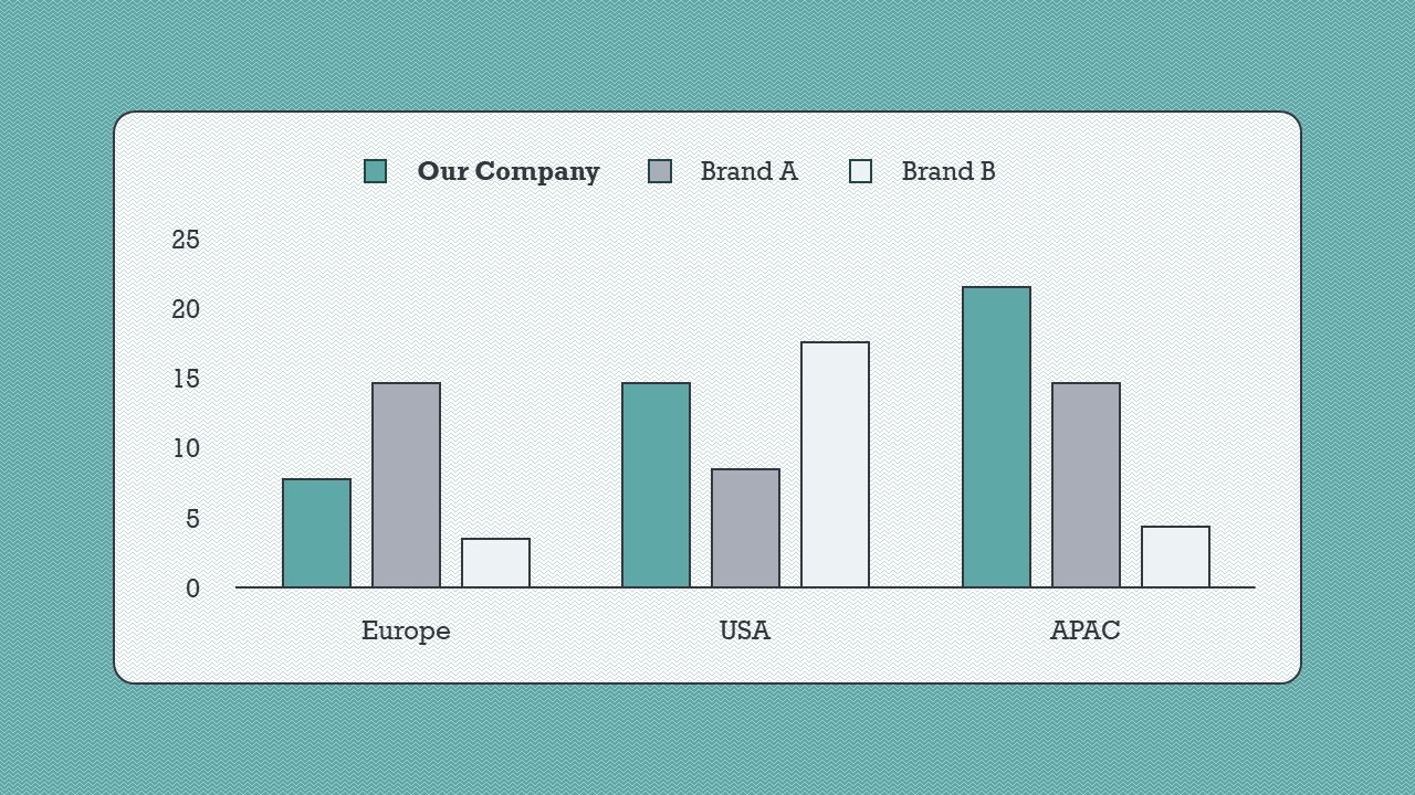
Avoid too much colour, this can be confusing for the audience. Using just two tones can create hierarchy and order to your slides. If you want to create a contrasting pop of colour make sure to use it sparingly – it will draw the audience’s eyes in instantly so ensure that it is your most important message within the slide content.
This slide uses a limited colour selection to direct audience attention to the most important data. To find out more about using colour in your presentations, read our guide to changing theme colours.
Don’t go picture crazy
Using pictures can be a great visual tool within your PowerPoint. However don’t feel like you need a picture for every point you are making. Picking just one strong and relating image to have in your background of the slide can be much more effective than having a collection of different images. Read more here about telling better stories with imagery for some useful tips and tricks.
Let icons do the talking
Text heavy slides are the biggest culprits when it comes to bad presentation design and I am sure we all at some point have been the victim of a PowerPoint like it! Make sure to ask yourself as you’re typing away – ‘Do I really need this?’ – most of the time the answer is NO! Instead of relying solely on text use iconography to make your point; your audience came to listen to your presentation, not to read it!
“Slides should reinforce your words, not repeat them.”
– Seth Godin
Creating impact with icons is just a few clicks away if you use Office 365, read all about it in this blog post.
Pick your fonts wisely
The temptation when trying to jazz up your slides is to add a load of fun and different fonts. I would advise, if you aren’t a typography guru and know all the tricks in the book, just stick with the two. This ensures your slides are clear and concise. If you need to create further contrast between titles and text then play around with the thickness i.e. bold, semi bold, italic…etc.
Give elements on your slide room to breathe! White space is not something to be feared within presentation design as it helps define specific areas within your slides, allowing your audience to digest information. It also means you can show off beautiful imagery – like in the example below – without covering it in text boxes. For more layout ideas, check out our blog post all about using white space effectively.
A PowerPoint template is the only brand element you put in the hands of the whole organisation – regardless of computer literacy, or design skill: it has to be robust enough so that it can’t be broken, but strong enough to carry your brand voice into every meeting, or leave-behind, or proposal it gets used for. Read on for a list of the essential elements every PowerPoint template needs to have.
Designing content to be accessible doesn't have to mean you compromise on vibrant design, or your brand guidelines. In this article you'll learn more about colour contrast and how you can preserve colour vibrancy without having to sidestep WCAG accessibility guidelines.
It's Christmas! After a late night with too much eggnog and brandy snaps we set ourselves a challenge to see who could come up with the wildest PowerPoint Christmas card! So it's the day after the night before, and through blurry eyes we can reveal our efforts...
Good advice – especially about using fewer colours, and embracing whitespace.
Many presenters worry that they’ll forget what to say if they don’t write all over their slides. But that’s what the Notes pane’s for! (as I show here)
The video animation looks AWESOME! Thank you sooooo much. I am very happy and proud with the result; this video is really convincing. Really really well done.


Good advice – especially about using fewer colours, and embracing whitespace.
Many presenters worry that they’ll forget what to say if they don’t write all over their slides. But that’s what the Notes pane’s for! (as I show here)