It’s time to show the world your research, how exciting! After all your hard work, all those hours in the lab, you can finally present your findings and talk to fellow researchers about your work! Except… you’ve left it a little late to create your poster. So, you dig out the trusty old PowerPoint template passed down for generations and fill in the gaps with your own findings. But be honest with yourself, how old even is that template? Instead of presenting the exciting poster you dreamed of, you’ve got an uninspiring wall of text which leaves your audience a little lost on what you actually discovered. Your academic posters should be keeping pace with the rate science is moving, not trailing behind! It’s time to upgrade your template and create beautiful and effective academic posters in PowerPoint.
Why use PowerPoint for academic posters?
PowerPoint is the go-to tool for creating academic research posters. If you weren’t already aware, we love PowerPoint, and for good reason! It’s easy-to-use, quick to edit and accessible to many, making poster creation a breeze. We’re going to take you through a whole host of PowerPoint poster creation tips from shaping your content into a clear and concise message, making the most of our free pre-designed poster templates to help you build effective and beautiful research posters!
Let’s step into your audience’s shoes for a moment and consider the problem with the typical ‘wall-of-text’ poster. The reality is poster sessions attendees have very little time to see a LOT of posters. Time is of the essence and your audience are a moving target, so you’ve got to grab their attention, and fast! You can’t assume your audience will be happy to stand and read your poster for ten minutes.
Your research poster should be a conversation starter, not a wall of impenetrable text. A poster is simply a visual abstract, representing a concise and accessible summary of your research. Its purpose is to drive attention to your research, not show every detail. Think of it more like a billboard, designed to transmit key information quickly as your audience moves past.
So, how do you go from your audience thinking ‘I can hardly read this poster’, to ‘Cool research, tell me more!’? First things first, get the content right…
Scripting
Cut the jargon – Consider your target audience, sure you may have attendees that are specialists in your field, but you also want your poster to be accessible to people who are new to your research. Cut the jargon and specialist terms and use plain language as much as possible to make your poster easy to understand.
Organise your story – Separate your content into sections using headers and ensure your poster tells a flowing story that includes: Background, Question, Methods, Results, Conclusion.
Condense your content – Decide what your audience needs to know, then consider what is just nice to know. Then get rid of the nice to know. Be ruthless and keep your content concise and clear. Aim for a maximum of 250 words, possibly <150 if you’re feeling brave! If you’re concerned about the lack of detail on your poster, you can link to a full version of your paper using a QR code – we’ll explain how to do this further on.
Summarise your key finding – Most important of all, what did you find out from your research? Why should people care? Consider what the punchline of your research is and translate it into conversational plain English. Determine what key image or graph will support this finding and help transmit your message clearly so that your audience can quickly understand the value of your research without standing and staring at your poster for an eternity.
Layout Creating an effective academic poster is all about making it easy for your audience to quickly understand the content. A clear and logical layout is fundamental to achieving this. Consider the hierarchy of your information. You want your audience to read the most important information first – in case they don’t make it to the bottom of the poster. So, place your key finding and a supporting graph or graphic right at the top of the poster. To ensure the rest of your poster is easy to read, consider the flow of your content. In the West, we read top to bottom, left to right so make sure your content follows this flow. You could number your sections or use arrows to guide the reader and use bullet points rather than long paragraphs of text. You can read more about hierarchy here
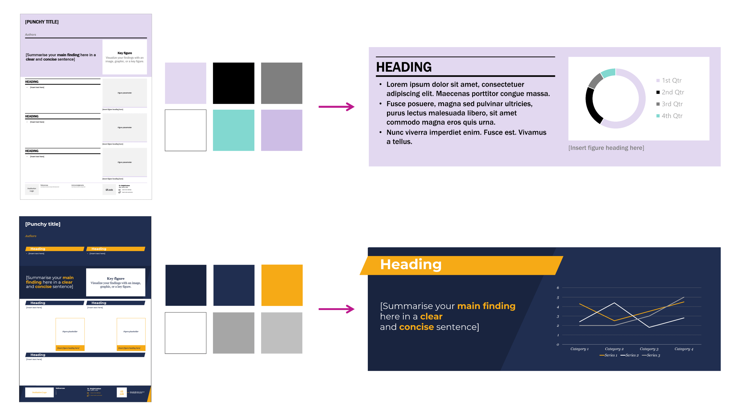
We’ve created 4 academic poster PowerPoint template layouts to help get you started!
Data Your research will inevitably contain graphs and data, and whilst you may want to show them all off on your poster (because they took ages to make!) you need to decide which are the most important.
Be selective – Display only essential data on your poster. Whilst pictures and graphs do help break up text, you don’t want to overload your audience with information so only include the most important graphs.
Simplify – Simplify your graphs and, if necessary, re-label them so scientists outside of your field will understand the basics.
Summary figure – Pick a single graphic to support your key finding and help your audience understand your punchline – fast.
Formatting – Apply the colour scheme and fonts of your template to any imported graphs for consistency across your poster. You can find pre-designed graphs in the sticker sheet for each of our templates!
Tips on the template – make your poster beautiful
Your content is ready to go, now it’s time to make your poster beautiful! To give you a head start, we’ve created 4 different landscape and portrait academic poster PowerPoint templates each with their own unique design style! Pick your favourite and fill in the sections with your content. We’ve helped get you started with placeholders for headings, graphs, references etc. on each template but these are editable so you can customise your poster to work best for you.
Each template also has its own matching ‘sticker sheet’. Just copy and paste any of the elements you’d like to use on the sticker sheet on to your poster
Now, let’s run through some top tips to make sure you get the most out of these templates!
Alignment and guides Wonky alignment and a poor layout can make your poster look unprofessional before your audience has even had a chance to read all the good stuff! Guides are your secret weapon to help lay your content out in clear, easy to follow sections. We’ve already set up guides in our poster templates, if you can’t see them head to the View tab in PowerPoint and tick Guides.
Guides are important to help align and balance your poster design. Some key things to remember are to keep the border clear and maintain the gaps (gutters) between sections to give your content space to breathe.
If you want to create your own guides, this article shows you how easy it is with our free PowerPoint add-in BrightSlide.
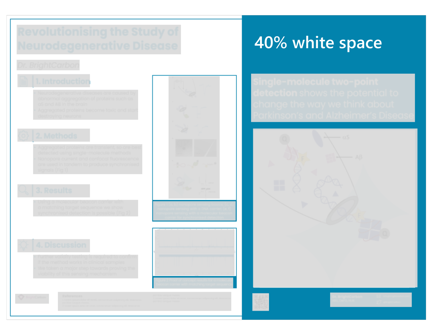
White space Don’t underestimate the power of what’s NOT on your poster. White space is essential for making a beautiful and effective poster. Your poster should roughly consist of 20-30% text, 30-40% figures and 40% space. Yep, you heard me, 40%! White, or ‘negative’ space is all about creating areas of contrast, with clear focal points to draw your attention to the important parts, and create a flow and hierarchy across your poster. Learn more about the power of white space
Try to avoid using photos in the background, it can clutter the poster and make it difficult for your audience to read the text or understand the graphs.
Colours We’ve predesigned our poster templates with carefully selected colour schemes to make them simply beautiful! But we’ve got some tips on how to best apply the set colour scheme to your content. Each template has a colour palette of 6-8 colours. We recommend using a bright colour as your accent colour to draw attention to key information on your poster. It’s important to use this accent colour in moderation to ensure it holds its attention-grabbing function! Make sure you apply the colour scheme to all the text, images and figures you’re using to keep your poster design consistent
If you have to use specific colours, or fancy creating your own colour palette, here are some top tips:
Use 3-5 colours – 2-3 shades of a primary colour, an accent colour that stands out, a background colour and a couple of text colours (one light one dark).
Use the eyedropper tool – Find an image with colours you love and use the eyedropper tool in PowerPoint to extract the colours. To use the colour, draw a shape on a PowerPoint slide, select it, head to Shape Format > Shape Fill > Eyedropper and click on the colour from the image.
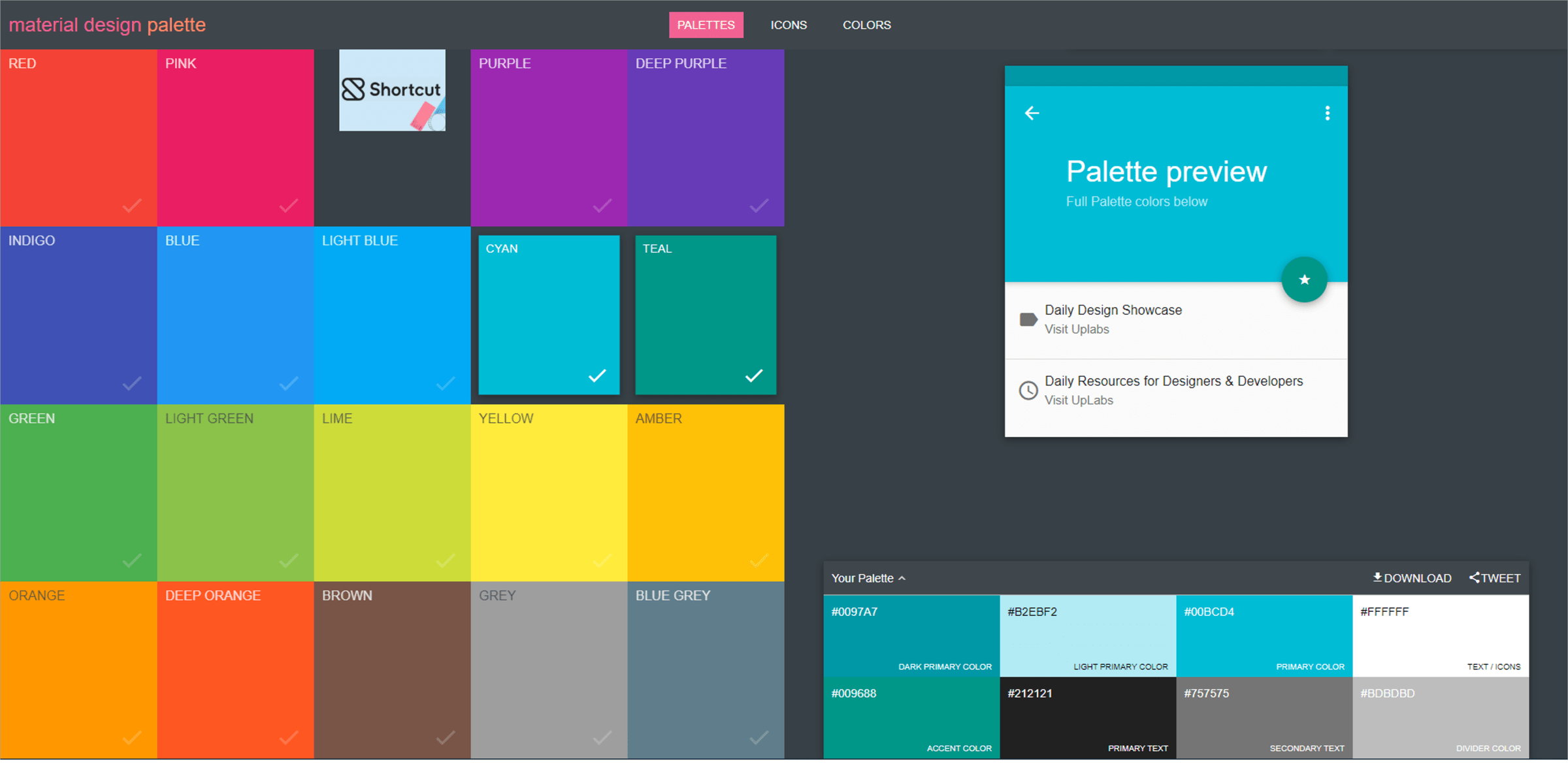
Use a palette generator website – We love Coolers, Adobe Colour Wheel (start with the ‘complementary’ option) or Material Palette. Material Palette allows you to select 2 colours and then produces a full palette with guidance on how to use each colour.
Use a colour contrast checker for accessibility – Poor colour contrast can mean your poster becomes less accessible to a whole range of people. Luckily, while this is a common error, it’s also a very simple thing to fix. Check out the free colour contrast checker in our brilliant PowerPoint add-in, BrightSlide.
Update your colour theme in PowerPoint – The best way to handle colours in PowerPoint is to set your template correctly and use a colour theme. Then it’s easy to use the same colours over and over again. Once you’ve chosen your colours, read this article to learn how to change the theme colours in PowerPoint.
Fonts Less is more when it comes to fonts, we recommend picking just one or two fonts. Using a second font can help to clearly distinguish your body text from your titles and headings, but this can also be achieved by making your titles and headings bold. Our poster templates have pre-set fonts but if you’re striking out on your own, here are some other fonts we recommend:
Body text – Generally serif fonts are better for body text, as the serifs (‘wings’ at the end of lines) lead the eye from one character to the next like joined handwriting. Examples include: Times New Roman, Garamond, Palatino Linotype, Book Antiqua, Bodoni MT, Bell MT.
Titles and headings – Alternatively, sans serif fonts have no marks at the end of their lines and are seen as modern, sleek and clean, making them better for titles and headings, Examples include: Arial, Helvetica, Verdana, Segoe UI, Franklin Gothic, Candara, Tahoma, Corbel, Roboto. And above all, avoid unprofessional fonts like Comic Sans.
Font size is also important. Your poster needs to be readable from a meter away, and your title and headings need to stand out. For A0 posters, try sticking to these font sizes:
Titles – 90pt
Headings – 60pt
Body text – 36pt
Check your font sizes by zooming in to your poster 100% and stand a meter away from your screen to test if you can easily read the body text and distinguish the headings.
Graphs We’ve created some pre-designed graphs, tables and diagrams in the sticker sheet to copy and paste on to your poster and insert your own data.
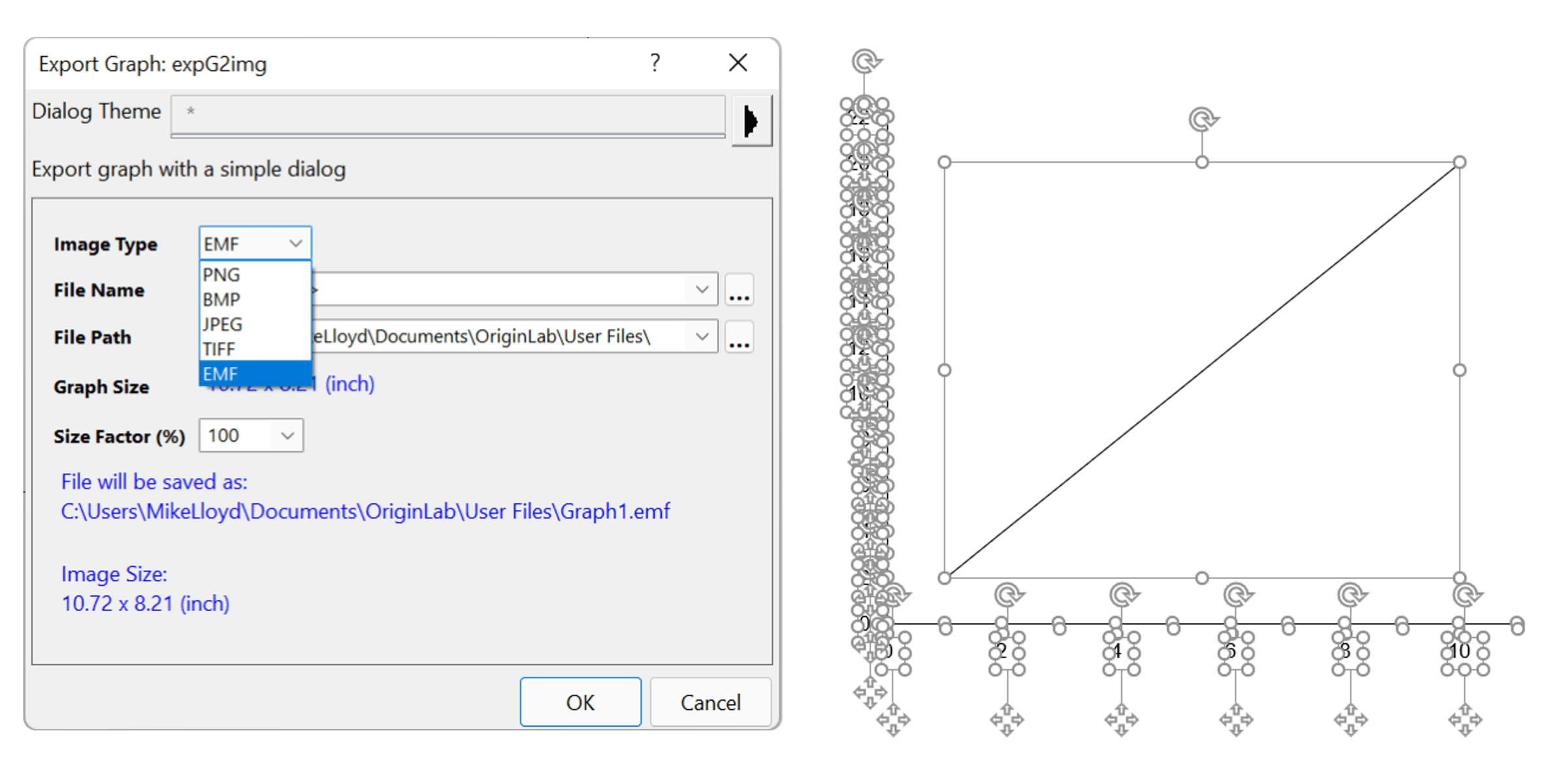
However, we recognise that you may not be using Microsoft Office to create your charts and graphs. In this case, we recommend exporting the graph from whatever software you’re using (Origin, for example) as an EMF image, and pasting that into your poster template. You can then ungroup the image and format the elements of the chart to match your poster template fonts and colours. Don’t forget to regroup the graph afterwards to make it easier to move and resize!
To make the most of your graphs and data, focus your audience’s attention on key information by using PowerPoint shapes or arrows. Edit the line colour, fill colour, and transparency to highlight important trends or values on your graphs.
Illustrations and icons Icons are great for storytelling and can really help to cut down your word count. We’ve created a pre-coloured icon set for each sticker sheet – if you’re looking for something specific, you can search for more icons by going to Insert > Icons in PowerPoint. You can recolour PowerPoint icons to match your template using the Fill colour tool. In fact, there’s almost nothing you can’t do with icons in PowerPoint! Learn more in this article.
If you’re using Office 365, you’ll be able to access PowerPoint’s native presentation icons, and we have a blog post showing you how to insert these PowerPoint icons. Whilst PowerPoint has a LOT of icons to choose from, you may be looking for something more specific for your research. If you’re in the environmental sciences, the IAN image library is a great free library of graphics. Another great generalist website to find free illustrations and icons is Freepik.
If you’re really after something custom or specific, Adobe Illustrator is a powerful tool for creating illustrations. Though it’s a paid software, there are lots of free resources out there to help you create exactly what you need. If Adobe Illustrator isn’t the right choice for you, PowerPoint can be used to create surprisingly sophisticated illustrations as this post explains.
QR codes Adding a QR code to your poster is a quick way to provide your audience with access to your full paper or a digital copy of your poster. This allows the attendees to walk away with as much information as they like. You can be more confident condensing your content for your poster, safe in the knowledge that your audience can still access your full paper through your custom QR code. You can head to Canva or qrcodemonkey to create a QR code. If you want to link to multiple files or locations, it may be worth using Linktree which allows you to connect your audience to multiple locations through a single link from your QR code. You can then add that QR code to your academic poster in PowerPoint before exporting the it ready to share.
Finishing up I hope your poster is coming together nicely now! But… you’re not quite finished yet. Here are a few tips to make sure you, and your poster, are ready to go!
Feedback and proofreading – It’s impossible to proofread your own work properly. Grab a friend or colleague and ask them to take a look at your poster as a trial run. Ask them:
Is the layout clear and easy to follow?
Did you understand the key finding quickly?
Can you double check my spelling and grammar, please!
It’s important not to miss out this feedback phase, and do it sooner rather than later, so you can implement any changes in good time! Trialling your poster will give you more confidence to present at your poster session too.
Export your file – You’ve made a few tweaks based on feedback from your friends, now you can export your poster as a PDF. In PowerPoint, head to File > Save As > Browse, choose where you want to save your PDF, then name your poster and from the Saveastype drop down menu choose PDF.
The final check! – It’s a good idea to test print your poster before printing it full size. Print your poster A4, or A3 if possible. Check everything looks how you want it to, that the resolution of your graphs and images is up to scratch (300dpi is recommended), that there is enough space in the margins, and nothing is cut off and do a final proofread of all the text.
Be prepared to present – Your poster won’t do all the talking for you, it serves as a conversation starter, so you’ll have to be prepared to talk about your research. Don’t panic! We’ve got LOADS of presentation tips to help you prepare.
Download all the free academic poster PowerPoint templates to get started!
We’d love to see the academic posters you make in PowerPoint using these templates, please send them to us or share them on twitter and tag us @BrightCarbon.
A PowerPoint template is the only brand element you put in the hands of the whole organisation – regardless of computer literacy, or design skill: it has to be robust enough so that it can’t be broken, but strong enough to carry your brand voice into every meeting, or leave-behind, or proposal it gets used for. Read on for a list of the essential elements every PowerPoint template needs to have.
Designing content to be accessible doesn't have to mean you compromise on vibrant design, or your brand guidelines. In this article you'll learn more about colour contrast and how you can preserve colour vibrancy without having to sidestep WCAG accessibility guidelines.
It's Christmas! After a late night with too much eggnog and brandy snaps we set ourselves a challenge to see who could come up with the wildest PowerPoint Christmas card! So it's the day after the night before, and through blurry eyes we can reveal our efforts...
A really fantastic set of resources and advice. I’ve been running seminars for our PGRs on this topic for a few years. It’s both reassuring to see that I’m not the only one saying PowerPoint will do the job and it’s made me revisit my own support content to review and update my advice! Many thanks Jon


A really fantastic set of resources and advice. I’ve been running seminars for our PGRs on this topic for a few years. It’s both reassuring to see that I’m not the only one saying PowerPoint will do the job and it’s made me revisit my own support content to review and update my advice!
Many thanks
Jon
I would like to learn more on how to create an academic poster
Thankyou your information was invaluable
Thank you for this great advice!
Good many thank you so much.
Great help, many thanks.