Who doesn’t love a well-designed chart that helps visualise your data and turn it into valuable information? They’re used in Excel for reporting and in PowerPoint presentations to help tell your story. But as soon as different people start creating them, well, they start to look like they were designed by different people. Templates are your best friend when it comes to consistently branding Microsoft Office documents. So, what’s available to you when it comes to charts and graphs?
What’s on the menu, Excel or PowerPoint?
Charts and graphs can be created in Excel, PowerPoint or Word, but under the hood, they all use Excel. Even though you can create them from scratch in PowerPoint, the most common way to get them onto a slide is to create them in Excel and copy and paste them over to PowerPoint.
This creates a brand consistency challenge. If your Excel file isn’t using the same Office theme as your PowerPoint file, then things aren’t going to look like they came from the same brand. Fonts might be different, and even worse, colours. Check out our Three Amigos article to find out how to use a common theme across Microsoft Office.
For now, let’s find out how to use chart templates.
Template soup
You might already know that you can use templates to create consistent-looking files across the suite of Office apps such as PowerPoint, Excel and Word. They use the template-specific file formats of potx, xltx and dotx respectively. These help you set up your brand fonts and colours, but there’s more you can do with the charts you create inside Excel, PowerPoint and Word.
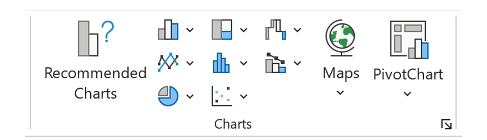
When you create a new chart in Excel, the first thing you’re steered towards is choosing which type of chart you want to insert from the ribbon:
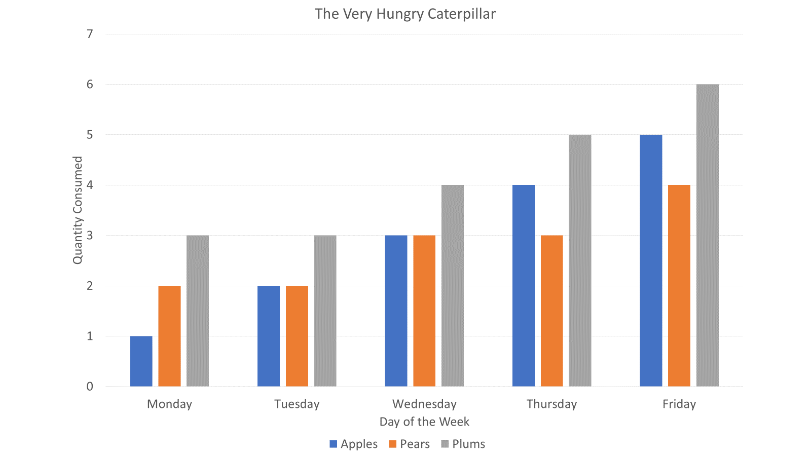
Let’s assume you choose the column type and create a chart like this:
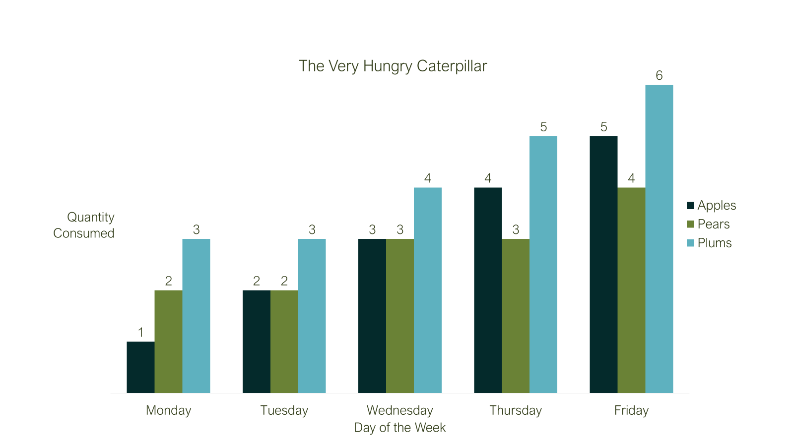
You then decide to tweak the chart design to arrive at this:
As you can imagine, there were quite a few steps to get here. So what happens when you receive another chart from someone and they ask “Can you make this look like that other lovely chart you designed please?”.
Do you:
Walk away?
Try to remember how you made your beautiful chart last week/month/year?
Use a chart template?
Of course you opt for the third option, but how? You can do it like this:
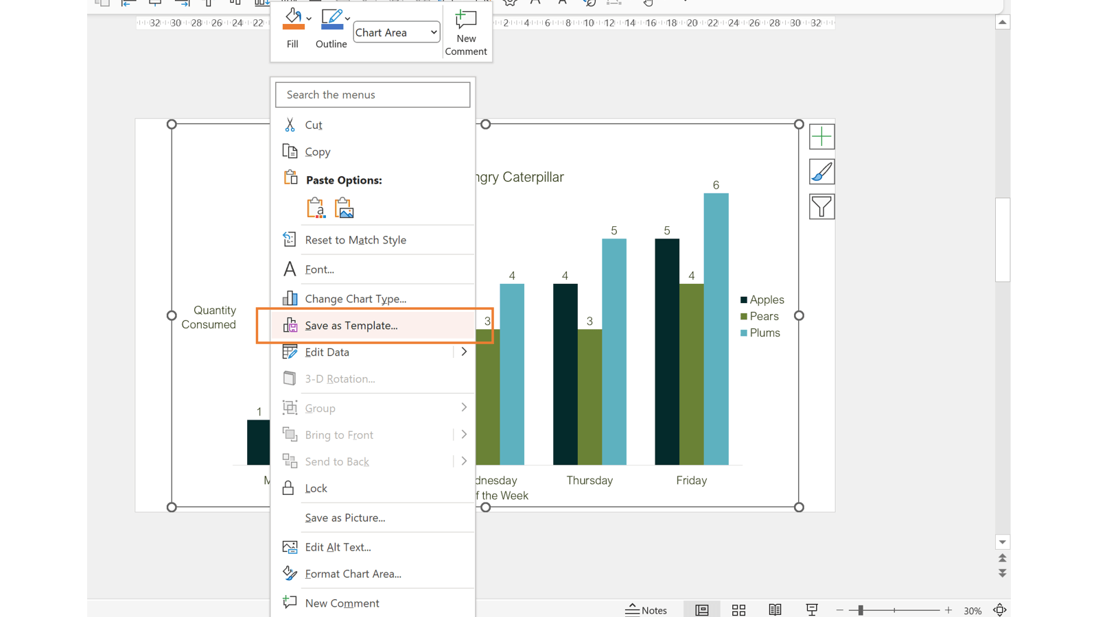
Select your beautifully designed chart
Right click on it
Select Save as Template…
Give it a fancy name (meaningful also works) and click Save
This creates a crtx chart template file on your computer. That means it’s available to you only, unless you share it with colleagues or ask you friendly IT administrator to deploy it to the company.
Now you can use your template to restyle existing charts as follows:
Right click on the chart to be styled
Click Change Chart Type…
And now for the magic, click the Templates tab on the left of the window.
From there you’ll see all of the chart templates you’ve created.
Click the one you want and click OK to save hours of fiddling.
You can also create a brand-new chart from your templates by clicking the Recommended Charts button in Excel’s Insert tab, or the little arrow in the bottom right-hand side of the charts group, followed by the All Charts tab in the window that appears.
Back in PowerPoint land
You read at the beginning that charts can be created in PowerPoint too, and the same chart templates experience is available for your delight there as well.
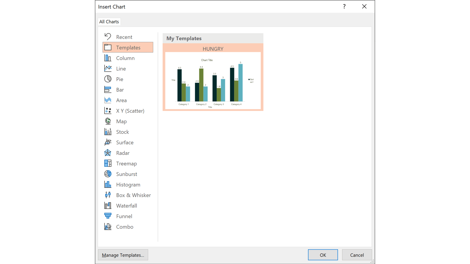
Go to the Insert tab in PowerPoint and click the Chart button from the Illustrations group in the ribbon. In this simplified version of the window you can again click the Template tab and choose your chart type:
The eagle-eyed among you may have noticed that the chart template thumbnail looks different here. That’s because when you create a chart this way, the data is entered afterwards, so PowerPoint uses dummy data to create the preview. Once you enter the same data, the chart looks the same.
Themes, but not as we know it Jim
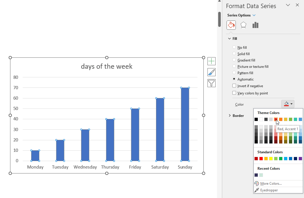
In what is probably one of the strangest experiences in Microsoft Office, it’s possible to get into a situation where the colours you see in the chart are not those reflected in the PowerPoint colour picker. The reason this happens is that Excel embeds a copy of the theme colours inside the chart when using chart templates. They call this ‘theme override’ and you can read more about it at the end of this Microsoft article.
When a template-based chart is copied outside of Excel and into PowerPoint or Word, the embedded theme colours inside the chart take priority over the theme in use within the PowerPoint presentation or Word document. This slide has such a chart and you can see that whilst the chart series is blue, PowerPoint thinks it’s red!
This is another reason why it’s so important to use the same theme across all of your Office apps.
Getting to grips with chart and graph templates can really save you time when putting together presentations. If you’re hooked on better ways to work with graphs and charts in PowerPoint, you’ll love this masterclass on PowerPoint graphs & charts.
Reuse Slides is a PowerPoint feature that will be phased out by 1 January 2026. If you're a fan, read on to discover what Microsoft might replace it with, and two alternatives to Reuse Slides to get you using your on-brand, pre-approved content quickly and easily across your whole organisation
For years, PowerPoint has been synonymous with boardroom presentations and academic lectures. Its default 16:9 slide ratio is tuned for projection screens, not LinkedIn grids or TikTok thumbnails. But what if the same tool that powers your pitch decks could also become your go-to design app for social media content?…
Placeholders in PowerPoint form part of a layout and keep content in the right place on a slide. But sometimes, you want the names you see in the Selection Pane in the slide to follow what you set in the master. We're going to unravel a bit of PowerPoint history and find a solution to this conundrum in the process.
Is there any way to embed chart templates in the presentation/template file? It seems a bit of an oversight not to be able to do this – i.e., you may be a PowerPoint template designer creating a file that is to be used by many people across an organisation where rolling out .crtx files isn’t an option.
BrightCarbon provided us with a fantastic service ... and left us with a presentation that secured us a £4 million contract. BrightCarbon is our first choice for presentations in the future.


Is there any way to embed chart templates in the presentation/template file? It seems a bit of an oversight not to be able to do this – i.e., you may be a PowerPoint template designer creating a file that is to be used by many people across an organisation where rolling out .crtx files isn’t an option.