Relationships are everywhere, and we’re constantly being reminded, whether on a billboard, Netflix, or just that shameless couple next to you at dinner, that you can’t get away from. The same is true when it comes to slide design. If you can crack how to show relationships effectively on your slides then you’ll have your audience swiping right instead of left.
Okay, first of all, let’s level-set on what I mean by relationships. I don’t mean couples, or friends, or even that wonderful bond people have with their animals. I mean showing how things relate to each other. So this might be to show that something is similar, or different. It might be to show that something is more important than something else.
You see, when you’re creating your presentation content you constantly talk about how things relate to each other. Maybe you’re talking about a sequential process, but if your slide looks like this…
…your audience has to dig in and read what’s going on and figure out the relationships themselves. But instead you can show these relationships – even simply – like this:
The visual communicates a huge amount without you having to explain either as voiceover, or as text on the slide. And what does that all mean? Well you can get to the point faster, and your audience isn’t distracted by trying to read and figure out the accidental puzzle you left them.
So over the course of this article, I’m going to show you how to identify and visualise four key relationships, and then what to do if you have multiple relationships in one slide. Read the whole thing, or skip to your favourite:
In this day and age we’re certainly more reliant on GPS to get us places (some may say over-reliant), but you’d be surprised how often we forget to signpost a journey – or process – to our audiences. Whether it’s how you onboard a new client, the steps in a new system you’re selling, or even just the next steps the audience member needs to take after they leave the meeting, processes and linear journeys are really common in presentations.
So taking those three examples, how do we go about creating a process slide?
Simple steps
Let’s start with something simple and linear (at least you’d hope so): a new client onboarding process. Clients and prospects want these processes to be as simple as possible, so we should make them look as simple as possible. Clean, minimal design goes a long way here, as does only a few easily defined steps.
Consider the following:
This is such a puzzle – where does the audience member start? Who is responsible for what? Why is there so much small text? This kind of slide should be marked internal-only for starters, there’s too much strategic detail that a client or prospect has no hope of retaining in a 30-minute presentation.
So how do we turn this into something elegant and memorable?
First cut down the number of steps. Can you collapse two or three into one parent category?
Next cut down the number of words. Rewrite the copy into short statements (tip: rewriting is often better than simply ‘editing’) with clear actions in each.
Assign a colour and icon to each party, this will enable the audience to easily see which tasks they’re responsible for, and what they can rely on you to do.
Finally choose a clean visual – arrows and chevrons are great for this kind of thing. And with a few design flourishes, they can look really classy too.
Et voila! An easy-to-understand roadmap that won’t take 30 minutes to explain.
Complex systems
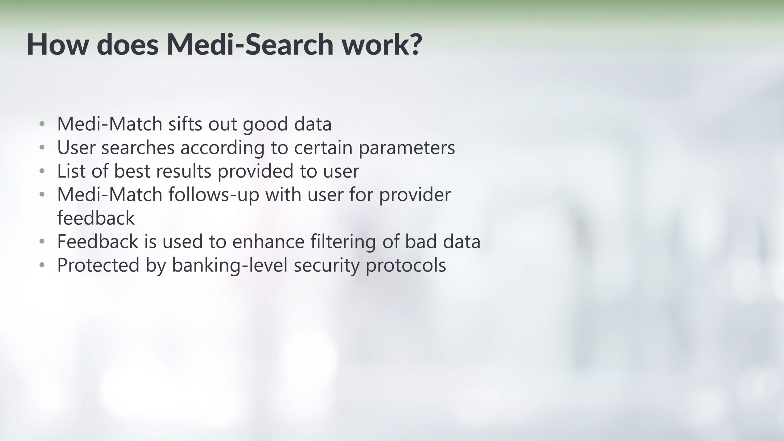
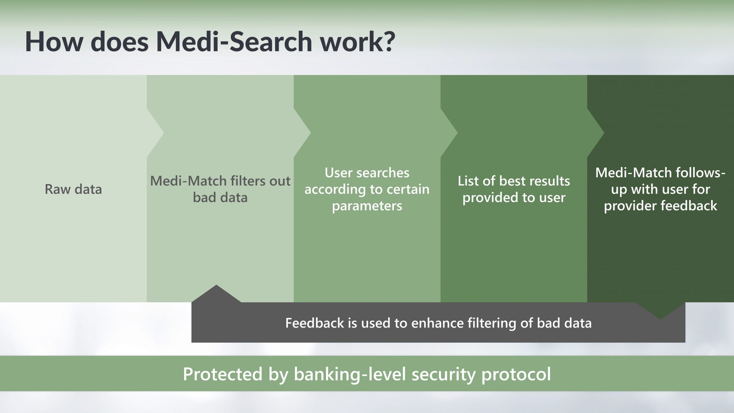
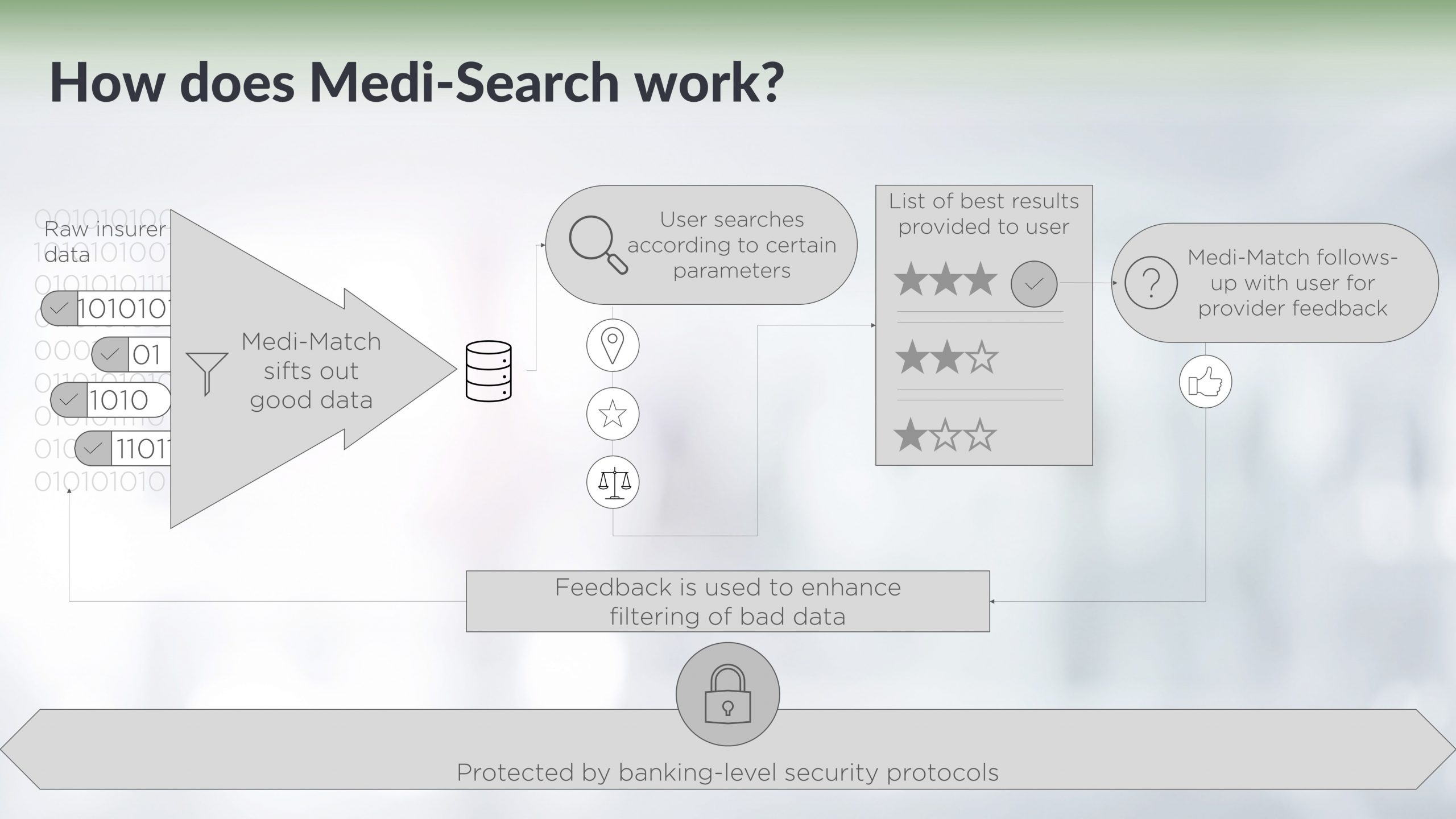
Sometimes, however, you need a system to look complicated, because it is complicated. A robust machine learning program designed to find patients the best health insurance takes information from lots of different sources and is constantly improving itself. Additionally, we want it to be safe and secure, due to the customer data it’s handling. We also want it to create meaningful insights for healthcare providers and patients. They say Rome wasn’t built in a day, and complex systems like that don’t just develop on the back of a beer mat.
Start by writing out your process and, like in the previous example, define some clear, simple stages with pithy captions.
Then start building your slide by sketching what happens where in the process. Some of the stages will happen sequentially, some will be happening throughout the whole journey, and some might mean you end up back at the beginning.
Once you have these blocks that relate to each other, you can fill them in with mini visuals that show what happens in each.
Then add a little design flourish – again keep it clean and simple. Don’t over-design this kind of thing. Finally, and don’t forget this stage, animate your slide. It can be really simple, but bring in each stage one click at a time, and talk about each stage before clicking and moving onto the next. If you show the audience the whole slide, they’ll skip ahead, figure out the puzzle, and then when you get to the punchline, they’ll have landed the plane about 10 minutes prior, just with less of the pizzazz.
Call-to-action
In murder mysteries and thrillers, the action builds up to the last 20 minutes, but after you find out who did it, you’re left with about 10 minutes of wind down. That’s what you get in presentations too – slides like ‘questions’ and ‘thank you’ take up important presentation time when they’re just essentially a background.
This is where call-to-action slides sit too, but at this point, the audience has already tuned out and they’re waiting to see if the adverts on the other side have finished so they can switch to a new show.
But calls-to-action are both really important and processes – they motivate your presentation audience to actually take a next step and mean your presentation ends with a bang instead of a whimper.
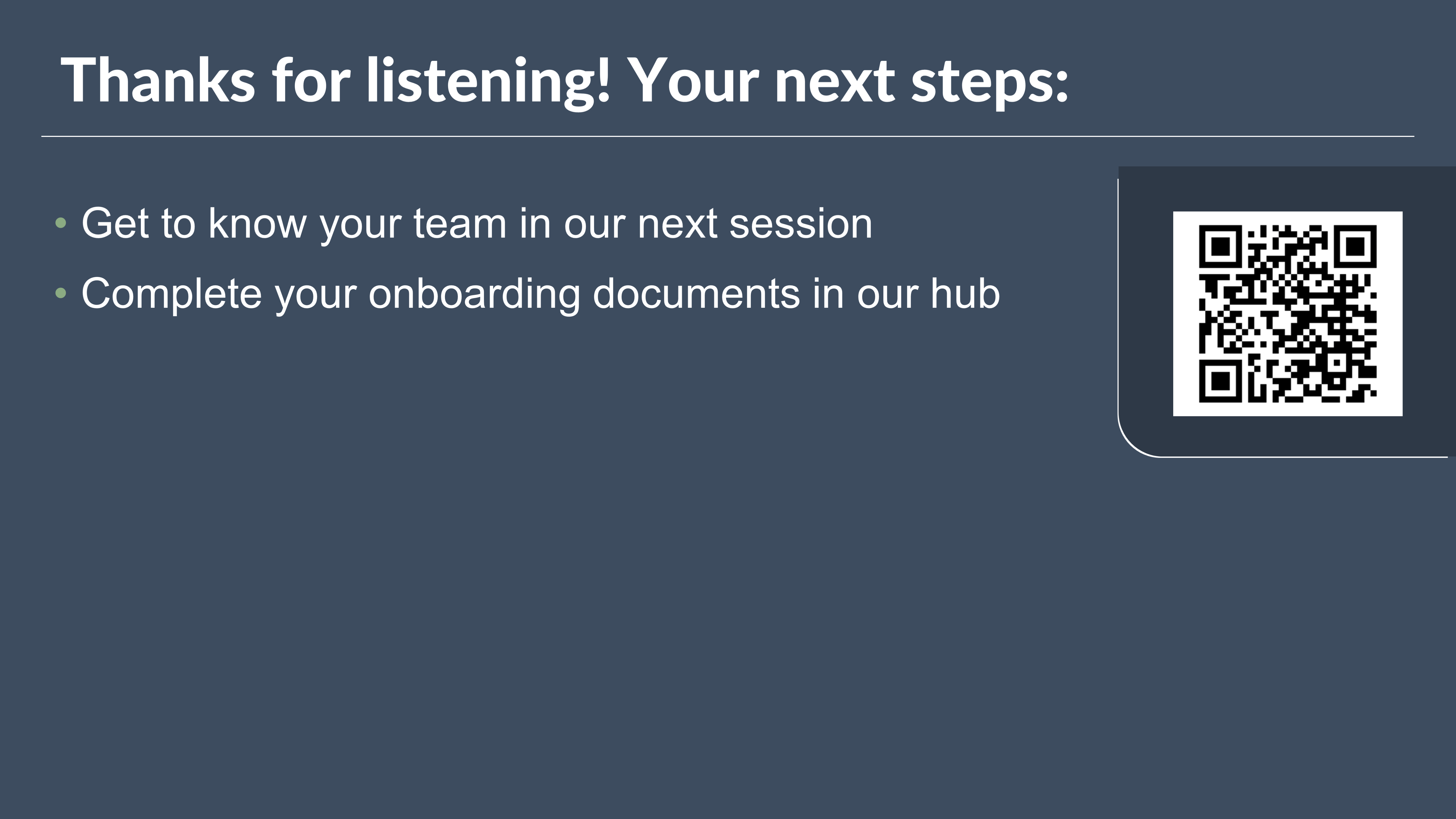
This is what a typical call-to-action looks like:
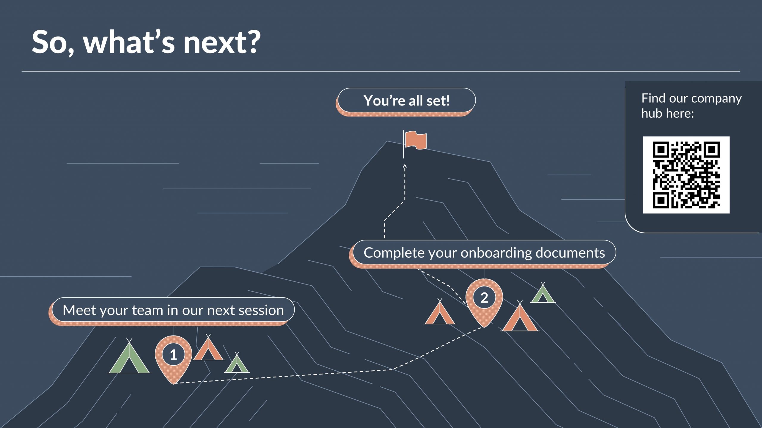
Hardly memorable, or meaningful. Instead, we can transform it into something like this:
Here we have a journey that shows how the two steps work together sequentially, and then we use the flag and the mountain to show that once these two steps have been completed, the client is headed for bright things!
Processes in training
A lot of training tends to be process-driven. In these cases you’ll need a really clear process graphic so that it sticks in the minds of learners. Follow the same steps to collapse stages to make everything more streamlined at the high-level view, or why not make an interactive map that you can click around to learn more about each stage? Learn more about creating interactive eLearning in PowerPoint.
Explaining a complex process in an animation
If you’re creating an explainer video around a process or journey, you’ll likely have more dynamic content to keep your viewers engaged. Consider using a process visual that you keep coming back to as a breadcrumb or way-marker. You could also have a complex visual that you move around, zooming from the big picture to the individual steps. Sound complicated? Did you know both of those effects can be done with just a few clicks using PowerPoint’s morph transition.
Comparison
Think about all the games of ‘spot the difference’ you played on the back of a cereal box when you were growing up: we’re all programmed to notice what’s similar and what’s different. Things that are different stand out to us, and we can use that in the stories we tell to get to the point we’re making quickly and efficiently, whether that’s in a presentation, animation, or piece of training.
Similarities
Let’s start by talking about similarities. Often we use this technique when we want to show that something is like something else – something pretty recognisable to the audience. Instead of having to create a whole new concept and context for your content, you can say ‘you know this thing? Yeah, well it’s the same.’
One of the most common instances of this will be in visual metaphors – it’s like summiting a mountain; it’s like a successful sports team; it’s as unreliable as an old car; it’s as epic as space travel. You can really go to town with your creativity here – using images, illustrations, icons, to make your story come to life.
Another way to show similarities is to set up your differences. So instead of telling a story about how one thing is like another figuratively, you can show how things are literally the same.
The example below shows how all your competitors are doing the same thing. We’re showing similarity with uniformity. This sets the scene for you to come in and introduce your company as the differentiator. You can use animation to make that transition really stand out:
Your solution here comes across as the ‘same but different’ – it’s the same core visual, but bigger, more colourful, and overall more impactful. Let’s dive a little deeper into showing effective contrasts.
Differences
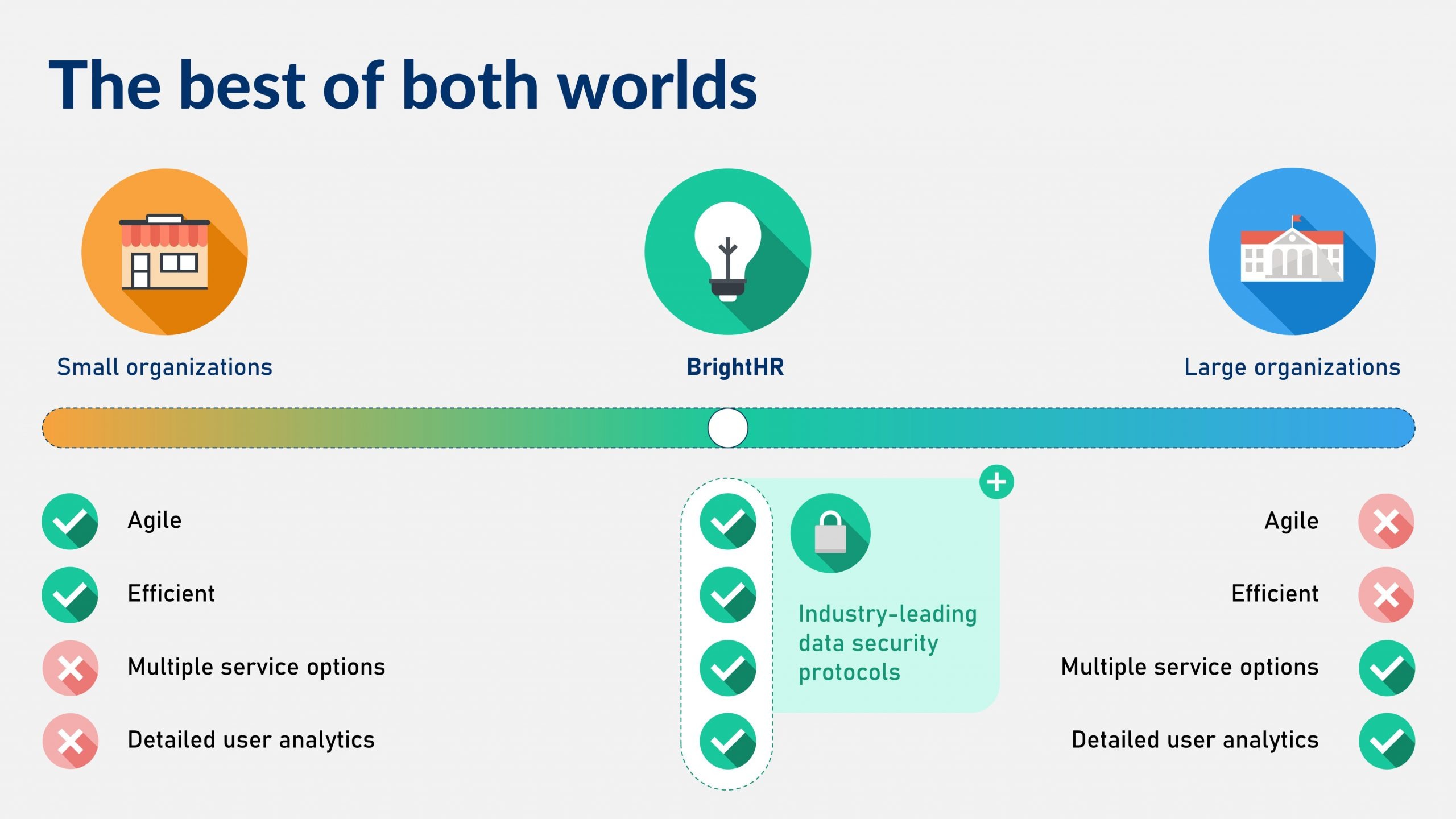
We all love a good villain, or a plucky underdog, and it’s the contrasts that we really live for. They also make the most compelling stories too. Think about it: competitor A has a really complicated and time-consuming solution; competitor B has a simple one, but it only covers about half of what competitor A does; you, on the other hand, offer a large suite of options, delivered efficiently, and with top-notch security protocols.
That slide might look like this:
Even better, you can use animation to introduce the two competitor solutions, and then use PowerPoint’s motion path animation to take the best of both and bring them together into one super-solution.
Apples to apples
One really important thing to remember in comparison slides is that you need to let your audience compare apples with apples (as the expression goes). Think back to spot the difference games – they only work because the two images are mostlythe same, this makes it much easier to spotlight the few and important differences. So if something is the same in two solutions, it should look identical.
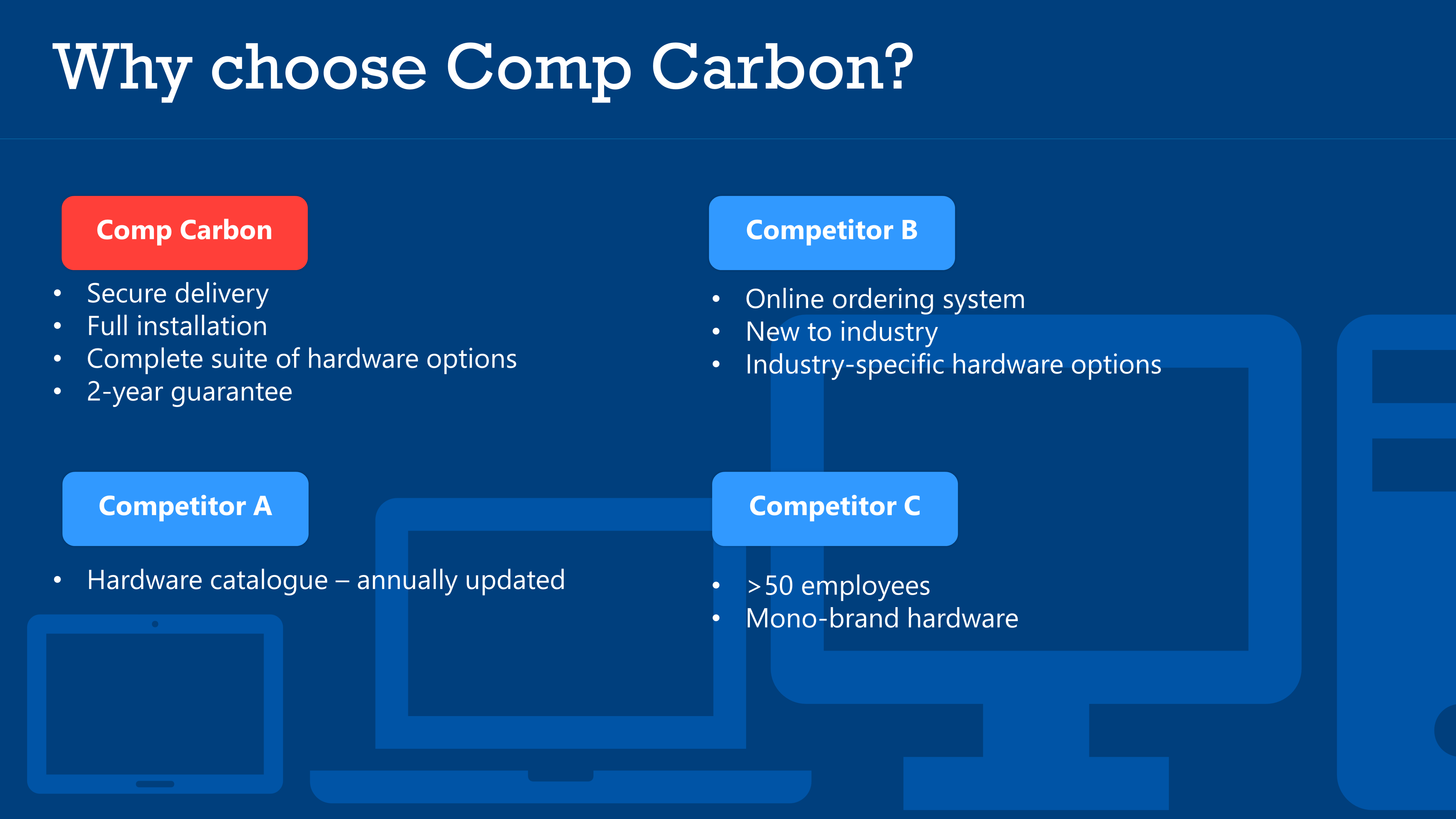
Take a look at the following:
It’s really hard to see what’s different about these solutions because it’s almost impossible to figure out what’s the same. But if we bring in some consistency with things like core layout and design, it becomes much easier to show what’s different through our use of colours, icons, deleting/adding certain content elements.
Now because it’s quick and easy to see what’s the same here, by extension, it becomes simple to figure out the differences.
Togetherness
Here we’re talking about parts of a whole – how different elements come together to form something. There are two key applications of this – separate things coming together to create one united solution, and then disparate things working together to form some sort of consistency.
Let’s take a closer look at those two instances.
One united solution
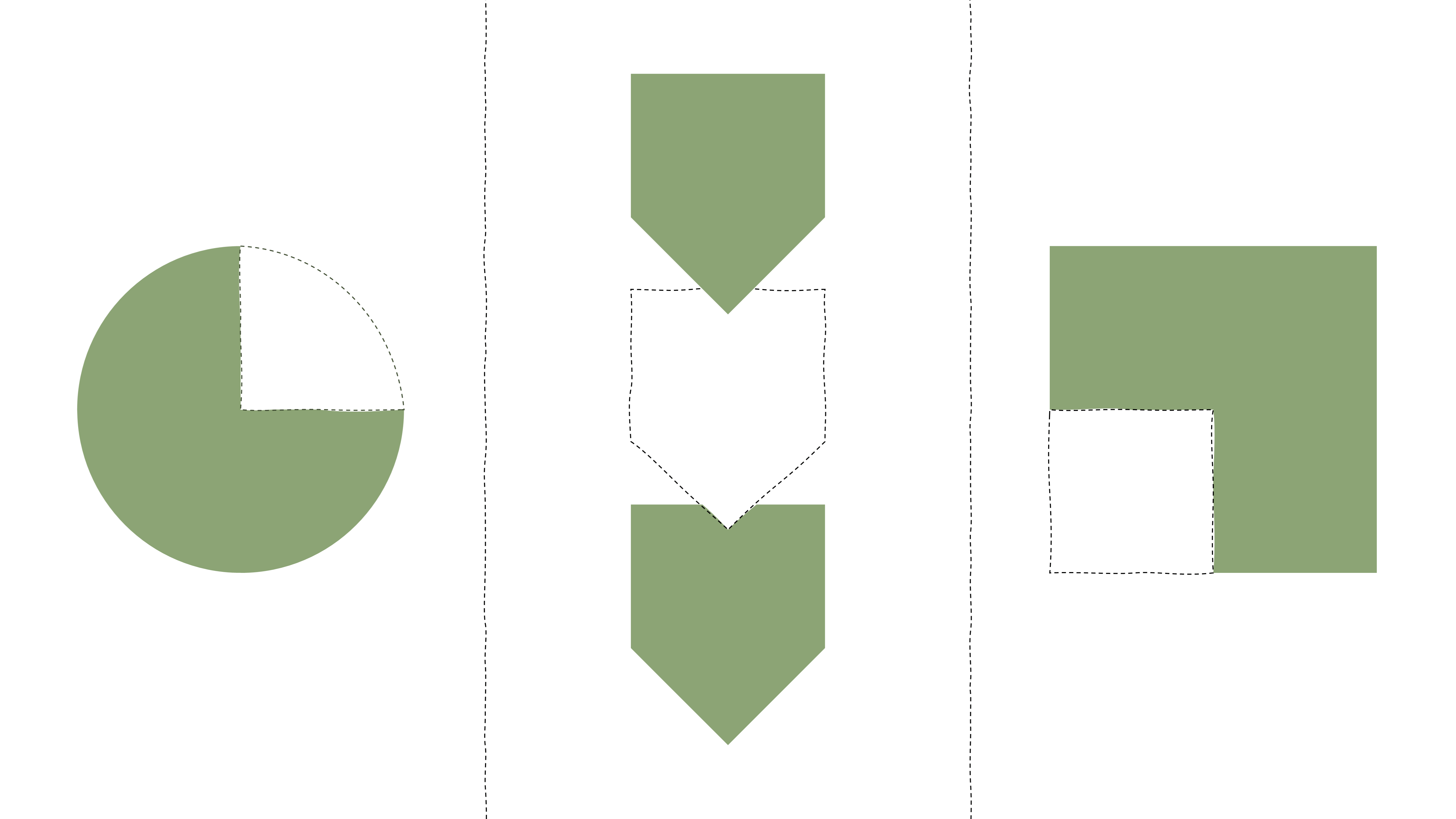
There’s power in the ‘whole’. A missing piece can drive us mad – take a look at the following:
What’s the missing piece? Why isn’t it filled in? We can lean into this to create a clear visual with a compelling story. Let’s review the following example:
We can see that competitors A and B only partially fill the criteria, but our company can do everything in one united solution.
There are lots of different motifs you can use with this technique – circles, doughnuts, squares, even the much over-used and slightly cliché puzzle pieces will do the trick (but maybe treat this as a last resort).
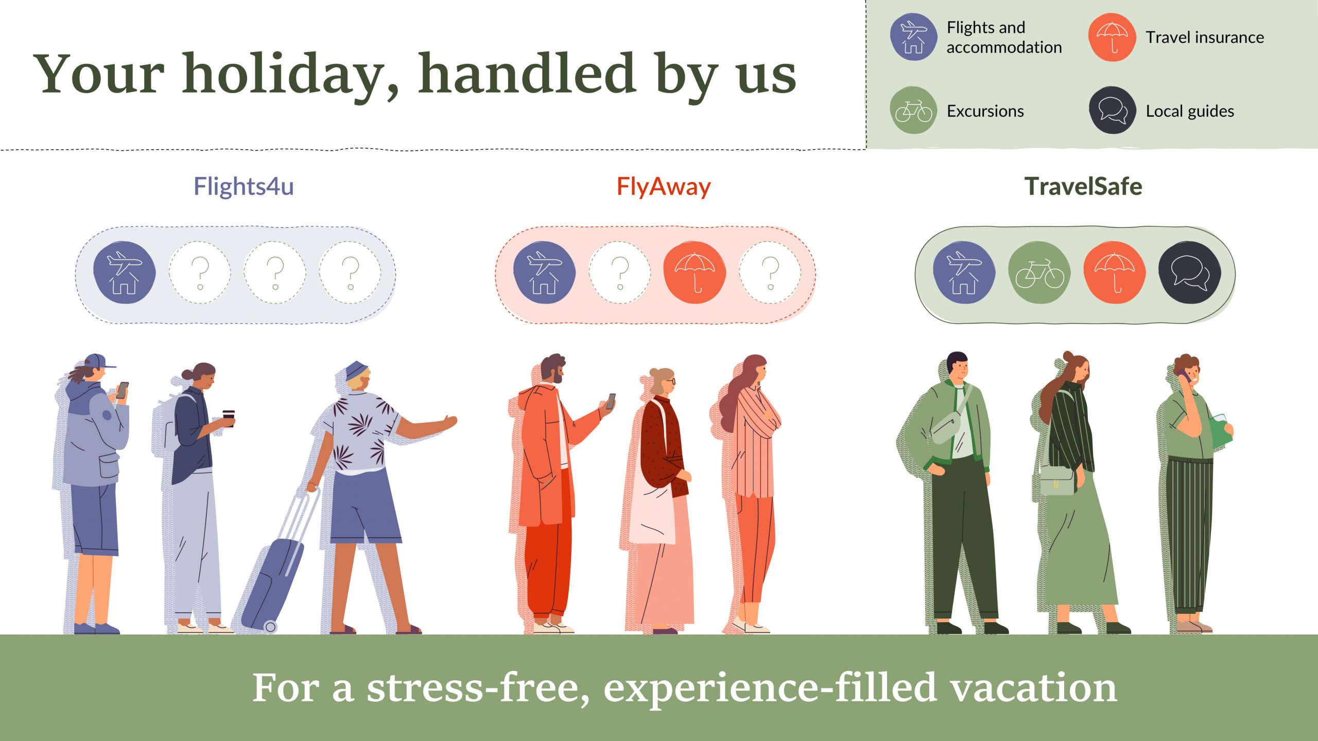
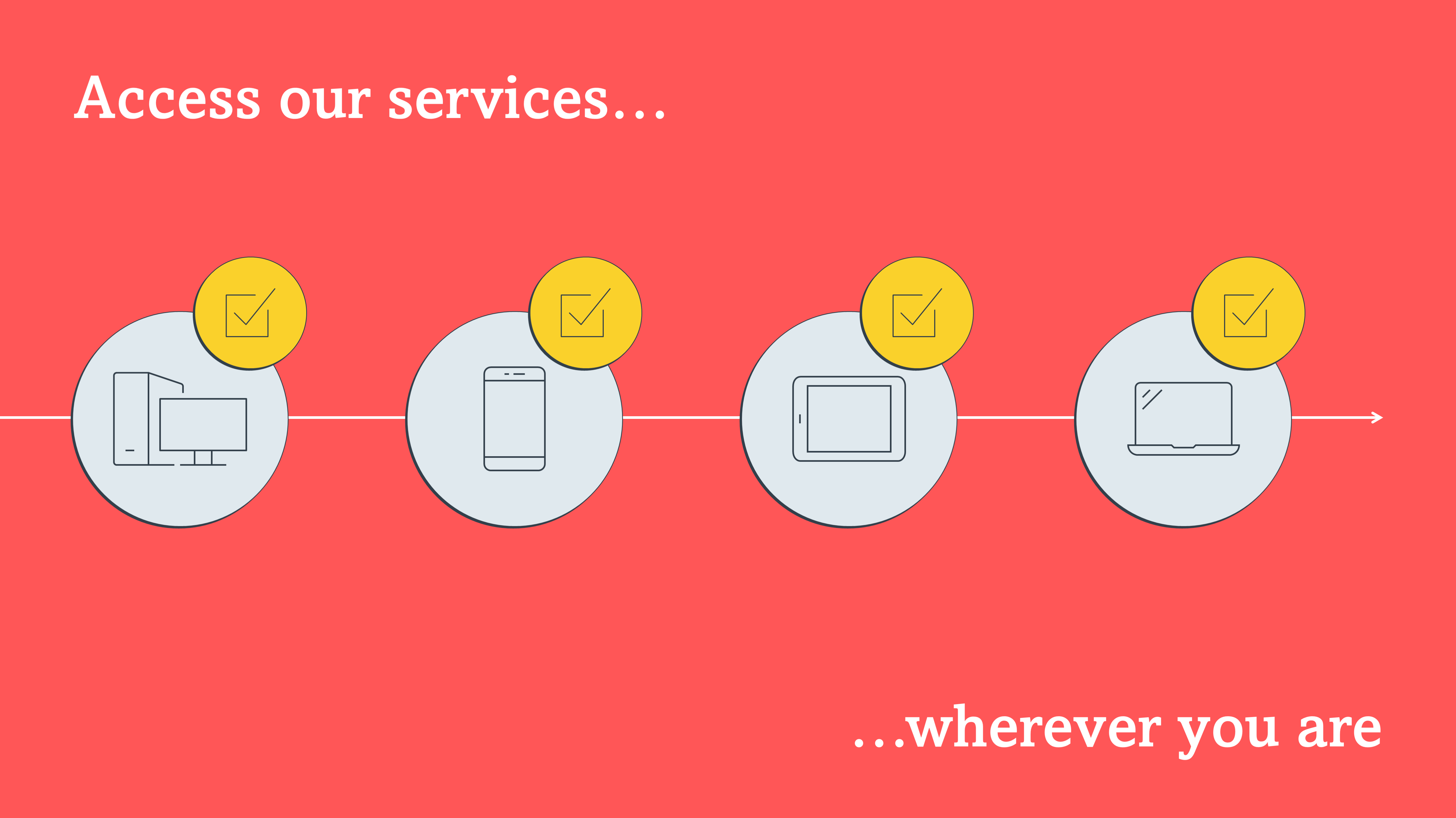
A consistent experience
You might be telling a story of consistency rather than unification: your solution hinges on the same experience at each part of the process, or consistency for all users. If you’re talking about consistency, then your visual needs to be just that – consistent. Use the same colour, icon, icon holder, text treatment, like in this example:
We’re using an image to help us tell the story, but although there’s a lot going on in the image, and a lot that is different from person-to-person, we’re showing that our experience is consistent for all of these users.
A note on style: you don’t have to use images, it works for illustrations, or even more abstract icon-based visualisations too.
Hierarchy
When we think of slides that show hierarchy we think of org charts. Hear me on this. Don’t put an org chart in your presentation. Literally no-one cares. Literally no-one can read all the details. And literally no-one will remember it.
Two sides to hierarchy
But there’s more to hierarchy than just who in your team is responsible for Pizza Friday. You can take hierarchy more generally to mean importance, and being able to show what pieces of a story are more important than others is a real win.
This goes hand in hand with the design principle of hierarchy too. In design, hierarchy refers to the order in which you view content, so often if a slide looks off-balance it could be that the hierarchy is wrong, and the things drawing your eye don’t follow the right flow for your story, so, for instance, you can’t help but reading the punchline first.
Importance goes hand-in-hand with hierarchy because often the most prominent things in your hierarchy will also be the most important, or you want to lead your user (with good hierarchy) to absorbing the most important thing (the punchline) last.
How to decide what’s ‘important’
Take a slide like this:
It’s so busy, you don’t even know where to start. And when probed, often the slide author says, ‘well, actually it’s all important’. If that is the case, then it probably needs to be split out over more than just one slide, but I bet in most cases there are some messages that are more important than others.
A good way to think about what’s really important, is to think about what you want the audience to take away, and what realistically they can take away over the course of a 15 or 30-minute presentation. These messages should be juicy benefits distilled into bitesize nuggets, and it’s these that should take pride of place on your slide.
But wait! Before you start creating a slide with the juiciest benefit right at the top, remember how the best stories are told: beginning > middle > end, or in sales speak: problem > solution > benefit. Start by explaining the problem you’re here to solve, then talk about how you solve that problem with your whizzbanging new solution, and finally you land the plane with a short statement that addresses the direct benefit to the audience (tip: remember to hunt down the benefit statements, and don’t fall into the trap of just listing features).
This kind of structure makes your slides easier to remember, and it really does help to weed out all of your ‘kind-of important’ messages so that you’re left with the purest story. And finally, don’t forget to animate each beat of your story so that you don’t give the punchline away too soon.
How to make something look ‘important’
Now we know what’s important in our story, how do we make it look important? I mean if you can’t give it a hi-res jacket and a clipboard, what do you do? Using colour and contrast (for instance darker, more saturated colours will ‘pop’ over lighter ones), so all your benefit statements use the same colour, or intensity of tone, will make those pieces stand out over the rest.
A note on colour: be mindful that not all users can see colour clearly, but going to ‘View’ on the main menu in PowerPoint and then choosing ‘Greyscale’ will knock out the colour and allow you to see tones and saturation, and show you if the slide has the same impact for users will a visual impairment. For more information on accessibility in presentations, you can read our guide here.
Another way you can emphasise something important is to make it stand out. Think of The Wizard of Oz: the action starts in plain-old Kansas in black and white, and then switches to glorious technicolor when Dorothy is transported to Oz. Colour is definitely one way of showing that change, but think about having the problem look drab and boring, and then have the solution look a bit more interesting, and then add some design flourishes to the benefit to make it really stand out. Sites like Behance are a great source of design inspiration if your brand guidelines don’t have anything you can use for this.
One final note is that these important punchlines will most likely be at the end of your story, so if your slide is building to a static picture, it’ll be on the right-hand side (if you read left-right), or the bottom. These important messages shouldn’t come at the beginning, and most definitely shouldn’t be in the title, you need to make sure you can set the scene for the benefit, before you tell everyone what it is.
So here’s what our designed slide looks like – note how the design builds and leads you through the story from left to right, and how the design flourishes and bold colour draw you into the benefit. Again don’t forget to use animation to further help you pace that story.
Combining relationship types
Slides don’t have to be monogamous. Often you’ll come across slides that fit multiple relationship categories.
Let’s take this slide. Well first off it’s a comparison – look at the competition section. But wait, it’s also a process – look at your ‘thens’ – there’s some temporal things happening there. But it’s also a problem > solution > benefit slide, so we need to make sure the story hierarchy is coming over too. In instances like this, you have to be mindful not to fall into the trap of ‘kitchen sinking’ your slide and including confusing visuals for every single item, so where do we start?
Start by working through the story with the problem > solution > benefit structure (that will help you get to the heart of the message, and crucially, where you want the audience to land).
Next, as you’re creating your visuals, remember the key principles of each relationship type. Make sure you’re comparing apples with apples to easily show the differences – if you use consistent colours and shapes to show your seamless solution, change up the shapes to show how your competitor’s solution isn’t consistent.
Use a pre-defined visual shorthand for a process – chevrons, numbers, arrows – to show what you’re talking about is sequential.
And finally, remember animation. Sometimes it’s easy to think that creating one slide you can present or use as a handout saves you time, and where that’s true, it probably won’t allow you to show off your solution by telling the best story.
So there we have it, some of the most famous relationships since [insert cultural reference more up-to-date than the early 00s], Posh and Becks, and toast and Marmite. Knowing how to create these slides will give you some great tools in your arsenal for creating compelling and visually engaging presentations.
As humans we find stories incredibly compelling, but why is that? And how can we make sure we're infusing storytelling in our presentations to keep our audiences engaged and invested? Read on to find out the rest of the story!
In our information-rich world, we like to gorge ourselves on data. There are stats and facts for just about any topic you can imagine, just a Google search away. But are data on their own informative enough? When you’re presented with a wall of numbers, are you able to easily decipher the context, background and ramifications of all that information? Probably not – which is why data visualization is becoming increasingly important.
We live in a noisy world. Advertisers constantly clamour for our attention and we’re much less likely to engage with something if we have to actively seek it out. The trend is that content is becoming bitesize. So how can we create content that will keep audiences engaged? Here are ten tips.
Brilliant read, Hannah! Not sure if it’s just on my end, but the example at the end of the “How to make something look ‘important’” section is missing. As the visuals in this really bring the message home, I would love to get every example I can get haha. Will be sharing this post with my agency to show them what I mean when I say that our slide decks can be improved with visuals, and not having them assume I just mean making it look “pretty”.


Brilliant read, Hannah! Not sure if it’s just on my end, but the example at the end of the “How to make something look ‘important’” section is missing. As the visuals in this really bring the message home, I would love to get every example I can get haha.
Will be sharing this post with my agency to show them what I mean when I say that our slide decks can be improved with visuals, and not having them assume I just mean making it look “pretty”.
Hi Michelle, so glad you’ve found this post helpful! And good spot – we’ve updated the post with the missing example.