In our information-rich world, we like to gorge ourselves on data. There are stats and facts for just about any topic you can imagine, only a Google search away. But are data on their own informative enough? When you’re presented with a wall of numbers, are you able to easily decipher the context, background and ramifications of all that information? Probably not – which is why data visualization is becoming increasingly important.
“Data visualization” has been trending in recent years thanks to prominent data journalism books and blogs such as Information is Beautiful, Mona Chalabi and The Pudding. These projects take reams of raw data, structure and contextualise them, and create impressive visual diagrams to illustrate the stories that emerge…
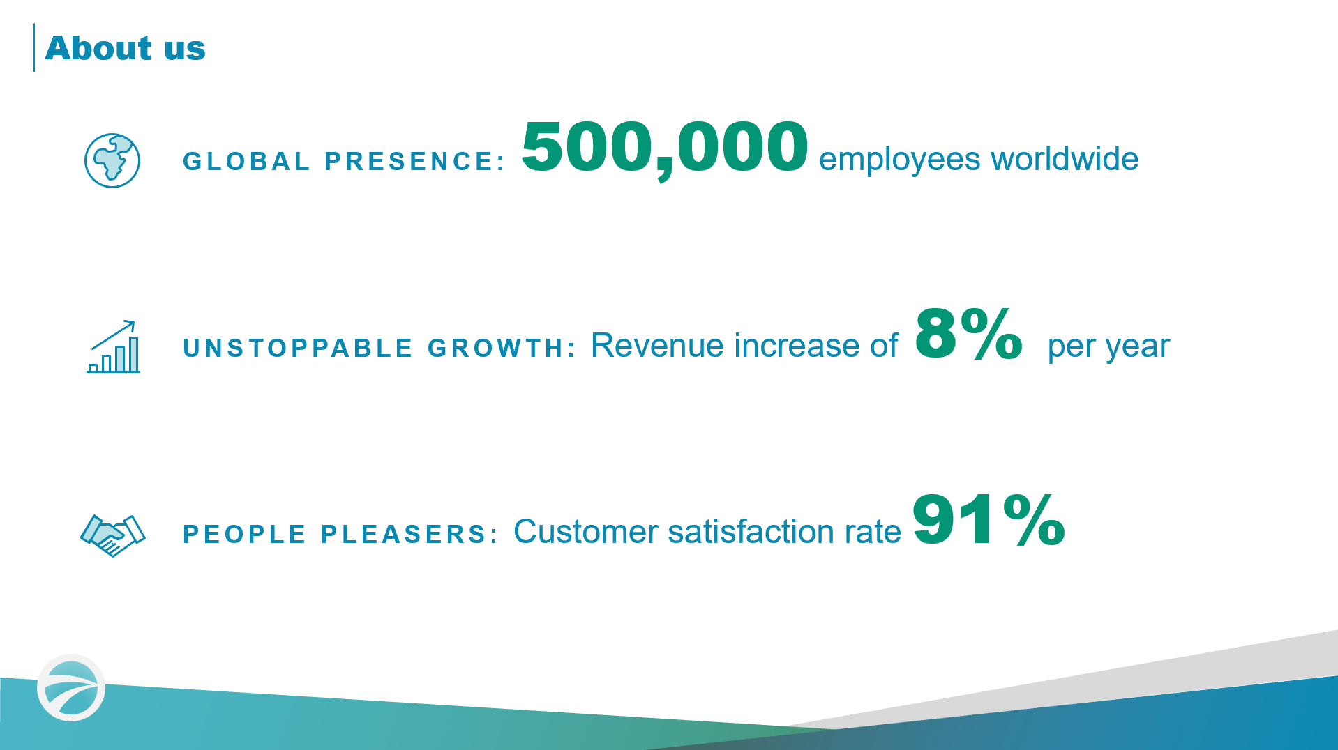
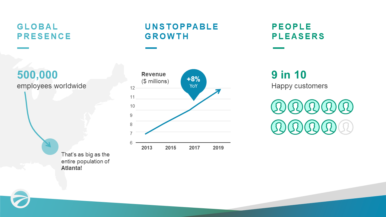
While fascinating to look at, this is not the kind of data visualization that the average person can replicate for use on their own statistics. That said, the information we present in our day-to-day is also in need of an enormous overhaul! You’re sat in a sales pitch, and up pops this familiar slide:
What does that slide actually tell you about the company? Chances are, you can’t imagine what 500,000 employees worldwide looks like. And what about 8% growth year on year? Simply quoting the numbers (and making them really large so they “pop”) isn’t enough to engage an audience. We’ve got to take things further, which is why data visualization is an important skill for anyone presenting information to others.
Data Visualization Level 1: Providing context
Data visualization is all about connecting the dots for your audience. You’re putting in a little more effort to create something visual, so that they don’t have to put in the hard yards to interpret the information themselves.
A great way to do this is to establish context. As humans, we understand new knowledge by categorising it based on things we already know. We like to contextualise new information by comparing it to something our brains have already tried and tested. Let’s imagine you’ve got this fact:
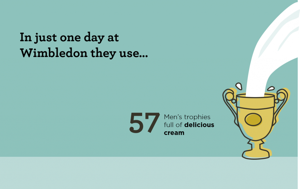
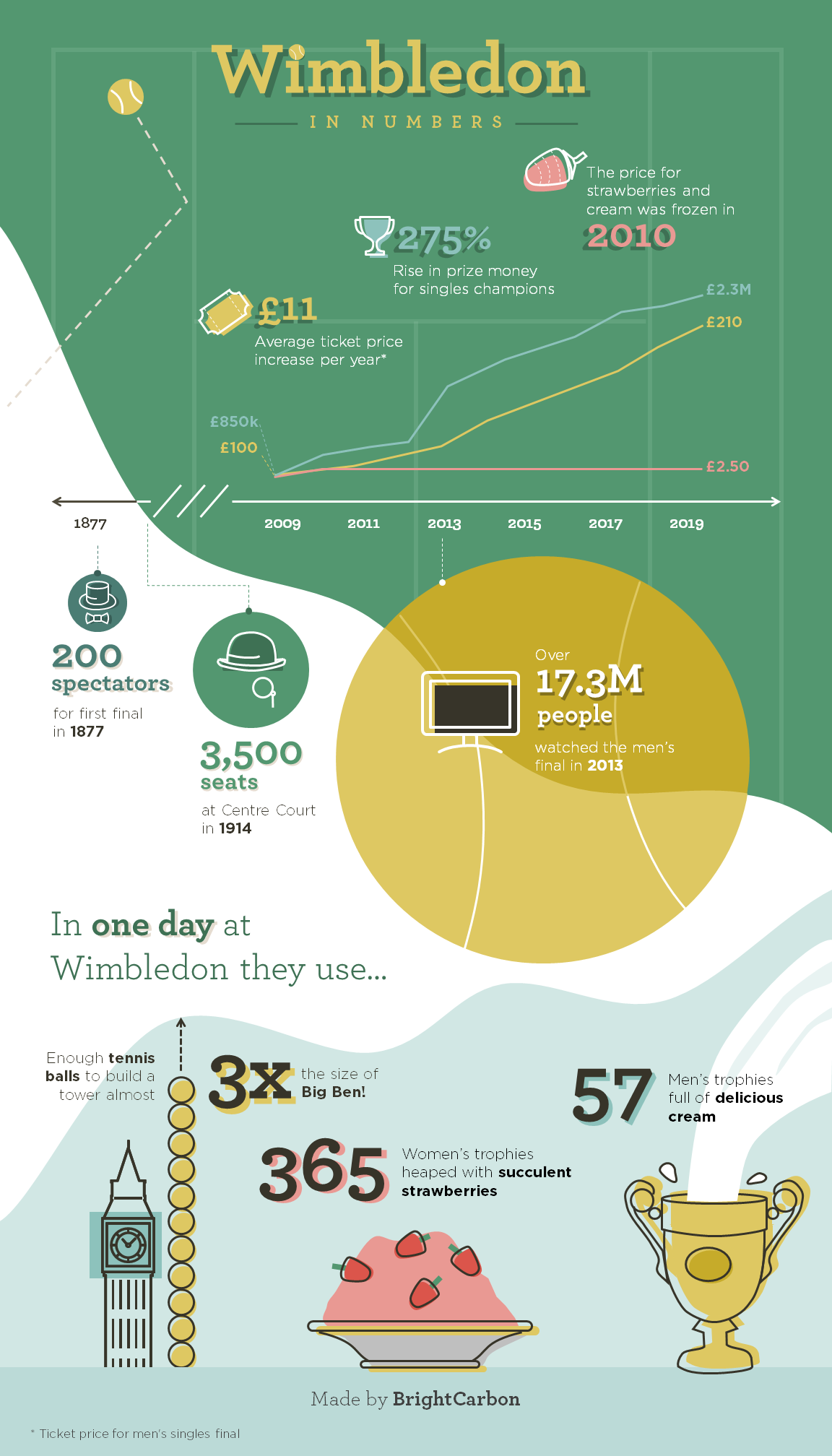
Roughly 7000 litres of cream are consumed every year at Wimbledon.
Your audience will (hopefully) be able to discern that this is a large amount of cream, but that’s probably the limit of what they can ascertain from the raw number. To really demonstrate what 7000 litres looks like, you’ve got to think about something of known size that can be used to demonstrate scale… like the Wimbledon Men’s trophy.
Putting the data into a context that the audience can picture immediately makes the data not only more interesting, but also more accessible. Here, we not only used the Men’s trophy to demonstrate scale, but also further contextualised the number by calculating how many cups full of cream would be consumed per day of the tournament.
Data Visualization Level 2: True data visualization
It’s not really enough to just compare your data to something known, though, because that alone doesn’t tell a story. It doesn’t make much sense to randomly share data halfway through a presentation just for the fun of it – you’ve got to use it to support your narrative.
True data visualization aims to clarify and contextualise information, removing any distracting stats that take away from the core message, and emphasising elements which help to tell the story.
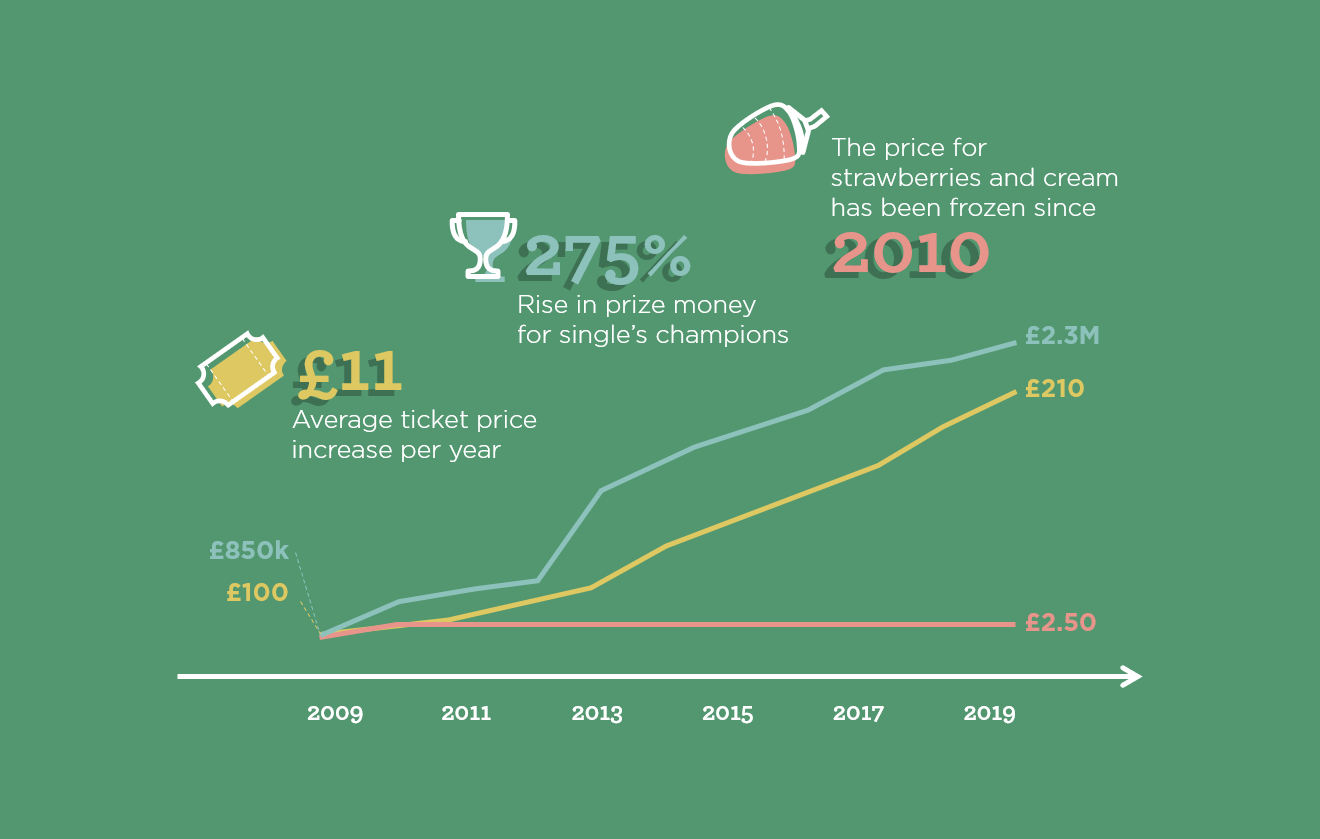
The typical way to present data, in a format that makes storytelling easier, is in a graph or a chart. A graph may seem like a dull way to show information but, when used properly, it’s one of the fastest and simplest ways to convey meaning. The rising popularity of infographics goes to show that people respond well to data shared in this visual way.
Returning to our Wimbledon example, shoving a bunch of tennis-related facts into a document would have read more like a shopping list than a story. We could show the stats about prize money and prices like this:
Date
Prize money
Ticket
Strawberries and cream
2019
£2,350,000
£210
2.50
2018
£2,250,000
£210
2.50
2017
£2,200,000
£190
2.50
2016
£2,000,000
£175
2.50
2015
£1,880,000
£160
2.50
2014
£1,760,000
£148
2.50
2013
£1,600,000
£130
2.50
2012
£1,150,000
£120
2.50
2011
£1,100,000
£110
2.50
2010
£1,000,000
£104
2.50
2009
£850,000
£100
2.25
The table doesn’t exactly scream “Look at this interesting information!” In fact, our audience would have had a hard time understanding what point it is we were trying to make here. We instead used a graph to show the progression of ticket price and prize money, which can be interpreted pretty much at a glance.
Applying these principles to your everyday
Data visualization often seems like it’s reserved for highly-skilled professionals who crunch numbers and create beautiful designs. This isn’t untrue, but we can all apply data visualization principles in the work we do, every day.
Remember our slide from earlier? We can turn this from a slide where you’d roll your eyes and check your phone, into something that says something meaningful about your organisation.
We’ve applied our two principles here and it’s made a huge difference. Our numbers are much more tangible for our audience, and we’re telling a story with the data so that we know that, for instance, 8% of growth is not just a good number, it’s a great number!
And we should take this approach whenever we use data. Always ask yourself these two questions:
Can I visualize the number?
What story is this data telling?
Example of data visualization: Wimbledon infographic
And for all you tennis fans, here is the complete infographic.
Further reading
For all you fans of data visualization, there are some great places to find out more about this fascinating discipline. For starters, Google have a very detailed guide to data visualization. For a step-by-step guide on how to create an infographic, take a look at our blog post. And if you need an infographic but don’t have the time to create one yourself, drop us a message about our services and we’ll be happy to help!
Relationships are everywhere and if you can crack how to show relationships effectively on your slides then you’ll have your audience swiping right instead of left.
As humans we find stories incredibly compelling, but why is that? And how can we make sure we're infusing storytelling in our presentations to keep our audiences engaged and invested? Read on to find out the rest of the story!
We live in a noisy world. Advertisers constantly clamour for our attention and we’re much less likely to engage with something if we have to actively seek it out. The trend is that content is becoming bitesize. So how can we create content that will keep audiences engaged? Here are ten tips.
Thank you so much for conducting our advanced PowerPoint training workshop. We will definitely use BrightCarbon in the future – we really think that we would be hard pressed to find anywhere better!