B2B sales is broken. Buyers don't want to work with sellers, but also don't have confident in their own team's ability to make a successful purchase. Enter the Framemaking approach. Dig into insights from Adamson and Schmidt's 'The Framemaking Sale', and learn what on earth you can do with your pitch deck as a result
Blog 

13th Nov 2026
How on-brand is my PowerPoint Copilot output
- Written by: Hannah Harper
- Categories: Presentation technology, Industry insights
We ran a test recently and discovered that 48% of our 400 survey respondents had a Brand Kit programmed in Copilot, but only 13% of them agreed that Copilot created content that respected their brand. So where’s the disconnect? Why does Copilot create off-brand content?
Much like tshirts, it’s not one size fits all – as each human is unique from the next, so is a brand, an organisation, and the content they typically create. But before you bounce back to your search engine or AI chat hot on the heels of that elusive silver bullet, I’m going to give you something better than a quick fix. I’m going to give you a methodology that will allow you to diagnose the issues you’re having, so you know exactly what you need to work on.
We’ll cover off how to identify issues and mitigate risk in three areas:
Use the links to jump to a key focus area, or start at the beginning with a nice cup of tea.
Getting started
For this you’re going to need at least one Copilot-created slide. Here’s a prompt we like for this test:
Create a slide that differentiates [my organization] from its competitors
Add your Brand Kit (if you have one) and click generate.
If you’re a brand manager or comms leader with an already full to-do list, we’d be happy to run a quick analysis for you. All you need to do is generate a single slide, send it over to us, and we’ll do the rest. Read more here. Lovely.
Checking for brand compliance
The first thing to look for is brand compliance.
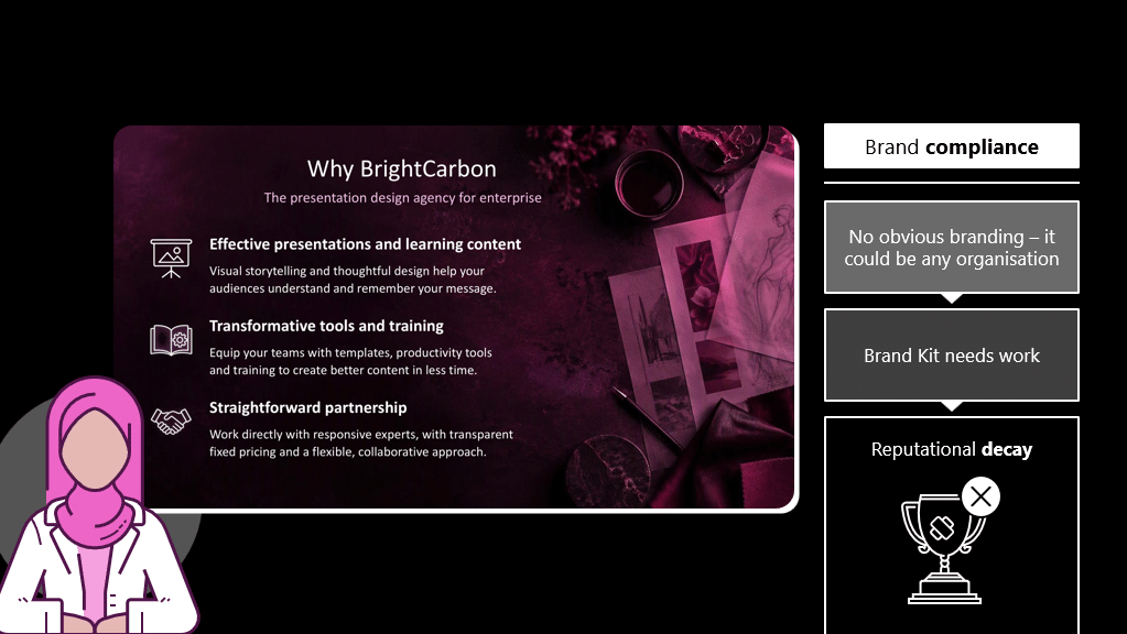
Symptoms: A slide that shows symptoms of poor brand compliance will feel generic – there won’t be any obvious signs of a defined brand. The acid test is to change the colours and remove the logo – if it could be any organisation then the branding just isn’t coming through.
Cause: The root cause of this issue is a missing or weak Brand Kit. If you don’t know what a Brand Kit is, check out chapter two of our white paper on creating on-brand content with Copilot. Let’s dig a little deeper:
- I don’t have a Brand Kit: If you’re an enterprise intending to create content at-scale with Copilot in PowerPoint, a Brand Kit will be vital. A Brand Kit is a Copilot-friendly version of your brand guidelines that provides the patterns Copilot will use to generate your content. Again, all the details are in chapter two of our white paper.
- I have one, but Copilot doesn’t seem to be referencing it: it might be that you need to troubleshoot access in your OAL. Read more about that here. You will also need to teach users to add the Brand Kit (use the @ in the prompt window to open the menu and select your brand).
- I have one, but Copilot doesn’t follow it like I want: Looks like there’s a bit of optimisation needed here. Make sure all areas of your Brand Kit are populated, and then run tests using your typical content to see if there are weak areas (colours, fonts, use of imagery etc.). This should help you further pinpoint what needs work in your Brand Kit.
Risk: If left unchecked this is the kind of thing that starts to slowly rot your brand. PowerPoint is the only content tool that non-professional designers have access to org-wide. Without a keen brand eye, your presentation collateral goes out feeling like it’s not coming from you. Not only does it undermine the hard work put into your brand look and voice, it makes your important messages less impactful.
Checking for visual storytelling
Let’s move onto our next check, which focuses on the visual aspects of the slide.
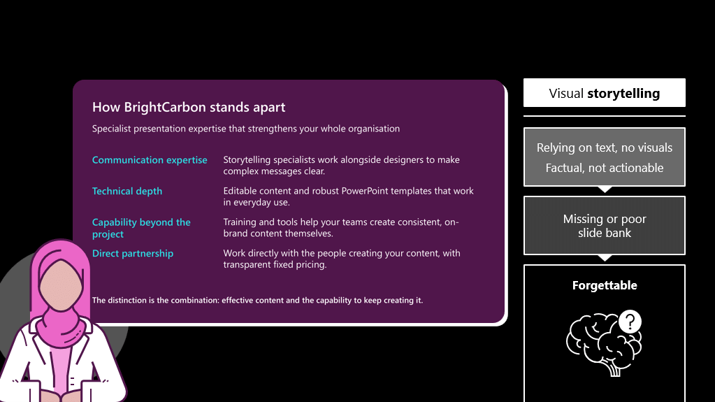
Symptoms: What do we mean by visual aspects of a slide? The best test I can give you is to take your slide and blur it back. If it’s text-driven the objects on the slide won’t tell you anything about the content, if it’s visual you’ll be able to discern meaning, like a process or a comparison. The bottom line is this – if your slide is text-led it’s not relying on visuals to help with the heavy lifting in the story.
Cause: The culprit at the back of text-driven design is a poor slide bank. A slide bank is a full deck of typical slides you use, designed to perfection (on your corporate template), giving Copilot lots of wonderful and creative patterns to follow when it generates net new content for you. Let’s take a closer look:
- I don’t have a slide bank: If you don’t give Copilot anything visual to reference, it won’t create you a visual slide. You have to show it best practice in order to get best practice.
- I have a slide bank, but the content output is inconsistent: There are several potential reasons for this, but one common one is if your slide bank is the greatest hits compilation of your org’s best slides.
Think about if you put the office playlist into AI and asked it to write you a new song. It would be a mix of pop and funk, with a side of rage metal. A mess, quite frankly. And it’s the same for content created by multiple authors. Copilot conscientiously looks for patterns and creates content based on what it can see. Which, depending on what you put in, could be a little… Picasso-y. To fix this, choose all the slides you want in your slide bank, and get them redesigned by one designer. We could make some recommendations if you like.
- I have a slide bank, but my content still isn’t visual: It could also be that your input just isn’t visual enough either. Copilot amplifies the strengths and weaknesses of your content, so if you’re consistently getting text-driven content out, it could be that it’s pulling from a lot of text-driven layouts in your slide bank. Taking some time to overhaul some of those more text-based slides for something more visual would likely yield much better results.
Risk: Here’s the thing. Audiences can’t read and listen at the same time, and research shows that they’ll tune out the presenter in favour of reading the slides. Further research has shown in some instances that it’s better to show up with no slides over text-heavy slides. The bottom line here is that if you step up to the plate with lots of wordy slides, you’ll have to work way, way, harder to keep your audiences engaged, and even harder to make that content stick in their minds after you’ve clicked ‘end meeting’.
Checking for structure and clarity
Our last check is on the structure and clarity of the slides in your sample.
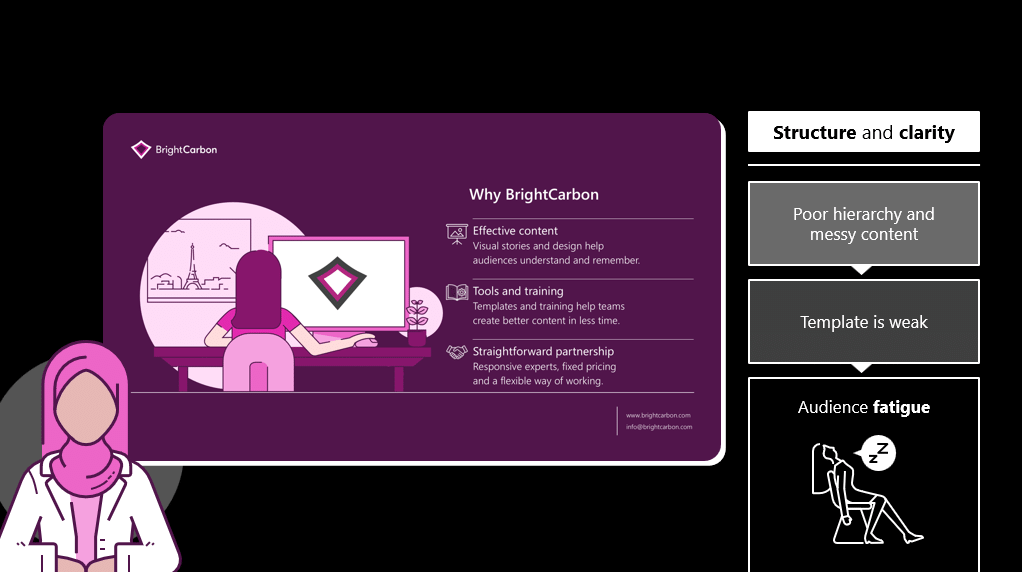
Symptoms: You might see your slide presenting symptoms of poor hierarchy, or more generally, it all looks a bit messy: the kind of slide your mum would take a look at and immediately want to tidy.
Cause: The saboteur of your nice clean slides is likely to be your PowerPoint template. Without robust programming of layouts and other core template components, your Copilot-generated slides won’t have a firm foundation to build on, hence why you tend to get slides that are a bit all-over-the-place.
Templates are also hugely complex beasts – you wouldn’t think when you open it up and it’s just a couple of slides long. We’ve written about what’s needed to optimise your template for PowerPoint in our white paper. It’s in chapter two and it gets deliciously nerdy.
Risk: Humans love to solve puzzles and figure things out. So if you present a messy slide to your audience they’re going to switch off from what you’re saying and try to figure out the problem you’ve just given them. This means your audience focuses on the slide (and not the presenter) and they also use up the cognitive resource you’re hoping they’re going to keep for that juicy call-to-action at the end of your deck.
What happens next?
This brief analysis should allow you to figure out which of the three main component parts of your presentation system needs attention.
We’ve been helping organisations like yours create Copilot-ready presentation systems, and if that sounds like something you would benefit from, you can read more about it here, and book a discovery call here.
For more help troubleshooting Copilot in PowerPoint, you can review our hub where we provide help and support on brand, quality, workflow, and deployment.
Leave a commentRelated articles

02nd Dec 2025
Insights from an accessibility action hero: Stephy Hogan
Accessibility often ends up being an afterthought in content creation, but we’ve been thinking for a long time about how it can become part of your foundation when you’re creating presentations – or any other content – using PowerPoint. We’ve been talking to presentation guru, PowerPoint MVP, and anime fan…

13th Mar 2025
Publisher is dead. Long live PowerPoint!
- Industry insights
- Comments: 20
Microsoft announced that Publisher is leaving us in October 2026. Read on for nostalgic Publisher memories and three great alternatives to explore before the Big Switch Off.

Join the BrightCarbon mailing list for monthly invites and resources
Tell me more!I absolutely love this, thank you so much. I have shared your fabulous resources with many folks. Thanks for all the brilliant work you do!
Michaela Butterworth State of Kansas