Unless you’ve been living in a PowerPoint bubble for the last ten years, chances are you’ll have heard of Prezi. This young upstart made quite a splash when it first appeared, offering a dynamic alternative to PowerPoint’s default static slides. If you’re new to presentation creation, there’s a lot that makes Prezi instantly appealing especially if you’re looking for an alternative to endless rows of dull bullet points. But those of us with a few more presentations under our belts can easily be tempted to dismiss Prezi as a one trick pony, great for the novelty value but not for much else, and definitely not your go-to tool for creating visual presentations. Well, here at BrightCarbon we like a challenge, so we set about exploring whether it is actually possible to make stunning visual presentations in Prezi.
Let’s start by taking a look at what tools we have to work with…
What is Prezi?
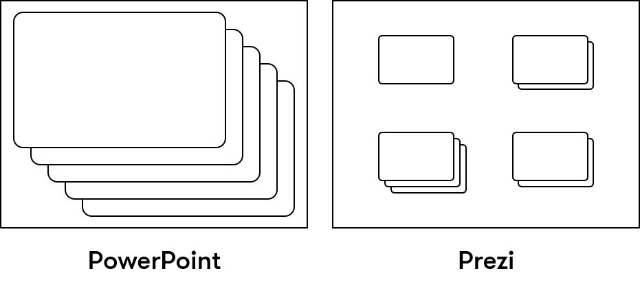
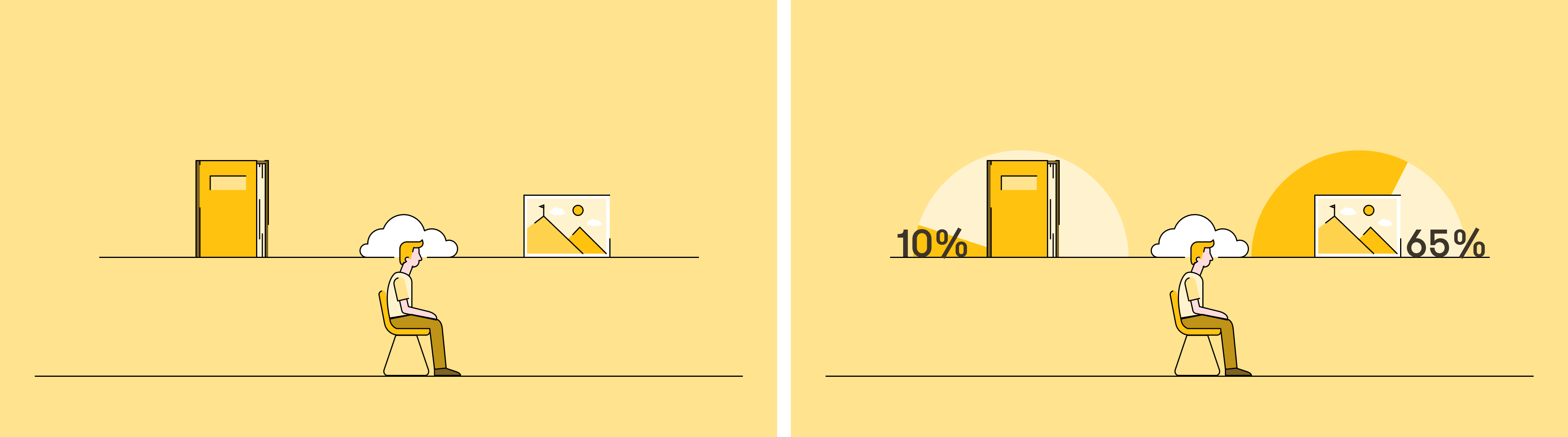
Prezi is a presentation creation tool, but where PowerPoint takes a linear approach to the arrangement of slides, a presentation within Prezi all takes place within one ‘unlimited’ canvas. So in PowerPoint you would have one single stack of slides, in Prezi they are arranged spatially as if scattered in little piles upon a tabletop.
This gives the presenter greater freedom (or perhaps the illusion of greater freedom – see below) to choose the route they take through a presentation by hopping from pile to pile, or slide to slide. The background (Overview in Prezi parlance) is what gives Prezi its visually arresting appearance. This is the ‘home screen’ you return to throughout your presentation meaning it effectively creates a theme for your presentation. What’s more, the spatial arrangement of your slides, and the transitions to reach them, imply relationships and invite analogies that need to be carefully thought out.
A positive spin on this might be to say that a well-designed Prezi presentation encourages a more holistic, themed approach to presenting that would appear to fit in well with the highly visualised storytelling we at BrightCarbon love. But the important thing is to take the time to develop a cohesive storyboard and message from the start.
Transitions and animation
In Prezi, animation – or more broadly, functionality, as the term also covers the space occupied in PowerPoint by transitions – is limited to zoom in/out and fade in/out effects, which poses a challenge if you’re used to PowerPoint’s numerous animation options. It’s not possible to combine these effects, though it is possible to have two or more objects fade in/out at the same time. Otherwise, each click makes one and only one animation happen.
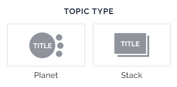
The default set-up for topics within a Prezi is either a series of stacks of slides (or pages) – like piles of playing cards with cards in each pile being turned over one after another until the bottom is reached before moving to the next pile; or a planet-satellite structure, where each sub-topic orbits around its main topic. Further sub-topics can be added to this structure seemingly ad infinitum. Whichever arrangement you choose, each successive topic is reached by zooming in, out and around your presentation.
Of course, the zoom animation lends itself well to the analogy of diving deeper into topics, but the lack of an alternative transition (or any real control of the speed or path of the zoom) means the constant zooming can wear thin, and even lead to complaints of nausea.
A new approach to visual presentations in Prezi
One way around this endless cycle of zooming in and out is to forgo the default structure entirely and to make use of the zoom animation to create frames, which you then position strategically around the main canvas. Using this method, you can effectively add a new animation to your arsenal, a panning motion that eliminates the constant zooming in and out and can be used more like a push transition in PowerPoint.
To create a smooth panning transition in Prezi it’s important to position your frames sufficiently close to each other on the canvas and to maintain a constant frame size. You can still create the illusion of a stack of slides if you wish by creating images that fade in or out over the top of your content.
This method should give you much greater control of how and when viewers experience your content. Another benefit of this approach is that it allows foreground images to pass in front of the ‘camera’ as you pan from slide to slide across the background, and there is an inherent slight parallax motion as the canvas image moves at a slightly different rate to the foreground objects. For more parallax fun, check out this article.
Creating visual presentations in Prezi
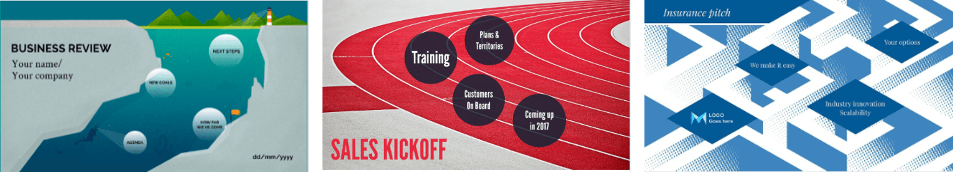
We’ve taken a chunk from one of our BrightCarbon masterclasses that we made in PowerPoint, and we’re going to remake it in Prezi using some of these tips and techniques outlined above.
Panning using Prezi
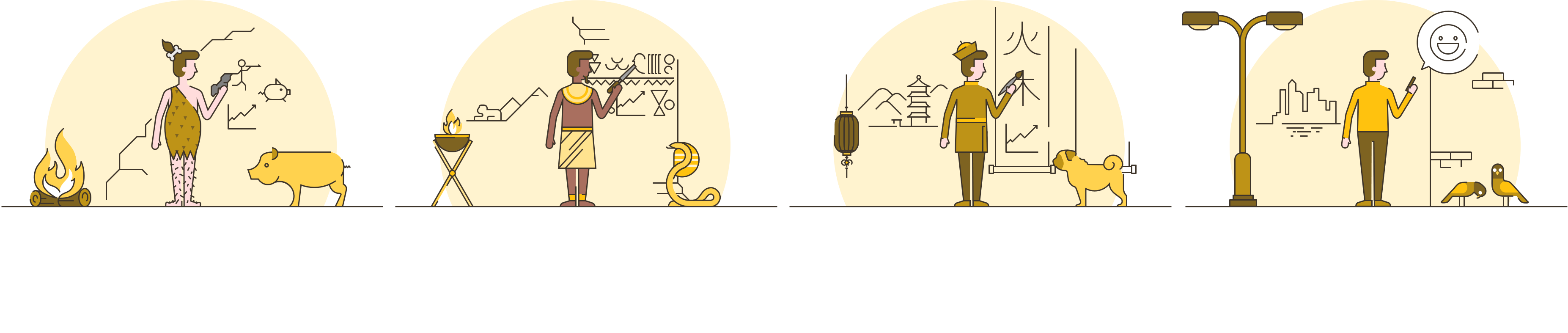
This sequence shows the different methods of visual communication in human history.
A sequence like this works well in PowerPoint because there is a large range of animations at our disposal. In order to prevent this sequence becoming repetitive in Prezi we replaced the individual walls that the characters are writing on with one continuous one that we could then pan across like a timeline, taking advantage of the parallax effect. Successive time periods fade in off screen to avoid spoiling the surprise.
Zooming and rotating in Prezi
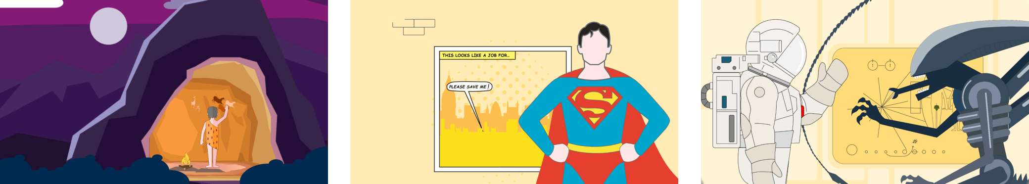
This sequence shows our ability as humans to look for patterns in everyday things.
A sequence like this would struggle to work in Prezi because it involves a complete scene change and continuity is broken. To address this, we looked for a way to continue the story, building upon the elements we’d already introduced. Here we took advantage of Prezi’s ability to zoom in, out and rotate on a much larger canvas.
Adjusting your visuals to account for the available effects in Prezi
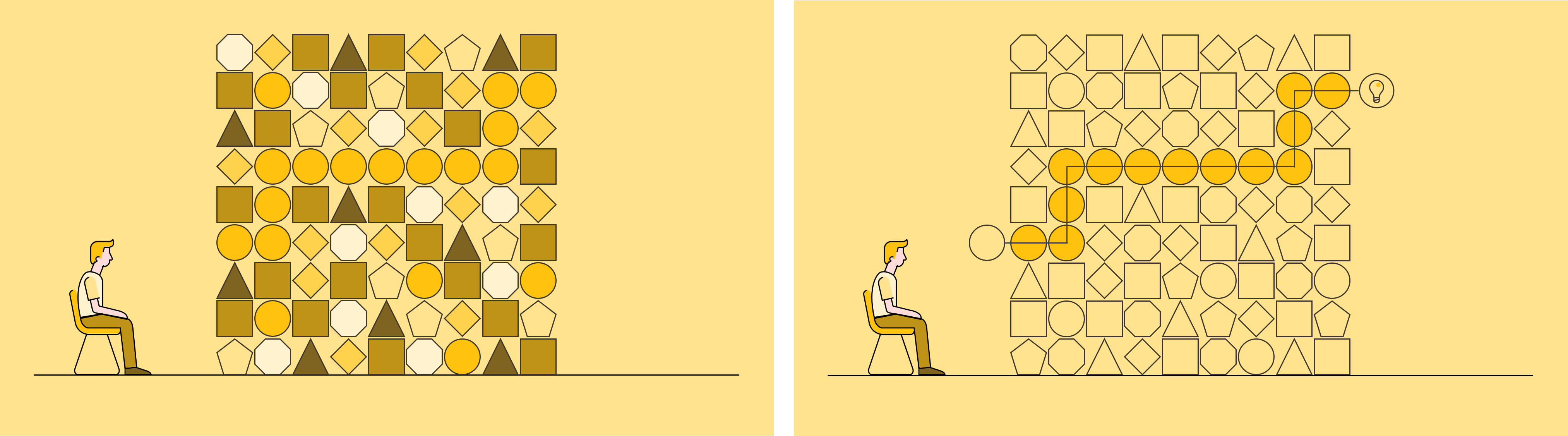
Here we have a sequence that is relatively straightforward to create in PowerPoint: we’re comparing two things, and we’re pacing them using animation to bring up the left-hand side first, and then the right.
Even though our main scene remains constant, it is the variety and sequencing of animations that adds visual interest. This means we needed to adopt a completely different approach for Prezi. We tried to create a context and sequence of images that justified the pan and zoom functions we had at our disposal.
Creating a seamless looping story in Prezi
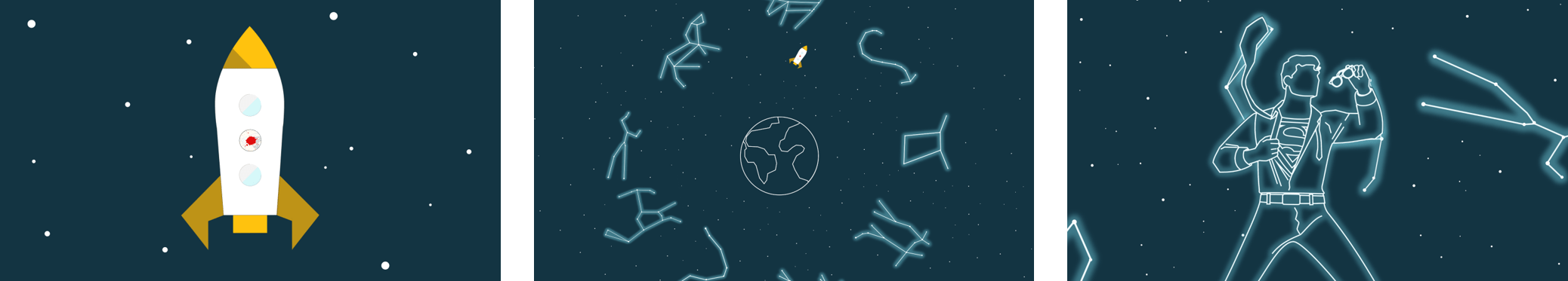
For a final flourish we let loose with Prezi’s zoom capabilities, making it seem as if we’d completed one long (hopefully) seamless loop around our presentation canvas.
Pretty epic right?
Now see it in all its glory here!
Your visual Prezi cheat sheet
So with all that in mind, you now have plenty of tools and tips if you want to make a visual presentation in Prezi that is as epic as ours. If you want the Match of the Day highlights version, we’ve got a couple of lists below that will be your visual Prezi cheat sheet:
Limitations:
The Overview set-up imposes themes and relationship on your presentation whether you want them or not
Only two animations/transitions are possible in Prezi, Zoom and Fade.
Nausea
Suggested approaches:
Treat the presentation as one large canvas
Choose a theme and maintain consistency throughout
Plan ahead to avoid monotonous motion paths or zoom effects
Consider and harness the interpretation that certain transitions imply
Make use of the multidimensional aspect to provide birds eye overviews or zoom in to focus on something in particular
Fading objects in/out of screen enables you to hold off reveals until the appropriate moment
Online presenting can be challenging. With more work and home distractions than ever, all competing for attention, no real-time audience feedback, it basically feels like you're just speaking into the void. But fear not. We’ve pulled together our 5 top tips for keeping your virtual audience engaged, present, and tuned in, so buckle up and turn your presentation nightmare into your presentation dream.
Accessibility often ends up being an afterthought in content creation, but we’ve been thinking for a long time about how it can become part of your foundation when you’re creating presentations – or any other content – using PowerPoint. We’ve been talking to presentation guru, PowerPoint MVP, and anime fan…
The biggest source of event stress comes from this interesting conundrum: the success of the thing you poured your life and soul into for the last few months does not depend on you. It all comes down to your presenters conveying your messages in the right way, with the right amount of energy, and the audience – that you have absolutely no control over – engaging with those messages. Good news. There is a solution: and it’s just one solution to address both challenges. It's all about the science of audience engagement and presenter anxiety, and how the content you present can help both.