
- PowerPoint design
- Comments: 5
February 14th is around the corner, so the BrightCarbon team have crafted three bespoke Valentine's day cards: all built in PowerPoint!

PowerPoint has a wealth of options for graphs and charts. It offers great ways to display your data visually. For example, a stacked column chart is a way of showing a part-to-whole relationship in the data it represents, whilst also indicating total values of each category. However, if you want the data you are sharing to be both easily understood and editable, you need to know how to add different types of labels to your charts.
As PowerPoint leverages the functionality of Excel, if you know how to add labels to an Excel graph, you can do it in PowerPoint and vice versa. Though most people can easily create the chart they need, how to add live total labels remains a mystery for many. Lucky for you, we have a great hack to share!
In PowerPoint and Excel you can add a range of data labels, as well as axis labels, to a chart. These can help your audience easily interpret your data. If you create a stacked column chart in PowerPoint, each segment of the chart will be labelled automatically. To add labels in Excel, click the add Chart Elements icon and select the elements you want to add.

When adding axis labels, you need to consider text size – what size screen will the chart be displayed on, will your audience be able to see the labels clearly? Similarly, you should consider the orientation of your labels; though y-axis labels are vertical by default, horizontal labels are easier to read. To change the orientation of a label right click on the label, select Format Axis Title, then Text Options, then Text Box, then chose the Text Direction.
Now you have axis labels and some data labels, but if you want the totals at the top you have to manually add text boxes and format them by hand. The downside is that when you need to update the data, you have to go back and reformat all of those labels so that they are still aligned properly.

However, if you want to produce something like this where every data point label is live, with a little bit of up-front finagling, there is a way to generate total values automatically using the Combination Chart option.
In PowerPoint, get your stacked column chart and right click to Edit Data. This will open up a spreadsheet with your data in it. Each row is a category, and each column is a subcategory.

You need to create a new column for the totals: name it Total for simplicity. Then, write a short piece of script to generate an automatic sum of the values in that row: =sum(first cell:lastcell). For the first row this looks like: =sum(b2:c2).
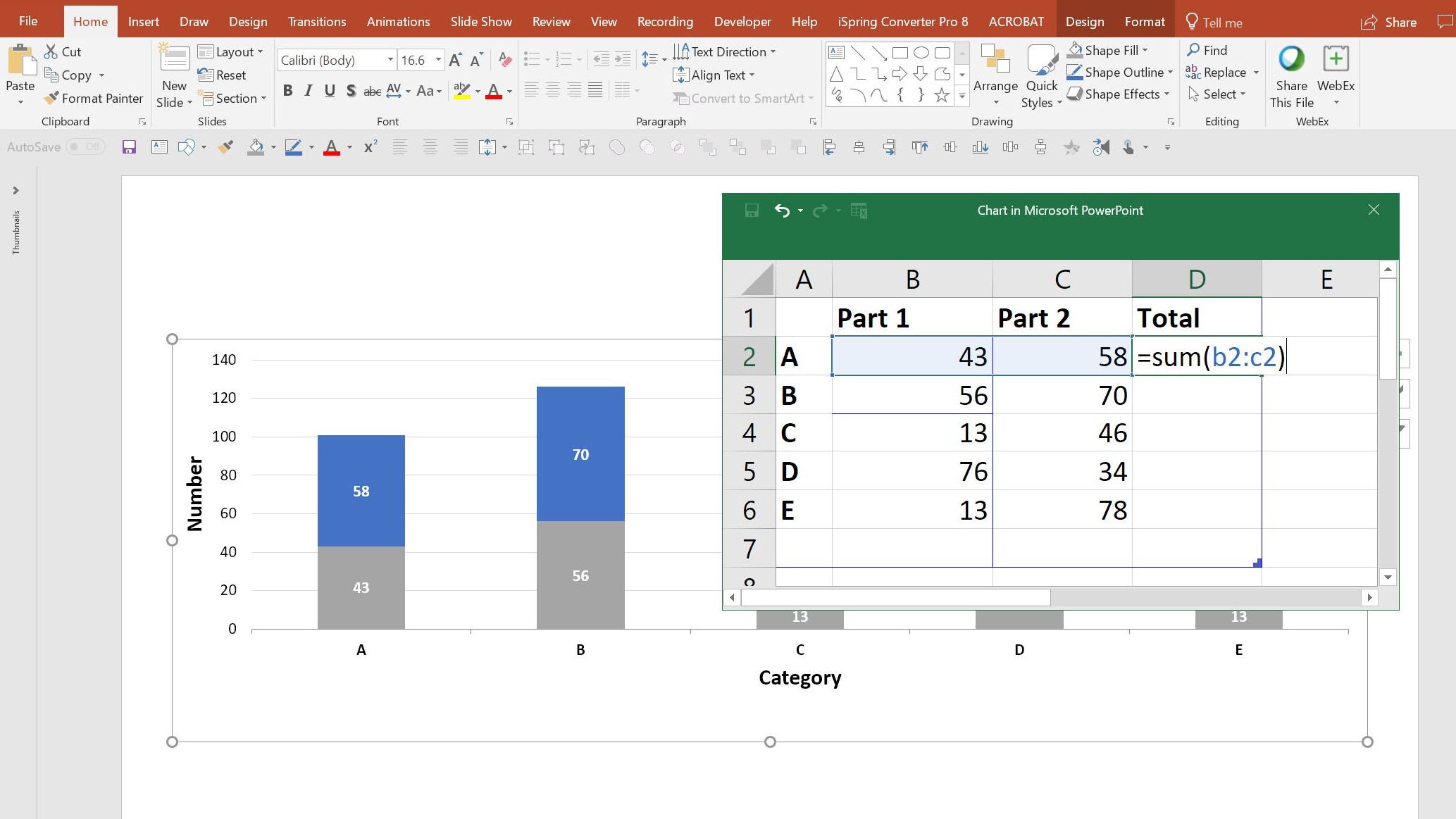
Do the same on each row, then drag the bottom corner of the blue box so that the Total column is included in the data selection, then close the data editor.
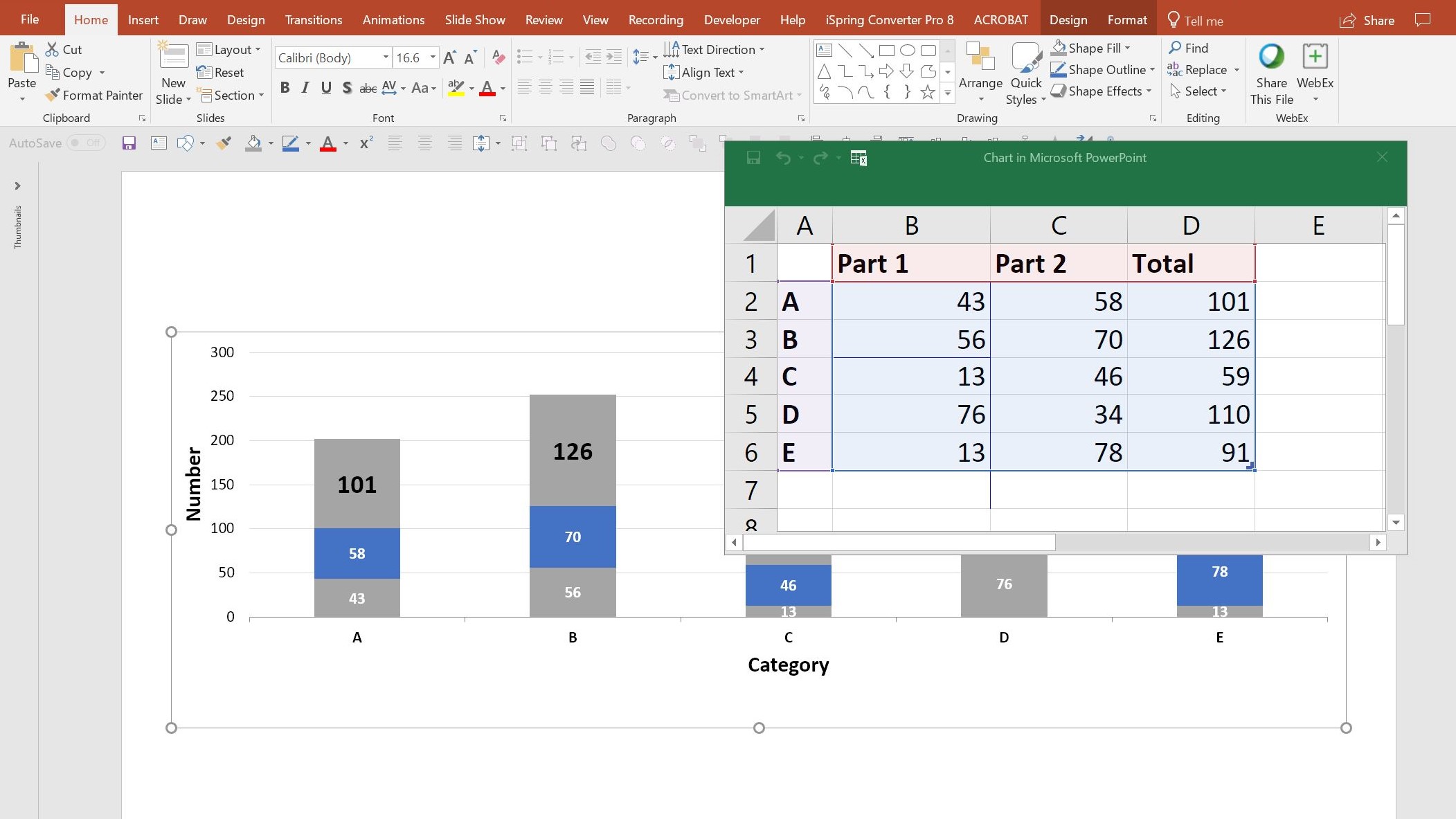
Exit the data editor, or click away from your table in Excel, and right click on your chart again. Select Change Chart Type and select Combo from the very bottom of the list. Change the “Total” series from a Stacked Column to a Line chart. Press OK.
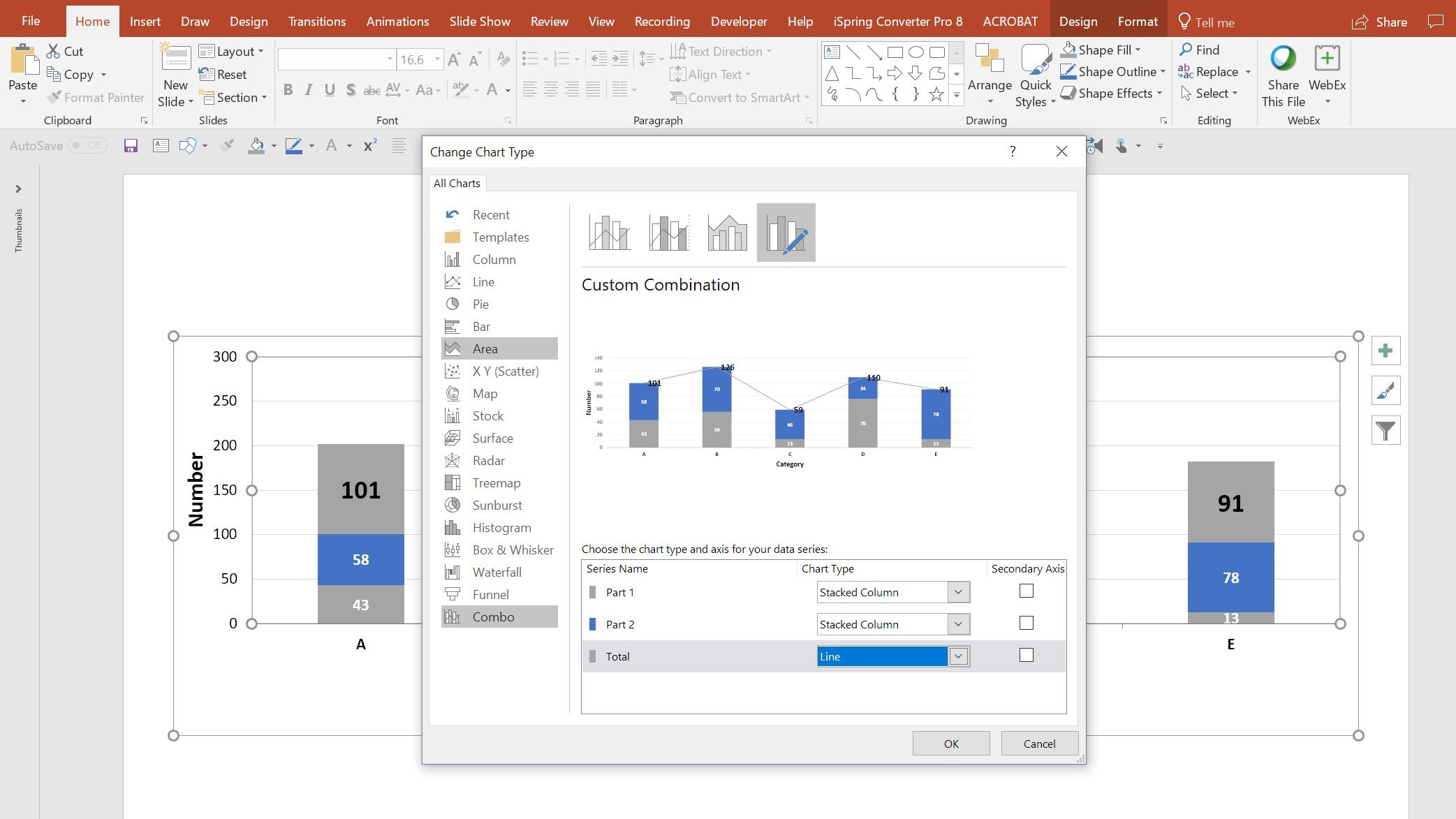
Now all the totals are represented on a line. To make it appear as if these totals are just connected to the top of each column, first select the line and change the colour to No outline. Then select all the total labels and right click to select Format Data Label. Change the label position to Above. You can follow the same steps in both Excel and PowerPoint.

Done and dusted! When you need to update the data in the stacked columns, the total labels will automatically update in both the spreadsheet view and in the live chart view, and automatically move to the correct position. You can use this technique on other chart and graph types, such as a grouped bar chart instead of a stacked column.
Now you know how to add labels in an Excel graph, check out our video resource on PowerPoint graphs and charts and our blog post on how to tell a data story through animation. And keep an eye on our Events page for our regular masterclass on the topic!
Leave a commentFebruary 14th is around the corner, so the BrightCarbon team have crafted three bespoke Valentine's day cards: all built in PowerPoint!
Some presentations require the exact same chart, graphic, or image on multiple slides. A new feature of PowerPoint 2016 is zoom links. With this feature, you can work around the issues of having multiple versions of a graphic throughout a presentation: PowerPoint will do the updating legwork for you! Read on to find how to make the most of this new feature.
I often find myself thinking about PowerPoint, and there's nothing I like more than finding out about a feature that helps me improve my PowerPoint productivity, or helps me to make something really cool. I've had a quick nosey around the Office Store and I've found three pretty nifty PowerPoint plug-ins that claim to do just that: Shutterstock Images, Mentimeter, and Symbols and Characters. I’ve given them a test drive so you don’t have to! Let the testing begin!
Join the BrightCarbon mailing list for monthly invites and resources
Tell me more!All of the content I've seen so far has been valuable and definitely worthwhile. The resources are awesome, and you're really crushing it with useful content.
Theresa Schuck Thorp Olympic Steel


Very clever, thank you so much
i cant follow im sorry do have a ready file of this that i can download and edit the data only
Hi! I love this approach, but using it in the most recent PowerPoint 365 on a Mac, I don’t have enough options in Combination graph. My first three data columns are shows as grouped columns, and the other three data columns are shown as lines. I tried adding extra blank columns to make only the totals a line, which worked, but it still won’t stack my columns.
Do you know if your trick still works on PowerPoint in Windows? Or does it need Excel these days?