It’s estimated that approximately one billion people in the world have a disability. That’s around a seventh of the world’s population. That disability could be visual, hearing, motor (affecting fine movement) or cognitive (affecting memory and thinking). Though research has been done on how physical disabilities can affect presentation audiences and how you can support your audience with physical disabilities, we talk a lot less about designing for psychological disorders. But, to design more inclusive presentations, we need to make sure we’re designing for neurodiversity too.
What is neurodiversity?
The term neurodiversity was coined by Judy Singer, an Australian sociologist, in the 1990s. She wrote: “Neurodiversity refers to the virtually infinite neuro-cognitive variability within Earth’s human population. It points to the fact that every human has a unique nervous system with a unique combination of abilities and needs.” Reading this definition, it’s clear that designing for cognitive disabilities is a little more complex than designing for physical disabilities. To start with, cognitive disabilities can be much harder to define. So for the purpose of this article, what do we mean when we refer to cognitive disabilities? We’re using the term to refer to a very broad range of conditions including autism, dementia, and persistent mental illness. These can affect a large proportion of your audience. Let’s take a look at a few examples:
Dyslexia affects about 10% of the global population. It can affect reading and writing skills, and the ability to process and remember information seen and heard.
Dyscalculia isestimated to affect between 3% and 6% of the population. You can think of it as the mathematical equivalent of dyslexia. Like dyslexia, this condition is not related to IQ but people can benefit from things like rounding up numbersand providing context for numbers instead of just showing tables of data.
ADHD or Attention deficit hyperactivity disorder is marked by an ongoing pattern of inattention and/or hyperactivity-impulsivity, and can affect things like concentration and focus. Though global figures vary, about 4.4% of adults in the US are diagnosed with ADHD. This number has been increasing as more people are diagnosed.
Autism It’s estimated that between 1% and 3% of people have autism. Like many cognitive disabilities, autism affects people differently but in general it can affect how some people understand abstract concepts and can make it more likely they will interpret words or phrases literally. Some people on the autistic spectrum can also be highly sensitive to things like bright light, high contrast colours and background noise, finding them very distracting.
Considering those with temporary or situational limitations
Designing for cognitive disabilities is likely to also help those in your audience with temporary or situational limitations. For example, removing unnecessary distractions and making your presentation clear and easy to understand can help people suffering from conditions such as anxiety and depression, or those who may be tired or stressed. This is an example of something called the curb cut effect – when designing for the needs of one group can allow everyone to participate fully. When you drop a pavement curb for wheelchair users, you make life easier for cyclists, the elderly, people with prams, people with suitcases etc. So, let’s lower that curb by improving our presentation slide design.
Cut down text
The first thing you should do before even thinking about designing your slides is cut down text and remove unnecessary visual clutter. It’s an age-old truth that slides jam-packed with too much text and information force your audience to skim read the text on the slide and ignore you. When people read, they are effectively speaking out the text to themselves internally. At the same time, the presenter is talking, explaining the bullet points or contextualising the information. The audience is trying to listen to two voices at once and, unsurprisingly, they can’t. They’ll listen to one and not the other, or try to listen to both, and not take in anything from either.
By replacing text-based slides with visuals, you’re encouraging the audience to process the information in two separate centres in the brain. If the visuals and narration are complimentary, you’re able to strengthen the audience’s understanding of the message, increasing the likelihood that they’ll be able to effectively recall it at a later date. Although you want to avoid reading bullets off a slide, to make sure your presentation is as accessible as possible you you will need provide a text equivalent such as closed captions to make sure those with hearing impairments aren’t excluded. And to ensure your presentation is still accessible to people with visual impairments, verbally describe any meaningful visuals shown on the screen – like graphs and charts. Check out our 7 steps towards presenting inclusively post to learn more.
Use design principles to improve readability and highlight key infomation
Whilst you should aim to minimise text on slides, there’s often some text left standing. And, as PowerPoint is so flexible, people often use the program to create interactive documents or supplementary material for their presentations. This is where we can use some key design principles such as hierarchy and text formatting to make the information easier to digest.
Whitespace
Whitespace doesn’t necessarily have to contain a lot of erm…white space. Another term designers use is ‘negative space’. Leaving a good amount of space around slide elements, and using proximity to visually group elements together, helps break up content and can significantly reduce the cognitive load of the audience.
Start by adding margins and gutters to your slides to give your content breathing room rather than filling every last pixel with content. Then consider how the balance of text, images, and empty space impacts the overall flow of your slide.
You can also increase line spacing in paragraphs to give text more breathing room, which can improve readability, especially for some dyslexic people. Thoughtful use of whitespace not only enhances readability but also helps your key messages stand out, making your presentation clearer and more engaging.
When designing presentations, it can be easy to get carried away by all the cool design tricks you learnt from BrightCarbon masterclasses. However, it is critical to keep in mind how your audience might absorb the information onscreen before you open up the animation panel. This is where it is essential to understand visual hierarchy.
Help your audience by showing them where they should begin on the slide. Western audiences will instinctively look at content in the top left first and move top to bottom, left to right. So, lay out your slide so it works intuitively with this reading order. If you have a more complex story to tell, using colour, bolding, or contrast can change the audience’s initial focus and could help the story flow more naturally.
Despite our instinct to start looking at a slide from the top left, bigger = more important. A viewer’s eye is likely to be drawn to bigger elements on a slide first. This can give you the freedom to arrange elements away from a traditional ‘title-top-left’ layout but it can also work against you if you don’t consider slide hierarchy carefully. For example, if a graph title is bigger than the key slide takeaway, the audience may be confused about what information is important.
Text formatting
Formatting text appropriately can also help your audience understand what they need to read first, and the importance of the words on the slide. Avoid confusion by simplifying the style, creating a sense of hierarchy, and cutting back on the effects you use. Make sure any effects you add – like color and bolding – are meaningful. Here are a few tips:
Choose a single font and size to use consistently
Remove any decorative bold type by selecting the bold tab
Apply a consistent style and colour to text boxes
Finally, try breaking up blocks of text into small chunks and use shorter line lengths rather than running sentences across the whole slide. Shorter line lengths are easier to read, and help those with visual impairments using screen magnifiers.
Pick more accessible fonts
To improve legibility, avoid using overly decorative or stylised fonts like display fonts or script fonts. You could get away using these fonts sparingly for large, short titles or decorative elements, but never use them for body text.
Unfortunately when it comes to choosing standard fonts for your slide copy – there’s a lot of conflicting guidance. The truth is, there is no best typeface to suit everybody’s needs – lots of typography and accessibility experts disagree on which exact typefaces provide the best readability. However, in general, you should aim for fonts that have clearly distinguishable letters. Let’s take these two popular examples. Here we have Times New Roman, a serif font, and Arial, a sans serif font.
Serifs are little strokes attacked to the end of letter forms, like you can see in Times New Roman. One of the benefits of serifs is that they can help make letters more distinct. So, serif fonts can help people reading smaller font sizes, especially in printed documents. If we look at letters such as p and q, and b and d in in Times New Roman, they are unique.
If we look at the same combination of letters in Arial, they letters look the same as each other but reflected. This can cause confusion for some people, such as those with dyslexia. However, interestingly, many researchers have found that sans-serif fonts can be beneficial for people with dyslexia, as well as some visual impairments. This is likely due to the fact sans serif fonts are cleaner and appear less crowded on the page. The other benefit to sans serif fonts is they typically render better than serif fonts on digital screens with lower resolutions.
So, when you’re creating your presentation, consider the environment your audience may be in. It’s very unlikely they’ll be using new high end retina screens at home, and the same goes for projectors and conference room screens.
All this typography stuff can get a bit confusing! But as a general rule, picking any commonly used sans serif font is most likely be the best for most people. There are also many accessible fonts built into PowerPoint, including the new Aptos font which is becoming the new default font in PowerPoint for Windows. Use Google Slides? Check out our favorite Google fonts too.
If you’re feeling a bit lost picking a font, remember that font size and formatting can have a much bigger effect on readability than the font itself. Here are a few “don’ts”:
Don’t use all caps. Capital letters are much less distinct from each-other. than lowercase letters.
Use bold instead of italics to highlight text.
Avoid using narrow character and narrow line spacing or condensed fonts as it makes the text more cluttered and difficult to read.
Be careful using light and thin font weights as they can be more difficult to see. Using regular or semi-bold font weights can improve the contrast and readability of your text, especially at smaller sizes.
We’ve written elsewhere on our blog about how increasing contrast can help people with visual impairments, but with different disabilities come different needs that can be conflicting. For example, people on the autistic spectrum can be sensitive to bright contrasting colours and very high contrast text, like pure black on white. High contrast text can also make words distort on the page for people with dyslexia. However, higher contrast can make visuals easier to see for people with colour blindness. So how can you find a balance that works?
Firstly, try using slightly lower contrast colour combinations that still meet accessibility standards. For example, using a dark grey on white instead of black softens the contrast slightly and can make it more comfortable to read. You could also try using a subtle background colour, like a very light blue or grey, instead of pure white.
You’ll also need to consider the environment you’re presenting in. If you’re presenting in a dark room with a very bright screen or projector, having a light coloured background could be very intense for everyone. In these scenarios, use a dark background theme.
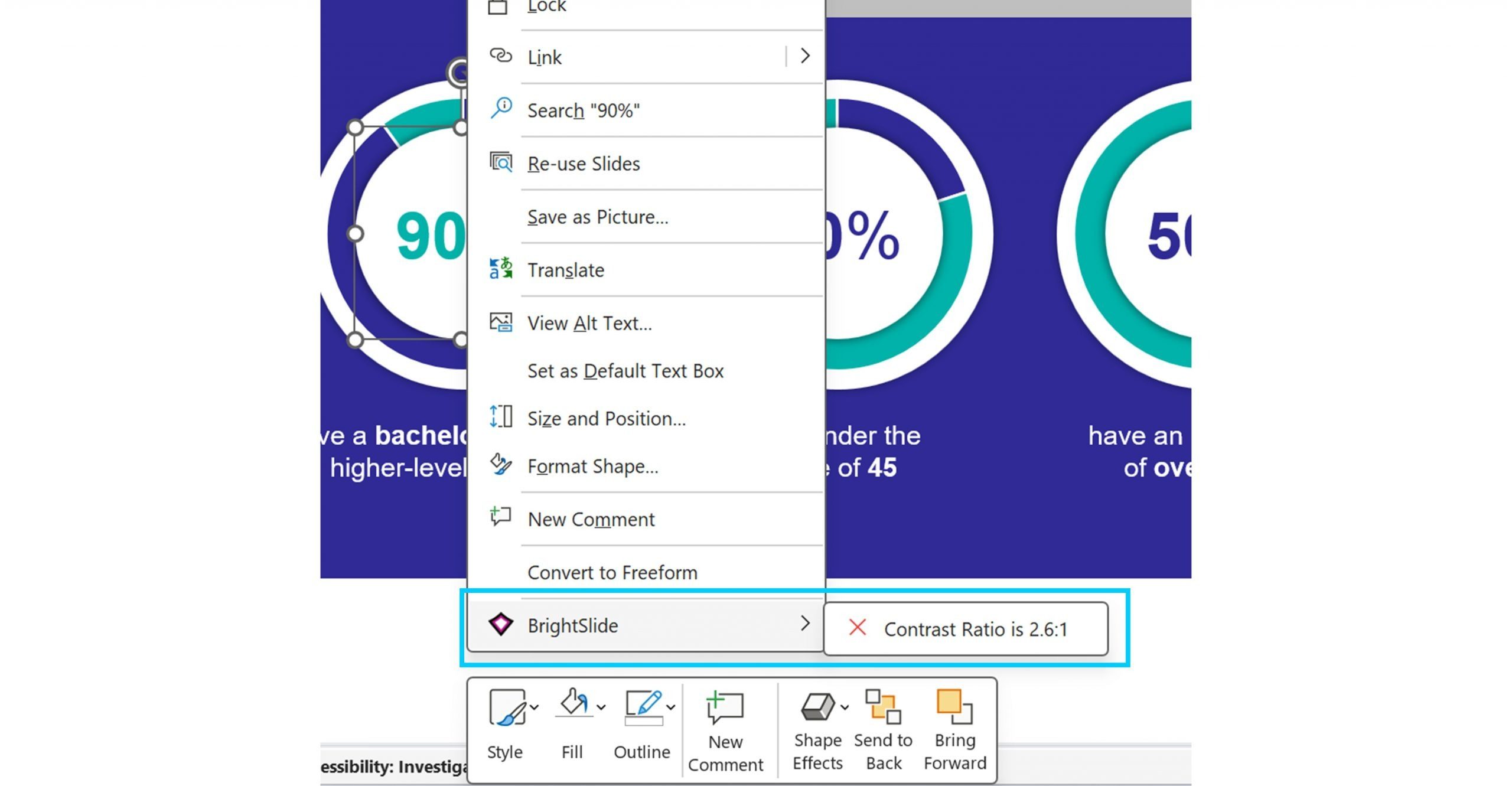
How to test for colour contrast levels
If you’re not sure if the content you’re creating is compliant when it comes to colour contrast download our free PowerPoint add-in BrightSlide. With BrightSlide installed, you can right-click on any text box in PowerPoint that has a background fill and it will tell you the colour contrast ratio, along with a handy indicator of whether it passes or fails the WCAG guidelines.
Focus audience attention and avoid distractions
You can use animation to draw your audience’s attention to important information as you present. By animating content and bringing information onto the slide with individual clicks you make sure that the audience doesn’t read ahead and instead stays focused on you as the presenter.
If you are going to use animation, make sure it’s purposeful and not an unnecessary distraction. For example, GIFs or repeating animations can be a great way to bring visuals to life or demonstrate something, but if you’re considering using these types of animation ask yourself: Are these animations adding to the story? Are they purely decorative? Are they unnecessary and distracting?
With repeating animations consider how long the animation is playing for. Perhaps they could animate for a certain amount of time then become static on a click as the presenter moves on to the next point. You should also consider the speed of your animations. If they are too fast or too subtle, the audience could miss it entirely, especially if they have a slow internet connection. Make sure your visuals still tell the story when static after the animation has finished playing.
And finally, avoid fast flashing animations and videos. Anything flashing more than 3 times a second can trigger seizures, so make sure to review any videos you’re using. You can find sites like this one which will review videos to determine if they contain any flashing that could trigger seizures.
If you found this article interesting, you may like our blog post on presenting inclusively.
Designing content to be accessible doesn't have to mean you compromise on vibrant design, or your brand guidelines. In this article you'll learn more about colour contrast and how you can preserve colour vibrancy without having to sidestep WCAG accessibility guidelines.
More accessible presentation slides can be the difference between your audience fully engaging with your content and your audience tuning out and missing out. And, if your audience miss out you miss out!
One of the most common mistakes, we see when it comes to accessibility in presentations is poor color contrast. When there isn’t enough contrast between the colors on your slides, your presentation becomes less accessible to a whole range of people. Luckily, while this is a common error, with BrightSlide's new color contrast checker, it's also a very simple thing to fix.
We have worked with BrightCarbon for over 5 years, across a number of healthcare divisions, where they have been a very important part of our bid programme, supporting numerous awards of new contracts.