You may have missed that, back in June 2021, Google Fonts released 60 new fonts that can be used in Slides, ready and waiting for you to add to your next presentation! You may be overwhelmed by the choice – graphic display fonts, sleek sans-serif fonts, and intriguing condensed fonts – which do you pick? Let us save you some time by showing you our new favourites.
Want to learn more about how to choose the right font for your presentation? Continue reading! If you’d prefer to skip ahead to our breakdown of the best new Google fonts, click here.
Choosing fonts in Google Slides
Text forms a core part of most presentations, so why shouldn’t your chosen font be as fabulous as the rest of your deck? While most people don’t analyse fonts with the precision or the tension of those in the American Psycho business card scene, and neither do we (we like to keep it more light-hearted), a great font can contribute to the overall appeal of your slides and shouldn’t be an afterthought.
Thinking about balance
When choosing a font, balance is key. Your font should complement the content and visuals in your presentation, not overshadow them. Don’t worry, this doesn’t mean you have to shy away from bold fonts, or stick to one classic font all the time.
Legibility
Of course, your slides should be legible and easy to understand. They hold information that you want your audience to read and take in effortlessly. If the content’s complex, you want to pick a font that’s super legible. You can’t adjust kerning (the gaps between individual letters) in Slides, so you need to choose a font with a decent amount of space between each glyph. If they’re too close, it’s hard on the eyes. If they’re too far apart then it’s hard to distinguish individual words from each other. You should also make sure the actual shapes in the font aren’t too wild, making them hard to read.
Personality
A legible font doesn’t have to be dull. Every font has its own character. Fonts are a major part of creating the right tone of voice, so they should line up with the personality of your presentation. If you want to create a fun presentation then, depending on the content, a slab sans serif, minimalist, or retro-inspired font could work. If your presentation topic is more serious, then a classic serif could be the way to go.
We’ve already given our verdict on 10 of the best original fonts in Google Slides, you can read that here. And if you need help adding and formatting fonts in Google Slides, check out the text and fonts section in our Ultimate Guide to Slides, otherwise keep reading to see our favourite new fonts in Google Slides.
Google Slides Fonts
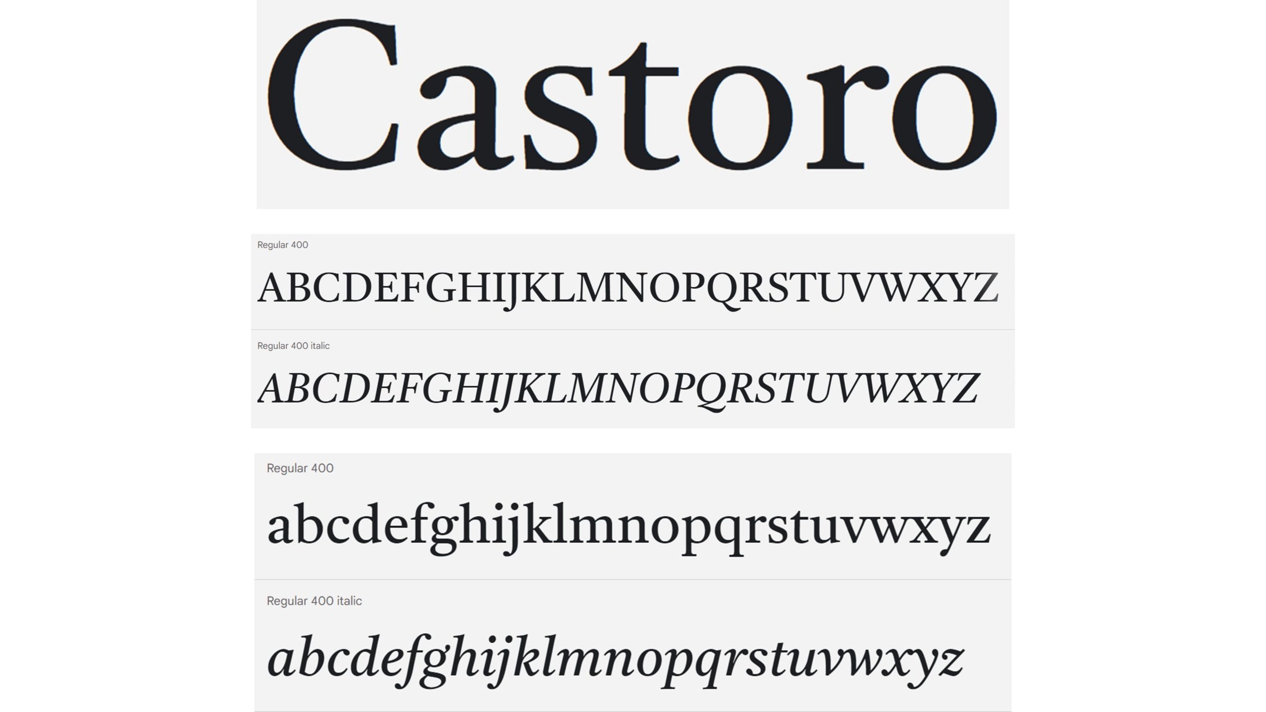
Castoro
Castoro is a serif font that works well for body text in presentations. If you’re looking for an alternative to Times New Roman but still want to appear professional, this could be the one for you. In this version, the font features diacritics and extra characters for many European languages. The starts and ends of characters in upper- and lower-case end with both sharp and softly rounded points, giving the impression of balance.
John Hudson designed the Roman type and the italic with Paul Hanslow, helped by Kaja Słojewska.
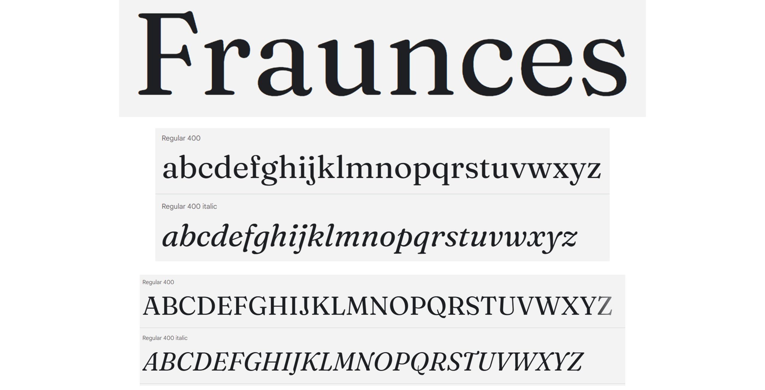
Fraunces
Fraunces is a serif, “Old Style” font, inspired by 20th century typefaces like the Cooper Series. It has a variable letter stroke width, more irregular than some other serif choices, which can make it a quirky choice if you want to stand out while retaining the professionalism of serif fonts. We particularly like Fraunces in upper-case italics. It works great for elegant titles, but the variable thickness and hook-like shapes can be distracting in body text. You might want to pair this font with a clean, neat sans serif like Roboto. Fraunces was designed by Phaedra Charles and Flavia Zimbardi.
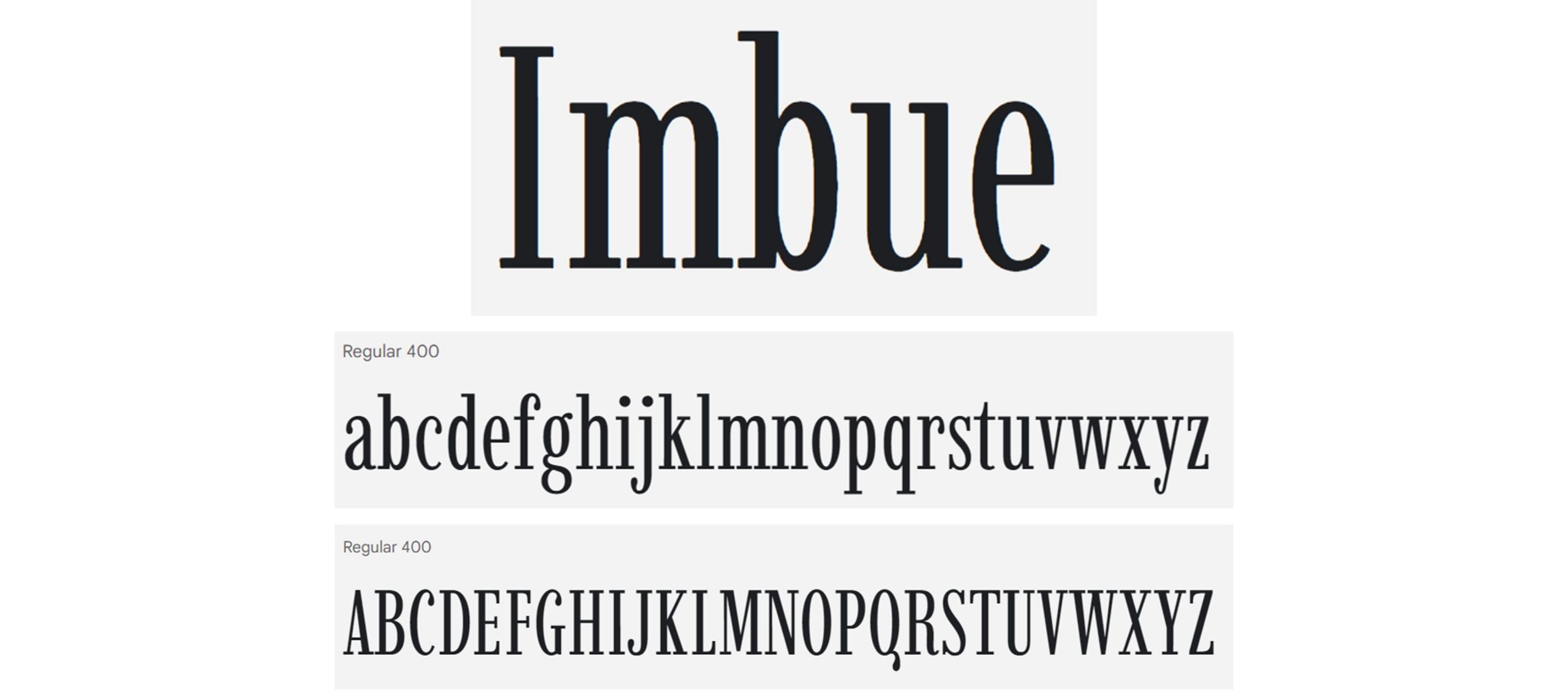
Imbue
Imbue is a condensed didone font (a genre of serif typefaces characterised by narrow characters and contrast of thick and thin lines). It’s not ideal for body text because its narrow x height makes it harder on the eyes but it makes for great titles. It’s didone characterisation takes this font back to the lineage of classical and artful treatises of the 18th century, while the thinner and irregular spacing between letters updates the genre. If you want an impactful serif font which balances professionalism and boldness, this could be a good choice for you. A lovely pairing would be with Helvetica, a classic sans serif font. Imbue was designed by Tyler Finck.
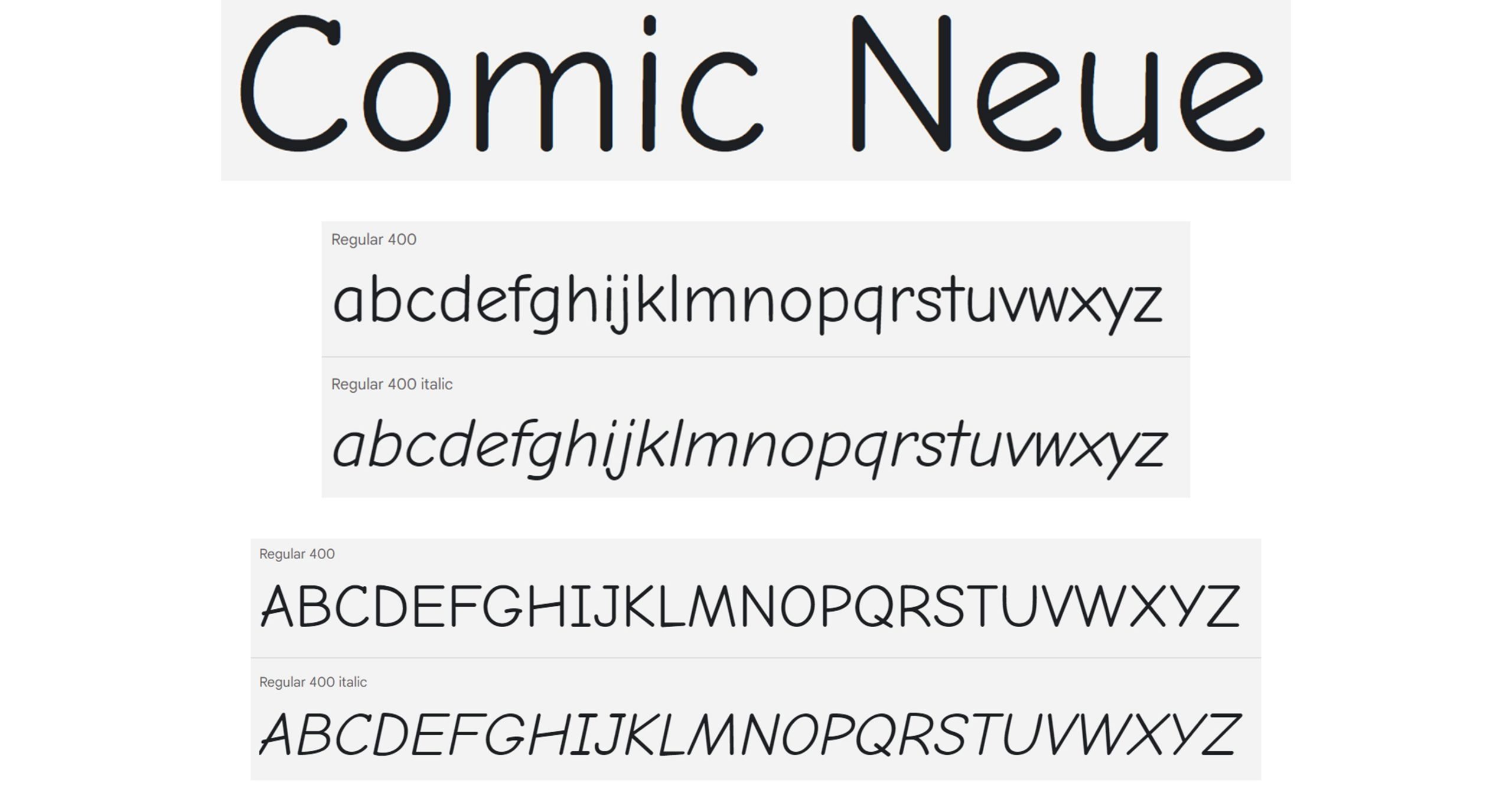
Comic Neue
Buckle your seatbelts for this exciting addition to Slides! Comic Neue is the reimagined successor to the much debated Comic Sans. This reinterpretation makes the Comic Sans we know and love to hate more regularly spaced and sleek while retaining its unique character. The project owners wanted Comic Neue to be a more refined version of the contentious Comic Sans. We think they’ve succeeded with this casual font that’s perfect for internal docs and presentations where legibility is key. This project was started by Craig Rozynski.
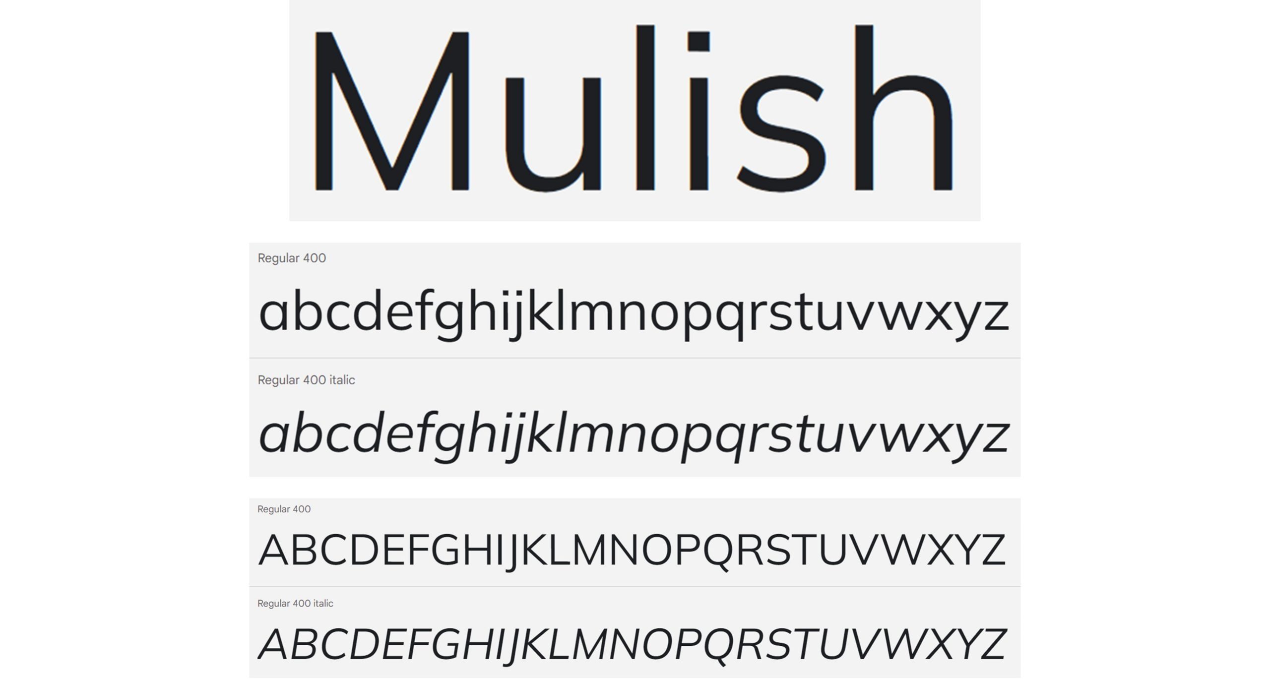
Mulish
Mulish is a clean and minimalist sans serif font. Mulish was designed for both display and text typography. Its simplicity means it would complement a bolder, or more stylised, font well (check out Oi or Rowdies below for your titles!). However, it’s also great alone! Pairing an all-caps title with sentence-case body text work well in presentations with a contemporary style. Designed by Vernon Adams initially, this font was updated by Jacques Le Bailly and Allison Le Bailly after Adams’ passing in 2017.
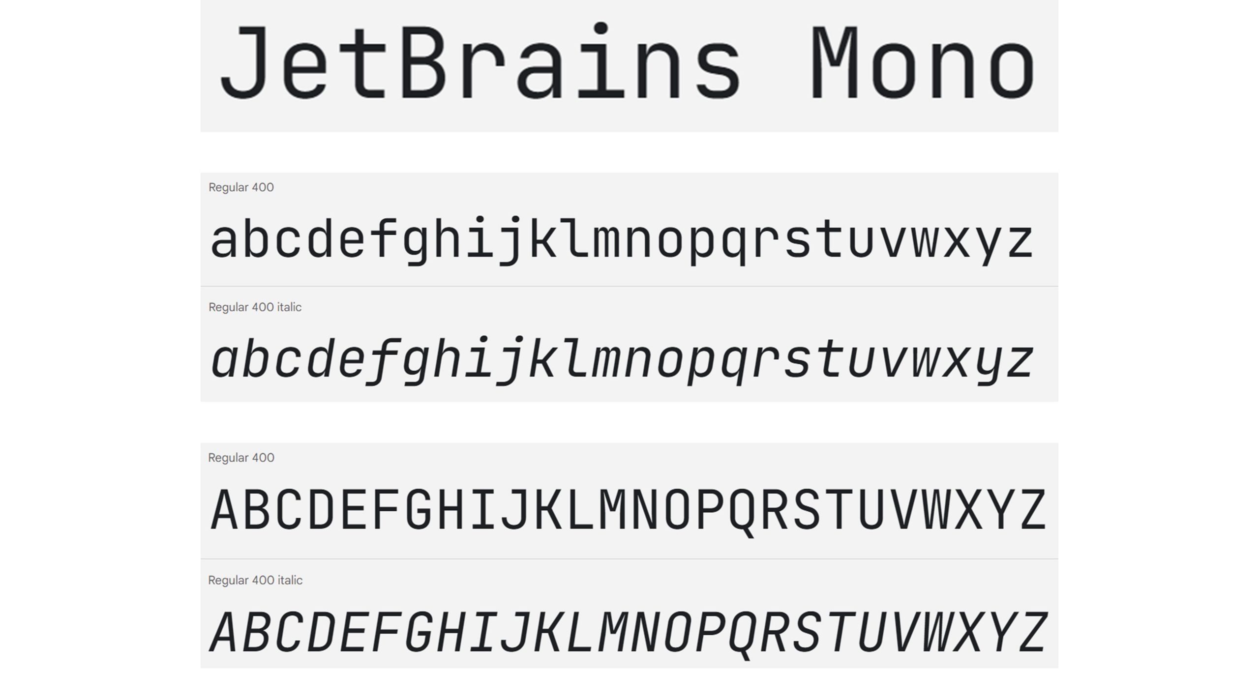
JetBrains Mono
JetBrains Mono is a unique sans serif font for a simple reason — it’s designed for developers. Maximised height for lowercase characters with standard width (hence ‘Mono’) allows code lines to be an expected length. Plus, the rectangular oval shapes of the characters ensures readers can read text easily. Its readability makes JetBrains Mono a great choice for presentations despite its specificity for programming. A fun way to use this font would be to have your titles in all upper-case while having the body text in sentence case. JetBrains Mono is designed by Philipp Nurullin and Konstantin Bulenkov.
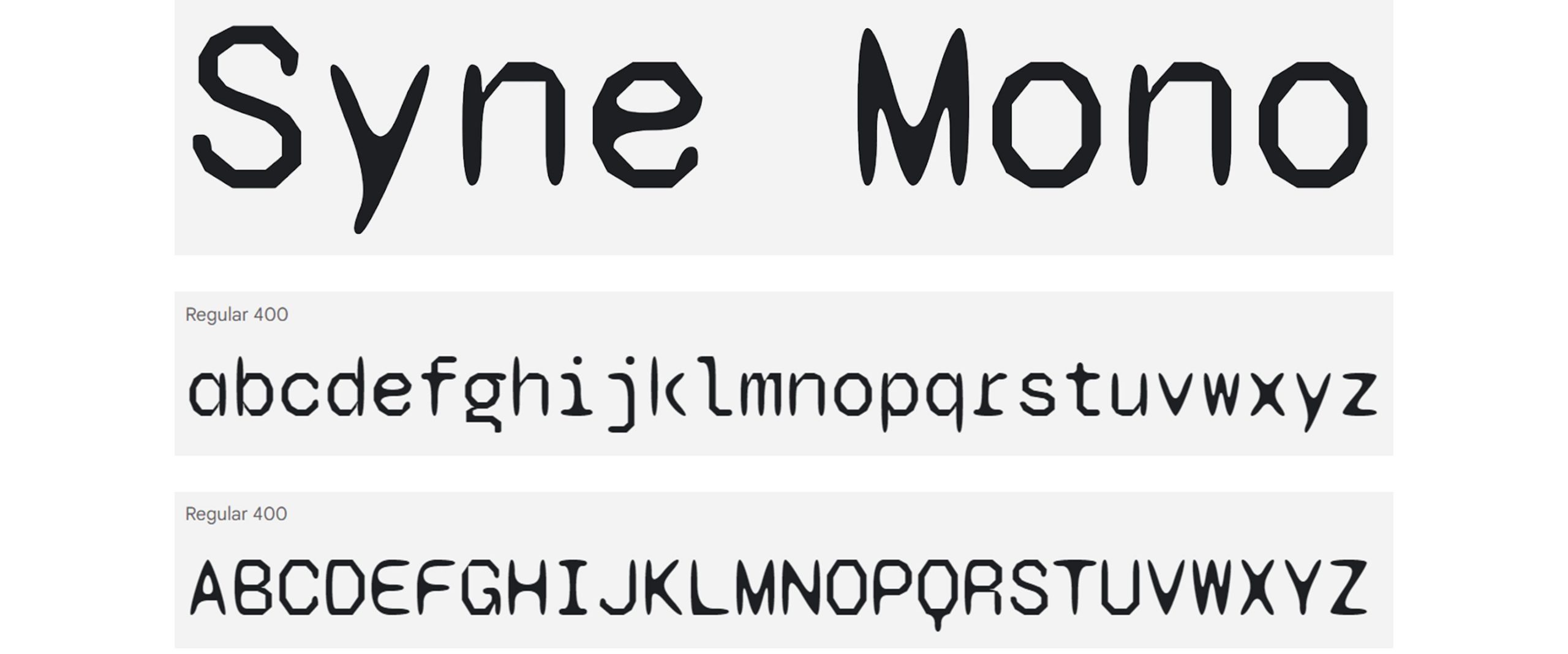
Syne Mono
Syne Mono is a quirky, artsy monospaced font is a font packed with arty intentions, it was designed as an exploration of ‘atypical associations of weights and styles’, with Syne Mono being a new take on ‘letting go of control’. This typeface serves as an alternative to more traditional fonts and takes on a nonconformist character – great if you want to create a presentation with a similar tone. Its variable width harks back to a 90s aesthetic of inky screenprints and glyphs on t-shirts, perfect for body text that you want to have a lot of texture. Syne was conceptualized by Bonjour Monde and designed by Lucas Descroix with the help of Arman Mohtadji
Syne Mono, like all these next fonts, may be distracting or too unique for some presentations, but there are quirkier fonts we thought to highlight to showcase an interesting variety.
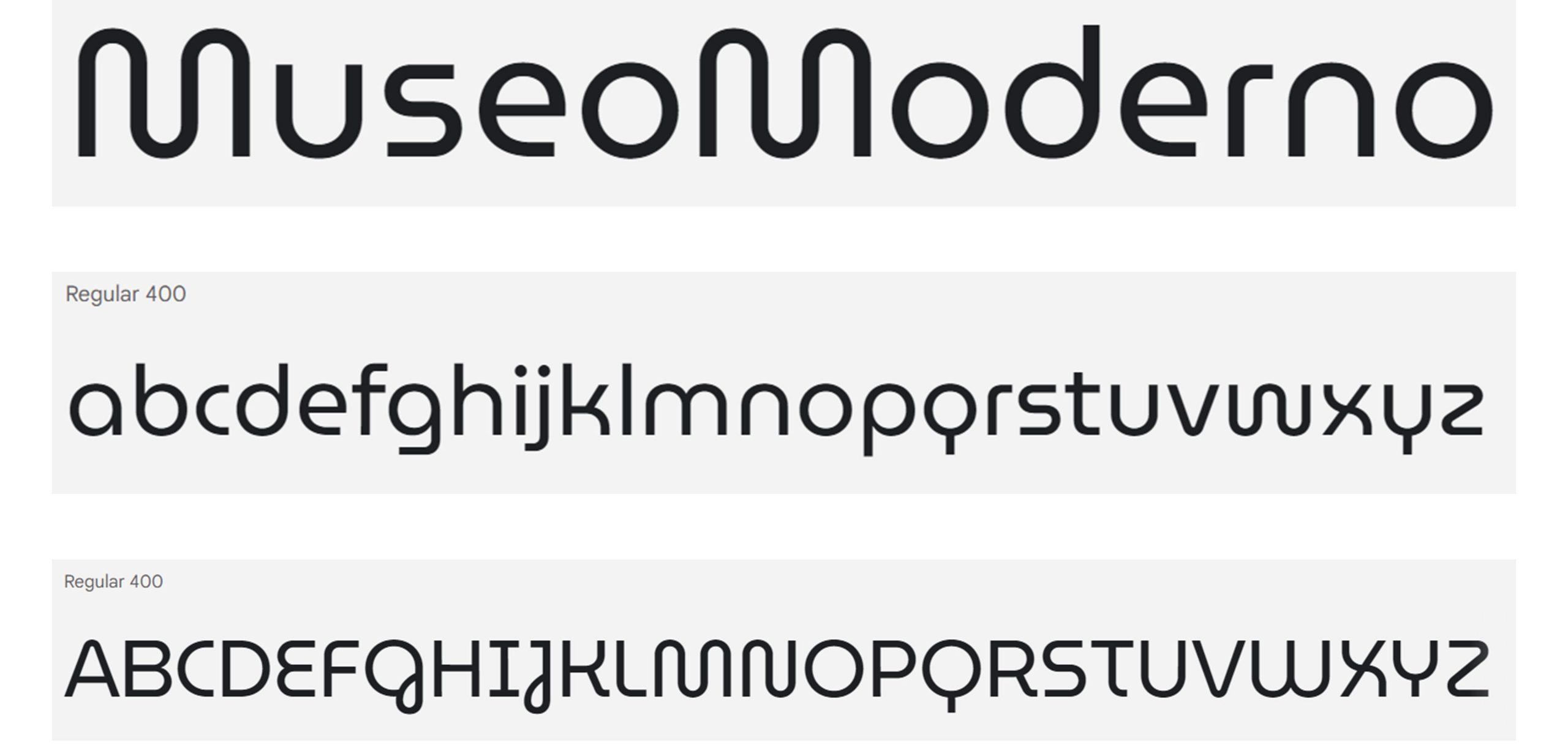
MuseoModerno
MuseoModerno is a contemporary sans serif typeface, originally designed for the new identity of the Museum of Modern Art of Buenos Aires by Marcela Romero, Héctor Gatti, Pablo Cosgaya and the Omnibus-Type Team. This font is particularly fun. Thanks to its fluid and geometric lettering, MuseoModerno has lots of character. We think that pairing a heavier and lighter weight of will look fantastic. Strongly branded for the Museum of Modern Art of Buenos Aires, this font would be an excellent choice for a graphic presentation relating to contemporary art and design, but perhaps not for a company looking to find its own unique identity.
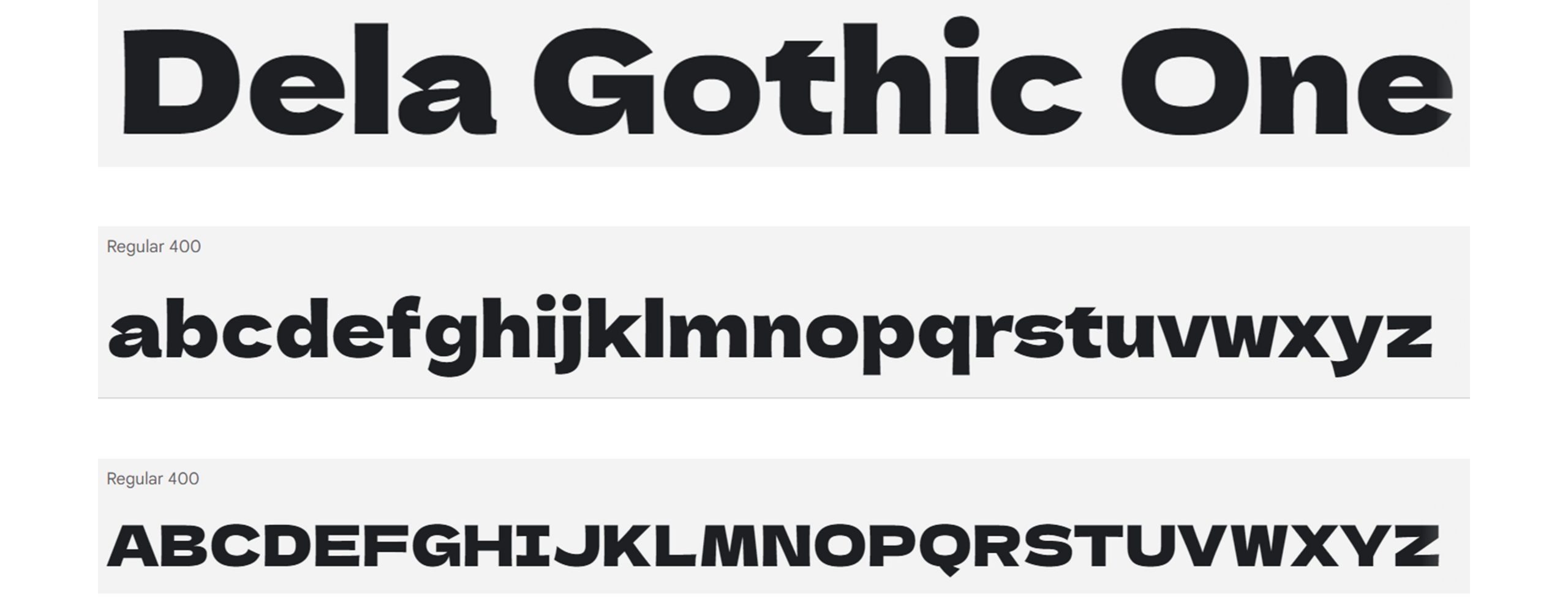
Dela Gothic One
Dela Gothic One is a thick, flat Gothic font which works well for title slides and presentations with less text when you want a contemporary, design-forward presentation. Heavily weighted fonts like this one lend themselves to colourful presentations. If you want your presentation to have a retro feel, but are worried about it feeling cheesy, then this font might be a good choice. Some letters, particularly the lowercase ‘a’ and ‘s’, have a real 70s feel but overall, the font gives an impression of stability rather than the goofiness some other novelty fonts might inspire. Dela Gothic One is one font from the Dela Gothic typeface family, and includes the Latin alphabet, full width hiragana and katakana characters, and kanji jis up to the third level. It’s designed by artakana.
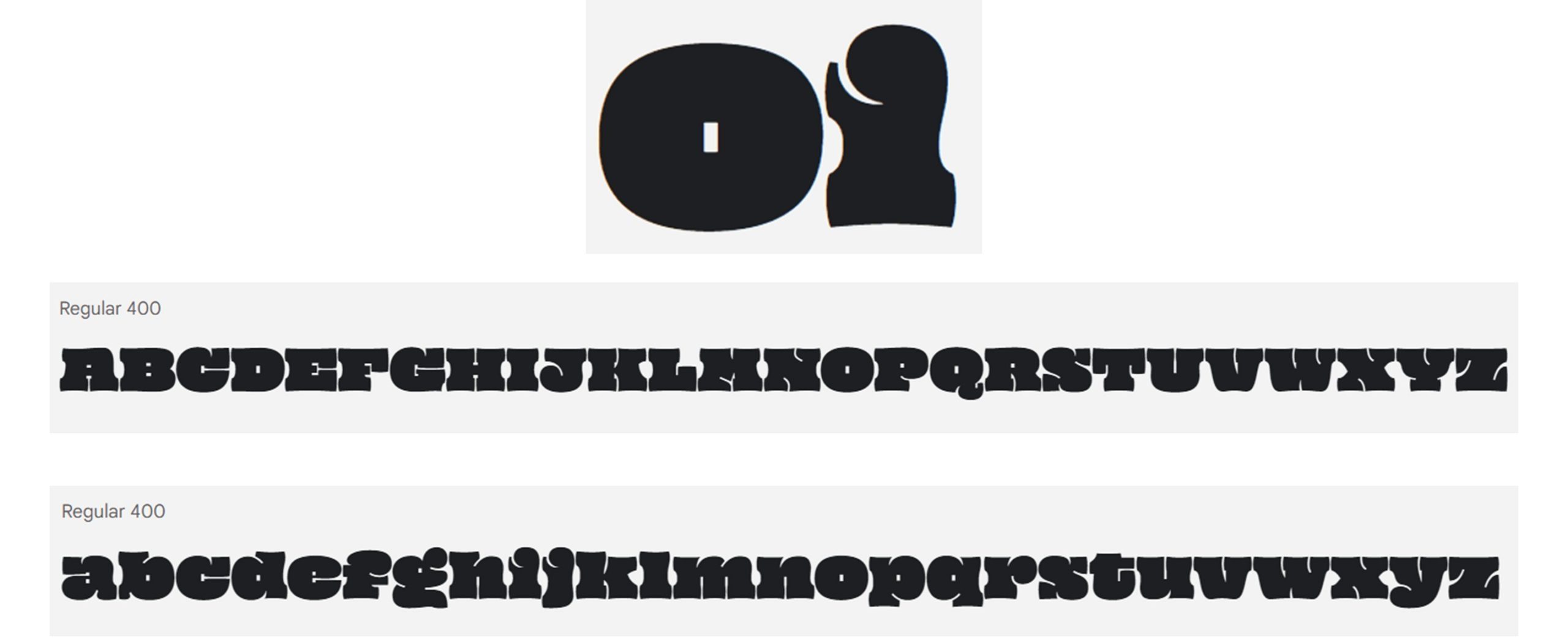
Oi
Feeling cheeky? ‘Oi’ is a fun and plump serif display font (a font designed for being used in large sizes). It pays homage to grotesque slab serifs from the mid–19th century such as Caslon Ionic. Its name, ‘oi’ is an abrupt and cheeky call to attention, as Google Fonts notes, mirroring its unapologetic attention-seeking character. Statement fonts with tight kerning, like Oi, are best used very sparingly (i.e. for title and section header slides) without any other text as it’s such a statement. Designed by Kostas Bartsokas, they deem it a ‘clarendonesque on steroids’. Read more about the story of Oi.
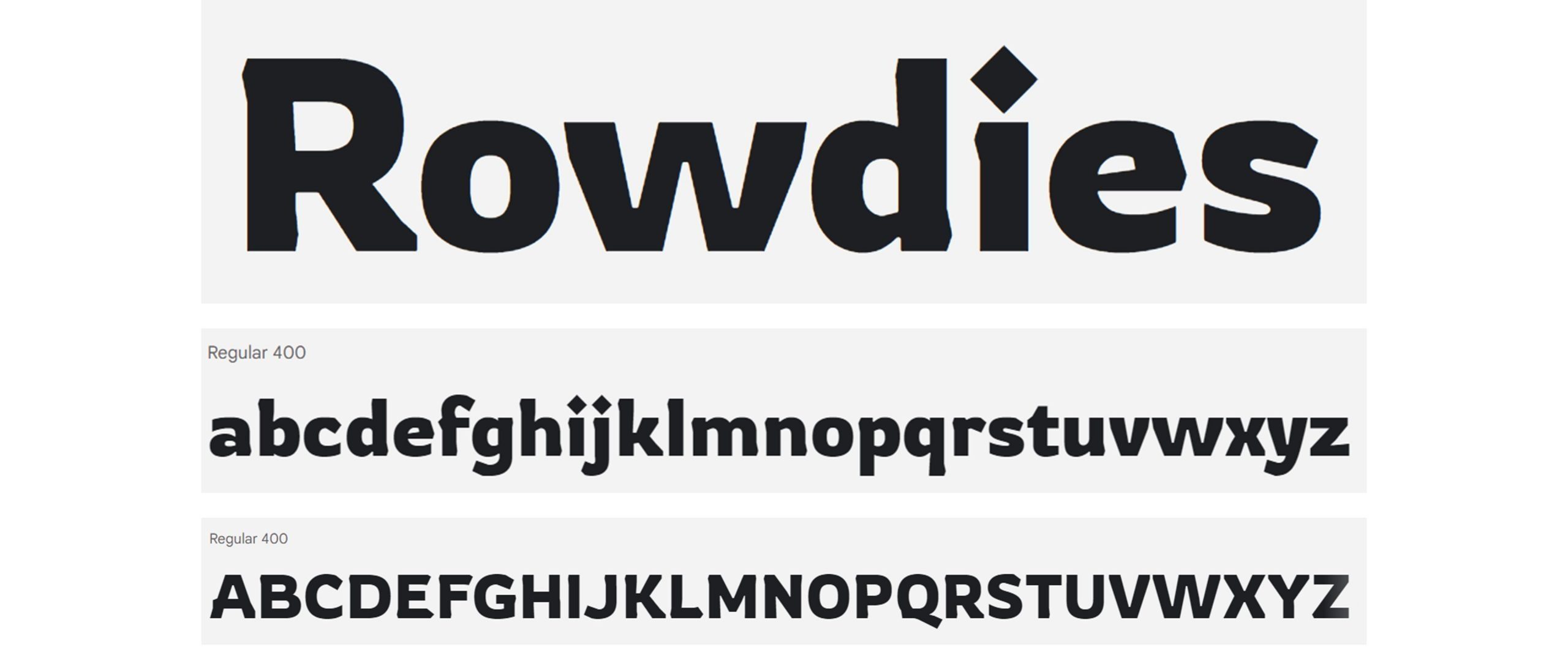
Rowdies
The final font on this list, Rowdies is a suitably named, bold display font inspired by Indian action cinema. Designed by Jaikishan Patel for drama, adventure, thriller and crime genres of storytelling, Rowdies will help you convey fearlessness. To keep a sense of modern professionalism in your decks, you could pair Rowdies with Gill Sans. This font has interesting features like diamond-shaped tittles (the dots above a lowercase i or j), and a mix of angular flat edges and round curves. It’s a great title font with wide enough kerning to be easily legible.
And there you go! Our top choices for the new fonts available in Google Slides. All these fonts are free and open source, licensed to use in print, digital, commercial or other projects under the Open Font License. Nothing here tickle your fancy? You can examine the whole range of new and existing fonts in the Google Font library, which you can download and use in projects in and outside of Slides. If you’re a PowerPoint user, check out our top 10 presentation fonts for PowerPoint here.
Google Slides templates are a great starting point to improve the look and feel of your presentation. They’re fab as they’re accessible and low cost, but it’s important to remember that even well-designed presentations can be ineffective if the content is text heavy.
If you're using Google Slides regularly then it's worth getting to know how you can integrate it with your other favorite Google Workspace programs - this time, Google Keep!