
30th Oct 2023
How to create PowerPoint templates that work
- PowerPoint design
- Comments: 2
Without a proper PowerPoint template, presentations can be a bit of a mess. Here are the building blocks for developing a PowerPoint template that works!
Most presentations are a cascade of text-heavy Death-by-PowerPoint slides, while online learners suffer the torture of wading through page after page of brochures converted to click-through-eLearning. However you look at it, a wall of text doesn’t work to engage people or compel them to action, so it really can’t be effective. That’s why most people now recognize that using visuals is the way to go. But how do you create visual presentations and eLearning that works? We think there are six steps you need to follow.
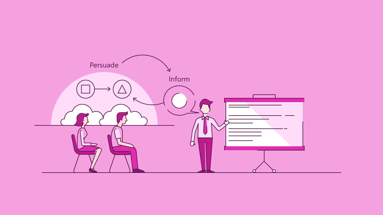
To know how to make a presentation effective, you need to understand the person on the receiving end and also decide what you’re trying to achieve. Are you trying to inform the audience of something – i.e. give them information they don’t have and help them understand it. Or persuade them to do something or change their behaviour – i.e. convince the audience the reasons to act in a certain way are stronger than the reasons not to. (Selling is typically a subset of this).
And it’s worth noting that a lot of the time, when you’re trying to inform people of something as your primary objective, you’ll also need to do at least a little persuasion, to get them to believe that your information is valid, valuable, and worth acting upon. Likewise, if you’re persuading people, you need to inform your audience so that they understand enough to be able to buy into your ideas.
When informing, you should have a clear idea of what exactly you are trying to inform about, and note it down in a couple of words so that you can easily refer back to it throughout the process.
If you’re persuading people, the same thing applies, but more specifically, we find it most helpful to think about this in terms of how the audience will benefit. What’s in it for them?
The options are many and various, but something short and punchy helps you to focus your story on what’s important to your audience and will make the story worth listening to.
Now you need to decide what information to present to your audience in order to achieve your goal. And assess how much your audience already know about the topic, so you don’t repeat unnecessarily.
Typically, anything you’re attempting to visualise into a visual presentation has a lot of detailed content with relatively little structure. So to help, we recommend you simplify down to the core message in a nicely structured way that’s easy to understand, which then helps you to pick out what detail is most important and how to bring everything together.
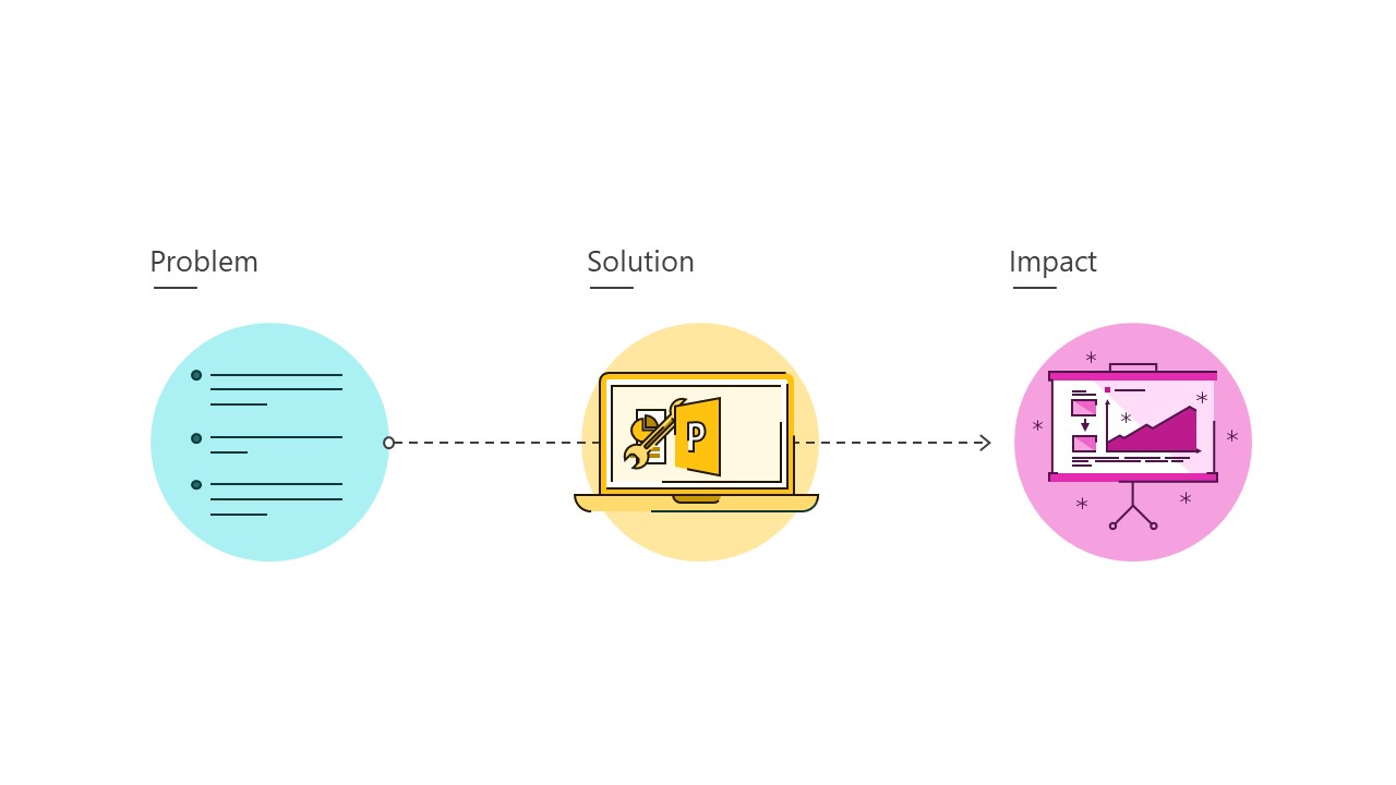
Then take the necessary pieces of information and organise them into a story that flows, so it’s easy to follow. Often the framework of Problem -> Solution -> Impact is a good one to follow.
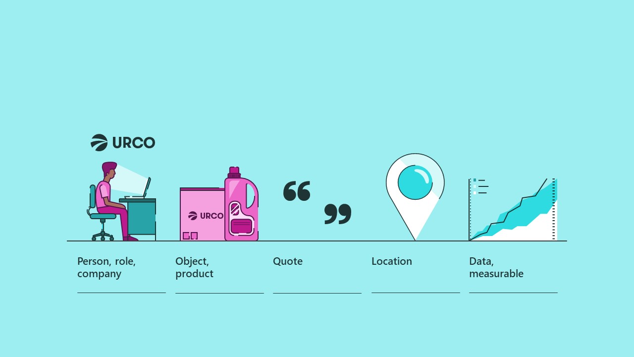
The next job, within these short sentences, is to identify the objects that are crucial to telling the story.
Person, role, company – Typically these are physical things, like objects or people. You can easily spot some of these – any mention of people, groups of people, job roles, or companies, could be represented by a photo of someone, or a silhouette, or a logo.
Object, product – You may have things that aren’t people, but are still easily recognizable entities, like objects – a computer, a phone, a bicycle, a hippopotamus – or a product or service, which might be a little bit more abstract, like ‘consulting’ or ‘water treatment’ – but still a concept that you can easily put a label on. Pretty straightforward visually, you could use an icon if you just want to get across the idea of a deliverable, or a photo of the product, or a label of the product or service, or you might even have a logo for it, especially if it’s something fairly abstract.
Quote – If you want to show a direct quote from someone, try to keep it short and to the point. It should really speak for itself, which means you’re going to have to keep quiet and let the audience read it.
Location – Then you might have locations – a point on a map, like a city, or maybe a type of building, like a hospital or office tower, or it could be an office floor plan. It could be something more abstract like an objective or a target you’re aiming towards.
Data, measurable – And then you might be able to pick out some data, like figures, percentages, dates, costs, that sort of thing, or some kind of measurable quantity, which are similar but they’re more vague – concepts that you can quantify, but that don’t really have any ‘number’ attached to them – things like a level of risk, or confidence, or effort.
That’s a starter gallery of different types of key objects. What these things all have in common is that they can all be represented with some sort of visual device that can be easily recognized, so you don’t have to do too much explanation and the audience doesn’t spend too long trying to figure out what it is. You might be using pictures, or icons, or labels to represent these things to create your visual presentation, or they might make up part of a diagram, which is what we’re going to look at in the next part of the process.
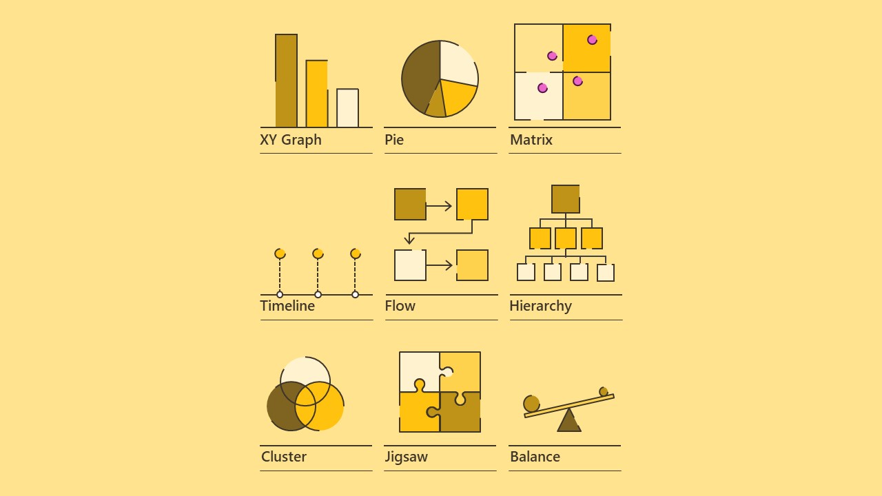
Once you know what’s involved in the story, start to look at the relationships between each of the key objects, and how they interact, which will give you the layout of the slide, the framework, or the diagram. There are plenty of options, but there are a few reliable regulars that you can draw on.
First you’ve got your different types of graph, which will probably be the first choice if you’re showing data. You could make an XY graph, two axes, and the data might be bars or lines, or an XYZ graph that shows a three dimensional data set, which might shrink or stretch across the three axes. A pie chart, to show proportions – this might be useful if you have percentages, as long as they all belong to the same category. Or you could have a Matrix arrangement, showing where elements are placed in different regions.
Then you’ve got a few ways of laying out elements that are distinct from one another. If you’ve got a sequence of dates in your information, a timeline might be a good choice, or if you haven’t you could just show a process diagram. You might just want to lay out the elements in a two dimensional space, or play around with the proportions to make a three dimensional scene, to add focus in on some elements and put others in the background. A hierarchy arrangement can show how elements are ranked in layers, useful for organization diagrams, or you could use a mind-map style layout to show connections between one big idea and a few other ideas that are linked up to it, or to each other.
A few other options for showing how things relate to one another might be a cluster or Venn diagram, to show connections or intersections between ideas, a jigsaw if you’ve got a number of things that fit together to form a larger picture, or just to get the idea across that a couple of things are well-suited to one another, and if you’re talking about a causal relationship, where one thing directly affects another, a balance diagram might work well, or a sequence that shows a push-pull relationship between two things.
This is a fairly small selection of the types of layouts you could come up with to create a visual presentation or eLearning, and a lot of slides might use two or more of these at once in order to get a complex idea across. To work out which ones to go for, you’ll have to look at your information and think about how you’d explain it, the order you’d point to your key objects, and how those key objects are related to one another. Crucially, you also have to think about the overarching message that the slide is supposed to be getting across, which you established in steps 1 and 2.
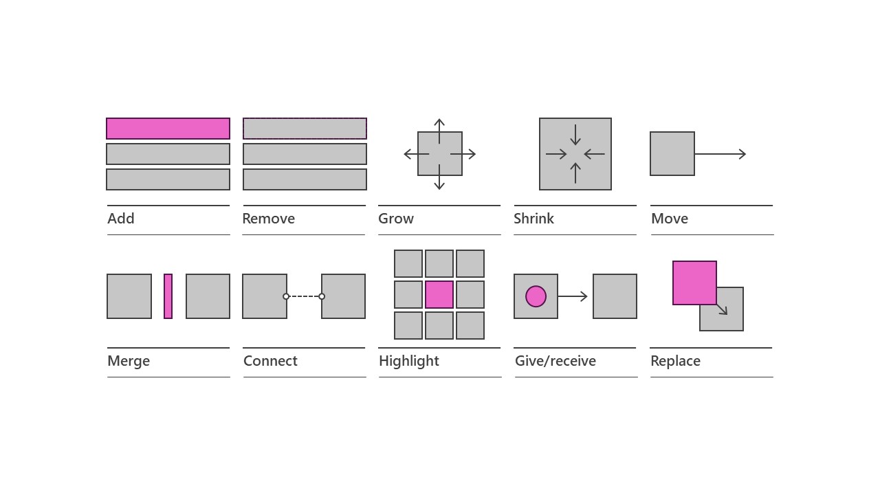
Now is the time to bring everything together. The individual key objects that you’ve got, with the layouts that show the relationships between them. Think about the order you want the story to be told, which will inform the layout of your visual slides, but also the sequence in which you’ll want to use the individual elements. And animations are a real help here, as they can pace the flow of information and ensure that you keep the audience focused on the right thing at the right time. They can also be a key part of actually telling the story, to make things happen, change elements, and emphasize the relationships between your key objects.
So if you’re introducing new ideas you can add things onto the slide. If you’re simplifying a diagram or removing things you don’t need, you can remove. You can make things grow, or shrink to show changing amounts, or changing importance, and you can make things move around to new locations. If you want to combine elements together you can merge them into one, or connect them together. You can highlight something that’s especially important, for your key message, and show something being passed along from one person to another, or data being transferred. You can also change something into something else, by replacing it.
Again, there are countless examples of these, and you’ll probably want to use a few of them for each slide, but this should give you a few good ideas of ways to move your key objects around, change the relationships, and end up with the right kind of visual punchline. These things can all be done with native PowerPoint animation (and check our animation articles and masterclass schedule for a lesson on animation if you’re not already a master at it!).
What you should have now is an idea or sketch of everything that’s going to happen on your slide to tell the story. You ‘just’ need to bring it to life and share your ideas. That’s not always an easy task, but if you check out this post by my colleague Bethany on some practical tips to achieve good presentation design, this post on some of our favorite websites for free design resources, and this one on presentation design in general, you’ll have a good head start. And of course the various PowerPoint tutorials and master classes are a wealth of information to help you out.
And if you’d like to see some examples of presentations that we’ve developed using these ideas, and then created in PowerPoint, you can draw inspiration from our presentation portfolio, showing you that pretty much anything is possible in PowerPoint.
Leave a commentWithout a proper PowerPoint template, presentations can be a bit of a mess. Here are the building blocks for developing a PowerPoint template that works!
By applying some key principles of presentation design, you can make your PowerPoint design really standout and deliver both a more ‘popping’, but also more effective presentation.
What’s the secret for how to print multiple PowerPoint slides on one page? We've got a few solutions up our sleeves, from simple and quick to completely custom!
Join the BrightCarbon mailing list for monthly invites and resources
Tell me more!Thank you so much for conducting our advanced PowerPoint training workshop. We will definitely use BrightCarbon in the future – we really think that we would be hard pressed to find anywhere better!
Emma Pring Iona Capital


Thank you very much, you are helping me to understand how to produce presentations so my students will want to see and learn from.
Great Estrella, lovely to hear that it’s working so well.
Its really helpful, thanks for providing such informative data in a unique way.
Just came across this while searching for Colour-Vision-Deficient-friendly PowerPoint tips. Aside from giving excellent advice, it’s wild that you’ve got graphics of what looks like Coronavirus in an article from 2017 – did you know something we didn’t 🙂 ?