In a world that clamours for your attention at every verse end, who needs another slide deck filled with bullet points and stock images? Your presentation audiences certainly don’t. In this step-by-step tutorial learn how to create a dolly zoom effect to help your audience zero in on what's important.
Blog 

14th Oct 2026
What results can you expect from ‘Visualise this slide’ in Copilot for PowerPoint?
- Written by: Hannah Harper
- Categories: PowerPoint design
There’s no doubt that Copilot is a fantastic tool. It can analyse my data, tidy my emails, summarise long reports, and give me meeting actions. It also promises to make beautiful visual slides for me too. But, as someone who has opened PowerPoint nearly every day for more than 10 years, there’s something inside me that’s a little bit sceptical: something that asks ‘but are you sure!?’.
We’ve tested a lot of slide creation tools, specifically with how they relate to brand consistency in our white paper, and we’re already helping organisations optimise their Copilot environment for AI-generated slide creation, but today it’s the turn of the ‘Visualise this slide’ skill in Copilot. As someone who has visualised thousands and thousands of slides in my life just how good is it?
Let’s find out.
How does ‘Visualise this slide’ work?
‘Visualise this slide’ is a skill baked into Copilot and available on the Copilot Premium plan. To use it, open up your Copilot pane in PowerPoint click the + select ‘Choose plugins and skills’ and then choose ‘Visualise this slide’ from the list. Alternatively you can ‘@’ the skill in the prompt window.
Put your content on your slide and you can literally hit go and it will start work right away, but you can also add in your own prompt information if you want to give specific ideas, or even design information.
For best results you’ll want to put your content on the slide instead of in the prompt – for two key reasons:
- You can suggest some basic hierarchy and visual relationships when you do a basic layout of the content. Copilot will explore this and look for patterns in what you laid out, giving it a solid foundation to build on.
- Keeping track of instructions and content in a prompt is hard – especially with a small prompt window. You’re more likely to confuse Copilot (and yourself) by trying to do both in one. For example, from our testing in the white paper we saw Copilot routinely putting instructional text on a slide where it couldn’t accurately separate instruction from content.
Your job as a content creator, therefore, will be to map out the slide using basic shapes and elements, and then fire up the skill to turn it into something designed.
But does it work? Do the results pass muster in a corporate environment?
The ‘Visualise this slide’ experiment
For this month’s newsletter I pulled together Google Search data to prove that even though the big season events feel like they’re getting earlier every year, consumer behaviour (as relates to online searches) pegs them as pretty consistent. Here’s what I mapped out.
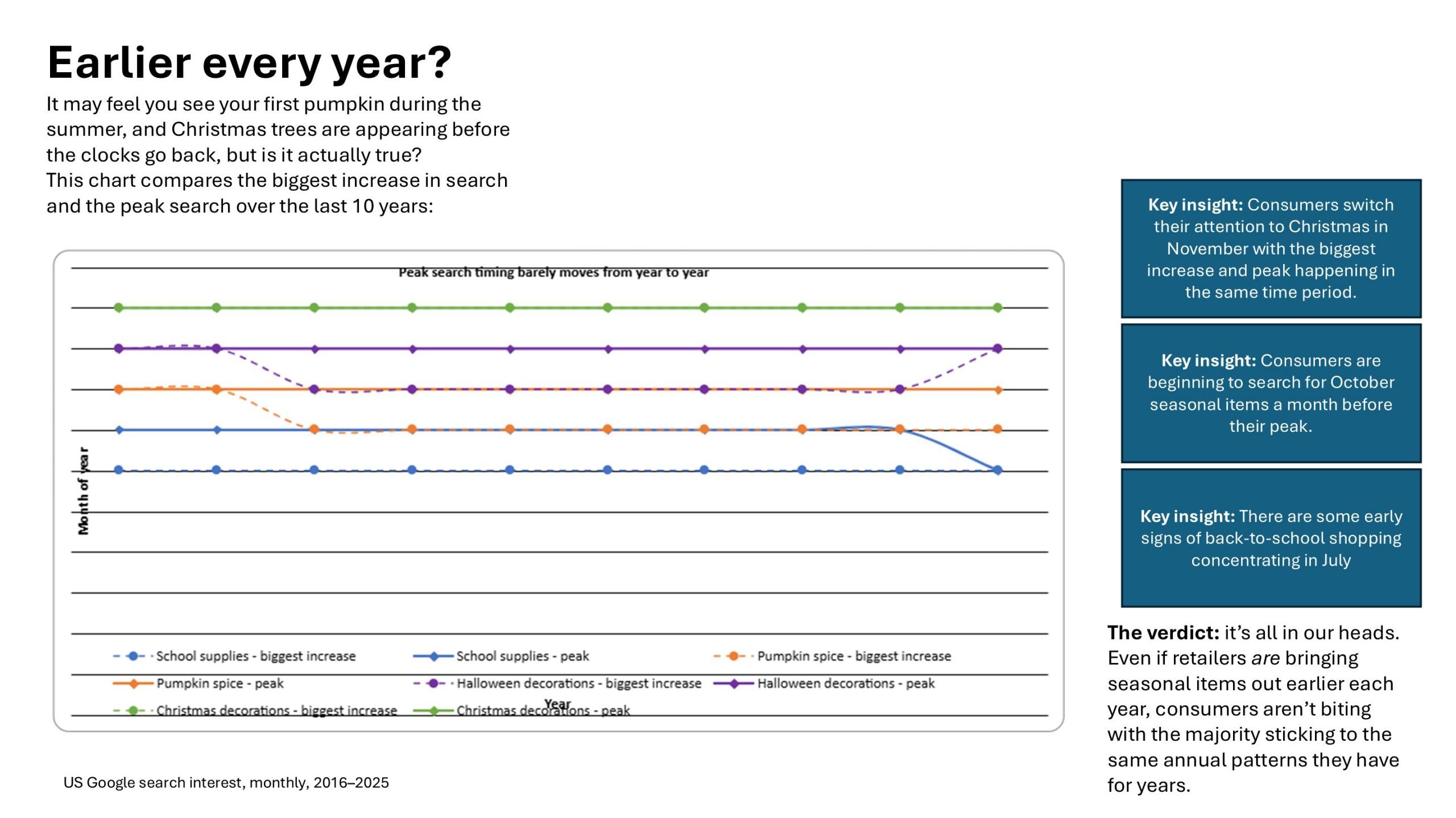
As you can see the data is on one chart, and I added in a number of text boxes and shapes to tell the story.
Here’s my prompt: visualize-this-slide – some key things I want you to do in addition to visualising the slide, remove the first six months of the year and make sure the months and years have visible labels. Make the colours on the chart easily distinguishable from each other so it can be easily parsed. Link the key insights to the relevant data sets. Design is up to you.
Version 1: Corporate, but basic
Here’s the first attempt.
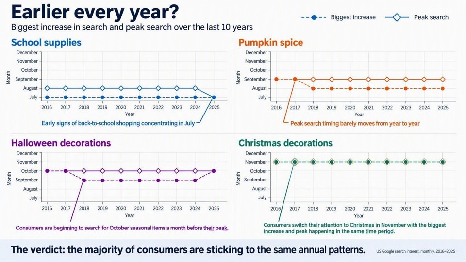
Pros: When sourcing the data, I hadn’t considered creating four graphs, my instinct was to plot all the data on the same graph and have one larger chart. But there are a few problems with that: not only do the colours blend into each other and so isn’t great for audiences with Colour Vision Deficiency, but labelling the data becomes messy. Splitting out the data into four separate charts makes it much easier to skim. Thanks Copilot.
Cons: This whole thing is a picture, so you can’t edit that baybeh unless you ask Copilot to help you. I don’t know about you, but it’s also a bit… plain.
Version 2: Fall newsletter chic
Like I said this was a really solid attempt, but I wanted to move beyond the PowerPoint defaults into something a bit more designerly and interesting. I gave a suitably vague prompt to make it ‘interesting and eye-catching’. Here’s what Copilot think that look like:
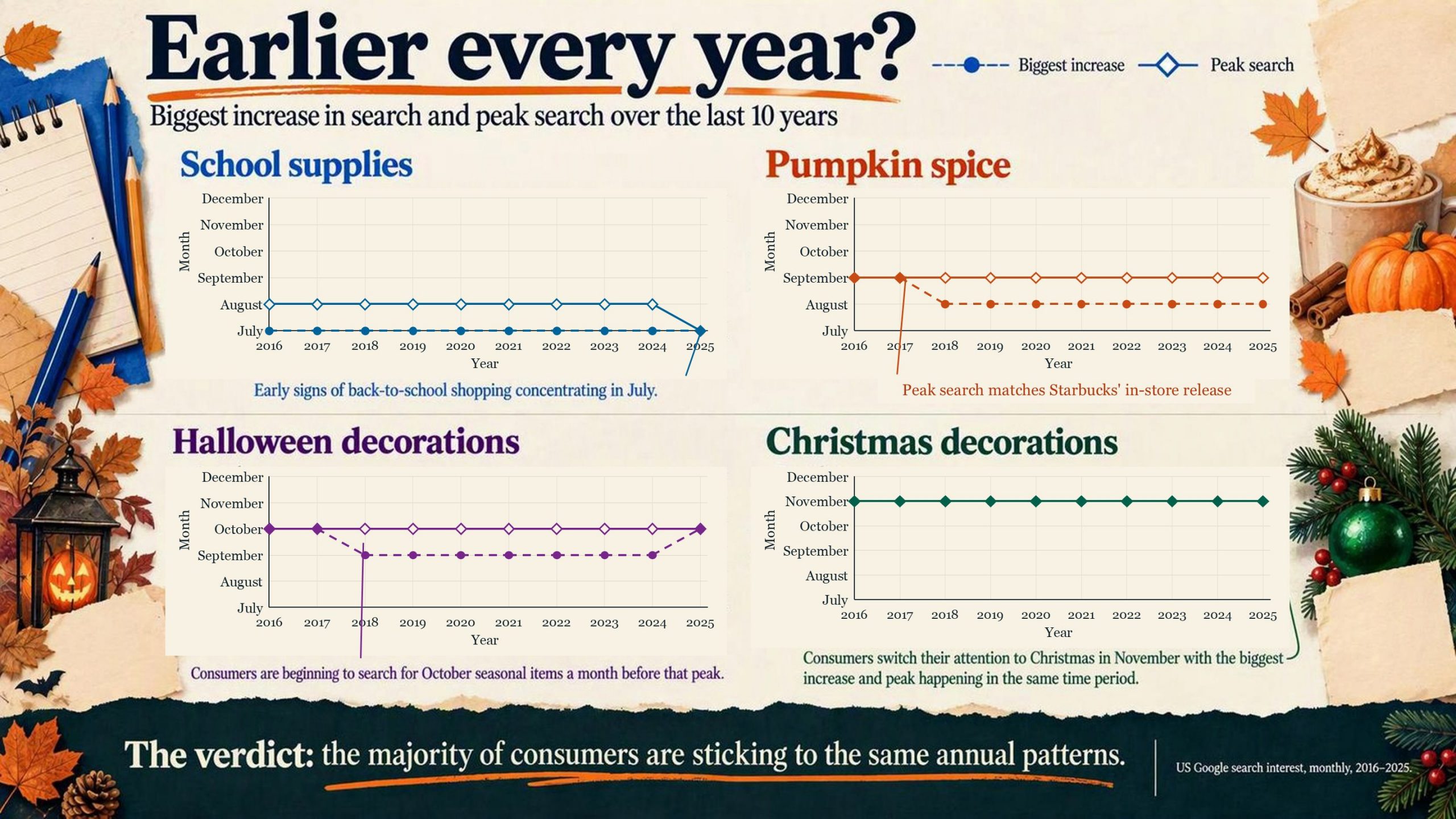
AI-generated content has been around for a while now, and it has recognisable design markers. Just like the em dashes in written content, 01, 02, 03 is classic Claude, and homely, cosy, kind-of-hand-drawn, is a huge marker of content seemingly regardless of the tool you’re using.
Pros: AI content can often feel crammed and busy, but this slide has a little bit of breathing space, and the illustrations add something cutesy to make the content come to life a bit more. The emphasis with the hand-drawn orange line is nice – it draws the eye to the punchline. In fact that whole punchline area is a nice point of contrast to draw the eye.
Cons: But, let’s face it, we’re not the school PTA, or the events committee for your local under-10s football team. Where this style is pervasive in small community organisations, it doesn’t scream corporate. In addition to this, the callout lines have also started to get lost – I say started because this is an element that decayed the more I edited the slide, and this is made up of some editable elements and some images. Ultimately it would be hard to really get into editing this without using Copilot.
Version 3-5: Corporate, but interesting
I’ll save you a few iterations here. Copilot and I worked back and forth to try and make this more corporate without that being a by-word for dull. Version 3 was like a dull version of version 1 (hard to believe, I know). With version 4 I introduced a brand style I liked and asked Copilot to use it as a reference. The results were okay, but it was a mix of the default PowerPoint template (that I’d started with) and a couple of key colours from the target brand.
For version 5 I refined the prompt to tell Copilot what I liked about the brand, and I told it to disregard the core PowerPoint template colours. I also got it to fix the connector lines, which by now were so broken they weren’t even worth including. Here’s the result:
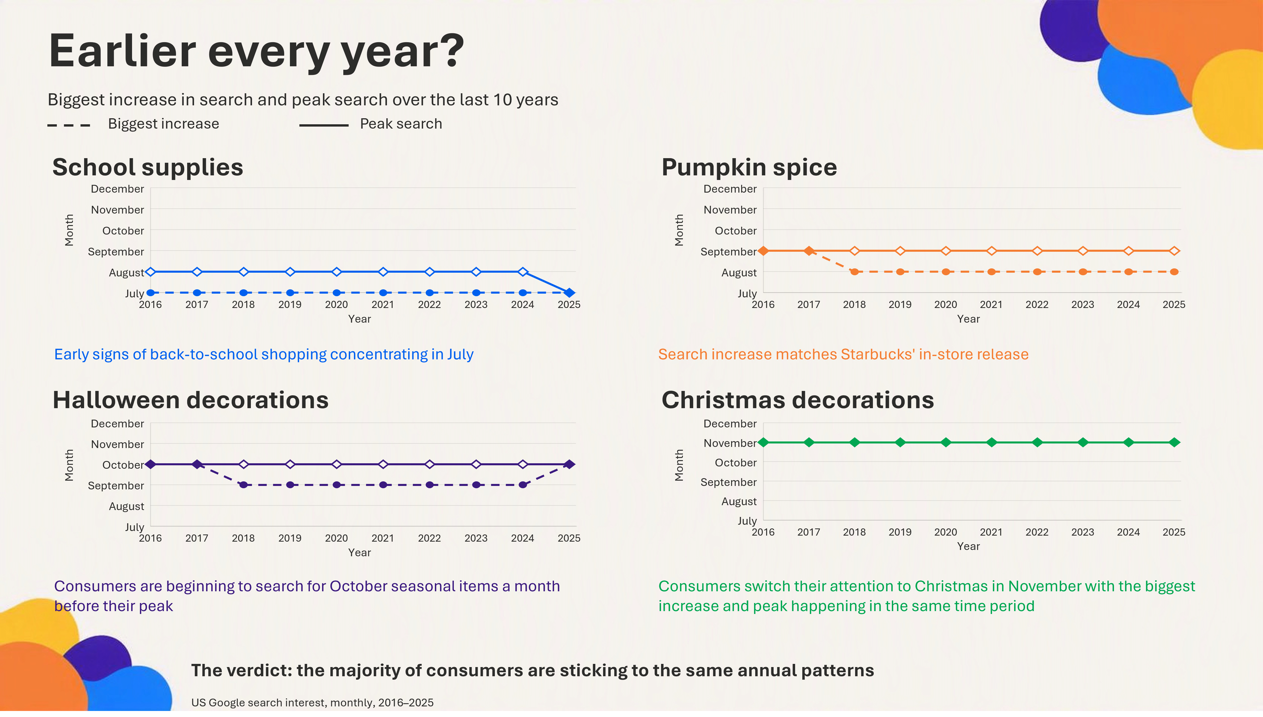
Pros: What we have here won’t win any design awards, but it’s clean and it’s clear, and it has a playful corporate style that doesn’t scream community kitsch, or design vacuum. Most of the slide is now editable (the charts aren’t live, but they are PowerPoint shapes you can change and manipulate). If you’re curious, this is the version that ended up in the newsletter.
Cons: Unless you end up with a ‘right first time’ version of your slide, the more Copilot edits it, the more it decays. I saw that in the way the connecting lines were drawn, but I also see it in the plain style of the text formatting. Earlier versions were more creative, but the design of those elements became more conservative the more versions I generated. Also, with data like this, though not essential to the story, a small icon or illustration can be helpful to orient the reader in the category topic. The previous version did well here, even if the style wasn’t what we were looking for.
Version 6: The brand experiment
I deliberately chose not to use a specific template or Brand Kit for this experiment because I wanted to see what Copilot would do with an open brief. But in the interests of fullness, I also used our test Brand Kit to create a version of the same slide.
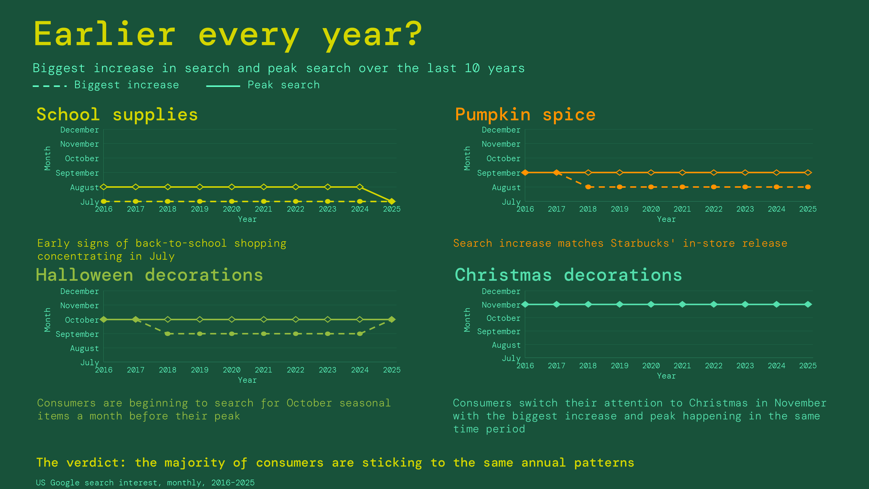
Pros: This is a neat visual depiction of the data, with some effort made to distinguish the different categories with colour. The alignment and arrangement is clean and precise. The slide is built of editable elements, so you can make basic changes without needing Copilot’s help.
Cons: The nature of the brand colours makes the greens hard to distinguish, the spacing is a little off when you compare title to chart, and callout to chart. The final takeaway is a little lost, and the overall hierarchy is a little muddy. Like the previous version, we also have no icons or illustrations to help us more easily identify the categories, and where that does keep the slide extra clean and minimal, we lose a bit of visual interest because of it.
How can I use ‘Visualise this slide’ to make my presentations better?
It’s easy to think of ‘Visualise this slide’ in two extremes: the one-click fix-all solution you were promised all that time ago, or a total gimmick. The truth is it’s neither, and it’s also both. ‘Visualise this slide’ sits somewhere in the middle, but as a content creator you can think of it as a tool in your toolbox – something you can draw on to help you do your job better and faster, when the need warrants.
You can use it to create slides for you. You can ‘settle’ for an early option, or ‘settle’ for an edited (but likely slightly decayed) version.
But a better use might be giving Copilot an open-ended prompt with creative freedom. This helps you as a content creator to think outside the box, without having to take the time to do the thinking in the first place. I’m not sure I’d have landed on the four charts on one page approach without trying the combined chart option at length first.
Lean into the non-deterministic nature of AI (that is, it’s different every time). It’s hard to unthink your own ideas, so instead get Copilot to think of a few different ideas for you. This will help you to shortcut your ideation process, whether you use the suggested design or not.
One final word of warning… Like I said, the more you edit your slide, the more it decays, but the more you generate different versions of your slide the more tokens you use and you might find yourself in a queue, having to wait a little longer for your slide. But let’s be honest, there are tools that make up such a fundamental part of our workday that we take the pros and cons in our stride quite happily. Coffee, I’m looking at you.
So. Give ‘Visualise this slide’ a go and let us know how you get on in the comments.
Leave a comment
Related articles

26th Aug 2025
How to make a logo wall in PowerPoint
Logo slides are a regular fixture of presentations, but they're often ugly and messy and tend not to do too much to build the credibility they're supposed to. Follow along to learn how to make a logo slide look neat and tidy, and if you want a stretch task, get inspired by some competitor-trouncing alternatives

07th Jul 2025
How to build layout slides for a presentation toolkit
When it feels like the call is to make more and do it faster, design smart and build a presentation toolkit packed with effective layout slides. We show you how to start off by building five of your own.

Join the BrightCarbon mailing list for monthly invites and resources
Tell me more!The launch was a success! Thank you so much for delivering even against the extreme turnaround time.
Mila Johnson InComm