Cinema is a pleasure to watch. On the whole, presentations aren’t. So, without spending $100 million on a sales pitch, what techniques can we borrow from cinema to bring our slides to life and create stunning cinematic presentations?
I’ll look at five conventions of cinema and explore how they can be transplanted into PowerPoint to take your slides to the next level: to make cinematic presentations. There’s good reason for this. Besides making them look cool, we’re aiming to leverage the way we feel about film – the easy way we relate to it, are moved by it, and admire the craftsmanship involved – and get your presentation audience to feel the same way about your slides.
I’m starting from the assumption that anyone reading this has already decided to ditch bullet points. We know they don’t work, and that a visual presentation is the way to go (if you’ve not yet taken the plunge, you can learn about visual presentations here). In this post, we’re talking about taking visual presentations and upping the ante – presenting our arguments not just visually, but cinematically, using 3D.
So, what’s the difference between visual and cinematic presentations? We’re not talking about hiring John Williams to write a score for your slides, nor having ILM create a CGI presenter to talk through the material. Instead, we’re picking out elements of the Western (hemisphere, not Magnificent Seven) cinema tradition that resonate with audiences and applying the same rules to visualising PowerPoint content. Some are subtle, others are more obvious, but when used well, can bring presentations up to the level of an art form.
Mimick depth & space: 3D in a 2D world
Film captures a 3D environment and translates it to a 2D medium. While live action cameras shoot the real thing, spaghetti westerns use huge painted backdrops to capture the same environment in a back-lot set, and animations have to replicate it manually. The 3D space in which we live has certain characteristics: things get smaller the further away they are, things up close are out-of focus, and everything is aligned towards a convergence point on the horizon. We are used to living with these rules and as a result, we find it much easier to relate to a 3D space than we do a 2D space.
Cinema uses the 3D environment is a certain way. The convention is to have the most important characters centred in the close-to-mid range of the shot, less important things are set back. Having grown up with this tradition, we subconsciously assign significance to things according to their relative closeness to that central space. As presentation designers, we can use this idea – replicating a 3D space in PowerPoint and using the position of certain objects or ideas within that space to say something about them.
In the example below, our character is given prominence purely because of her position in the 3D space that we’ve created in the slide. The second slide, showing the same characters in a 2D space, is less obvious. Here, I would need to add an animation or an additional graphical element to highlight her prominence (such as a box appearing around her, or a change in colour), doing so could compromise the look of the slide, and moves us away from its simple design. In using depth and space in this way, we are able to economise on the devices used to get our message across. The visual speaks for itself, and does so in an intuitive and powerful way.
Use focus to direct audience attention
This economy of expression is something that can also be achieved by using focus – utilising effects in PowerPoint to mimic the way a camera lens works. Focus can be used in a presentation to subtly emphasise a particular object or idea, highlighting it amongst other elements without having to move things around or add additional elements. This allows you to elegantly direct the audience’s attention without losing the context of the idea.
The technique is particular powerful if you have multiple elements and then ‘throw’ focus between them, bringing each into focus (and throwing the others out of focus) in turn. The example below shows a series of slides that work in this way. The first two examples show how we can direct attention to item A, then B, without changing anything on the slide. The effect looks organic and natural. Compare that to the third set of products. This slide shows three objects at different distances from us, all of which are in focus. The effect looks false; our eyes do not work like this, so to see it on screen feels slightly strange – it distracts us from the point being made.
Create dynamic animations using relative movement
The concept of having a single point of focus is carried through to camera movement. Convention dictates that the camera follows the most important character in a particular scene, so while other elements may drift in and out of frame, we stay with the person that we are supposed to be focussed on. In PowerPoint, this is a great way to present a journey or a process and make your presentations feel more cinematic. The first example in the video below shows how relative movement can be used to keep attention on a single element (the truck) as it moves. We are instinctively drawn to the element that remains in the ‘sweet spot’, centred in the close-to-mid range. Other elements move in and out of our view and our awareness.
The second animation in the example shows how the same technique could be used to guide the audience through a process. Again, we focus on the main central element, and the objects that come into contact with it. We are not distracted by extraneous parts of the process as we might be if the whole diagram were simply shown in a single slide. This technique enables us to follow the process at an appropriate pace, whilst making the slides more dynamic and interesting at the same time.
Use direction to support your message
There is a long-established convention that when travelling, film characters should move from the left of the screen to the right. This does not happen in every instance of a character moving across the screen, but montage scenes and lengthy shots involving travel from point A to point B, tend to begin with the hero on the left of frame and end with them on the right. The convention mimics the way we (in the West) read – a left-to-right flow seems more natural to us, and we feel more comfortable with movement in this direction. It follows that movement in the opposite direction tends to be reserved for characters travelling back, retracing their steps or returning home.
In PowerPoint we should follow the same tendency. Movement from one idea to another should follow a path from left to right. This is what an audience subconsciously expects and will think of as most natural. When we want to show something that is not part of the natural flow – a setback, an obstacle – we should set its path of motion in the opposite direction. The idea is a simple one, but can have a big impact in cinematic presentations. These powerful instincts exist in all of us, and if there is a chance, we should utilise them to support our message.
Add emphasis using a zoom
The zoom is somewhat passé in cinema nowadays. However, it remains a favourite of soap opera and sitcoms for its ability to add emphasis and drama to a particular scene at a particular moment. Typically, a sudden zoom in (or crash zoom) would be used on a character following a dramatic revelation. The camera works as an exaggeration of our attention and literally zooms in to get a better view of the action.
PowerPoint tends not to go in for melodrama too often, but the zoom remains a powerful tool for adding emphasis, and is all the more effective because it is rarely used in this medium. The trick to replicating a camera zoom in PowerPoint is to have any other elements on the slide move relative to the object you are zooming in on. Without doing this, the object will simply grow in size (while the others stay small). This will not have the real world feel. However, it might be the look you’re after.
You can play around with zoom effects to get the impact you want – just keep in mind that some combinations feel more realistic than others. This video demonstrates three ways of using the zoom animation with simple slide elements.
Conclusion
The techniques discussed here require a basic knowledge of PowerPoint animations (help is at hand, if you’re not yet confident). More than that, they rely on the presenter embracing the idea that a presentation doesn’t have to be dull to be professional.
People who write presentations and present material, tend to do so with their ‘business hat’ on. Much of the damage done to a presentation is self-inflicted. Material may be dry and uninspiring, but all too many shoot themselves in the foot by keeping it that way; deliberately keeping the slides ‘straight’ in case they should come across as unprofessional. People are afraid that animation, transition, movement, colour, imagery, iconography, design – in short, artistry – will water down their message and show that they are not taking the material seriously. The reality – and the irony, once you realise – is that nothing is further from the truth.
Pulling apart information and reworking it into a simpler, more approachable and dynamic form shows a much deeper understanding of the material than leaving it as it is. When messages become clearer, arguments become more persuasive. A visual presentation is quite simply a more effective means of communication; easier to present, easier to take in, more likely to be remembered – everyone’s a winner.
Once we accept this truth, we open up a world of possibilities, and redefine the limits of what a presentation can be. We have grown up with film, and the industry has had a long time to develop its craft, learning what we respond well to, the best ways to make us to pay attention, to get us to take things in, and to move us. We in turn, have become familiar – at least subconsciously – with how a film should look and feel. If we can utilise some of the traits that are commonplace in film and use these cinematic conventions in PowerPoint, we can transform presentations into something more enjoyable, more familiar, and ultimately more powerful.
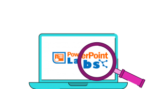
The National University of Singapore have developed an add-on software called PowerPointLabs. If you are an ambitious PowerPoint user who doesn’t have time to fiddle around with learning all the tricks that experts such as the BrightCarbon staff have figured out, then you may find PowerPointLabs to be very helpful.
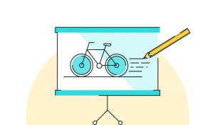
There’s a new feature in PowerPoint 2016 called ‘Screen Recording’ that allows you to record video (exported as an MP4) of hand-drawn sketches, which can serve as a great tool for many different applications, including presentations, eLearning and training. For anyone who is new to the Screen Recording tool, this blog will serve as an easy introduction on how to best use its functionality and get the best results...
Great article Kieran, thank you. It is clear that the best presenters are also entertainers (Jobs etc)
In regard to point 4. Direction, whilst it is accepted that from right to left = back … it also has strong sub-concious connotations of good vs bad. It is an excellent example of the hundreds of non-visual communications that we make during our delivery.
In film, the protagonist or hero moves generally left to right, the antagonist or bad guy/killer/crook/femme fatale moves right to left. It plays into our subconscious that it’s somehow just ‘wrong’
How often have you watched a movie and said something like “There’s just something I don’t like about him …” I’m not suggesting it’s only because of the characters movement, but rather it is ONE of the regular items pulled from the Director’s bag-of-tricks to signal to you unconsciously about that character.
You can google a lot on this and Martin Scorcese covered it beautifully in his excellent personal history of cinema. You can see this technique all the way back to Murnau’s Nosferatu in 1922. I’m sure it was brought into cinema from the stage with the antagonist moving in from stage left (the right hand side of the stage from the audience view often called ‘house right’).
Of course the stage is also the home of placing characters in 3D space. A director will instruct actors to move forward and back relative to the depth of the stage.
Moving towards the front of the stage is called ‘downstage, whilst towards the back of the stage is called ‘upstage’. This is the origin of the term ‘to be upstaged’ when you are overshadowed (another stage/lighting term) by another performer who either literally or metaphorically draws focus and seems to move your own character ‘upstage’ into a less prominent position at the rear of the stage. The ‘up’ and ‘down’ elements come from when stage floors were raked to allow better viewing of all actors on stage and to add perspective and options for sets to create what ? ……. Depth and Space 😉
Thanks very much for your comments – really interesting insights. The uneasy feeling you mentioned when ‘bad’ characters move screen right to screen left is a strange but powerful way of unconsciously affecting the audience’s reading of a scene. It can be used to great effect in presentations if something is wrong or working sub-optimally – or of course to highlight the ineffective (literally backward) processes of your competition.
We have to remember that these feelings are based primarily on convention – we respond best to what we are used to. So in different societies (particularly Eastern vs Western cinema convention), the effects would be different. We need to take this into account when designing material for different audiences.
The idea of 3D placement of objects is also interesting, particularly how we give prevalence to objects that are front and centre. However, because this is influenced by physiological rather than psychological traits, it is applicable all over the World, across all cultures.
TVC directors and film makers learn these tricks early. Indeed one often evolves into the other (Ridley Scott for a start) So we can learn a lot from them. Another reason why people like Garr Reynolds are very taken by people like the screenwriting guru Robert Mckee author of “Story”
The left to right movement example really hit me because it highlights that most of us don’t know what we don’t know about our non-verbal communication. (Perhaps that’s why I also like the TV show Lie To Me on the same topic.)
So for instance is there a ‘better’ side to stand of the screen if you have a choice ? Does the above principle suggest we’d look more ‘natural, and unconsciously believable if we stand to the left and gesture to the right ?
Back to presentations a simple, practical take away for the above phenomena is to make sure that you always reverse your gestures so the audience sees a logical movement. Eg; when you say “We’ve come a long way from way back in 1985 … to our technology today” You need to make it backwards for you (right hand out in a vertical blade motion to show 1985) then left hand out to delineate the present.
Coincidentally last night I was researching customs and business practices in the middle east for a local (Australian) client who needs to ramp up their business in the ME.
One article I found pointed out that unlike Western/Roman text, Arabic is bottom right, to top left. So in simple terms, if you are showing a slide with a before and after pic, best to put the before pic on the right side of the screen and the after pic on the left and speak to them accordingly.
I already knew about the text, but had not thought about reversing design elements as well. Not that I’m suggesting backwards Roman text … unless presenting to Leonardo da Vinci 😉
Hey it’s tough enough to try and get our clients on the same page when we’re all in one country let alone different cultures and parts of the globe !


Great article Kieran, thank you. It is clear that the best presenters are also entertainers (Jobs etc)
In regard to point 4. Direction, whilst it is accepted that from right to left = back … it also has strong sub-concious connotations of good vs bad. It is an excellent example of the hundreds of non-visual communications that we make during our delivery.
In film, the protagonist or hero moves generally left to right, the antagonist or bad guy/killer/crook/femme fatale moves right to left. It plays into our subconscious that it’s somehow just ‘wrong’
How often have you watched a movie and said something like “There’s just something I don’t like about him …” I’m not suggesting it’s only because of the characters movement, but rather it is ONE of the regular items pulled from the Director’s bag-of-tricks to signal to you unconsciously about that character.
You can google a lot on this and Martin Scorcese covered it beautifully in his excellent personal history of cinema. You can see this technique all the way back to Murnau’s Nosferatu in 1922. I’m sure it was brought into cinema from the stage with the antagonist moving in from stage left (the right hand side of the stage from the audience view often called ‘house right’).
Of course the stage is also the home of placing characters in 3D space. A director will instruct actors to move forward and back relative to the depth of the stage.
Moving towards the front of the stage is called ‘downstage, whilst towards the back of the stage is called ‘upstage’. This is the origin of the term ‘to be upstaged’ when you are overshadowed (another stage/lighting term) by another performer who either literally or metaphorically draws focus and seems to move your own character ‘upstage’ into a less prominent position at the rear of the stage. The ‘up’ and ‘down’ elements come from when stage floors were raked to allow better viewing of all actors on stage and to add perspective and options for sets to create what ? ……. Depth and Space 😉
Cheers
Dean
Hi Dean,
Thanks very much for your comments – really interesting insights. The uneasy feeling you mentioned when ‘bad’ characters move screen right to screen left is a strange but powerful way of unconsciously affecting the audience’s reading of a scene. It can be used to great effect in presentations if something is wrong or working sub-optimally – or of course to highlight the ineffective (literally backward) processes of your competition.
We have to remember that these feelings are based primarily on convention – we respond best to what we are used to. So in different societies (particularly Eastern vs Western cinema convention), the effects would be different. We need to take this into account when designing material for different audiences.
The idea of 3D placement of objects is also interesting, particularly how we give prevalence to objects that are front and centre. However, because this is influenced by physiological rather than psychological traits, it is applicable all over the World, across all cultures.
Hope to hear from you again.
Kieran
Hi Kieran
TVC directors and film makers learn these tricks early. Indeed one often evolves into the other (Ridley Scott for a start) So we can learn a lot from them. Another reason why people like Garr Reynolds are very taken by people like the screenwriting guru Robert Mckee author of “Story”
The left to right movement example really hit me because it highlights that most of us don’t know what we don’t know about our non-verbal communication. (Perhaps that’s why I also like the TV show Lie To Me on the same topic.)
So for instance is there a ‘better’ side to stand of the screen if you have a choice ? Does the above principle suggest we’d look more ‘natural, and unconsciously believable if we stand to the left and gesture to the right ?
Back to presentations a simple, practical take away for the above phenomena is to make sure that you always reverse your gestures so the audience sees a logical movement. Eg; when you say “We’ve come a long way from way back in 1985 … to our technology today” You need to make it backwards for you (right hand out in a vertical blade motion to show 1985) then left hand out to delineate the present.
Coincidentally last night I was researching customs and business practices in the middle east for a local (Australian) client who needs to ramp up their business in the ME.
One article I found pointed out that unlike Western/Roman text, Arabic is bottom right, to top left. So in simple terms, if you are showing a slide with a before and after pic, best to put the before pic on the right side of the screen and the after pic on the left and speak to them accordingly.
I already knew about the text, but had not thought about reversing design elements as well. Not that I’m suggesting backwards Roman text … unless presenting to Leonardo da Vinci 😉
Hey it’s tough enough to try and get our clients on the same page when we’re all in one country let alone different cultures and parts of the globe !