One major reason your audience is suffering from ‘death by PowerPoint’ is that you’re using slides that simply spell out what you’re trying to say. The problem is that words you see and words you hear are processed in one part of the brain, meaning it’s impossible to read and listen at the same time. So, if your audience is trying to read text on a slide and listen to you speak, they end up either confused or completely ignoring you. Neither of which you want!
The answer’s simple. Reduce the amount of text on your slides and use pictures, diagrams, and graphs that reinforce your message instead. It can seem daunting to take a text-heavy slide or list of bullets and turn it into something visual, especially if you don’t think you’re super creative. However, the first step is simply reducing the amount of text on your slides – and you don’t have to be an artist to do that!
Here are 3 quick fixes:
1.Wave goodbye to presenter props
Often presenters put a lot of text on their slides to help themselves remember what to say. However, most of your audience will read quicker than you’re able to speak so if you do this and simply read aloud what’s written on the slide, then what’s the point of you being there at all? As you talk your way through your fourth bullet point, the audience will have already finished reading the tenth one. They’ll start making mental shopping lists, planning their weekends or dozing off as they wait for you to get to the end.
Enough is enough! For the good of audiences everywhere, presenters need to take off the stabilizers, practice their presentations, and learn how to use the speaker notes. Any text that describes what’s being shown visually e.g., “This graph shows…” is a prop for the presenter and should be dropped into the speaker notes where it belongs. Not everyone has time to commit a presentation to memory but this is where a good presentation structure that encapsulates your USPs can really help. A logical structure is more memorable than a random collection of ideas, and you can add helpful divider slides and titles as signposts to keep you on track. If you need some tips on how to structure an effective presentation, try this guide.
It’s not about throwing the baby out with the bathwater; some text can be useful for an audience, for example, labels on a diagram or important statistics. Keep in mind that the text is there for the audience, not the presenter.
2.Ban the bullets
Despite our tireless campaigning, long lists of bullet points are still very common in presentations. I won’t repeat our anti-bullet point arguments here, you can head to this post to get the (science-backed) low down. However, at BrightCarbon we don’t just complain, we provide solutions!
If your bullets are very wordy, start by cutting out all the extra text. Remember, you can copy and paste the original version into your speaker notes so don’t worry about the content being lost. We’ve got some tips on cutting down presentation text here. Once you’ve got short, snappy sections of text you can begin to think about the relationships between the information; are you describing a process? Can you group or categorize the information in a meaningful way? Are all your points part of a larger solution or problem?
Depending on your content, there are lots of layout options to choose from that will communicate something meaningful about the information to your audience. Here are a few before and afters to feast your eyes on!
These wordy bullet points are all activities that contribute to an outcome. The simple layout below cuts down the text, shows the link between the points, and brings in some relevant iconography.
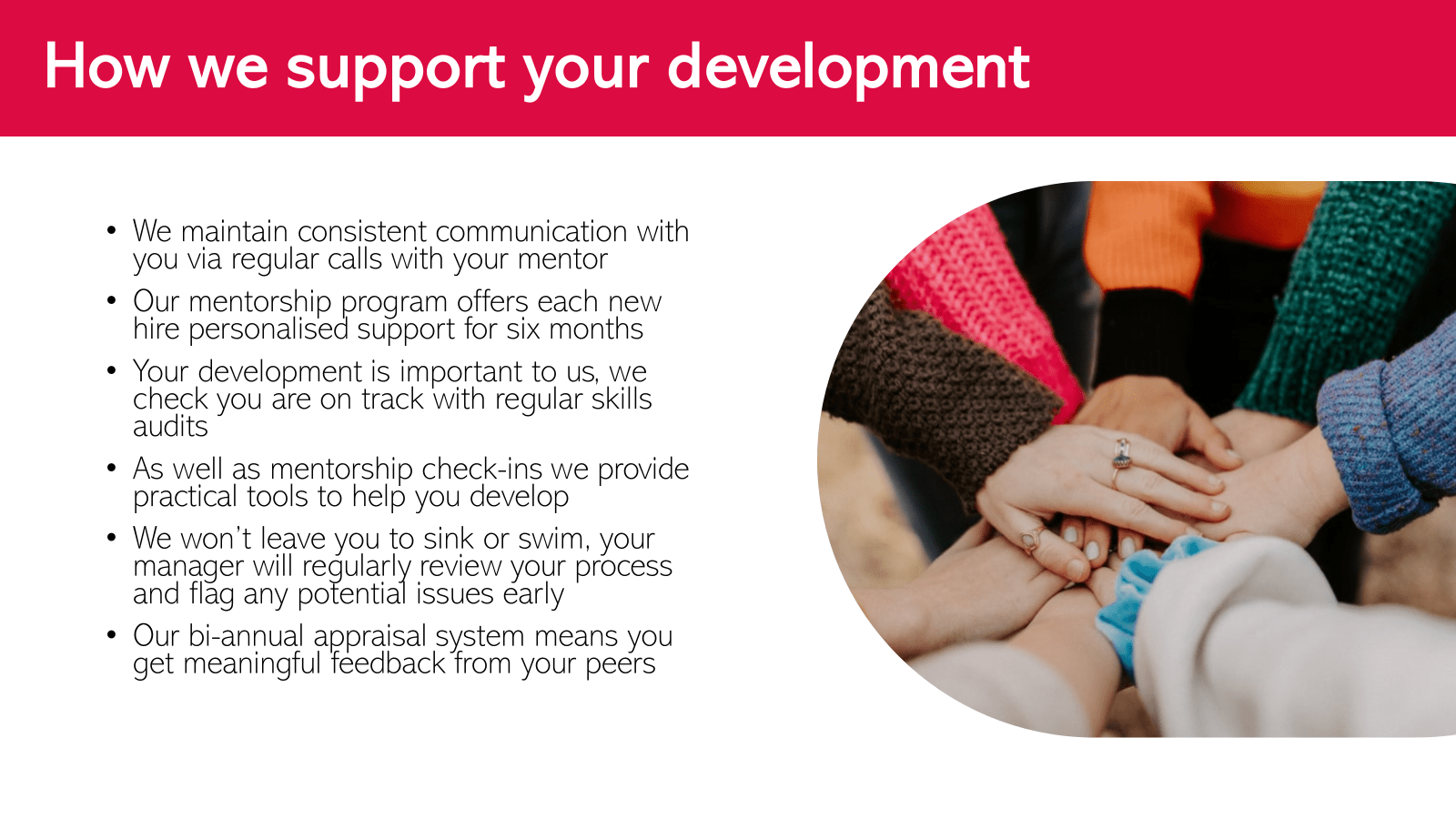
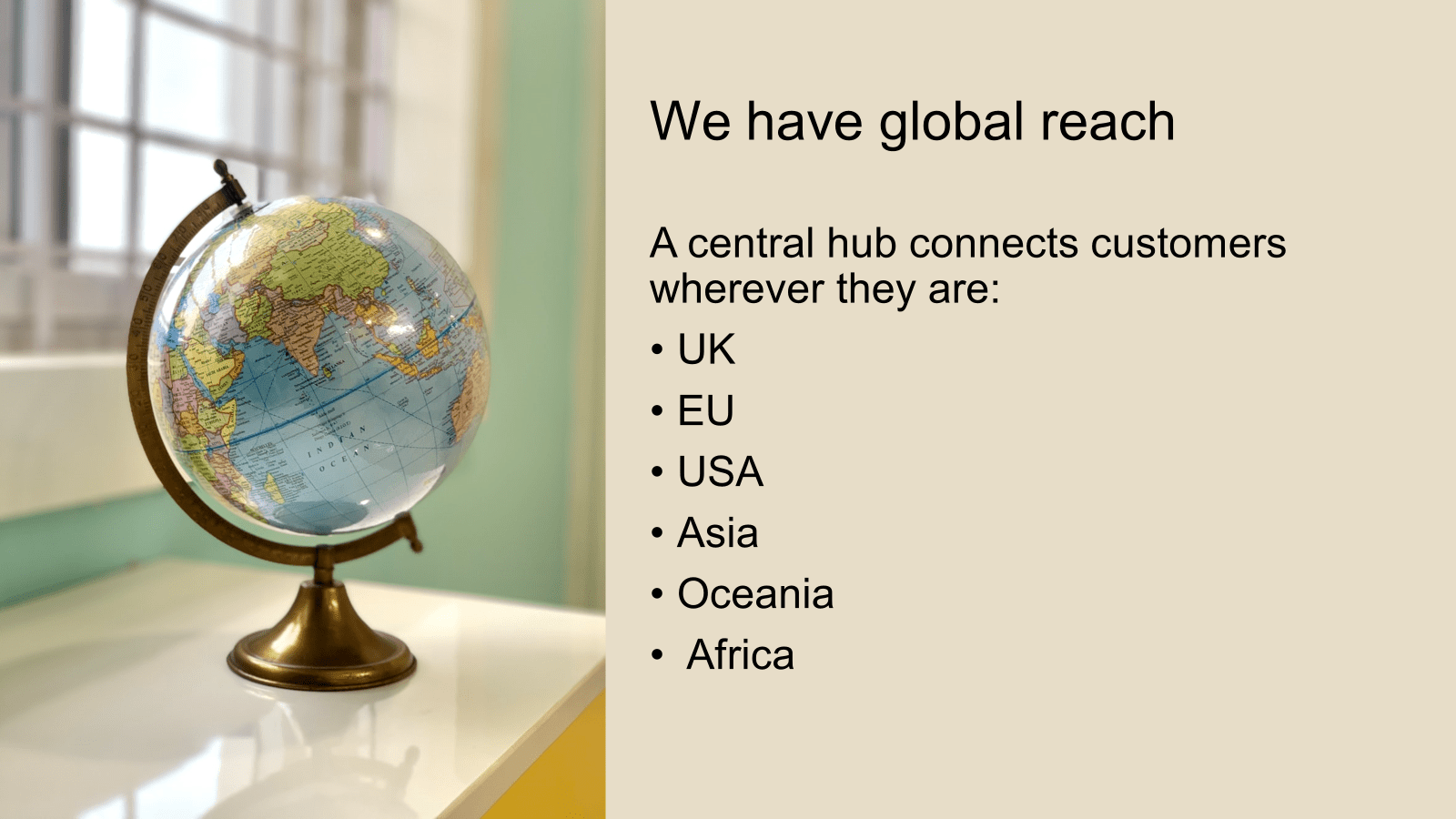
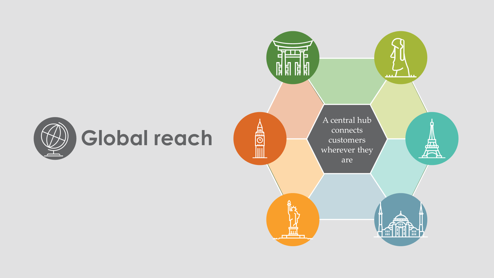
Here’s another slide transformation. The original slide is pretty bland and the visual doesn’t convey anything meaningful.
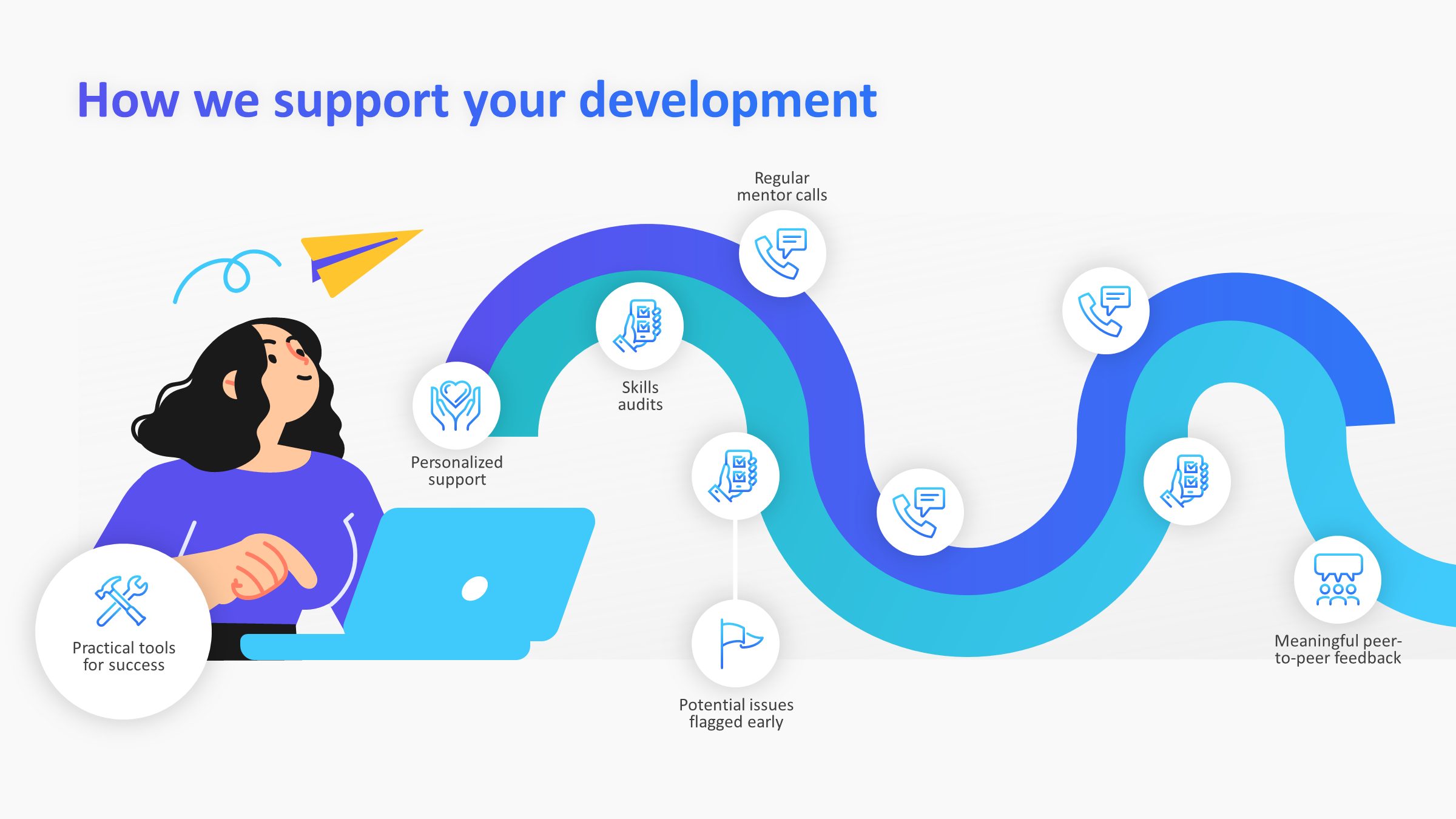
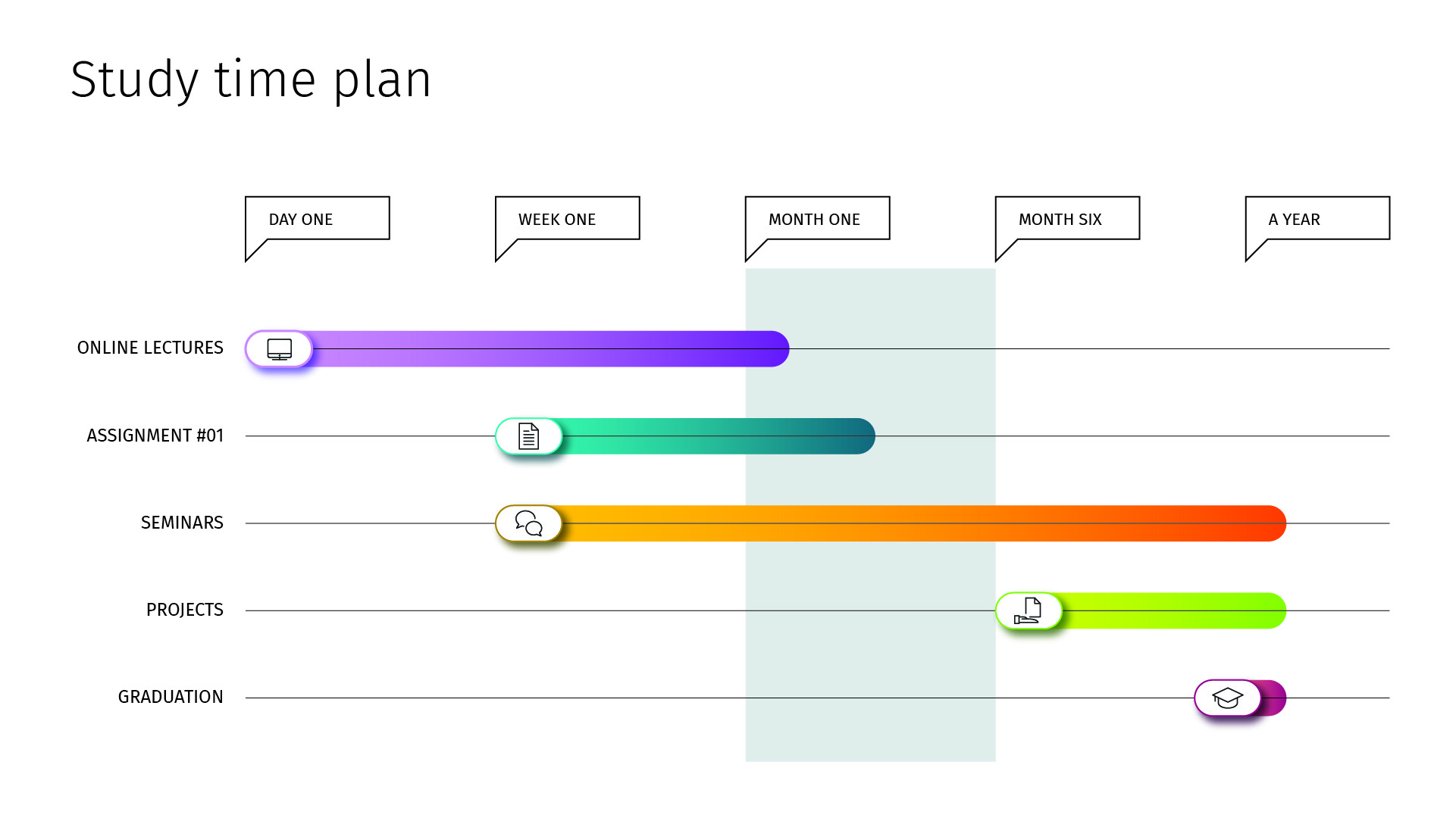
However, you can take the main idea – here the concept of a central hub – and arrange the rest of the information around it to create something that conveys the core message. You can also transform bulleted timelines and processes into visual, easy to understand slides. Here are a couple of examples!
Once you’ve arranged your bullets in a meaningful way, you can take it a step further and animate each section on a click, allowing you to direct the focus of the audience and control the pace of the presentation.
3. Adopt a 2-for-1 approach
There’s a myth that the more slides you have in a presentation, the longer it takes to present. Well, I’m here to bust that myth wide open. Think about it, you could have 10 slides and take 3 minutes per slide or 30 slides and spend a minute on each. Depending on your presentation topic, audience, and slide content, either approach could work.
So, if your slides are too busy, be brave and split them up! The same amount of content split over a few slides will actual feel shorter to your audience. They won’t be overwhelmed by loads of text all at once and can absorb the information more easily. And, every time something new happens on the slide, it helps to recapture the attention of those whose minds are wandering. Finally, by holding back content until you’re ready to talk about it, you make sure your audience isn’t skipping ahead. Each bit of information feels important as it’s not competing for the audience’s attention with the two paragraphs and three graphs shoved on the same slide.
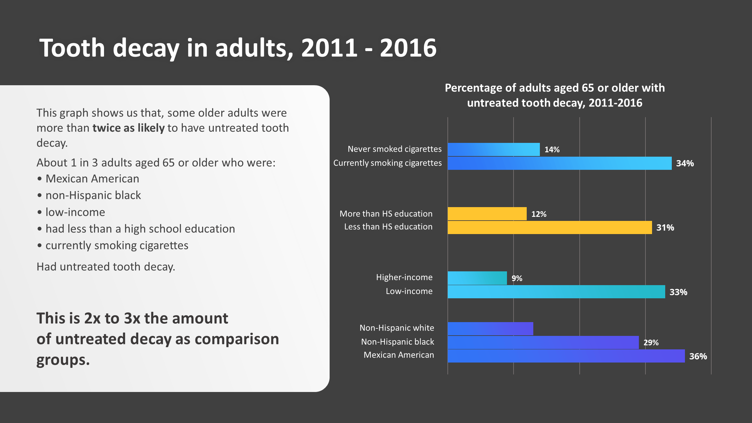
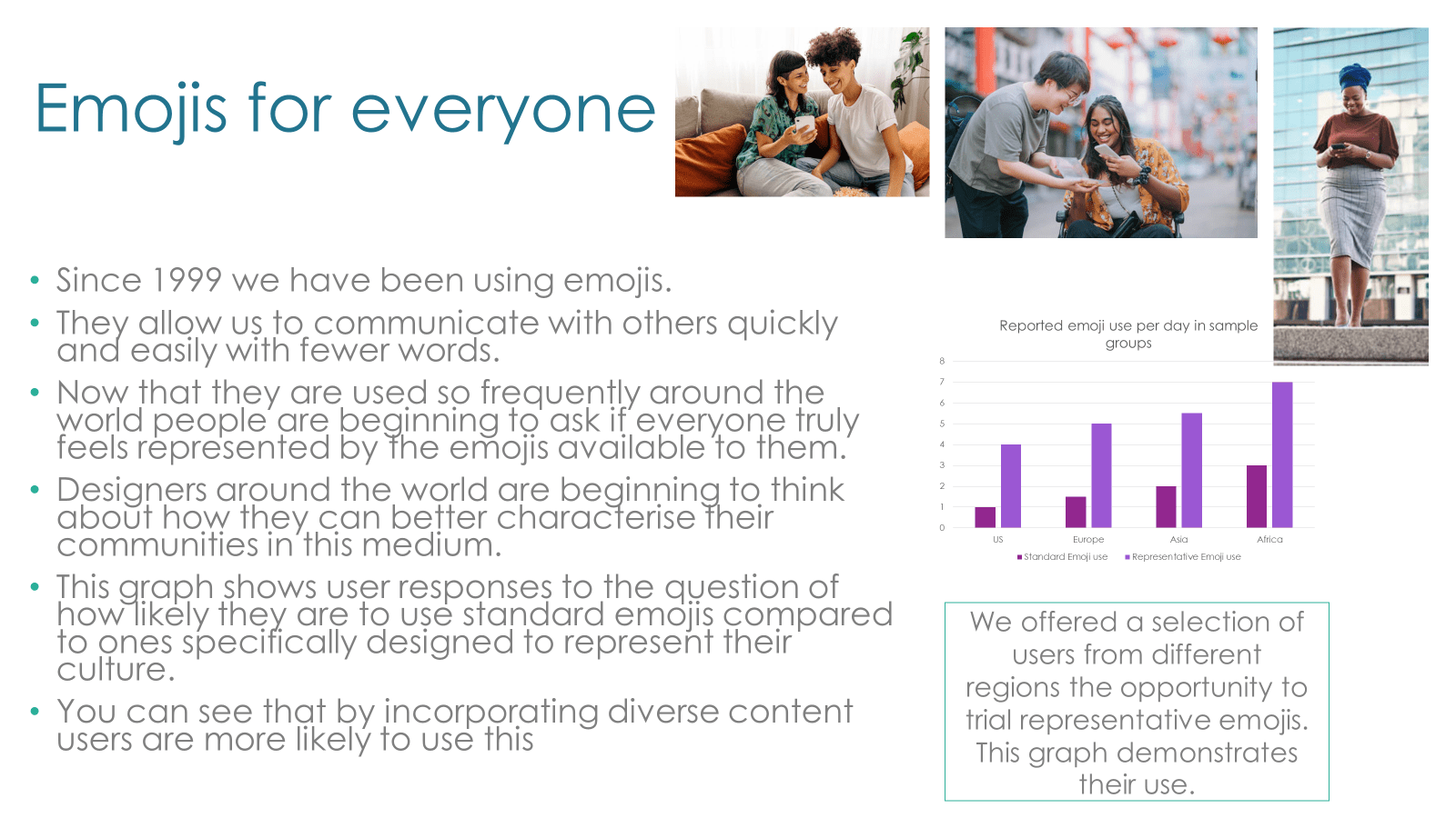
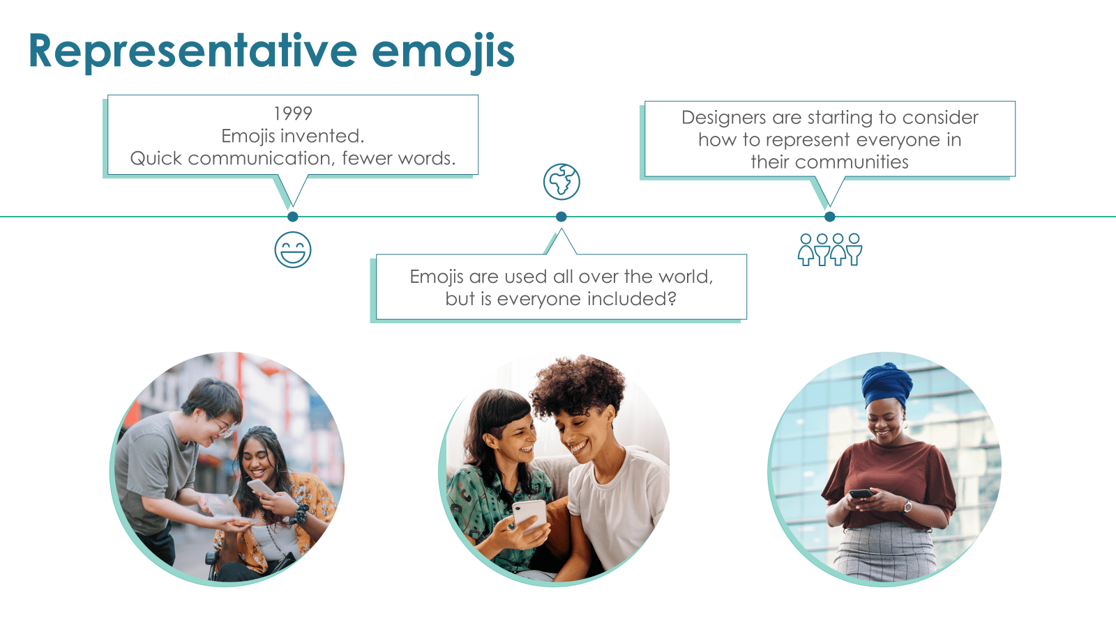
For example, this slide has too much text, the images are small and not adding to the story, and the graph is practically unreadable.
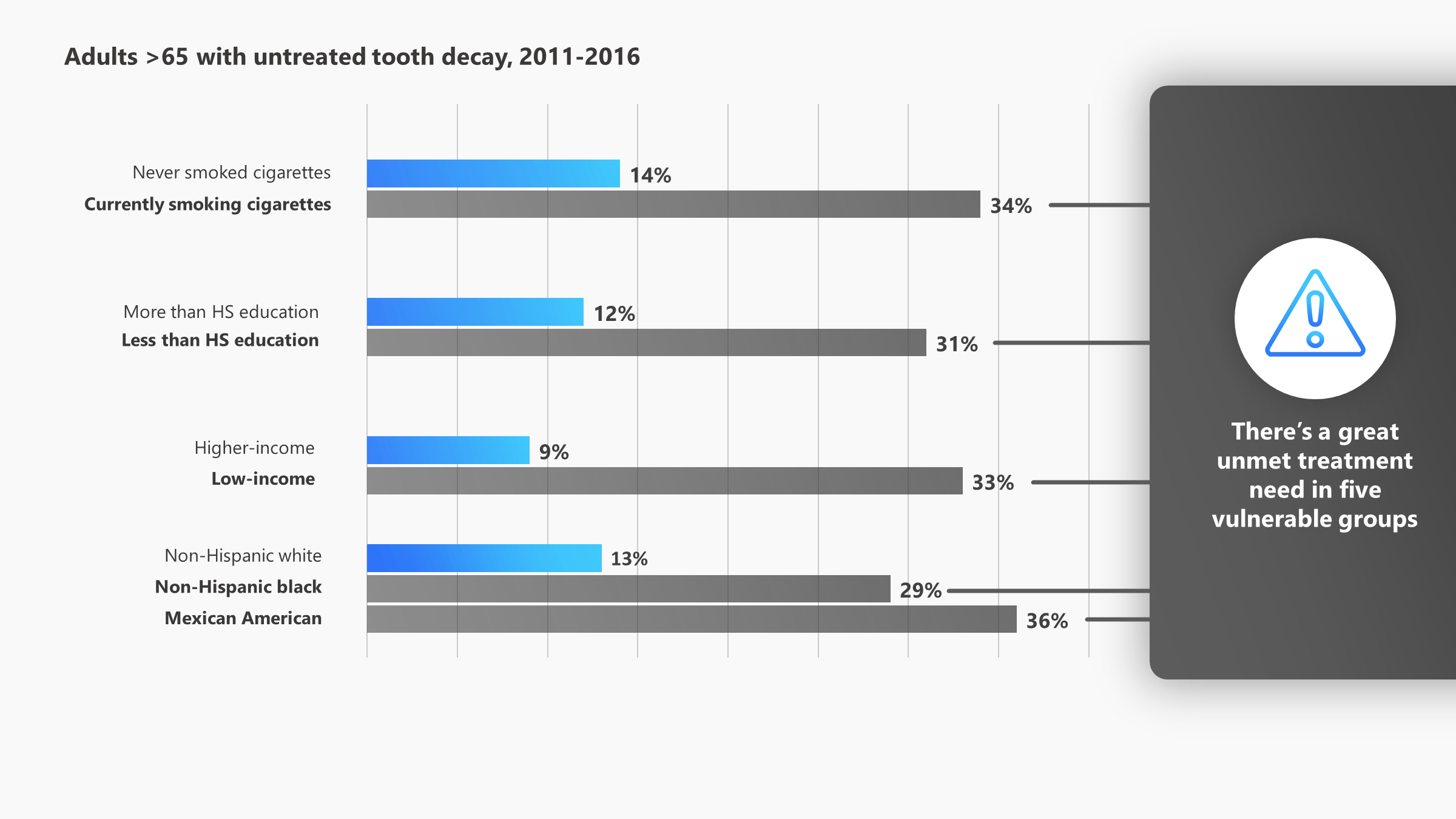
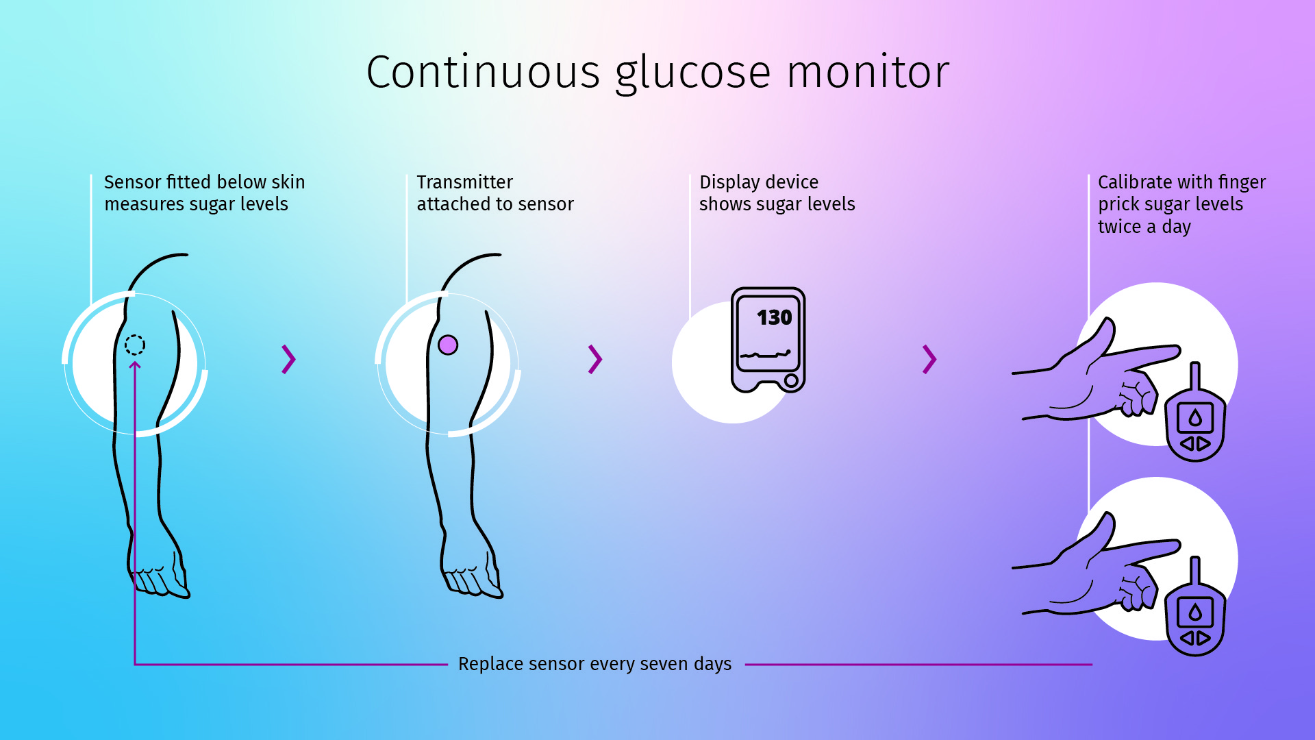
Spacing out the information over a few slides means you can create slides where your content has much more room to breathe. We’ve taken a few key pieces of the story and created this slide:
A special case I want to highlight in this section is graphs and charts. It’s no exaggeration when I say that we’ve seen a deck with no fewer than 12 graphs on one half of a slide (well, maybe a little exaggeration…) Either way, stuffing slides with tiny, pixelated pictures of graphs or charts is a frustratingly common presentation habit. Shoving all your graphs together reduces the impact of your data and makes it practically impossible to communicate its importance effectively.
The simple fix is spacing out the graphs on to separate slides. This means you and your audience will actually be able to read the graphs, you can physically point to key data points or trends you want to highlight and, if you’re feeling brave, even add some animation to tell a more compelling story.
If you’re going to spend 3 minutes on each graph, it doesn’t matter if they’re on the same slide or not, you’ll still be talking for the same amount of time. The only difference is that the experience will be much better for both you and your audience. And, if you find you don’t have much to say about half the graphs you were going to include, cut them out! You can always email out extra information afterwards – just cherry-pick the best bits for your presentation.
Now you’ve pruned your text-heavy slides, you as the presenter are bringing something more to the table than a text-to-speech function. Your slides are easier to understand, meaning your audience is more likely to pay attention and your presentation will be more effective. Everyone’s happy!
Ready to take the next step? Let’s get visual (visual) and add effective visuals to your text-light slides.
We’re calling out one of the major injustices of corporate rebrands across the globe – PowerPoint falling to the bottom of the rebranding checklist. We discuss why it's a problem and how to fix it!
A PowerPoint template is the foundation on which polished and professional presentations are built. We interview BrightCarbon’s new Templates Lead, Gemma Leamy, and pick her brains on the ideal process for creating robust PowerPoint templates.


muy bien