
29th May 2025
Designing presentations for cognitive disabilities
Find out how you can make more accessible and inclusive presentations by thinking carefully about fonts, layouts, colours and structure.

Colour contrast plays a crucial role in slide design, yet it’s often overlooked. Around 8% of men and 0.5% of women are affected by colour blindness or colour vision deficiency (CVD). Factor in other types of visual impairments, and situational limitations such as screens and projectors, and poor contrast could make your slides difficult – or even impossible – to understand for a large part of your audience. But designing accessible slides doesn’t mean sacrificing vibrant colours or going off-brand. With thoughtful use of colour, you can create presentations that are bold, bright, and fully accessible, ensuring everyone sees your content clearly.
Poor contrast on your slide doesn’t only affect those with colour vision deficiency. Everyone in the audience can have different needs at different times, and situational factors play a huge role in contrast issues. Something that looks fine on your screen when you’re designing can look completely different in the room it’s being presented. Projectors for example can be terrible for this – whether that’s due a poor-quality projector, an audience sitting too far away from the screen, or the room you’re presenting in being too bright, you don’t want this added stress when it comes to the day you have to present.
The same goes for presenting online. Your audience will be viewing on many different types of screens in different brightness environments all of which you have no control over.
The trick is to make sure your slides are already designed with a high enough contrast to be ready for these different situations.
When designing presentations, it’s important to challenge our own biases – what may look fine to you could look completely different to someone else in your audience. The only way to know for sure is to get into the habit of testing contrast on your slides. Luckily, there are various tools available to us to make this easy to do!
Most laws for digital accessibility such as Section 508 are based on the Web Content Accessibility Guidelines, which is often abbreviated as WCAG. These are the benchmark for web accessibility across the world.
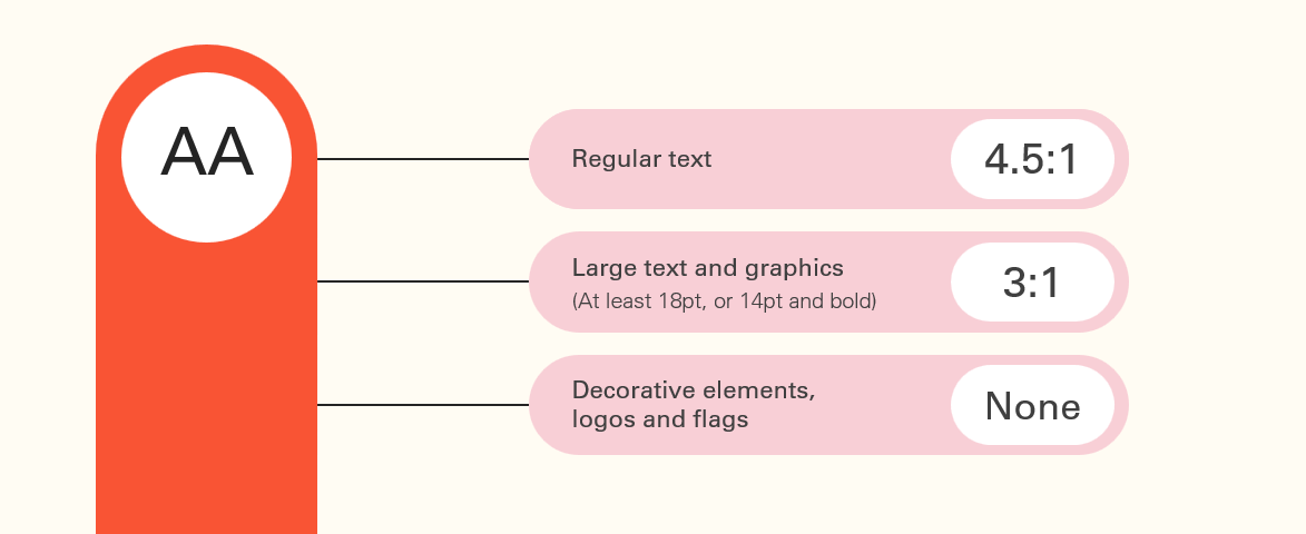
The WCAG guidelines are organised into three levels of accessibility standards; A, AA, and AAA. Whilst AAA ensures the highest level of accessibility, it can be more difficult to achieve and is not always possible in every scenario. So for most organisations, the objective is to satisfy level AA guidelines. These deal with the biggest and most common barriers for disabled users, so we will use this as a guide for our minimum colour contrast.
The aim is to make sure that any text or graphical content that the audience needs to understand has a high enough contrast ratio from its background.

Colour contrast is measured in ratios. To satisfy the AA guidelines, text needs to meet a minimum contrast ratio of 4.5:1.
Now there are some exceptions to this:
If this seems a bit confusing, as a rule of thumb we recommend aiming for a contrast ratio of at least 4.5:1, as it’s always better to be safe and aim higher – and making sure your text is large enough will also help with this as well.
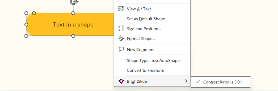
Our free PowerPoint add-in BrightSlide has some tools that help you test contrast directly in PowerPoint.
With BrightSlide installed, you can right-click on any text box or shape in PowerPoint that has a solid background fill and it will tell you the colour contrast ratio, along with a handy indicator of whether it passes or fails the WCAG guidelines. This also works if you select two separate shapes with solid fills to find the contrast between those two fill colours.
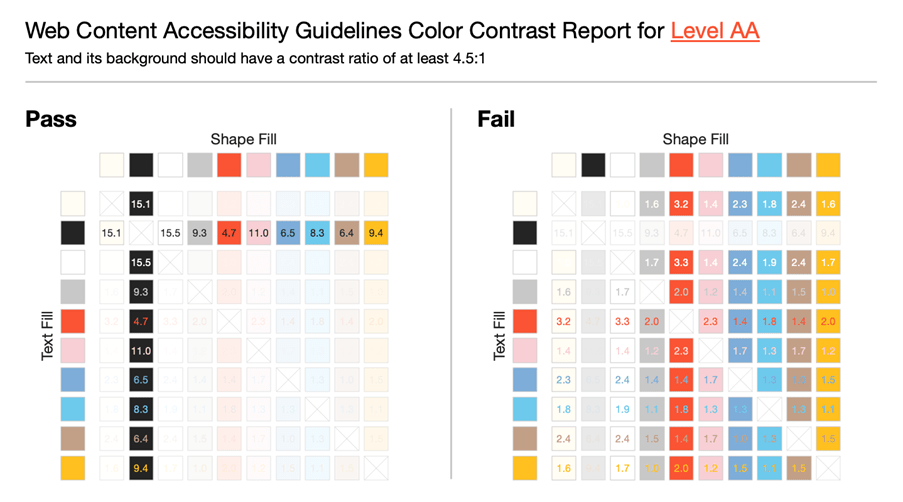
If you’re using any kind of PowerPoint template – you can use another BrightSlide feature called the colour contrast report to show you all the accessible combinations in your colour theme.
Locate the BrightSlide tab, go to ‘theme colours’ and then ‘Colour Contrast Report’. This will generate a report for all the theme colours in the currently active master.
If you’d like to test contrast for text boxes with transparent backgrounds, or gradient fills, check out the Colour Contrast Analyser by TPGi. This allows you to make use of a colour picker to test the different colours around your text.
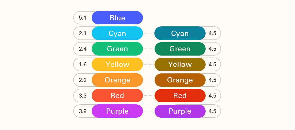
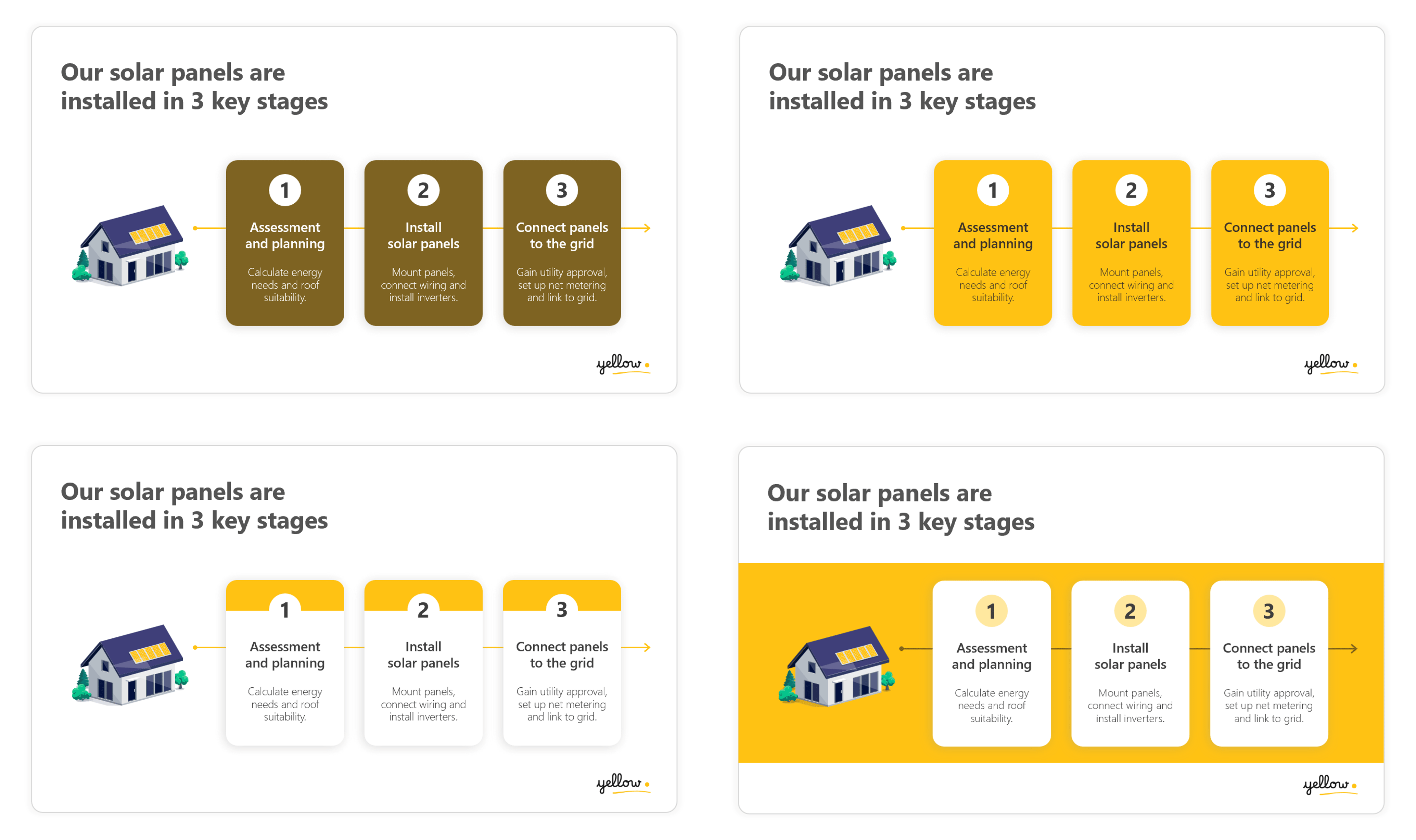
Achieving sufficient colour contrast is particularly difficult with certain colours like yellow and orange that have a high luminosity. If we look at the contrast ratios of all these text-filled shapes, you can see many of these colours have very low contrast, especially the cyan, yellow, and orange that all have contrast ratios of 2.2:1 or less. If we try and darken some of these colours so they have a ratio of 4.5:1, they begin to lose some of their vibrance, especially the yellow which is now more of a brown – and using different shades like this might not be part of your brand.
You don’t necessarily have to avoid the use of bright colours – you just need to be more careful with how you use them. Let’s take this example here, where yellow is the brand’s primary colour. On this slide, we have some white text in yellow boxes which has a very low contrast and difficult to read:
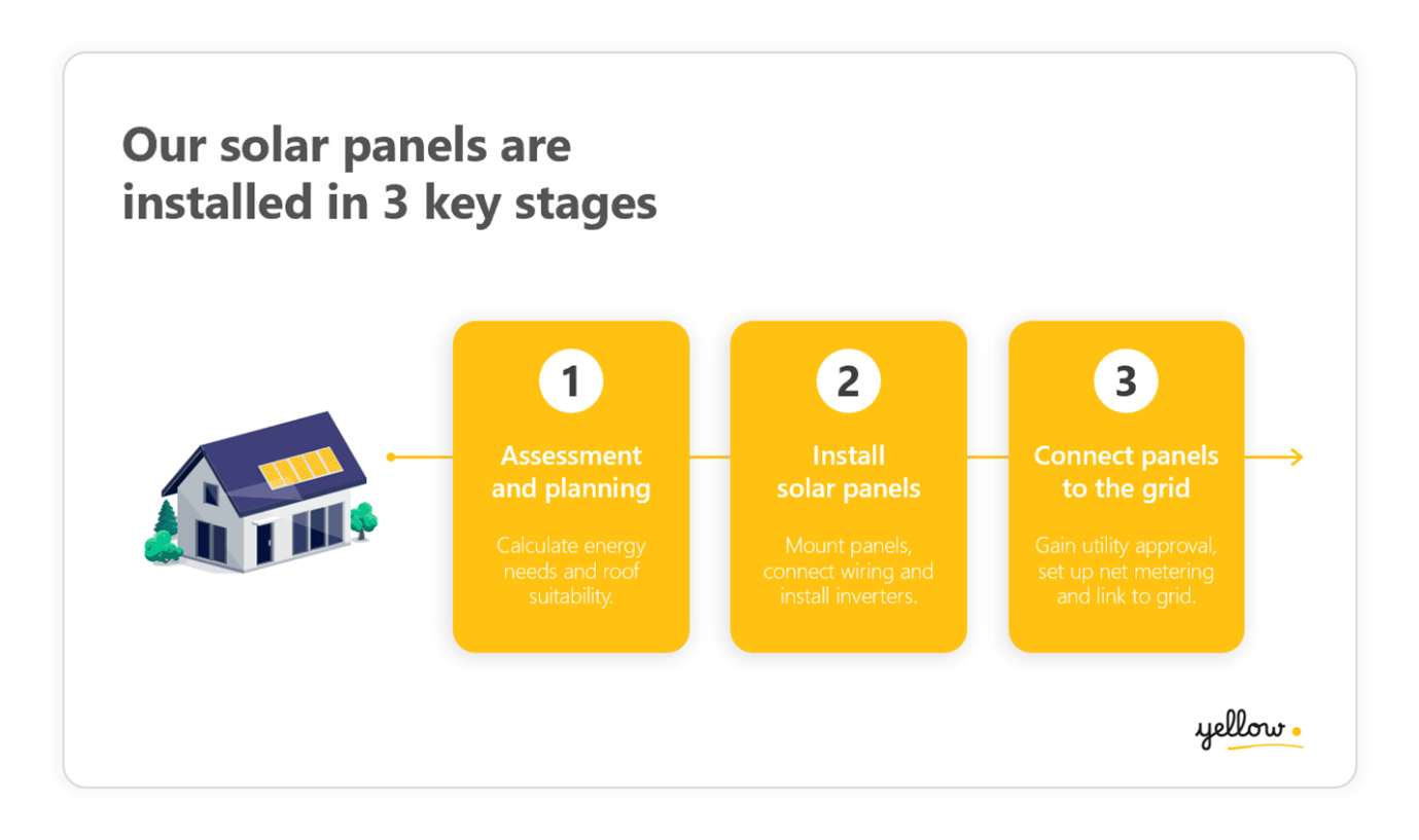
If we use tints or shades to make it a high enough contrast, it looks completely off brand, so what other options do we have available to us? The easiest technique here would be to use a dark text colour instead which has a good contrast against the yellow. But we could also just use the colour in a different way. For example, we could use yellow as an accent colour on the top of these cards instead of a background colour, or if we wanted something more bold and colourful, we could make the slide background yellow and keep the text in the white cards. When yellow becomes an accent colour we no longer need to worry about how it contrasts with the text because it is purely decorative:
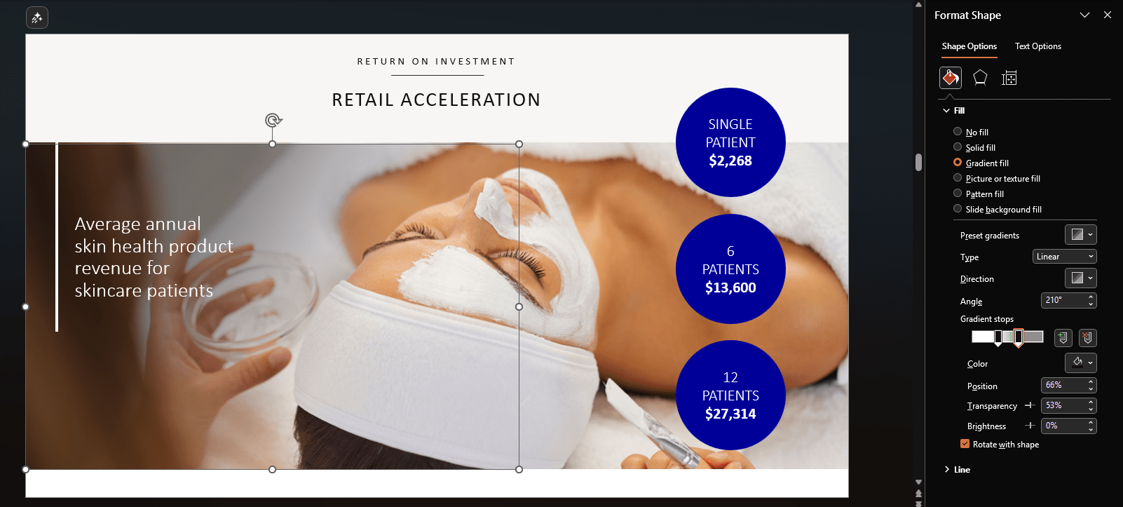
To enhance the accessibility of your presentations, it’s generally safest to avoid placing text over images. However, if you choose to use this design approach, there are a few techniques which can help improve readability.
Instead of darkening the whole image, you could darken the area underneath the text. Start by adding a shape with a solid or gradient fill on top of the image, then go to format shape and increase the fill transparency. This darkens the image in the area where the text is to improve the text contrast:
The problem with images is that they often contain details which not only make the contrast difficult to test, but also add visual noise making text harder to read. Another trick you could use is blurring an area of the image to create a frosted glass effect to reduce the background detail behind the text:
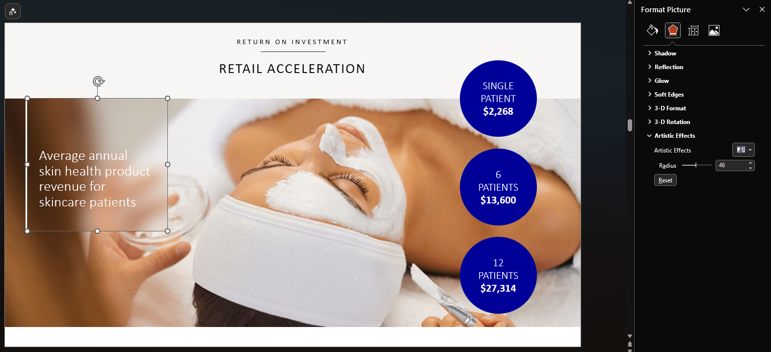
Now the background behind the text is less distracting, but to take this even further you could also reduce the brightness of the top image to increase the contrast of the text:
Whilst ensuring your slide content has enough contrast from its background will make your presentation accessible to much more of your audience, you could still be excluding people with CVD.
For demonstration, we put these colours through a colour blindness simulator. There are different types of colour blindness, here we have used deuteranopia (red-green colour blindness) which affects about 1.3% of people. For these people, red and green, or some colours with red or green in them, are almost indistinguishable from one another.

Coincidentally, red and green are often used to signal useful messages – such as start and stop, on and off, etc. In this example, red and green are used to show the audience which statements are correct or incorrect. But if you put them through a colour blindness simulator, you can see that they no longer have meaning if you don’t have full access to those colours. So how do you make this more accessible?
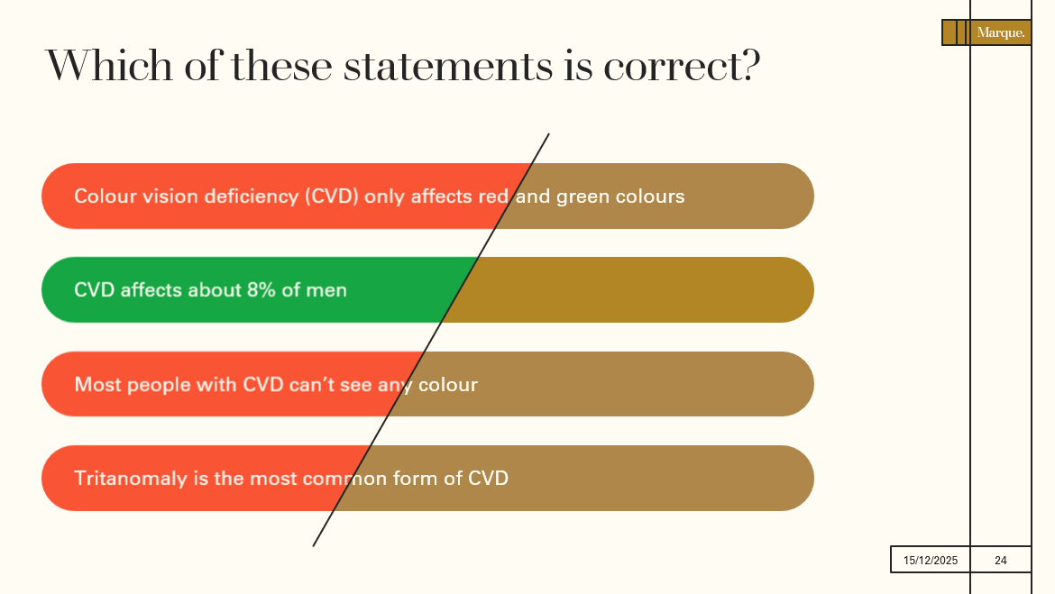
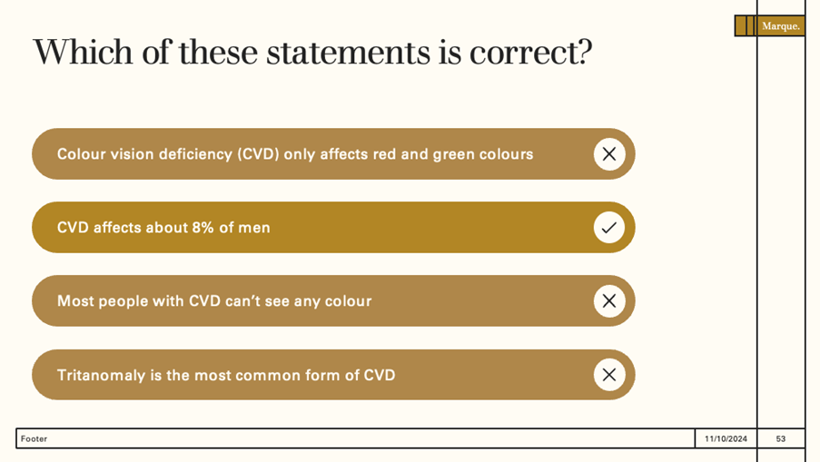
The trick is to make sure there is something other than colour that represents this information. So this can be things like text, symbols, and patterns. If you add tick and cross icons to these statements, removing the colour doesn’t cause any meaning to be lost.
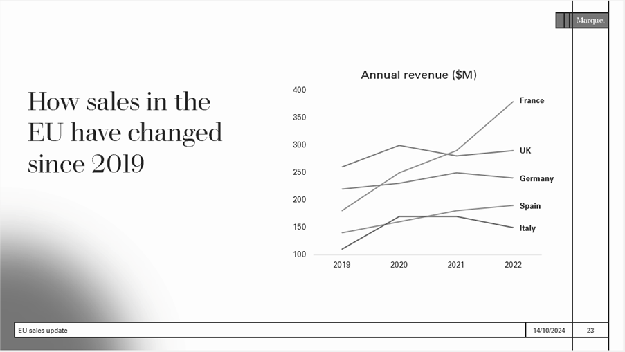
This starts to get tricker in data visualisation such as graphs and charts with a legend, and this is the most common place we see this mistake. The problem is that legends usually rely on colour.
The lines in this graph have a sufficient contrast from the background (3.1:1). But in order for people to be able to differentiate the lines and use the legend, the colours all need to have at least 3.1:1 contrast against each other as well, not just the background. This becomes increasingly difficult or impossible the more data sets you have.
There’s a simple and much more effective technique which we can use for data visualisation like this – and that’s adding direct data labels. Here we can get rid of the legend altogether and add text labels directly to each of the lines. Now the audience can clearly see which line relates to which country, without having to understand colour.
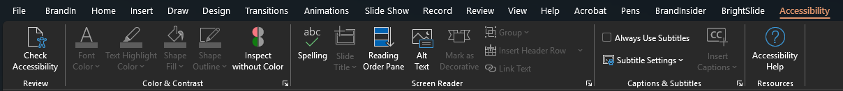
If you’re ever unsure if your slide is relying on colour to tell a story, PowerPoint has a great ‘Inspect without Colour’ feature so you can check your slides. Go to the Review tab, then in the accessibility dropdown choose ‘alt text’. This will open the accessibility ribbon. Select inspect without colour to review your presentation in greyscale and make sure your visuals still make sense.
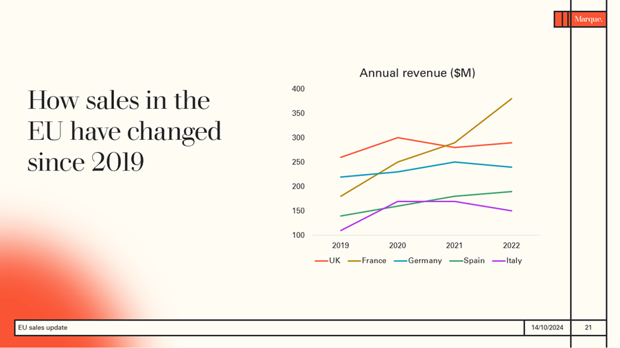
Whilst we need to ensure our slides are accessible by not using colour as the only way of telling your story – colour is still a very powerful tool in visual communication. By using too many colours, we can miss the opportunity to direct audience’s attention to what is the most important. For example in this line graph – what are we actually showing the audience here? And how relevant is all the data?
We can start by pulling out the key message and using it to add a more descriptive title. Here we want to show that revenue in France has increased and overtaken the UK to become the biggest European market. So instead of making every country a different colour, now that they are all labelled directly we can make them all the same colour except France, which we have highlighted in a colour with a 3:1 contrast ratio to the others. We have also used thicker line weight for this line to help it stand out more:
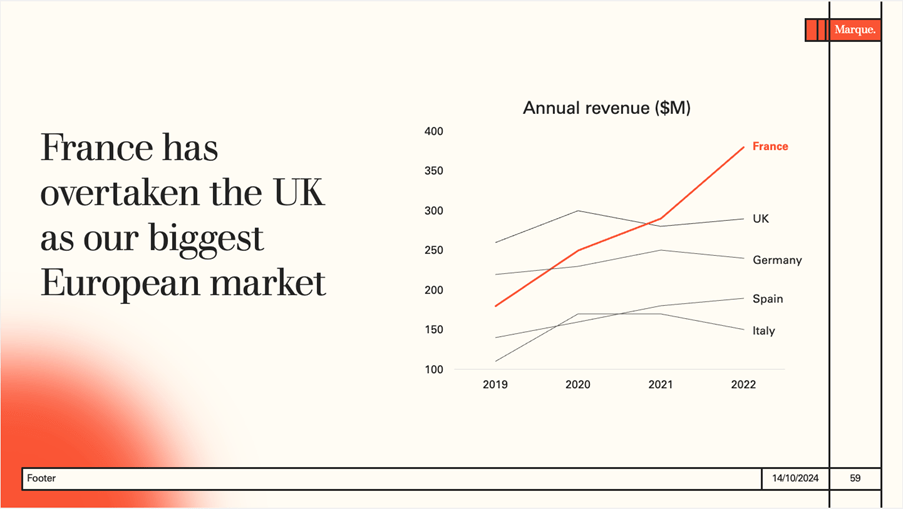
This is a great example of how designing for disabilities often results in a better design for everyone. We used direct labelling to solve for low vision – but we have also reduced cognitive load for the audience as their eyes no longer need to jump between the legend and the graph data, trying to recognise each one. And being more intentional with our use of colour has not only made it easier to find colours with enough contrast against each other, but it has also clarified the message. Remember, you can always provide more data as further reading for anyone in the audience who may be interested.
Accessible design doesn’t mean abandoning creativity or your brand’s signature style. By being intentional with your use of colour and using colour in different ways, you can create presentations that are both vibrant and inclusive. And, designing with disabilities in mind will ensure that everyone in your audience can follow along, whether they are colour blind, in a brightly lit room, or finding it difficult to concentrate due to tiredness or stress. So, embrace accessibility, and keep things bold, bright, and beautifully on-brand!
Leave a commentFind out how you can make more accessible and inclusive presentations by thinking carefully about fonts, layouts, colours and structure.
More accessible presentation slides can be the difference between your audience fully engaging with your content and your audience tuning out and missing out. And, if your audience miss out you miss out!
One of the most common mistakes, we see when it comes to accessibility in presentations is poor color contrast. When there isn’t enough contrast between the colors on your slides, your presentation becomes less accessible to a whole range of people. Luckily, while this is a common error, with BrightSlide's new color contrast checker, it's also a very simple thing to fix.
Join the BrightCarbon mailing list for monthly invites and resources
Tell me more!A big and sincere thanks for all of your superb help and effort in preparing such fantastic material and for all your excellent coaching tips. Look forward to working with you again soon.
Greg Tufnall Siemens


Great tips, presented clearly and concisely.