Presentation and eLearning resources
from the experts at BrightCarbon
BrightCarbon are on a mission to create better presentations, presenters, and eLearning. We believe that when content is more engaging and effective, everyone benefits.
We’ve compiled these resources to help you master the art of presenting, up your PowerPoint game, create successful sales tools, and increase the effectiveness of your eLearning.
And they’re all free!

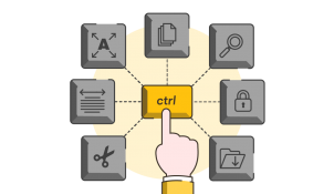
Google Slides keyboard shortcuts
Next time you make a Google Slides presentation, how about taking a shortcut. In fact how about you take several! Learn how to fast-track your productivity with a downloadable cheat sheet of your new favourite Google Slides shortcuts.
How to write scripts for eLearning
eLearning is on the up. But writing the content that will be narrated during your eLearning isn’t the same as writing your instructor-led training speaker notes, or even your leave-behind document. Learn how to write scripts for eLearning in this course.

8 Storyline tips and techniques to try
If you feel like your latest Storyline courses are getting a little tired, and you're looking to build your library of engaging interactions and effects, here are 8 techniques you can try to level up your skills - and your courses.

Christmas quiz template
It's Quiz-mas! Download our free Christmas quiz PowerPoint template for festive fun and fiendishly difficult quiz questions!

Presenting online
Presenting face-to-face and presenting online are really different. This video presentation tells you how to present online at webinars, online meetings, and for online sales presentations. This resource covers how long to present for, how to prepare and rehearse, how to maintain audience engagement, making use of technology, and how to run online sales presentations.

BrightSlide
Created for PC users by PowerPoint experts the BrightSlide add-in will help you create, polish, and edit presentations at speed. It draws on industry-standard shortcuts to boost your workflow and provides amazing, extra functionality PowerPoint users have only dreamed of. And it’s all yours, for free!…

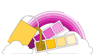
Color tool for PowerPoint
Often, when working in PowerPoint it can be really hard to quickly check what theme colors are programmed into the PowerPoint presentation you're using - especially if they use different templates. It can also be tricky to have your custom colors easily accessible. Download our PowerPoint color tool and paste into your presentations to check your theme colours and pre-fill your custom colors.
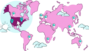
Editable PowerPoint maps
A globe-trotting collection of editable PowerPoint maps, featuring a PowerPoint world map, PowerPoint country map, and PowerPoint US state map, which you can use to take your audience on an incredible journey
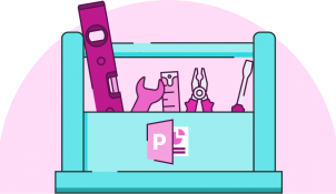
Awesome presentation toolkit
An awesome presentation toolkit, free to download, which contains PowerPoint visuals, iconography, slide templates, and other graphics to kick-start your next presentation.
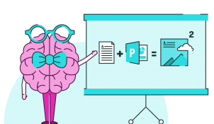
Mind blowing PowerPoint!
We've all seen PowerPoint, we all know what to expect, right? Boring bullet points, uninspiring design, and terrible animation effects. Well prepare to have your mind blown! PowerPoint in the right hands can be a powerful tool; find out how to start creating your own mind blowing PowerPoint presentations.
Join the BrightCarbon mailing list for monthly invites and resources
Tell me more!