Power-user is a Microsoft PowerPoint add-in that provides you with visual elements and tools to help you make better and more impactful business documents. At BrightCarbon, we spend most of our work time (and admittedly, some of our free time) creating, editing, and generally playing around in PowerPoint, so we wanted to know whether this add-in really can transform our workflow.
Power-user is compatible with all versions of Office from 2007 onwards on PC as well as Virtual Machines.
Pricing
Power-user has three pricing options: free, premium, and premium (10+ users):
Free: Limited number of templates, icons, maps, and diagrams, over a million HD pictures.
Premium: $8.75/month free for academics; 500 PowerPoint templates, 6,000 vector icons and flags, over a million HD pictures, 250 editable maps, Agenda builder, Clean, Advanced charts, 10 tools to automate formatting, 10 tools to manipulate shapes.
Premium (10+ users): $9-15/month; all features in Premium plus Shared libraries, Tombstones, Admin portal for license management and brand compliance.
This is the Power-user tab in PowerPoint. Power-user includes features for Microsoft Word and Excel, but its PowerPoint capabilities are the focus of this post. I checked out the Premium subscription.
Templates
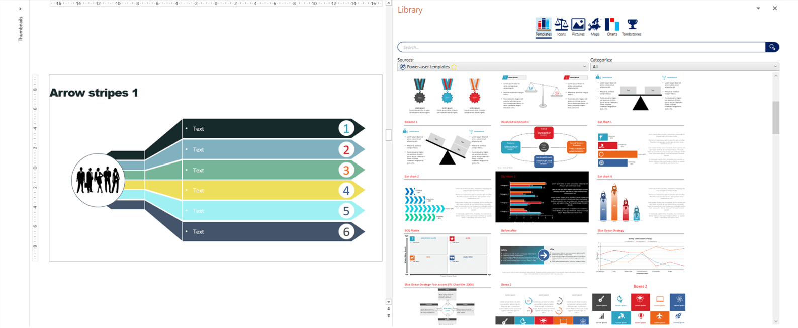
Pre-built slides can help you quickly whip up consistent decks, using similar layouts again and again. Power-user pride themselves on providing users with a huge range of templates. These can be accessed through a searchable side bar by clicking Library in the Power-user tab.
There are so many template slides that it’s a bit overwhelming! Rather than endlessly scrolling through the hundreds of options, I recommend using the filter function to search the templates by slide type e.g. tables, diagrams etc. Though you can’t filter by recently used, you can save your favourite templates to Mytemplates by inserting the template into your deck, right clicking, and selecting Save in library. You can save any slide to the library (not just premade Power-user slides), so if you create a design you love, you can save it to the Power-user library and access it whenever you need to. Power-user can also work with organisations to provide a library of company slides for employees.
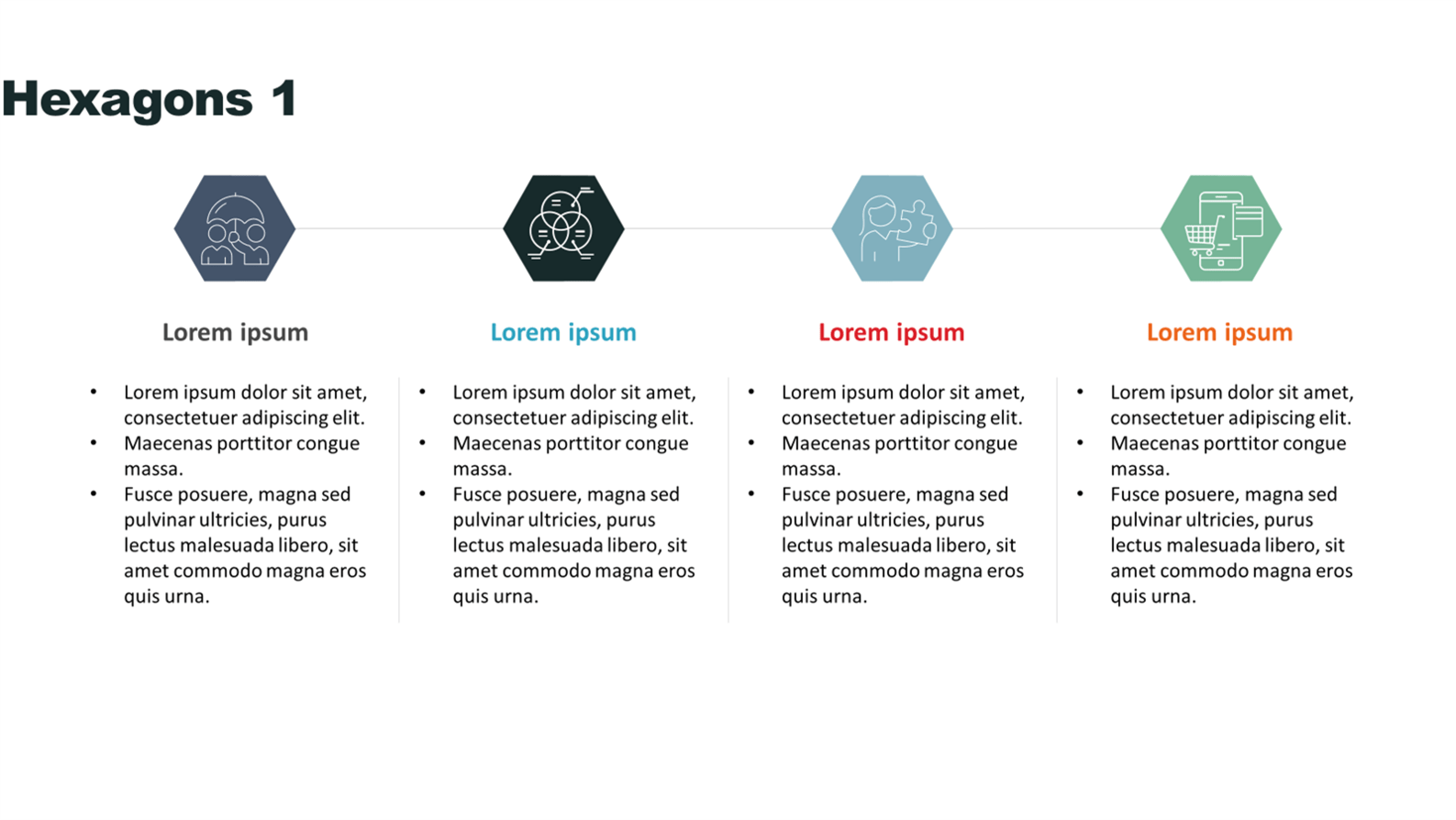
If you’re not confident creating your own slide layouts, some of the simple, clean layouts provided by Power-user, like this one below, are a good start. It uses simple shapes with a clear hierarchy and is easy to edit – read more about slide hierarchy. Just be wary of adding too much text to a slide. What happens when audiences see text-heavy slides? They don’t read them, or worse – they read the slides and don’t pay attention to you! If you’re not sure how to create more visual slides, check out this post.
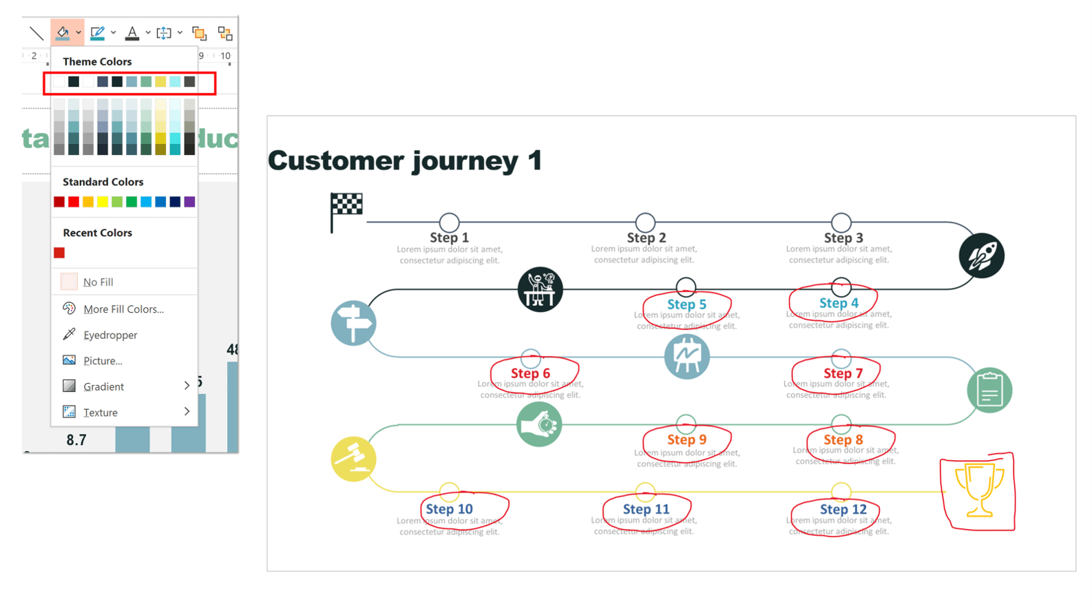
Unfortunately, when you add these premade slides to your deck, they don’t consistently adopt theme colours. Whenever you’re working in a PowerPoint deck, the template you’re using will have a set of specified theme colours – even if it’s just PowerPoint’s default colours. These dictate the colour text, graphs, charts, and shapes automatically take. You can see what the theme colours are in the deck you’re working in every time you go to recolour an object or text. Learn how to change theme colours.
Most organisations have a brand template, with specific brand colours set as the theme colours, to make sure everyone’s presentations look consistent. However, as you can see in the screenshot below, though the icon holders match the theme colours I’m using, the bold blue, orange, and red text and the final orange icon on this Power-user template slide do not.
Why is this a problem? There’s a risk that users may not spot these errors, especially when working at speed, compromising brand identity. This can quickly become an issue, particularly when working on an enterprise level.
One set of template slides I’d recommend staying away from entirely is the animated slides. They are a bit odd, use very PowerPoint-y animations (in the worst sense of the word!), and you can do much better animating your slides yourself using simple transitions and basic PowerPoint animations.
I’m unsure what the point of this template slide is!
Graphics
Power-user comes with lots of visual assets to help you build engaging slides. These are accessed through the Library sidebar.
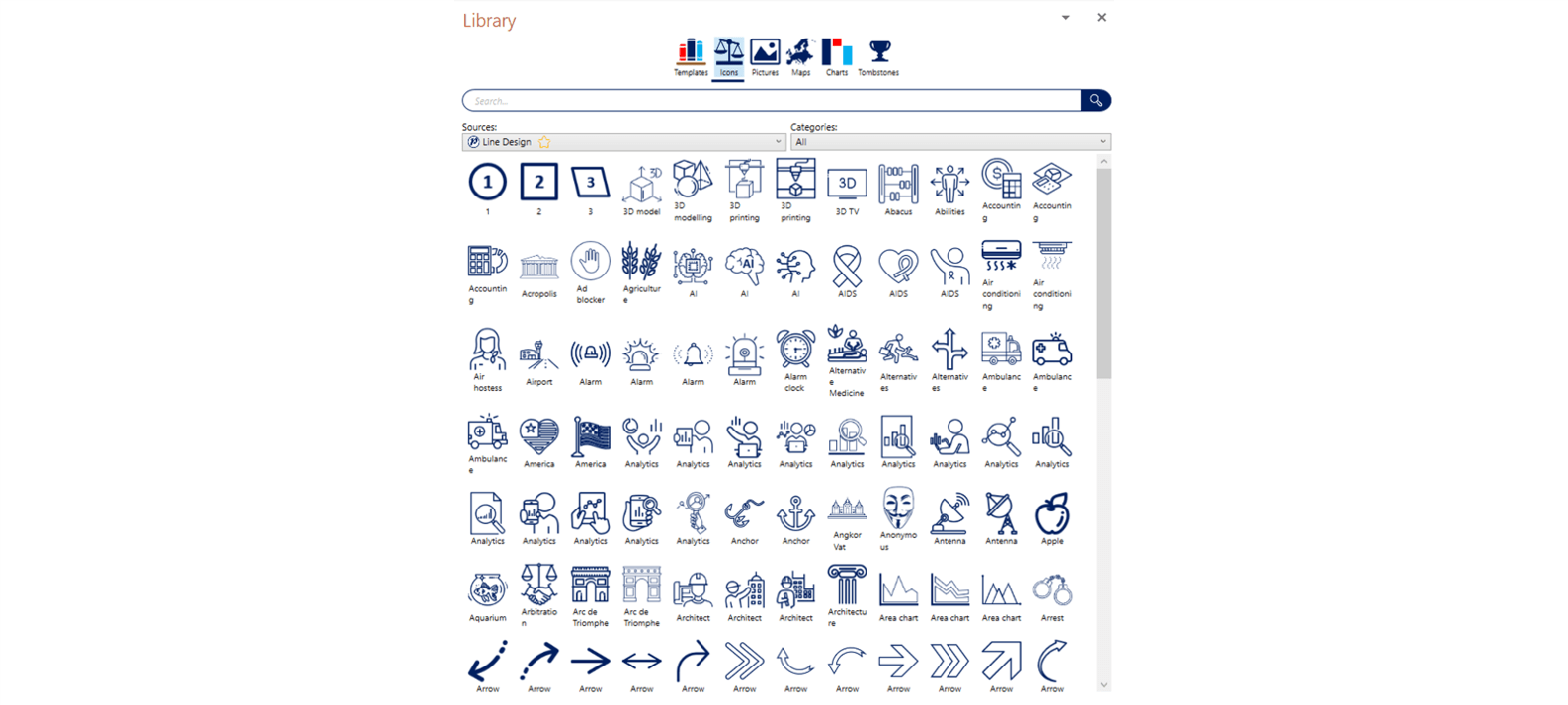
Icons are super versatile and can have a big impact on the drabbest of slides. Check out a few examples in this blog post. As PowerPoint’s native icons – accessible to Office 365 users – are getting better by the day, it’s interesting to see how Power-user’s offering compares. There’s a large selection of icons which you edit (fill and line colour) once the icons are on your slide. There’s probably a bigger range than PowerPoint offers at the time of writing, but you need to make sure to filter by style to ensure consistency.
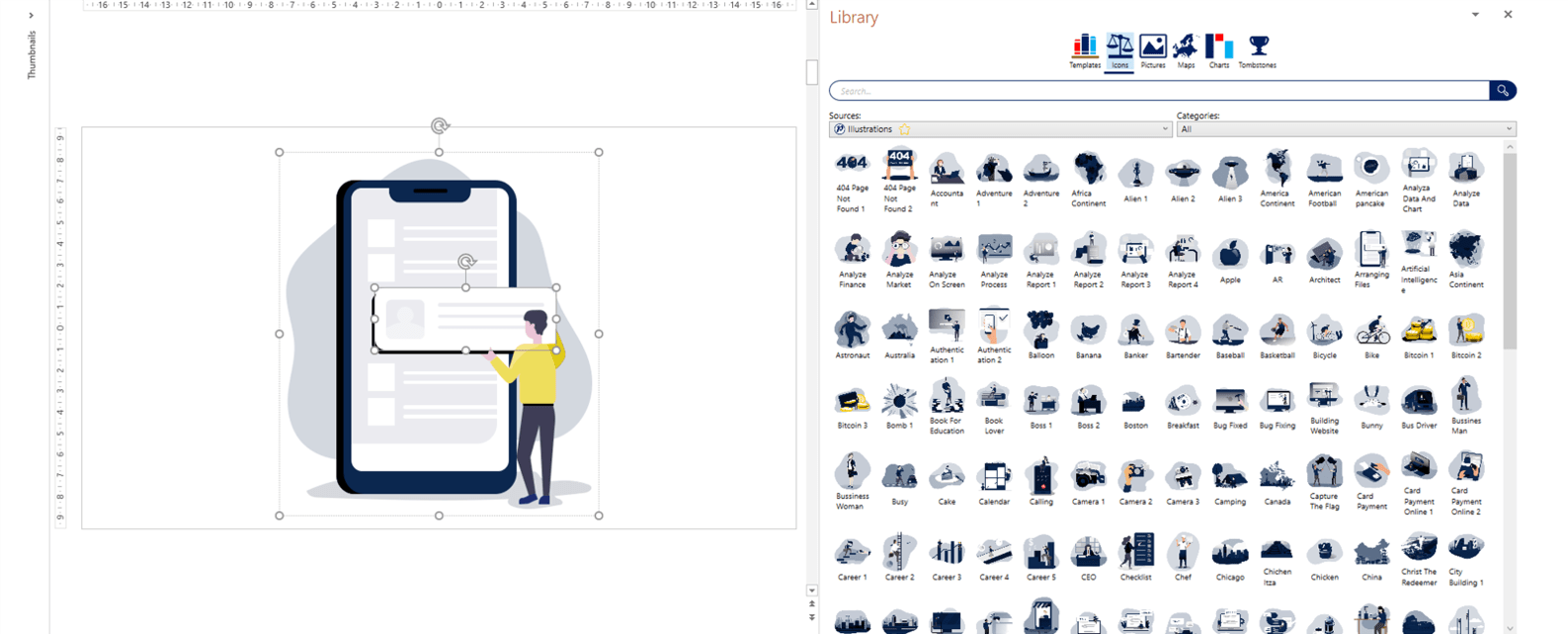
Moving on, the illustrations in Power-user’s library are an interesting asset especially for users without an Office 365 subscription (PowerPoint now has a great range of native, editable illustrations under Insert>Icons). Once you add a Power-user illustration to your slide, you can ungroup it to access the individual elements of the design. This allows you to edit the illustrations and get creative! It would be great to see a wider range of illustrative styles here in the future.
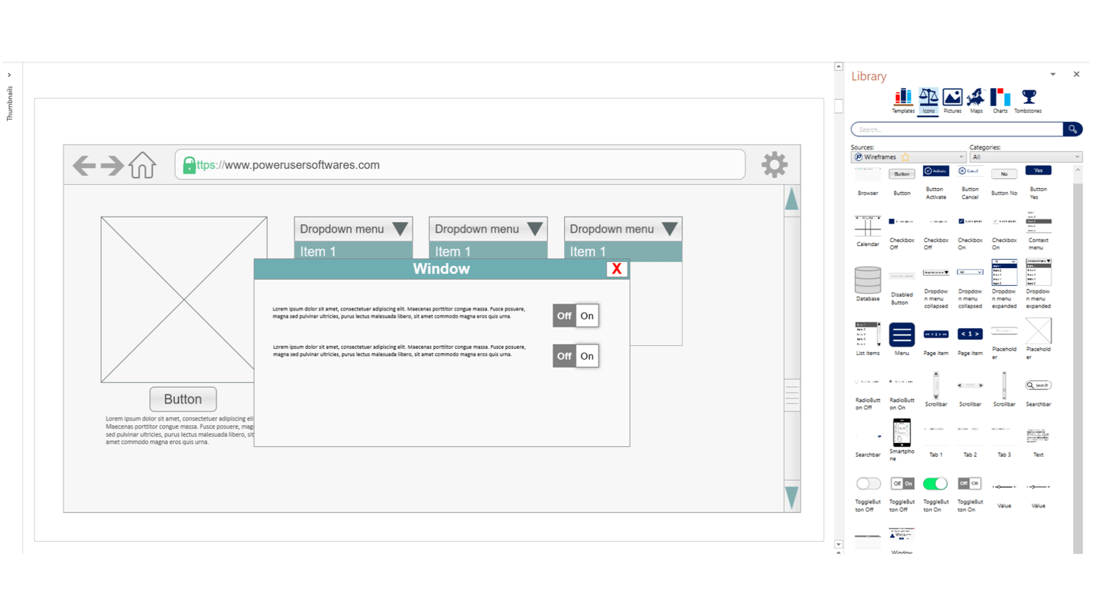
The wireframes are another unusual feature from Power-user, with pre-made components enabling you to quickly build out, well, wireframes. If this is something you need to do regularly, to create UX or instructional design interfaces, these elements will be a real time saver. Be careful when resizing as the elements can easily be distorted.
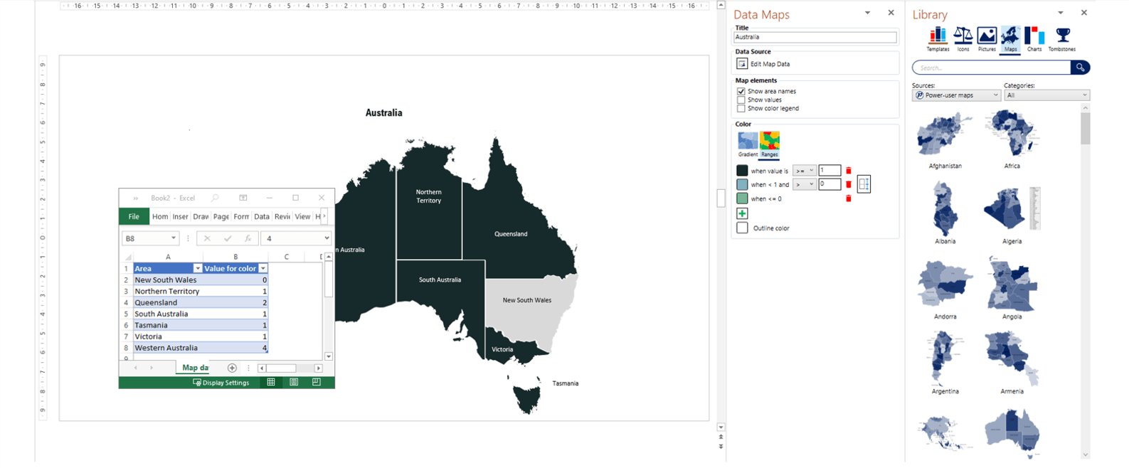
We first tried out Power-user back in 2016, and were impressed by their data maps. Four years later, they are still an impressive resource! There are over 150 different maps with removable labels. By right clicking on the map on your slide and selecting Edit map design, you can change the values associated with each country or region in an Excel sheet. You can then set colours for different values or ranges of values in the Data Maps side bar. You can also edit each region or country manually as a PowerPoint shape.
Charts and Chart+
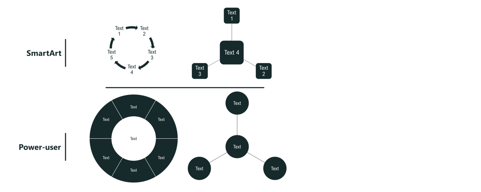
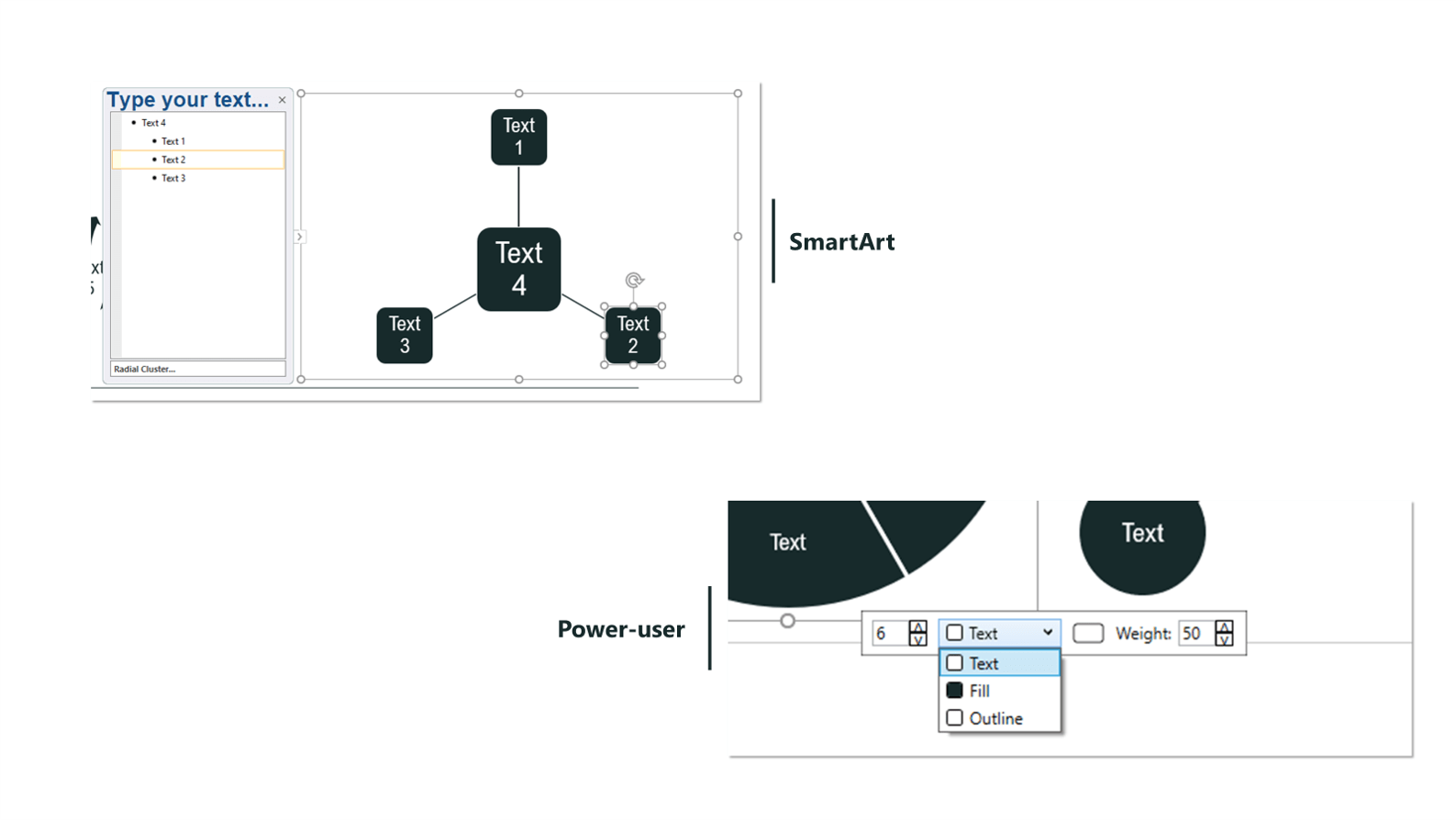
Power-user offers lots of pre-built diagrams. Some of these diagrams are similar to those already available in PowerPoint via SmartArt like these two.
However, the Power-user versions have more flexibility as they are made up of grouped PowerPoint shapes, meaning you can ungroup the diagrams and animate each element easily. This means your charts and diagrams can do more to help you tell a story, you can lead the audience through your slides, animating each section of a graphic in individually and holding your audience’s attention until the very end. Watch this masterclass to learn more about storytelling with graphs and charts. Power-user’s diagrams also have a more intuitive interface to help you add/subtract segments and change the colours and size of the diagram.
Being able to insert these diagrams, rather than create them from scratch could help save a lot of time.
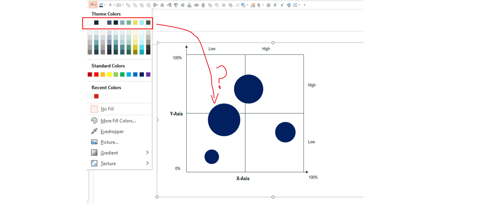
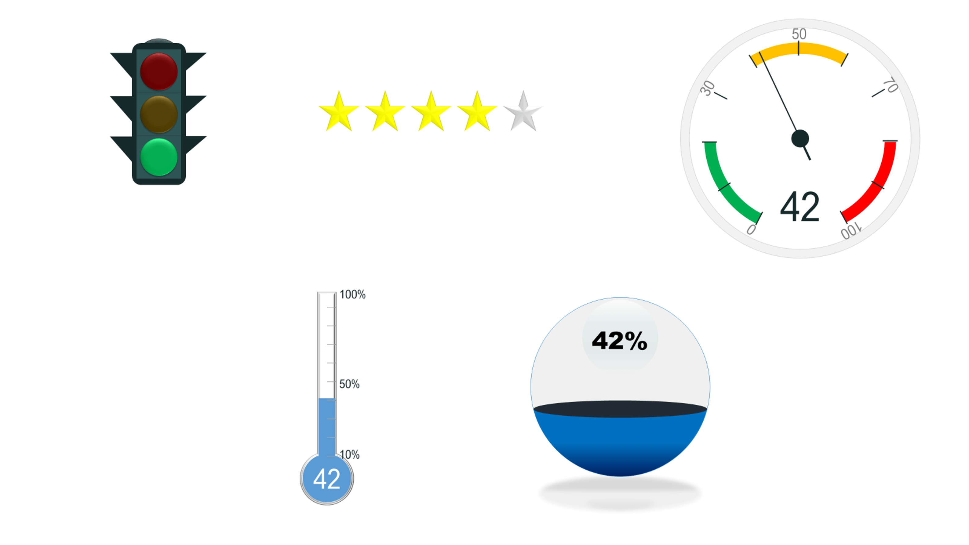
The Power-user charts (accessed through the Library tab) can be linked to an Excel spreadsheet. Just a note: most of the charts (except ‘3 dimension’ – see first screenshot below) default to your theme colours, but quite a few of the diagrams, such as the traffic lights and ratings (see second screenshot below), don’t.
The Chart+ tool is supposed to allow you to edit multiple charts in a presentation in one go, resetting fonts, dimensions, adding or removing data labels etc. In theory this is a great tool, sadly it was pretty glitchy for me: the tool only updated a few charts in my deck rather than all of them.
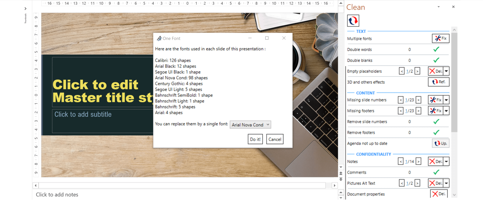
Clean
It’s important to give any presentation a thorough check and proofread before an audience sees it. Power-user’s Clean tool will review your slides, produce a list of potential errors, and, in some cases, help you fix them in a couple of clicks.
This includes identifying empty placeholders, missing slide numbers, notes and comments, hidden slides, unused layouts and more. Using the arrows, you can skip your way from one issue to the next and fix or delete the problem slides/objects, as necessary. This worked well and could be great for reducing file bloat by deleting unused masters and layouts as well as polishing your slide content.
Object control
You may already be familiar with the standard PowerPoint alignment and spacing tools. They allow you to align objects to certain points on the slide and distribute objects evenly across certain distances.
These can be enormous time savers when you’re laying out a slide. Power-user took these tools, and added some more options: touch align (moving objects so that their edges touch), vertical/horizontal symmetry, and horizontal/vertical spacing. The horizontal/vertical spacing tool was glitchy for us a few years ago and it still doesn’t act exactly as you might expect. For example, if you have objects in a straight, horizontal line and increase vertical spacing three times and then decrease it three times, you don’t end up with your objects back in a straight line.
There are also some useful tools that help you manipulate objects including: size matching, merge/split text, and swap objects.
Sharing is caring
More than ever, we’re working remotely and needing to find effective ways to collaborate with colleagues. Power-user provides a handful of features to make this easier. For example, you can “stamp” slides in your deck with various text including, ‘Confidential’, ‘Draft’ etc. This is helpful to signal to colleagues or clients which slides are complete and which still need work. You can use the same tool to remove stamps.
You can also streamline your workflow by emailing your presentation, or a portion of it, directly from the PowerPoint file.
Usability
The Power-user tab is designed to be a one-stop shop for PowerPoint users. The tab is crammed full of all the tools you’re likely to use every time you open PowerPoint – both Power-user and standard PowerPoint tools. The logic here is clear, but it does make the tab quite busy. And, because Power-user wants you to learn to use their tab for everything, every time you insert an object, the Power-user tab opens automatically. As someone who uses a Quick Access Toolbar and other PowerPoint add-ins like BrightCarbon’s BrightSlide, this was a smidge irritating. If Power-user became part of your workflow, the automation would be another time saving win. However, if you only use a few of the tools you can turn this setting off by going to File and scrolling to the bottom to edit the Power-user settings.
Power-user has many features that we didn’t cover here. If you choose to purchase Power-user, you should definitely spend time up-front familiarizing yourself with the different areas of the toolbar and take advantage of the various tutorials Power-user provides. To learn more about Power-user click here.
I received a subscription to this software free of charge in exchange for my honest review and opinion.
A PowerPoint template is the foundation on which polished and professional presentations are built. We interview BrightCarbon’s new Templates Lead, Gemma Leamy, and pick her brains on the ideal process for creating robust PowerPoint templates.
It can seem daunting to take a text-heavy slide or list of bullets and turn it into something visual, especially if you don’t think you’re super creative. However, the first step is simply reducing the amount of text on your slides – and you don’t have to be an artist to do that!
It is, quite simply, the best deck we have. I did a nice presentation with it yesterday and would like to do the same next week... I am sure it will get a lot of use. The visual impact and flow are compelling!