We live in a world where there is already an overload of data and information, with a constant stream of statistics and surveys being produced, all designed to persuade us to change our behaviour, our buying habits, or our views. The need for infographics has never been greater.
But what is an infographic? An infographic is a way to present information, data and knowledge in a visual manner. Picture the scene – someone gives you a report on how house prices and buying habits have developed in the last 50 years. Imagine reading number after number – ‘56% says this…’, in ‘1987 23% of 16-25 thought this…’ – at the end of one page of text you’re absolutely lost at sea with no hope of remembering what’s important, or why is matters to you.
But with infographics, that dense data is represented visually. This has a two-fold benefit: not only does it make the information easier to digest and understand because you can process concrete things, but it makes it far more memorable than a page of text would be. Infographics help keep your audience engaged and can be a great tool to help promote and advertise your brand.
Not convinced? Take a long lunch break and pour through the Information is Beautiful archives – you’ll soon be a convert.
And there are some great uses for infographics – everything from giving your sales reps a cheat sheet on all your key selling points, to stylish leave-behinds for your prospects, even to key facts and figures to put on social media.
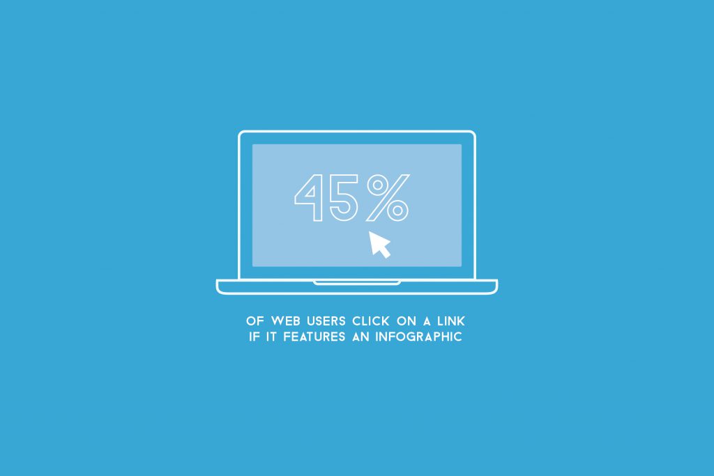
Have a look through the visuals below to see why infographics are so important in displaying information…
And if you’re keen to know how you can add a stylish infographic to your sales arsenal, then have a look at our infographics page for more information.
Online presenting can be challenging. With more work and home distractions than ever, all competing for attention, no real-time audience feedback, it basically feels like you're just speaking into the void. But fear not. We’ve pulled together our 5 top tips for keeping your virtual audience engaged, present, and tuned in, so buckle up and turn your presentation nightmare into your presentation dream.
The biggest source of event stress comes from this interesting conundrum: the success of the thing you poured your life and soul into for the last few months does not depend on you. It all comes down to your presenters conveying your messages in the right way, with the right amount of energy, and the audience – that you have absolutely no control over – engaging with those messages. Good news. There is a solution: and it’s just one solution to address both challenges. It's all about the science of audience engagement and presenter anxiety, and how the content you present can help both.