When you’re showing data on a graph or chart, particularly in a scientific context, it’s often important to show the variance of the data. You do this by showing error bars on your graph, commonly standard deviation (SD), standard error of the mean (SEM), or confidence intervals (CI). Statistics packages will do this for you, but what if you want to create the graph using good old Microsoft programs? Well, happily, it’s very easy to add error bars in PowerPoint – thanks to its leveraging of Excel functionality you can create good-looking charts that are accurate and useful. In this article, I’ll show you how to add error bars in Excel and PowerPoint as the method is almost exactly the same in both programs.
Step 1: Create your chart or graph
I’m going to assume that you already know how to choose a chart or graph in PowerPoint and add your own data to it. If you’re not sure how to do this, then check out our free resource on creating graphs and charts (we also run a free masterclass on this, so check out the schedule to see when it is next on).
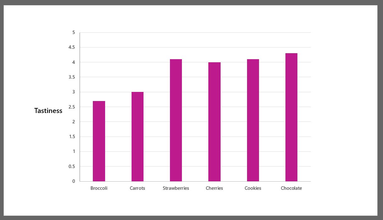
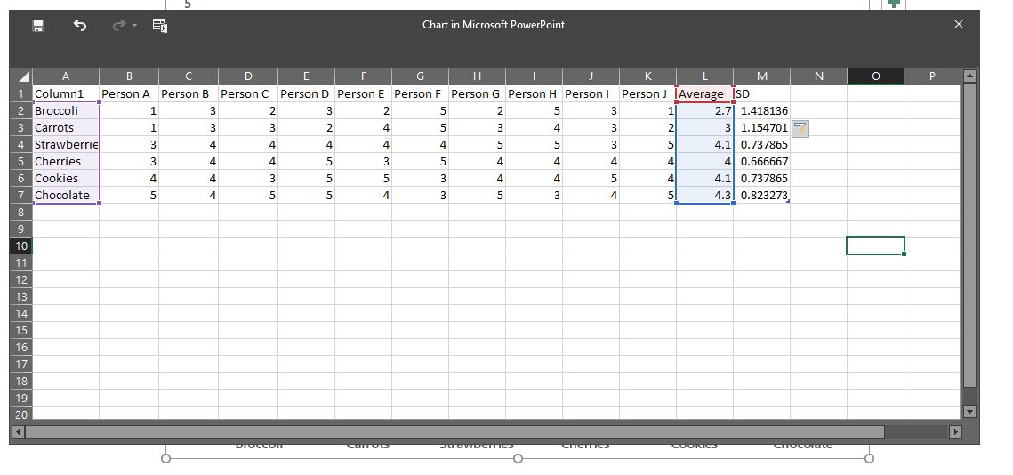
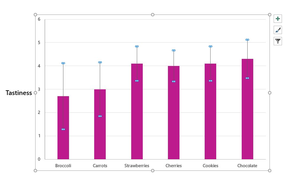
This is my chart – it’s a simple clustered column one with an entirely fictional dataset (that may perhaps show my own bias a teeny bit…).
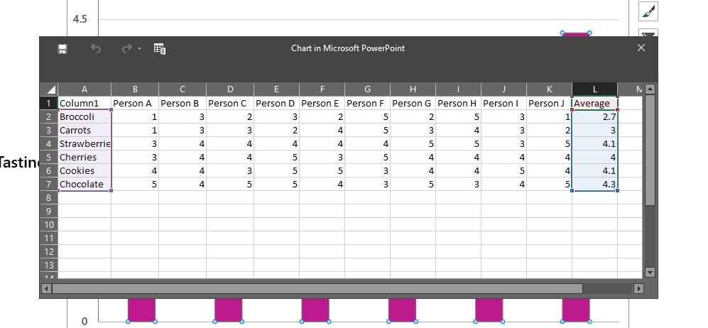
It’s based on this data – and I’ve just plotted the average for each type of food.
Step 2: Tell PowerPoint you want error bars on your chart or graph
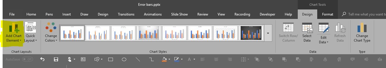
Error bars count as a chart element. You can add them in a couple of different ways. You can use the ribbon:
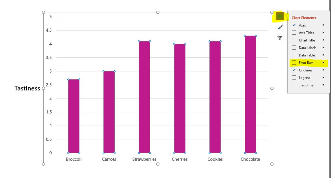
Or you can use the button on the graph itself:
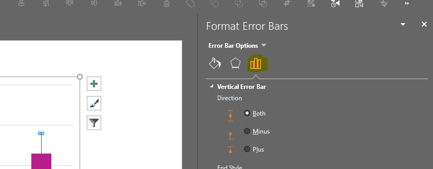
When you click the button, choose More options and a formatting pane should open on the right-hand side of PowerPoint. Make sure the chart icon at the top of the pane is the one that is selected.
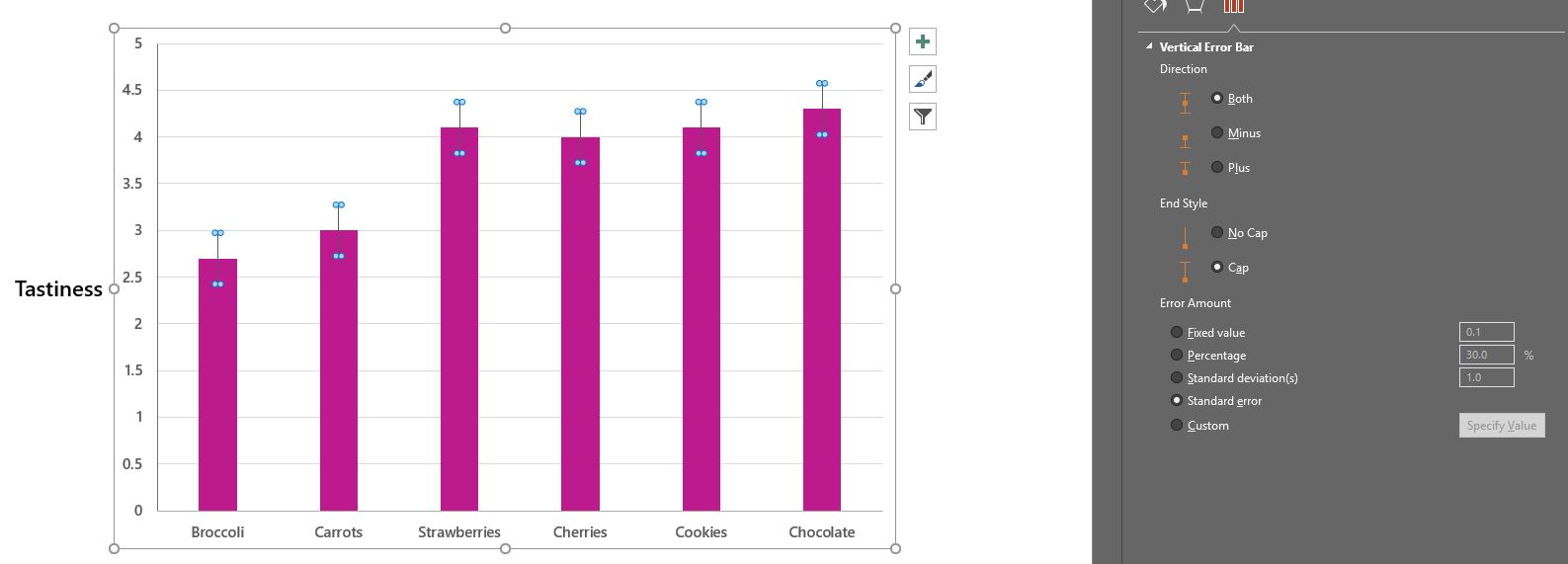
Step 3: Edit your graph/chart’s error bars in PowerPoint
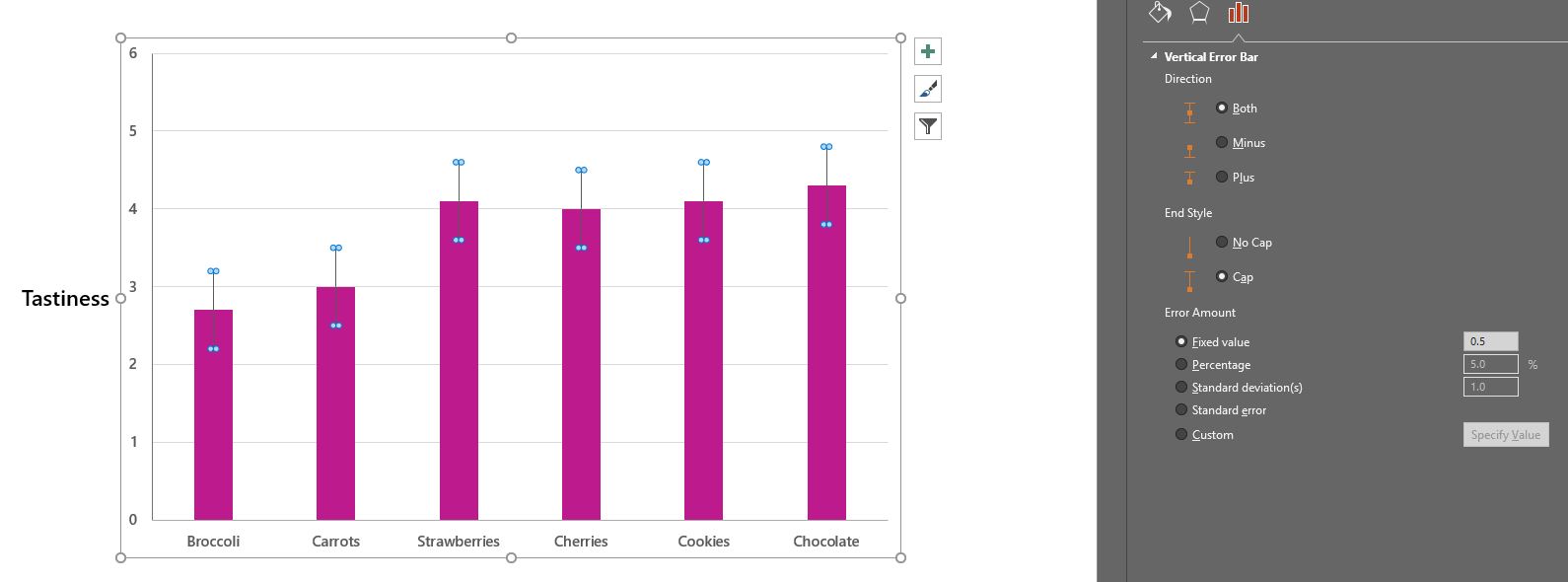
PowerPoint offers lots of options for customising the style of your error bars. Working from the top down, you can first choose which direction the errors bars should go in. You can also choose whether you want them capped or not. Finally, you can choose the error amount.
There are a few options for choosing the error amount of your error bars in PowerPoint:
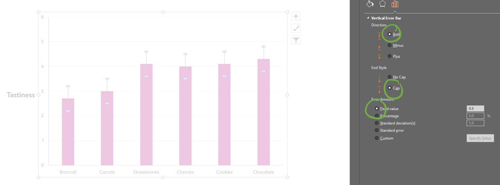
Enter a fixed value
This will give you the same value for each bar, the same value above and below the bar, and will be centered on the top of the bar.
Enter a percentage
This will give you different values for each bar, the same value above and below the bar, and will be centered on the top of the bar.
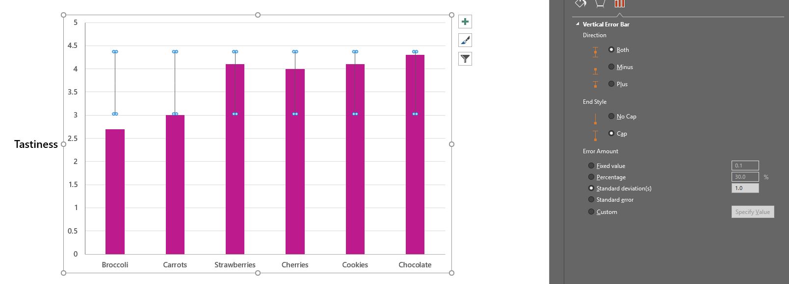
Enter a standard deviation
This will give you the same value for each bar, the same value above and below the bar, and will be centered on the mean (average) of the sum of all the columns.
Choose standard error
This will give you the same value for each bar, the same value above and below the bar, and will be centered on the top of the bar.
Importantly, note that this standard error is based on the totals of the columns, NOT the original data, even if you have included that in the spreadsheet.
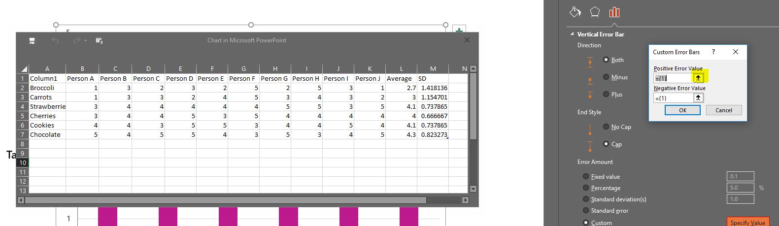
Now if you want to show SD or SEM, you may have spotted that the built-in standard deviation and standard error options above are not very good ways of going about it. Luckily there is another option: create your own custom values. This can give you different values for each bar, different values above and below the bar, and will be centered on the top of the bar.
Don’t click that Specify Value button yet, though!
The first thing you need to do is to add the numbers of the variance you want to show into the spreadsheet that is linked to your graph. There are a number of ways you can do this: you can calculate the variance using an external package and just copy and paste/type the numbers in; or you can get the PowerPoint spreadsheet to calculate the SD/SEM using the standard excel formulae. It’s easier if the numbers are in adjacent cells and all in the same row/column.
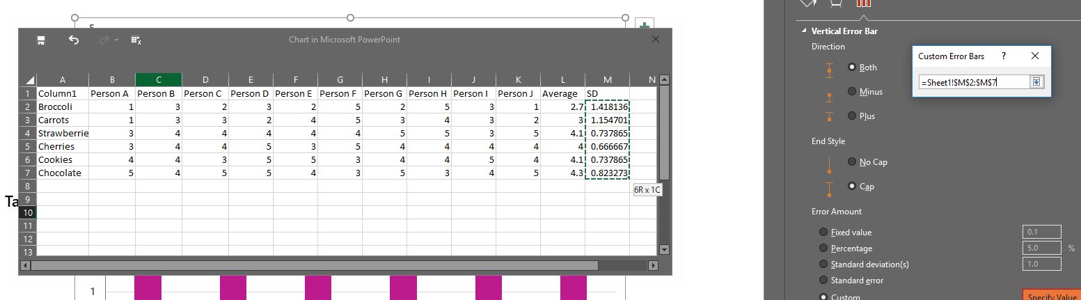
Now that you’ve added the numbers you can click the Specify Value button. It may take a bit of time to process, but the spreadsheet with your data on will (eventually) open. Now you can click the Positive Error Value up arrow button, and then select the row/column with your positive variance in and then click the down arrow.
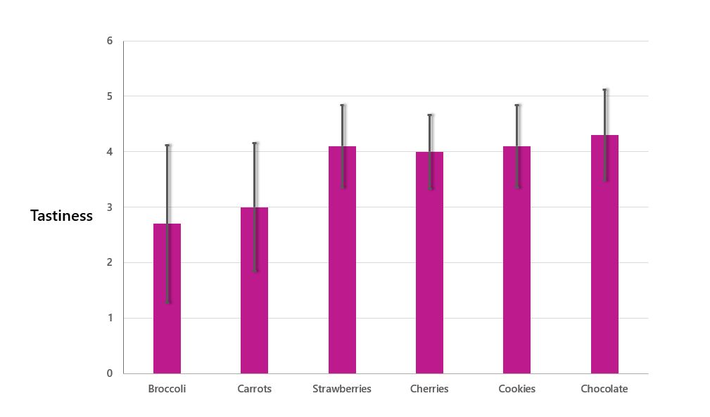
Do the same for the negative error value. (At this point PowerPoint might, for some reason, blank out the text in the cell – ignore it, it has remembered them.) Then click OK. And there you should have your chart complete with error bars.
Step 4: Format your graph/chart’s error bars
Now you can use those other tabs to adjust the style of your error bars: you could change their weight, their colour, even give them a shadow if you’re into that sort of thing.
Et voila! The finished chart!
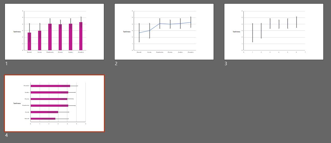
You can add error bars in PowerPoint with other charts too, such as line graphs and bar charts.
If you have any questions, or run into any trouble with your error bars in Excel or PowerPoint, leave us a comment below and a friendly Carbonite will come to your rescue! Happy charting!
We’ve found there’s no hard-and-fast rule for how big or small text on slides should be. Each presentation has its own unique requirements – it all depends on what you’re using the slides for, what you’re hoping to achieve with them, and how your audience will be viewing them. That said, we do have a few best practices for you to consider.
If you're unfamiliar with the tech, delivering presentations can be a really nerve-racking experience. This blog post gives you a useful rundown of the features of Presenter view in PowerPoint and how they can help you showcase your content with confidence.
Articulate Storyline 360 is a great tool for producing interactive eLearning content. A particularly useful feature allows you to import your pre-designed slides, so that you can convert PowerPoint to Storyline and turn your presentations into beautiful eLearning, saving you time and effort. We’ve put together our top five tips for converting PowerPoint slides to Storyline.
Thank you so much for conducting our advanced PowerPoint training workshop. We will definitely use BrightCarbon in the future – we really think that we would be hard pressed to find anywhere better!


Thanks a lot for the article post.Much thanks again. Fantastic.
I have trouble entering a column containing 95% confidence interval onto the graph. How should I do that?
Thanks
brilliant, clear and concise tutorial that’s easy to follow. really helpful, thank you!!
Thank you. This was very well explained.