PowerPoint templates aren’t exactly the topic of a new high-octane streaming series, but they’re certainly one of the main characters in your corporate story. Think about it – every piece of collateral that gets created in PowerPoint leverages your template. It has a bit-part in every story you’re telling. But is it in the running for a supporting actor award, or is it stealing the show because of its awful performance?
At BrightCarbon, we’ve designed custom PowerPoint templates for everyone from small businesses to global enterprises, reaching hundreds of thousands of users. Along the way, we’ve spotted common pitfalls that crop up again and again: outdated designs, clunky layouts, and templates that frustrate users instead of helping them. The good news? Most of these issues are easy to spot, and even easier to fix. Read on for five signs your PowerPoint template needs an update, plus practical tips to get it back on track.
1. Limited layout options
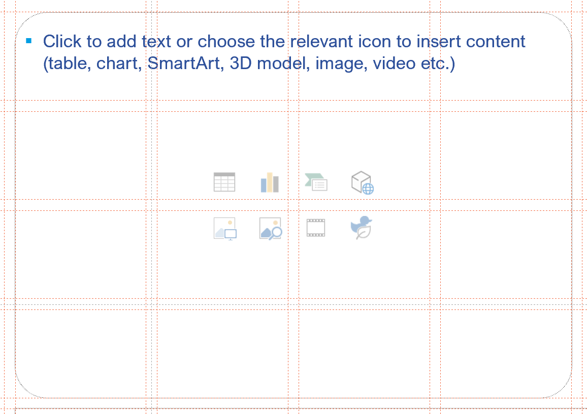
What is a layout in my PowerPoint template? Your template has layouts baked into the template design. You can see them if you right click a slide and then hover over ‘Layouts’, or you can also look at the full set by navigating to View > Slide Master. A pre-baked layout like this gives you a starting point for your content creation. True you can still create something from a completely blank page, but layouts give you an on-brand framework from which to start.
Problem: If your template only includes a handful of simple text-based layouts, but your team spends their days working with data-heavy charts or organising high-profile events and conferences, you’ve got a problem. When the layouts in your template don’t match real-world needs, your team starts creating their own and before long, you’ve got multiple off-brand templates in circulation.
Solution: Build out your layout library to give your users more ready-made and flexible layouts available to use. We recommend running an audit of existing content to identify the most-used slide types. Update your template so it includes those layouts, then be sure to test it with daily PowerPoint users to make sure everything works in practice. This keeps slides consistent, saves time, and prevents your team from reinventing the wheel.
Pro tip: Serving up on-brand content to teams can be challenging. It’s a learning curve to teach users where to find assets and even with a beautifully-built template complete with all your best layout slides, if users can’t access it easily, you’ll still end up with adoption issues. Consider a tool like BrandIn that allows you to provide in-app access to your brand kit (PowerPoint template, pre-built slide layouts, images, icons – the full works). Admins and brand guardians set up the content library on SharePoint and then provide access via BrandIn. This makes your template the default starting point for every piece of content creation in PowerPoint and Word.
2. Low skill level
Problem: PowerPoint is an incredibly versatile program, and it enables users to create all sorts of pieces of content with native functionality. That doesn’t mean it works perfectly every time. Or that it’s bulletproof. Or that it doesn’t sometimes get so frustrating that we develop a free add-in that revolutionises how people work in PowerPoint. But love it or hate it, PowerPoint is here to stay, and unless you’re working with a team of pro-level users, you’ll likely have knowledge gaps in your organisation.
Now add that to the fact that there is an incredible amount of complexity that hides behind that beautiful blank slide with a ‘click to add text’ prompt. Fully-programming a PowerPoint template is a world of macros and xml and pixel adjusting. In fact, most corporations don’t have a fully-programmed template, in fact many corporations have little-to-no programming in their template, and that means more manual effort for the user in order to create on-brand, consistent content.
For some users this combination is too much and they’ll turn to other tools to create their content, or they’ll stick with PowerPoint, but make something below par and far from professional. The result? Inconsistent messaging, wasted time, and a diluted brand identity.
Solution: Make your template work harder for your team. Microsoft provides some limited instruction in placeholders (think ‘click to add text’). But you can edit that text to give your users more guidance. If your brand guidelines require sentence case, why not change that placeholder text to read ‘Insert title here, font size 24pt, sentence case’. This means users don’t have to internalise all the details of your brand and reduces the risk of inconsistency overall. To edit the text in the placeholder, simply navigate to the Slide Master view and alter the text in your chosen layout.
A quick note on ‘lorem ipsum’… You might have seen this chunk of Latin text that designers often use as placeholder text to show you where the text will be and how it will look. Where it does serve this primary purpose, more often than not it serves to distract users and has a habit of creeping into final presentations making everyone think they’ve just been transported back to ancient Rome. Using instructional text in your placeholders is a great way to show users where to put their text (and what it might look like), whilst giving them guidance at the same.
Here’s an example of instructional text designed to help readers use the template more effectively:
You can also supplement this with a short user guide and run training. All of this will help to demystify your template and build confidence to use it to create content. If you need help running training on templates, or even upskilling in PowerPoint, our expert trainers are on hand to help.
3. Outdated design style/branding
Problem: Over the years, your brand has probably evolved, but it might be that your PowerPoint template hasn’t kept up. If the logo, fonts, or icons don’t match your current brand, your presentations will look outdated – and so will your company. Inconsistent branding confuses audiences, weakens credibility, and undermines your identity.
Problem: Copilot is a powerful tool. It promises a lot – ‘Copilot make me a slide on this for my pitch presentation’ – but it only really works if your template is set up correctly. In order to create ‘on brand’ content, Copilot reads your template and draws from your layout library. If you don’t have your brand elements programmed and your layouts aren’t well structured, Copilot can’t interpret them, leading to messy slides with poor alignment and repetitive elements. Without a working template, your team will end up spending more time on manual fixing than automation.
Label your layouts with a short, descriptive tag (title, content, divider, etc.)
Within your layout categories provide 2-5 options for each slide to give Copilot a range to choose from. Without this it will likely pick the same 1 or 2 slides and your deck will feel very repetitive.
Not only is this best practice for template creation anyway, but it will future-proof your deck if you’re using Copilot now, or if you decide to use it in the future.
5. Poor accessibility
Problem: Designing your template without accessibility in mind, means you’re at risk of excluding colleagues and audiences. From low contrast backgrounds to unreadable fonts, an inaccessible template limits who can create and consume your company’s all-important content.
Solution: Build accessibility into your template from the start. Use high-contrast colour combinations, legible fonts, and avoid relying on colour alone to convey meaning. Remove barriers to improve the effectiveness of your presentations for everyone.
Pro tip: In PowerPoint, select the Review tab and use the Microsoft Accessibility Checker. This flags contrast issues, missing alt text, and reading order errors – helping you create a template that works for your whole team, and reaches your entire audience.
Your PowerPoint template isn’t just a set of slides – it’s a productivity tool and a reflection of your brand. If you’ve recognised any of these five warning signs in your template, it’s time to refresh. With the right setup, your team can create professional presentations that are faster to build, easier to use, and always on-brand. At BrightCarbon, we specialize in building templates that do exactly that: flexible, user-friendly, and designed to help you tell your story. If your template needs a boost, let’s chat about how we can help.
A PowerPoint template is the only brand element you put in the hands of the whole organisation – regardless of computer literacy, or design skill: it has to be robust enough so that it can’t be broken, but strong enough to carry your brand voice into every meeting, or leave-behind, or proposal it gets used for. Read on for a list of the essential elements every PowerPoint template needs to have.
A PowerPoint template is the only brand element you put in the hands of the whole organisation – regardless of computer literacy, or design skill: it has to be robust enough so that it can’t be broken, but strong enough to carry your brand voice into every meeting, or leave-behind, or proposal it gets used for. Read on for a list of the essential elements every PowerPoint template needs to have.
Designing content to be accessible doesn't have to mean you compromise on vibrant design, or your brand guidelines. In this article you'll learn more about colour contrast and how you can preserve colour vibrancy without having to sidestep WCAG accessibility guidelines.
Thanks so much for your generous sharing, always love reading your insights!
Regarding BrandIn mentioned in this blog, I wonder if there are any plans to make it accessible to non-organizational Office 365 users someday. We are college students in the same lab, and we often work together on academic projects and presentations. Sometimes we want to share common resources and leverage the power of the cloud to keep our slides consistent and well-branded.
However, it’s quite challenging to persuade our university IT admins to deploy the add-in since it may involve additional costs. It would be wonderful if individual users like us, especially those who can’t use a university account for this purpose, could also benefit from this powerful and elegant tool.
As we were novice and non-marketing professionals, everyone took the time to explain and teach while also doing, which came in handy to feel more comfortable with what we were creating.


Thanks so much for your generous sharing, always love reading your insights!
Regarding BrandIn mentioned in this blog, I wonder if there are any plans to make it accessible to non-organizational Office 365 users someday. We are college students in the same lab, and we often work together on academic projects and presentations. Sometimes we want to share common resources and leverage the power of the cloud to keep our slides consistent and well-branded.
However, it’s quite challenging to persuade our university IT admins to deploy the add-in since it may involve additional costs. It would be wonderful if individual users like us, especially those who can’t use a university account for this purpose, could also benefit from this powerful and elegant tool.
powerpoint i
like it
love it