So you're trying to set up your Organisation Asset Library (OAL) in SharePoint, to streamline brand content delivery to your users. What happens when you need to restrict access to some teams or grant access to others? And suddenly, what sounded like a nice, productive afternoon turns into a nightmare, as you try to figure out permissions and access across a range of Microsoft services. Grab a cup of calming tea and let us help you figure out the best way to manage access to your brand assets.
Blog 

5th Aug 2026
How to make a killer dissertation defence presentation
- Written by: Anya Golder
- Categories: PowerPoint design, Presentation skills, Visual communication
So you have to make a dissertation defence presentation. Or maybe you’re deciding if you want that to be a part of your final assessment. But it also sounds like a lot of work – on top of your thesis – and you hardly have the ability to command a room like Steve Jobs or Brené Brown. Over the course of this article, we’ll look at how your dissertation defence presentation can be one of the best tools in your arsenal when it comes to showcasing your work, and how you can make yours stand out from the crowd.
How to use this article
We’ve got a few sections for you to delve into covering how presentations function in academia through to some practical creation tips. If you’re already sold on the presentation format, you can skip to the tips and methodology, if you still need some convincing, take a look at the first section to help you make up your mind.
Presentations as a tool in academia
A dissertation defence presentation typically shows up at the beginning of the formal assessment of your dissertation or thesis, and/or precedes your viva (if you have one). It’s a dedicated chunk of time where you can walk your examiners (and any interested bystanders) through your work, demonstrating your knowledge of the topic, and orienting your examiners in the most interesting and noteworthy parts of your research.
Done well, you might find you streamline your subsequent interview and/or viva as you answer questions examiners would normally put to you off-the-cuff, and you more effectively signpost examiners to what’s worth really digging into, to help give you a more focused discussion.
Some bodies of work naturally lend themselves to presented content; anything with a lot of data gives you a natural starting point for your on-slide visuals, but that doesn’t mean if your work deals more with verbal argumentation that you should abandon the presentation altogether.
What makes a presentation unique?
Let’s start with this idea of what a presentation is, and why it’s a good tool for you. A presentation is pre-prepared argument that mixes on-screen visuals with a live talk track. Your dissertation or thesis might be pre-prepared, and it may contain visuals, but it doesn’t give you the opportunity to narrate, explain or add an extra layer of insight. It’s a static document, and a very long one at that. But opting to do a dissertation defence presentation allows you to play the role of tour guide, walking your audience through what’s important, how everything fits together, and how to get the most out of it.
Why choose to present?
Let’s take the three components that make a presentation unique to build our argument:
- Pre-prepared: The most nerve-wracking part of any interview-based examination or viva is the element of the unknown. What will your examiners ask? What will they pick up on? How fast can you think? How eloquently can you put your thoughts together? A presentation gives you an allotted chunk of time to be in complete control of the narrative. You have everyone’s undivided attention while you summarise some of your key themes, and gently nudge them towards the topics you want to discuss in more detail.
- Visual: Humans can’t read and listen at the same time, but when presented with a talk track and visuals that align, retention jumps. Choosing to create a presentation with some well-though-out visual slides means your audience will be more likely to remember the content you present, again acting as that effective signpost in your discussion.
- Talk track: Outlining and rehearsing a specific talk track does wonders for building fluency and confidence in a subject. Practicing a presentation – out loud, please – makes you much more at ease talking about your topic of choice, which, in turn, helps you prepare for the discussion part of your examination.
Dissertation versus thesis
If you’re working towards a PhD and you’re deciding whether to write a thesis defence presentation, the same logic applies. You’ll actually be dealing with even more complex subject matter, so having a clear presentation at the outset gives you complete control over the narrative to explain what’s important, where to focus, and pre-empt some of the questions you’ll likely be asked.
In fact the presentation format also gives you an invaluable opportunity to rehearse and refamiliarize yourself with content you might not have looked at closely for several years, and allows you to review your complete body of work together.
How to make an effective dissertation defence presentation
Structuring your presentation
The good news is that you should already have a structure for your presentation built-into your dissertation itself. Use this as your starting point, even if you make slight modifications, just so that your presentation is as good a signpost to your thesis as it can be.
Some dissertations are more anthological, in that instead of one argument that compounds over the paper, it visits different, but related topics that aren’t necessarily additive. Here consistency will be most important. Have a consistent way of tackling each subject (for example: aim > research > outcome) to make it easy for audiences to draw out similarities and differences in each topic, and to make your work come across as more cohesive.
A sample structure you might want to use or adapt would be:
- Introduction: Attention spans are short and an engaged audience will give you positive feedback signs that will boost your confidence as you present, so it’s important that you engage everyone from the get-go. Here are three things you might want to try:
- Ask a question: Humans love solving puzzles, so you can outline a problem that you’ll solve, or a mystery that needs answering, or a conundrum that needs parsing.
- Tell a story: Is there a particularly interesting story from your research? Set the scene, create mystery and intrigue, and then resolve it, but not fully. Think of your favourite TV show, leave something of a cliffhanger you’ll look at later in your presentation.
- Start simple: Don’t jump in at the detail, start with a quick overview of your area that gradually gets more specific as you go to make sure your audience is on the same page when you get to the really meaty stuff.
- Talk through your research: Here’s a three-beat structure you can use to talk through a key topic. If you adopt this approach, make sure you use this structure for all of your key topics for greater consistency.
- State the aim: As you dive into your research, orient your audience by setting out the goal.
- Explain the research: Bring in the method, the data, the details.
- Describe the outcome: Where did you end up? Did you achieve the aim, or discover something different? What did you learn? What can everyone else learn from it?
- Conclusion: How does your thesis end? How does it tie up these ideas you’ve presented from your research? You already have this in your paper, so it’s a case of making sure you’ve got all the breadcrumbs in place throughout your deck so that your audience is with you when you land the plane at the end of the presentation.
Let me take a moment to expand on that idea of bringing the audience with you. Just because your audience is made up of experienced academics, used to sitting through long, dense presentations doesn’t mean doing more of the same will be the best presentation output. In fact, having an audience present in the room doesn’t guarantee that they’re actually listening.
Hear me on this – I’m not saying dumb your content down and simplify it. Instead think about the cognitive load of your audience. When it comes to presentations it’s really easy to overload audiences and give them too much information in one go. It’s like giving them a bunch of things to hold, and once they reach capacity, they can only accept more if they put something else down.
So how do you create a presentation that respects the cognitive load of your audience without dumbing down your subject matter? We’ve already talked about consistent structure – that gives a simple, repeatable pattern that audiences can anticipate.
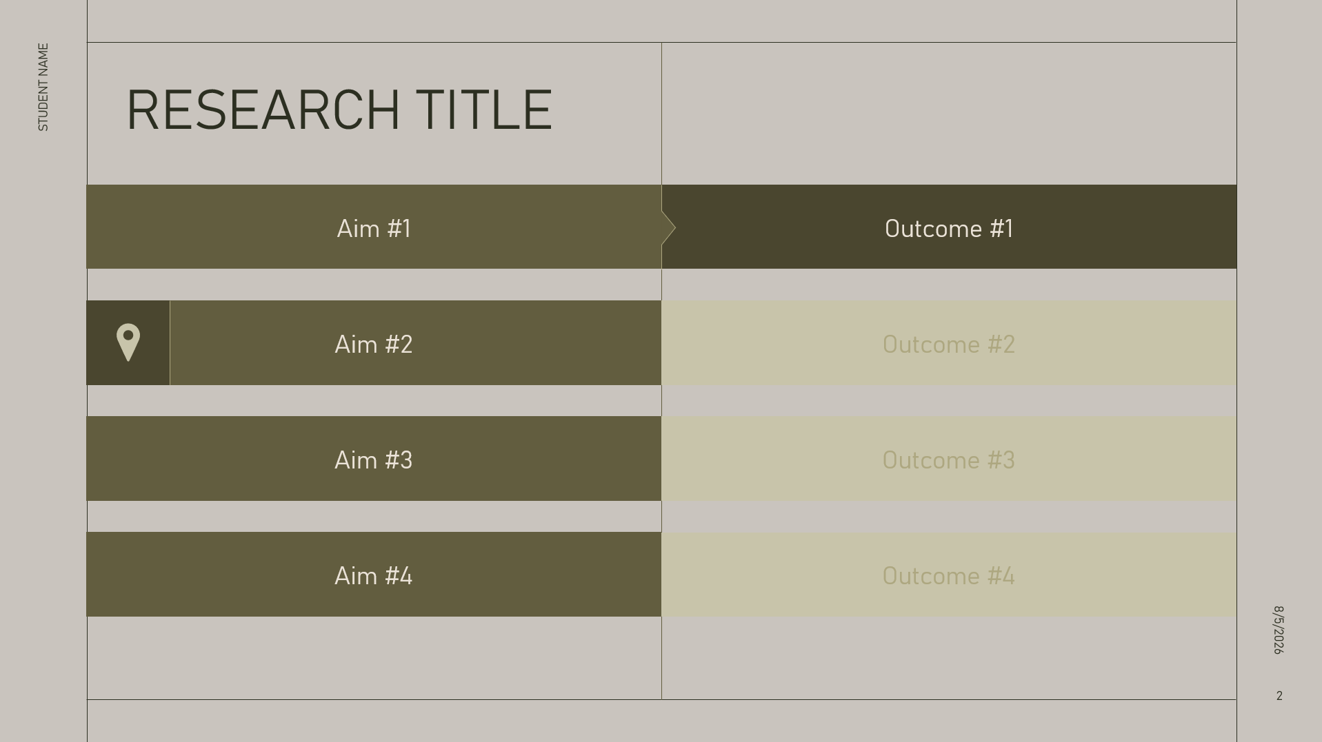
Repetition is another helpful way. It might be that you use a slide that lists out your main aims as an agenda. Seeing it multiple times helps audiences to remember it, and it serves as a way-marker to tell audiences where they are in the content. You could also take this one step further and add a simple concluding statement every time you close a section, so that you end up building a one-slide summary of the key aims and outcomes in your thesis.
Another way to bring the audience along with you is to make explicit connections between ideas. Don’t assume that someone has made the same connection that you did. This helps with cognitive load in two ways:
- You aren’t giving your audience a lot of disconnected ideas to remember or ‘hold’.
- They aren’t spending their brain power trying to make the connections themselves.
Building your slides
Once you have a well-structured outline, it’s time to start building your slides. Put the structural elements in first – agendas/way-markers so that you can see the basic structure of your presentation. Next write out the key points you want to cover in each section. Depending on the detail that might be one slide, or it might be several. Finally add any supporting visuals you already have – data, diagrams, quotes – that sort of thing.
Now you have the basic bones of your deck upon which you can build a compelling presentation.
What makes a good slide?
Slides aren’t just a copy of your speaker notes (in full or even cut down). Slides also aren’t just a place to put the graph you’re talking about. Slides work best when they complement what the presenter is saying: when they show visually what the presenter is talking about audibly. This is called dual-coding and means that the information gets processed in two parts of the brain (the phonological loop and the visuospatial sketchpad).
This works best when these two streams of content are in sync: that is to say you haven’t put all your information on the slide while you talk to it for 20 minutes. If you give away the punchline on your slide, your audience will tune out; if you put up something so complex and impossible to easily parse, your audience will tune out; if you don’t have any visuals at all, your audience will tune out – eventually.
The way to overcome this is to split out your slides, and reveal things piece-by-piece in time with your talk-track. But before we get to what to put on your slides, let’s answer another key question.
How much content should I put on each slide?
This is a classic ‘how long is a piece of string’ question, and so the best way to answer it is to give you some guardrails you can use to evaluate your own content:
- Keep text 12pt or above: If you have to resort to lower than 12pt chances are you have too much content on your slide.
- Stick to one key visual: one chart, one diagram, one quote etc.
- Minimal decoration: Don’t add images and icons for the sake of it. If you could delete it without it affecting how the slide is understood, it’s probably just there for decoration.
So when it comes to deciding what goes on your slides, here are a few common visuals you might rely on based on your dissertation or thesis.
Data: In first place is all of those charts, graphs and numbers you’ve spent the last several years digging into. Not every graph, chart, table, or figure from your thesis needs to make it into your presentation – just pick out the most important ones to tell the story of your research.
Assuming, therefore, you only have data that is relevant to your content, the next thing to ask is, what is this data showing and why is it important? This gives you the context, or set-up for your data, and also the ‘so what’ at the end of it all. Just like in our structure we had: aim > findings > outcome, you can adopt the same structure for showing data too.
With your information outlined, how do you bring that to life visually on your slide?
While you may use Excel or PowerPoint to build your charts, if you have used other software, it will be likely that your chart will end up in your presentation as an image. Even though it’s static we can still pace the information with the talk-track.
Consider exporting versions of your data that add a key element each time. Build the axes and explain them, then build one data set, then build another, then build any key highlights or call-outs.
You can also do this by drawing PowerPoint shapes to mask out aspects of your chart. Have the shape disappear on a red exit animation effect and reveal parts of your data a bit at a time. Check out this video for how to quickly animate charts in three ways:
Diagrams: Your dissertation may also include some diagrams. If possible you should try to rebuild these with shapes and lines to give you the most amount of edit and animation flexibility. With a simple fade animation for your shapes, and a wipe animation for your lines or arrows, you can build a diagram in a way that makes it clear how the objects relate to each other. The audience isn’t left to figure the puzzle out for themselves and tune you out in the process.
Remember that PowerPoint also has an in-built icon library if you want to add some visual coding to your diagram components. You might want to skinny down on the amount of text in your diagram in favour of visuals that represent high-level concepts and act as a shorthand for your audience.
For more insight on using icons well, check out this article.
There’s another cool trick that you can use with diagrams and that uses the Morph transition in PowerPoint. You can create an effect that looks like you’re zooming into a diagram and moving around it to see the details of what’s going on. This gives an elegant way you can show the diagram at a high-level before digging into the details for each step.
To learn how this works, check out this video from 1.30.
Equations: Like diagrams, often equations have to be built a little at a time. You can use the Equations tab in the Insert ribbon in PowerPoint, you can recreate your equations using shapes, text boxes and lines, or you can use an image that you mask out – just like in the data example.
Quotes: Finally, you might have some quotes you want to include. Quotes, by their very nature, are text-based, but it doesn’t stop you making them more visual. First of all, never read out a quote when you put it on a slide. Instead pause and let the audience read it. Be explicit about that. Let them know you’re giving them a moment to read it themselves. Then jump back in and talk about why the quote matters. Use PowerPoint shapes or lines to draw on highlights on the quote to allow the audience to focus in on what’s important.
What if you don’t have any of that?
Not all dissertations are data-led, or have an array of diagrams, equations or quotes. So what do you do? The temptation might be to talk through your content as a kind of monologue, or skip the presentation altogether.
Let’s just loop back with why presentations work so well – they give you an opportunity to be in control of the content, and the audience has a clear visual to signpost them to what’s important.
Even if you don’t have a lot of obvious visuals, you can still create an effective presentation with a couple of approaches:
- Use an agenda slide to show your aims and their corresponding outcomes. Even if this ends up being the only slide in your deck, it’s helpful for your audience to see what you’re going to talk about, and track progress through the presentation.
- Dig into the concepts behind what you’re talking about and show the relationships as your slide content. Are you talking about a contrast, a comparison, a process, are you telling a story with characters? Start by analysing your content and attribute a relationship. Then think about how you can show the relationship with the content you have. So showing a contrast will be a comparison between two things where you can see one is different in a key area. For more info check out this article on how showing relationships makes more effective slides.
A note on design
Design is often the first thing people think about when it comes to building slides. Design is what slides look like after all. But the most important thing is actually the content – design is secondary. Think about it, what’s more effective – a beautifully designed set of bullet points where your audience can read ahead and ignore you, or a simple chart that builds steadily as you make your argument. Spoiler alert: your audience will think it’s the second one.
So as long as you’ve carefully considered your slide content first, and spent the majority of your time working on the content, you can now look at design.
Without the restrictions of a corporate brand, you can design according to any colour or style you like. The internet is literally teeming with free templates you can download for all of your favourite presentation software, so the world really is your oyster.
Having said that, here are three words of wisdom to consider:
- Keep it simple: Clean, minimal design will give you a simple canvas upon which to add your ideas. Anything busy becomes a little distracting, as well as tricky to add in data screenshots, or other collateral that might not fit your look and feel.
- Be mindful about your use of colour: When we have all of these amazing colours to play with, it becomes tempting to use them anywhere and everywhere. Choose two accent colours, and be careful about attributing meaning to colours – those with Colour Vision Deficiency might struggle to differentiate between the colours you’ve chosen (red for bad and green for good is a really common example of this). Learn more about CVD and being mindful of colour usage in this article.
- Build a toolkit: Have a quick cheat sheet of design elements to keep everything consistent. Decide what your text boxes will look like, what your accent colours will be, what shapes will look like. Then you can simply copy and paste these elements as you build your slides, which creates visual consistency without having to create elements from scratch every time.
Presenting your content
By now you should have planned out and created a great dissertation defence presentation. It has a compelling structure, it looks good without a bunch of clutter that doesn’t need to be there, and the slides and talk track are perfectly synced. All you need now is a presenter. Oh.
Just like we said at the opening, it can be really intimidating to think about some of the best presenters you’ve come across – or even just a really compelling lecturer – and think that’s the gold standard you’re aiming for.
People will give you all sorts of suggestions like imagining your audience naked or doing some guided breathing before you present. And sure, that kind of soft-skills practice might really resonate you, but if you want to make the biggest impact, there’s one hack, and one hack only.
Practice.
Okay, so it’s not really a hack, but it’s a really important step. Let me explain why: often people think that they know the information in their thesis inside and out – they did write it after all – but when it comes to saying those words out loud and putting together the 10-minute version, or the 30-minute version, things start to unravel.
So once you’ve made your presentation, practice presenting it. Not just once or twice, like 20 times. And do it out loud. The cringe is real, but it’s worth it. Because unlike in writing, you can’t start a sentence and go back and write it differently. You can’t move around a couple of paragraphs to make the flow better. You have to commit to your sentence, however downhill it may be heading, and finish your thoughts in all their ugliness.
Doesn’t it make sense, therefore, to practice doing that before you stand up in front of an audience? The presentation has already helped you order your thoughts, and you have some great visuals to keep you on-track as you go, and the last piece is figuring out what you want to talk about at each stop on your journey.
Now, at this point you might write a script that you intend to learn, but scripts stifle your fluency, and what’s more, they can massively impact your confidence if you forget what’s coming next, or you get interrupted. Quick shout out to remind you not to put your script on the slides either. That’s called a document, and that’s what email is for.
Instead, run through your presentation in show mode, saying the points out loud, reworking sentences as you need to, having as many attempts as you need to get it right – all in the safety of your own room.
As you keep doing this you’ll notice that you can talk about the concepts using different words each time – you’ve reached a level of fluency that comes with confidence in speaking about the topic. This helps you to come across as the expert you are. You can talk about this naturally and easily, because you’ve had practice doing it.
It might feel like the worst bit of the whole process, but practicing your presentation in this way is a great way to normalise presenting as a practice. It’s okay if you have a bad run-through every now and then. It’s not a one-and-done thing, it takes repetition – and sometimes a little forgetting is actually helpful.
If you can speak fluently and freely about your topic, it puts your audience at ease. And if they’re relaxed, you’ll be more relaxed too. You’ll also be much better prepared for your viva or interview portion of your assessment as you’ll have had so much practice talking through your work.
Conclusion
Like every good dissertation we have a conclusion. And like every good dissertation we wrote it at the beginning. A dissertation defence presentation is a fantastic tool to have at your disposal. As the presenter you can confidently signpost your audience to the most pertinent insights and orient them in your key arguments. It adds a visual element to your work and allows you to control the narrative in a way that is just not possible in an open question time.
We’d say best of luck, but with prep like this, you won’t need it.
Leave a commentRelated articles

In a world that clamours for your attention at every verse end, who needs another slide deck filled with bullet points and stock images? Your presentation audiences certainly don’t. In this step-by-step tutorial learn how to create a dolly zoom effect to help your audience zero in on what's important.
How many slide masters do you have in your PowerPoint template? How many should you have? And is it one of those things I should even care about? Learn the answers to all those questions in more.

Join the BrightCarbon mailing list for monthly invites and resources
Tell me more!There is absolutely no doubt that the BrightCarbon presentation was a quantum leap beyond anything else at the conference with respect to the clarity of the presentation.
Curtis Waycaster Smith & Nephew