Data visualization library
- Category: PowerPoint design Visual communication Courses

Data visualization is an incredibly useful storytelling tool. By using graphics and visuals to bring your data to life you can make your content so much more digestible and actionable that just be presenting a lot of numbers.
Data vis is both a science and an art – how do you tell an accurate story and make it all somehow come across as relevant to your viewer? How do you draw them in whilst staying true to the facts you’ve gathered?
We think one of the best ways to learn is to practice, and that’s what we do. Every month we do a piece of true data visualization for our monthly newsletter (you can subscribe to that here), and so here is our library of data vis examples for you to browse through. We’ve also provided the prompts if you want to have a go yourself.
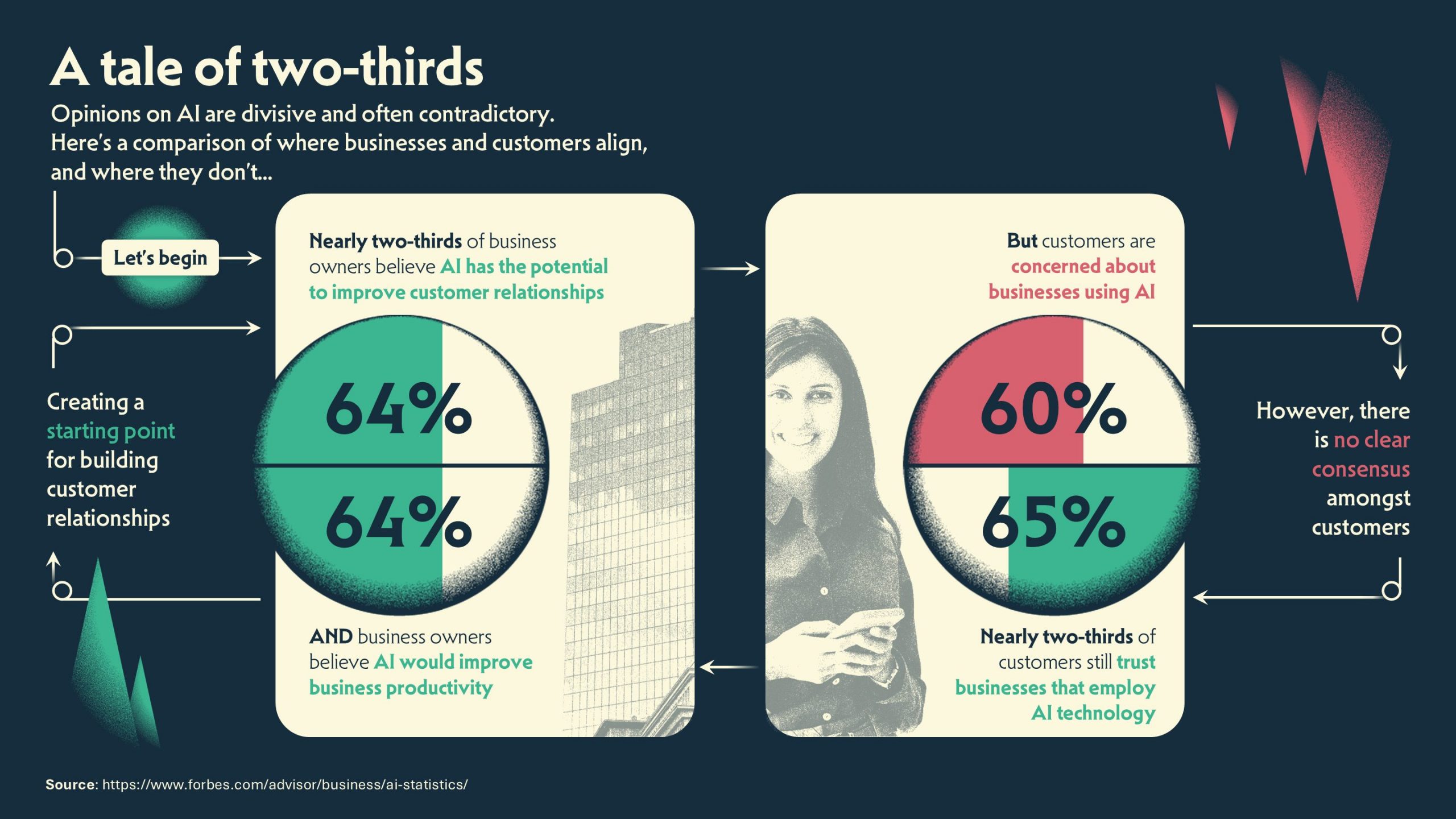
Businesses v. customers in AI adoption
April 2026
Brief: There’s no doubt that AI is divisive and often contradictory, so this month we set ourselves the challenge of taking four numbers that are very similar and turning them into a data visualization that tells a meaningful story. Here are the four numbers, from this piece of research from Forbes: 64% of business owners believe AI has the potential to improve customer relationships; 64% of business owners believe AI would improve business productivity; 60% of customers are concerned about businesses using AI; 65% of customers still trust businesses that employ AI technology.
Here’s our version:
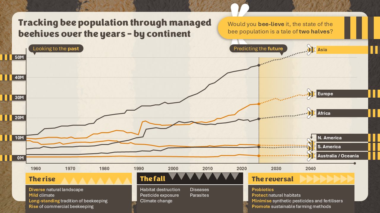
The rise and fall of bees
March 2026
Brief: Bees are hugely important, and we often hear a lot about falling bee populations, but the numbers suggest it’s a tale of two halves. This fascinating report compiled by Earth.org looks at what’s been happening over the last few decades, and shines a light on what we can expect in the future. The data tells lots of different stories as it maps the trends over the different regions. How will you use data visualization techniques to make the stories come to life?
Here’s our version:
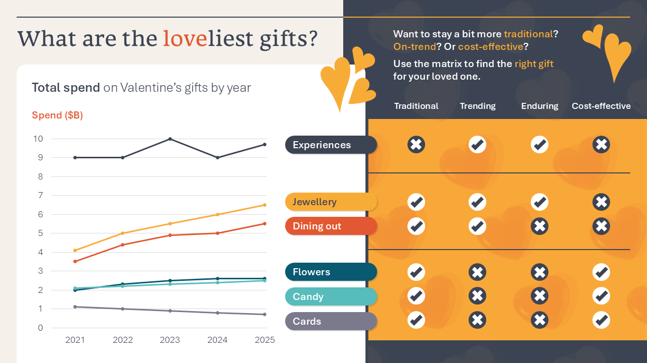
The most popular Valentine’s Day gifts
February 2026
Brief: The raw data we’ve used here looks at the total spend on Valentine’s gifts over the past five years. Line graphs are a great way of showing comparative data, as well as change over time. We turned up the story dial and added a matrix allowing the reader to use the data to help them evaluate the gift they should buy according to a few defined criteria. This is just one story, if you’re trying this data visualisation out yourself, what story will you tell?
Here’s our version:
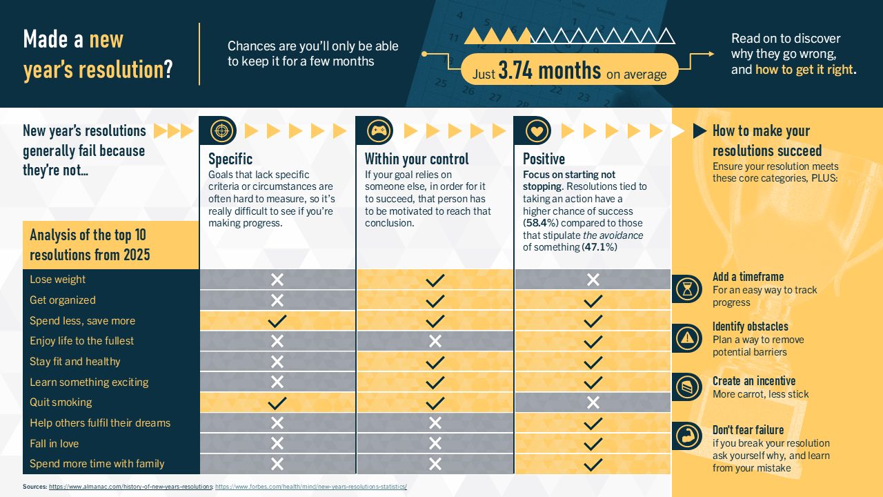
The problem with new year’s resolutions
January 2026
Brief: There are lots of stats out there about new year’s resolutions. We’ve chosen two articles: this one from Almanac and this one from Forbes. There is a shedload of data here, and it’s all too easy to make your data visualisation just read like a collection of disparate facts and numbers, so we started by defining a story. We were most interested in why new year’s resolutions fail, and we used some of our learning expertise to talk about how to make them succeed. If you’re giving this one a go, see what story resonates most with you – and most importantly your chosen audience – from the data available.
Here’s our version:
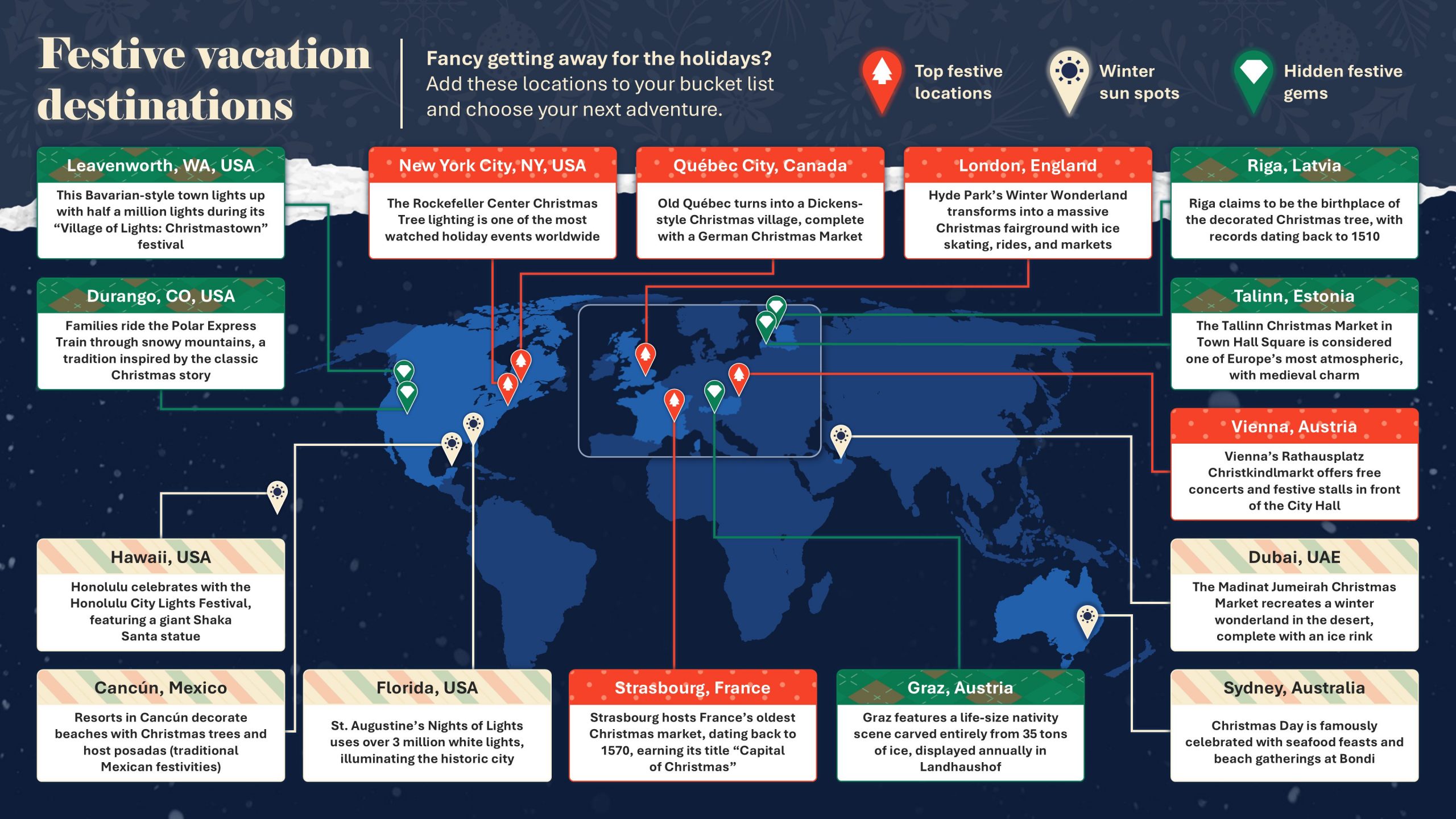
Festive vacation destinations
December 2025
Brief: Are you sitting, sipping your peppermint latte and thinking about where to holiday this Christmas? Or is there wrapping paper everywhere, a half-full box of Christmas decorations, a bunch of glitter all over the floor, and you’re wishing you could plan a Christmas getaway? Wherever you are, we have a list for you.
- Top festive locations: New York City, Quebec City, London, Vienna, Strasbourg
- Winter sun spots: Hawaii, Cancun, Florida, Dubai, Sydney
- Hidden festive gems: Leavenworth WA, Durango CO, Riga, Talinn, Graz
Here’s our version:
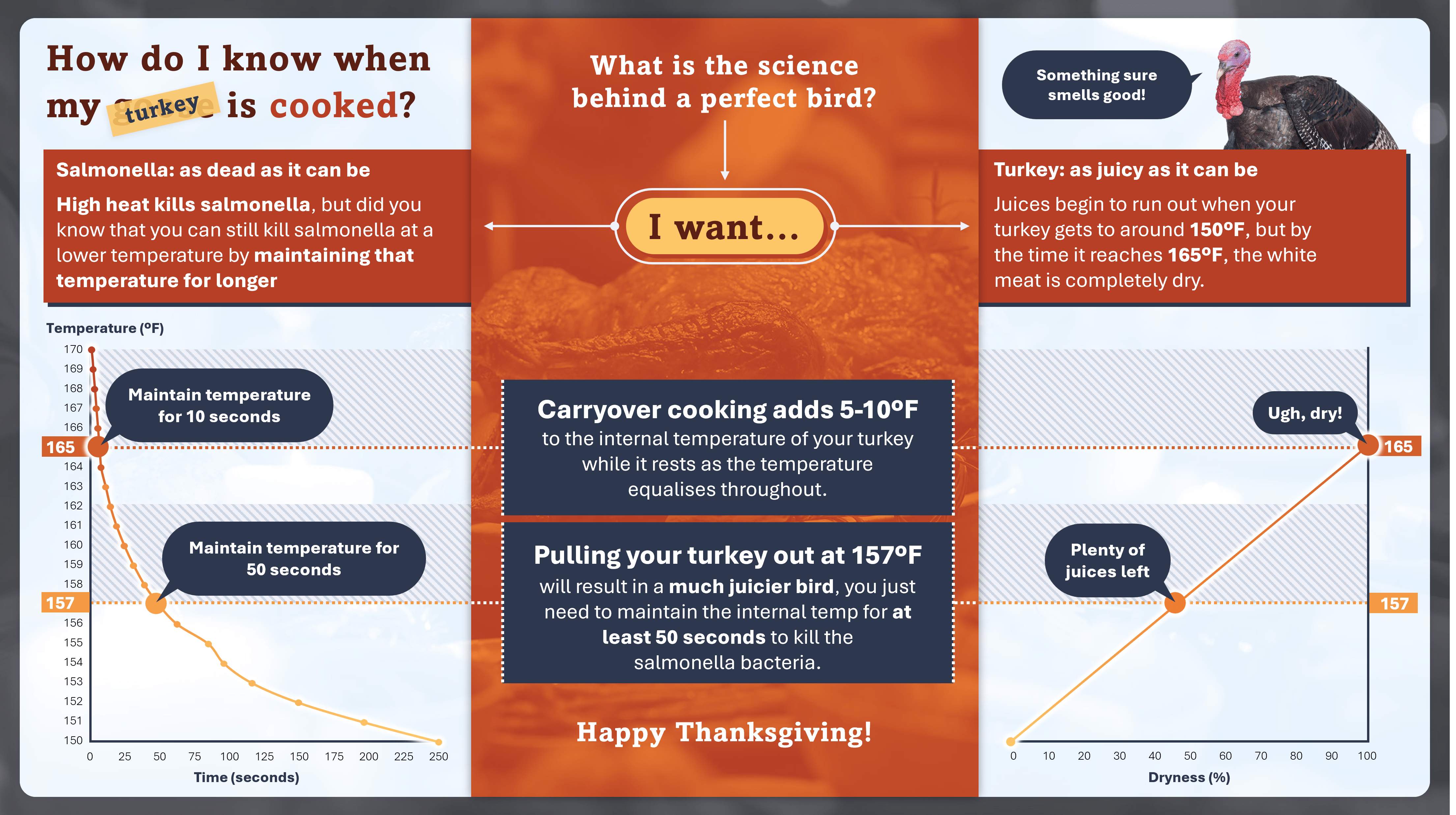
How do I know my turkey is cooked?
November 2025
Brief: USDA advises cooking your turkey to 165ºF in order to make sure any salmonella bacteria is really, truly dead. But heat experts at ThermoWorks think the story is slightly different. Juices start to run out of your turkey when it hits the 150s, and by the time it reaches 165ºF, the white meat is completely dry. If you can pull your turkey out at 157ºF and use carryover cooking to maintain that temperature for 50 seconds, you’ll still have dead salmonella, and you’ll also have a much juicier bird at the end too.
Here’s our version:
When does coffee reach Perfect Drinking Temperature?
October 2025
Brief: 55ºC is considered to be perfect drinking temperature for a cup of coffee, so how long do you have to wait to get there following a standard Aeropress brewing process?
Water comes out of a kettle at 98ºC into an Aeropress. After 4 minutes, water from the kettle is used to dilute the coffee – it is now at 77ºC. When poured and chilled milk is added (circa 1 minute later), the coffee immediately reaches a PDT of 55ºC. Is the coffee is kept black, you have to wait a further four minutes (8 minutes from the first pour) until it reaches PDT.
Here’s our version:

Join the BrightCarbon mailing list for monthly invites and resources
Tell me more!First of all the deck looks great, once again you guys have done an outstanding job. Second, I’d like to comment on the quality of the training provided by your colleagues - quite simply it was exceptional. I have spoken to the whole team and that view is unanimous. Please pass this on.
James Bagan MyLife Digital