Julie Terberg is a passionate designer, consultant, writer, and Microsoft PowerPoint MVP based in Michigan. She volunteers on the Presentation Guild Board of Directors and is a long-time collaborator with Echo Swinford. Read on to discover how she began her career in presentation design, her top tips for today’s designers, and how she stays creative day after day.
So, Julie, you studied industrial design at college, can you talk a little bit about what led you to study design in the first place and what made you take a job in presentation design when you left?
My creative parents always inspired me. I knew from a young age that I wanted to work in an artistic field. Reviewing my portfolio during college admissions, the administrator said I would be a good fit for the industrial design program. Industrial design encompasses many different specializations, such as automotive design, product design, environmental signage and spaces, and packaging design (which was my focus). Looking back, that was a great decision but at the time it was a bit intimidating. It was a male-dominated department that included many “car-guys” and I didn’t like drawing cars, but we were encouraged to expand our studies with classes from other departments. I was fortunate to learn foundational graphic design skills from a variety of talented professors.
And when did you begin working in presentation design?
It was in the dark ages! The summer after my junior year I saw a job posted on a board at school. The position was with a small design studio but didn’t really describe what the job entailed. I went for the interview anyway and got the job… designing slide presentations.
At the time, we used DOS-based software and everything we created was output to 35mm slide film. Occasionally, the slides needed enhancement using film techniques, as many effects were not yet possible using software. The finished slides were positioned in a carousel atop a projector. For large events, multiple carousels would be synced together.
Wow, so you have really been in this industry from the beginning!
There aren’t many software programs that I haven’t touched throughout the years that have a connection to the presentation industry. At our small studio, we continued to acquire more advanced technology and computers. I recall one immense and expensive computer workstation. You would scan items at one end, do basic raster image retouching and editing on the monitor in the centre, and then output full-colour prints on the opposite end. Even though this beast had fewer features than the first version of Photoshop, clients were thrilled with the concepts that we helped them design and take away on paper.
The Mac (I think it was an SE) arrived at the studio, followed by newer models and a host of ground-breaking programs like Adobe Illustrator, Freehand, Photoshop and so on. We had to figure out where our little studio could contribute in the design space. We were still creating slide presentations while helping our clients with more print materials.
From there what made you start your own company?
After the small studio, I worked for a large marketing firm designing presentations for business theatre. Our department took advantage of the best graphics programs available at the time, RiO, Lumina, Tips, etc.—all programs that PowerPoint would eventually eclipse.
Fast forward a few years to marriage, a baby boy, and one tired mom working overtime. Part time wasn’t an option, so I made the leap to freelancing. It turned out to be the best business decision for me. At the time, I belonged to a women’s design group. We helped each other navigate the world of freelance design, sharing ideas on networking, proposals, contracts, pricing, and so on.
How did you market in 1997 when you started and how has that changed today?
Most of my clients found me through networking, through colleagues or other clients. At the time, I wrote a regular column on creative techniques for Presentations magazine, a sister publication to Training magazine. That was a great catalyst for getting my name out in the industry. I had a small ad in the magazine as well, along with a crummy little website. Well, it may have been better than some early presentation design sites, but it’s tough to look back at your older work!
I started speaking at conferences in the early 2000s. The editor of Presentations magazine said that I really should present at their upcoming conference. At first, I was reluctant and had no idea what I was doing, but I prepared a session and spoke in front of a few hundred people. I delivered sessions at the Presentations conference for a few years and then presented at the How Design conference in Vegas to an audience of eight hundred. That was daunting! And I’ve been fortunate to be invited back to speak at the Presentation Summit (PowerPoint Live) each year since 2004.
So, you got launched into the presentation circuit sort of unwillingly?
Totally unwillingly! I prefer to be behind the curtain, not in front of it. When I was working for the marketing firm, we produced big business shows around the country. I was either making edits during rehearsals or advancing the graphics backstage during the show. That’s where I was comfortable, behind the scenes with a headset on.
However, with practice you get used to presenting. One of the best pieces of advice I was given was to think of yourself as a teacher in front of roomful of students. I’m not a motivational speaker trying to change minds, I’m helping people learn new skills. This mindset works for me.
As a PowerPoint MVP I’m sure you’re able to speak to many of the different capabilities of PowerPoint, so what made you write a book specifically on templates?
I met Echo Swinford at the Presentation Summit and we quickly became best friends. Echo was a Microsoft PowerPoint MVP for many years before I was nominated. We worked together to design and build templates for large corporations. This was at the time when Office made its monumental shift to XML so there was a steep learning curve. We had to troubleshoot a lot of things ourselves and continued to question the Microsoft team for answers to issues. There was no one resource you could go to, at Microsoft or otherwise, to find all the things you needed to know about developing templates that work properly for everyone who will use them.
We kept our notes on template construction and checklists for proofing, adding steps and details as we continued to build templates and the program continued to change. All this experience and expertise went into our book, Building PowerPoint Templates: Step by Step with the Experts. There are a few original copies remaining and we are working on an updated version.
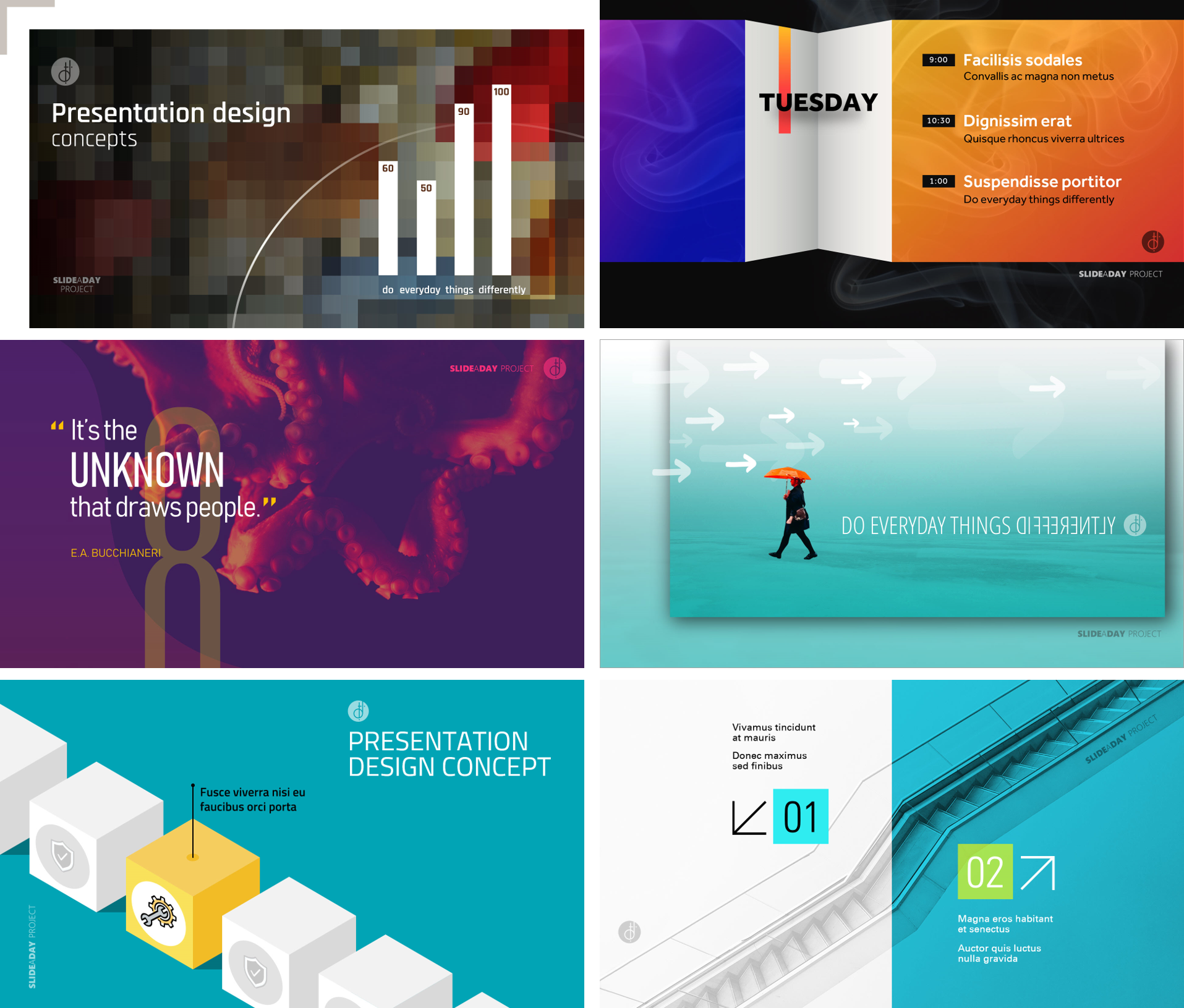
At the beginning of 2018, Julie challenged herself to devote time daily to experimenting with new design ideas and posting one slide concept each day. Obviously, creative design is very important to Julie, so we want to know where she gets her inspiration from and how she stays creative year after year.
So, what inspired you to start the #SlideADay challenge?
I’d seen quite a few designers on Instagram and Twitter post an image each day and thought I could step out of my comfort zone and do something similar with slide designs. It’s easy to get burned out creating work for the same brands all the time, even with multiple clients and projects. This also goes along with my Inspired by Design advice: you should always be looking at other media and other designers for inspiration, keeping a log of things that spark your interest.
For this project, I wanted to explore new ideas and push myself creatively. I wanted the daily concepts to be fresh and unique. So, #SlideADay was an exercise that pushed me. The bonus is a library of new concepts to display on my site. Most of my client work is confidential, so I’m unable to share many examples in my portfolio.
Do you tend to use the concepts explored in #SlideADay in your work or is it more of a creative release?
That’s all it is, a creative release. Generally, I like to design slides for the content that is being delivered, but I can take bits and pieces from my #SlideADay creations and implement them in a client’s brand. #SlideADay is also a good way to demonstrate to potential clients that I have a wide range. It can get them thinking outside the box, as too often our clients have an old school view of what presentations should look like.
We definitely agree with Julie on this point. Getting clients to think outside the box with slide design is so much easier if you can show them a ‘for instance’ to paint the picture for them. We do this a lot with our portfolio content, for example.
Are there any that you’re particularly happy with?
Here are some of Julie’s favourites!
In what other ways do you push yourself through creative slumps or try to find new creative spaces?
Some days are tougher than others. I find that I am most creative in the morning, so I try and wake up early and work on the most creative projects then. When I am forced to be creative all day, I like to take a break and go for a walk or run in the woods.
If I am looking for something to inspire me, I’ll review my notebook or comb different websites, like Behance or AIGA. Photography can also be inspiring. I’ll start looking through my own photo archives or search for unique images on Unsplash. If I am planning an animation, I may look at a bunch of animated videos on YouTube and take inspiration from a broad selection.
What are some of the brands, products, or people that help you do your job?
Some of the very talented technical folks behind the scenes writing add-ins for PowerPoint make my job so much faster.
Steve Rindsberg has a tool called Thor which is a free hammer tool. It allows you to pick up the position and size of an object and apply the settings to other objects. Let’s say you have a deck of thirty slides, and you need a text box moved by a few pixels on every single slide. You pick up the new position and then hammer it into place on all the other slides. It is so amazing.
Jamie Garroch creates custom, time-saving, PowerPoint tools based on suggestions from colleagues, PowerPoint MVPs, Presentation Guild members, and so on. (We are thrilled that Jamie has recently joined the BrightCarbon team! Read our interview with Jamie here.)
John Wilson at PowerPoint Alchemy also develops incredible add-ins. I told him at one point that I could use a one-button solution to immediately crop and re-size images to fill a widescreen slide. The next day, a Crop to Fill Slide tool was available in his ProTools add-in!
And how about a designer or photographer who is really inspiring you right now?
I follow a few designers on Instagram that have nothing to do with the presentation community but the little things that they create make me smile. For example, Kelsey Montague paints uplifting murals in cities around the world. Illustrator Jean Jullien posts lovely, witty watercolour sketches that are very inspiring. Tanaka Tatsuya creates whimsical photographs by combining miniature figurines with everyday objects, like a hairbrush or salt and pepper shakers, for instance.
Of course, there are the famous designers Paula Sher and Michael Bierut at Pentagram, Stefan Sagmeister, Chip Kidd, John Maeda, and so on. Creative icons who have been in the business as long as, or longer, than I have. They inspire me because they are still going strong, producing incredible work, and mentoring younger designers. Speaking of younger, I also check out the student work from my alma mater.
And finally, how about some books you’ve ready recently that keep you going:
I read a lot of fiction and recently finished The Name of the Wind by Patrick Rothfuss, recommended by fellow PowerPoint MVP Ric Bretschneider. Many of the PowerPoint MVPs have common interests beyond presentations, so we’ll recommend books, shows, and movies to each other.
Julie is an undisputed expert on all things templates and masters in PowerPoint, so we asked our fearless BrightCarbon designers if they had any burning questions Julie might be able to help with in our quickfire round:
What are your thoughts on animated elements in slide masters?
No. Don’t do it.
What should go in a slide master vs. what just goes in the deck
Depends on who is building the slides, but I would say less is more for any template. Everything should be based on a grid structure. Foundational elements, such as colour, font choices, placeholder settings, etc. are all defined as part of the template and should make it easier for others to create new content. Personally, I prefer clean and simple template designs without a lot of embellishment.
Slide title placement inconsistency—is it okay?
Go for it! If it looks nice within that brand or within a series of slides, then I’m all for it. Presentations should be designed as a whole, and slides do not have to be cookie-cutter duplicates. Maintain the foundational elements and the grid structure and aim for interesting visual variety.
Formatting slide masters – what are your golden rules?
A couple of golden rules when you are formatting the slide master:
Do not delete any of the placeholders even if you are not going to use them. You can size the footers very small or make them 100% transparent and position them off the slide area, but don’t delete them.
For title placeholders: bottom align the text and plan for two lines of text. Also, do not apply the “Shrink text on overflow” setting.
More insights from the Masters Master!
If this has inspired you to get to grips with presentation templates and masters, or if you’ve been inspired by Julie’s design, then you might be interested to know she will be presenting at the Click, the presentation design conference in Seattle in June. And if that wasn’t enough, our very own Richard Goring will be there too!
Further reading:
Julie has given plenty of words of wisdom here, don’t forget to check out her website designtopresent.com and if you’ve been inspired by her presentation designs, why not check out some other places on our website to help you with your PowerPoint design and inspiration:
Before you get to grips with design, it’s really important to get your presentation content right. We’ve written a complete guide to writing presentations to make sure your foundation is right. Take a look at that here: How to make the ULTIMATE sales presentation.
Then, once you know your content is good, download some of our free resources, like the awesome presentation toolkit with ready-to-use visuals, iconography, templates and graphics, our PowerPoint templates & masters video tutorial, and our video guide to slide design, and you’ll soon be creating beautifully designed content like a PowerPoint pro.
A PowerPoint template is the foundation on which polished and professional presentations are built. We interview BrightCarbon’s new Templates Lead, Gemma Leamy, and pick her brains on the ideal process for creating robust PowerPoint templates.
PowerPoint gives people a lot of freedom, but in a large organisation this can be more of a curse than a blessing. Most employees aren’t designers so it can take them a long time to make presentations, and PowerPoint can encourage the wrong behaviour (not least with its famous ‘Click to add text’ instruction!). How can you improve your corporate presentations?