The chart clarity checklist
- Category: PowerPoint design Visual communication Tools

Raise your hand if there’s a chart in the presentation you’re working on right now. Or the last one. Or the one before that? Okay, I made my point. Graphs and charts are a go-to when it comes to presentations because they’re a really helpful visual way to illustrate proof, or provide evidence around what you’re talking about. But they’re also really easy to get wrong – messy or confusing charts can actually do more harm than good for your audience, they can distract instead of focus, and undermine the great story you’re trying to tell.
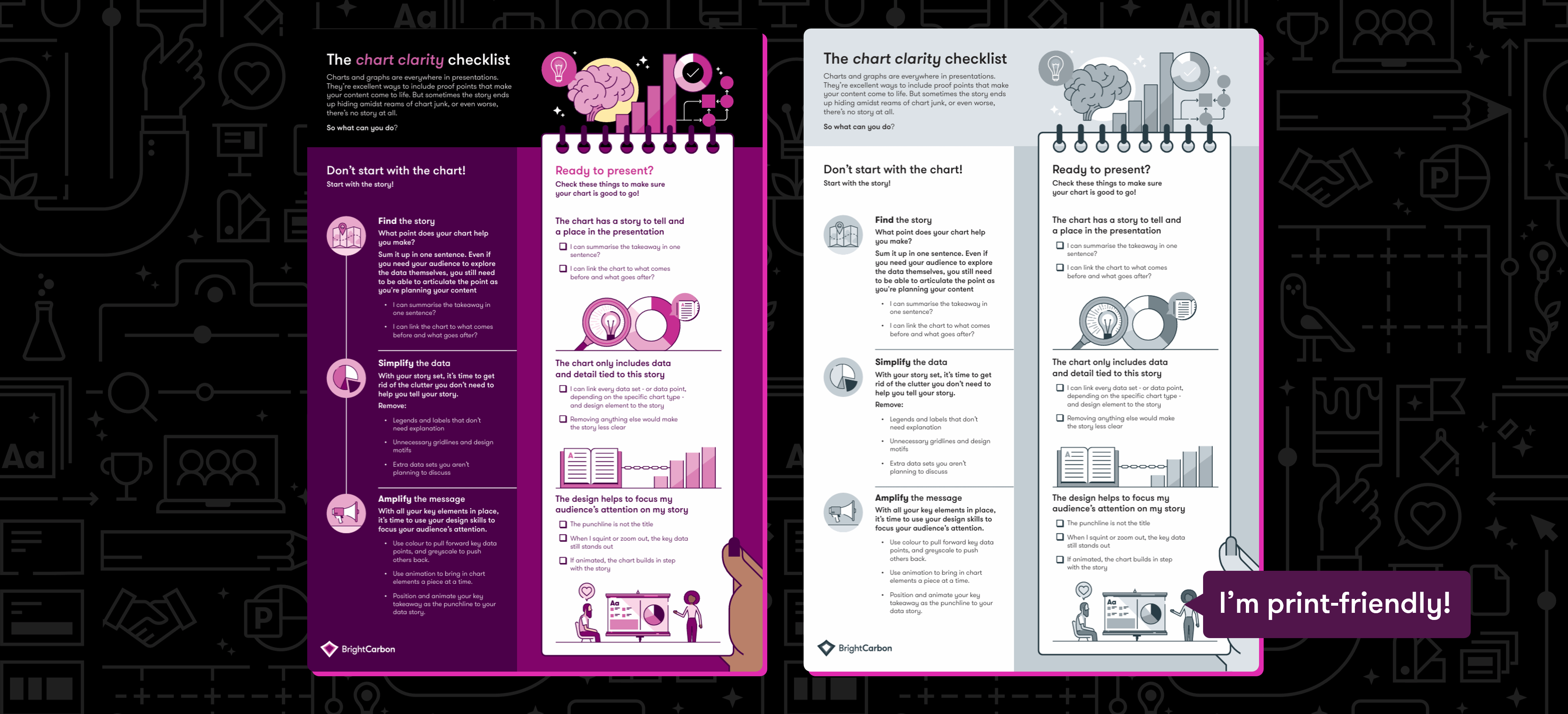
This is why we have the chart clarity checklist. Three stages to create, three steps to check.
Start by finding your story
Instead of starting with your chart and finding a way to link it to your material, flip the script. How does your chart help you tell your existing story? How does it strengthen the message you’re telling. You need to be able to sum up your story in a single sentence. Even if you want your audience to explore the data themselves, you should still be able to succinctly explain what it’s doing there, and what point it’s making.
Next, simplify your data
Oftentimes – just like humans – charts come with a bunch of baggage. Unlike humans, you can delete most of it for charts, or rework what you have to make it cleaner and clearer. Trim everything that doesn’t need to be there so that your audience can see a tidy data set that they’re ready to dive into with you.
Finally, amplify your message
There are a number of design tricks you can use to make your message come to the fore. Be mindful in the way you use colour, and consider bringing your key data forward with colour and pushing other points back to greyscale (see this article for more ways to use colour and data together). Use animation to pace the flow of information. Don’t overwhelm your audience with a complex chart to review that appears all in one go, instead bring elements in separately to keep the audience tracking with the presenter. And make sure the data punchline appears at the end. If you give the game away too soon (like in the slide title), your audience can figure out the puzzle and they tune out. Keep them hooked, and do the big reveal at the end.
Join the BrightCarbon mailing list for monthly invites and resources
Tell me more!BrightCarbon has created several animations for us. The result was always the same: a very clear “wow” effect. I highly recommend BrightCarbon for making complex topics come to life on screen!
Isabel Figge Intergraph