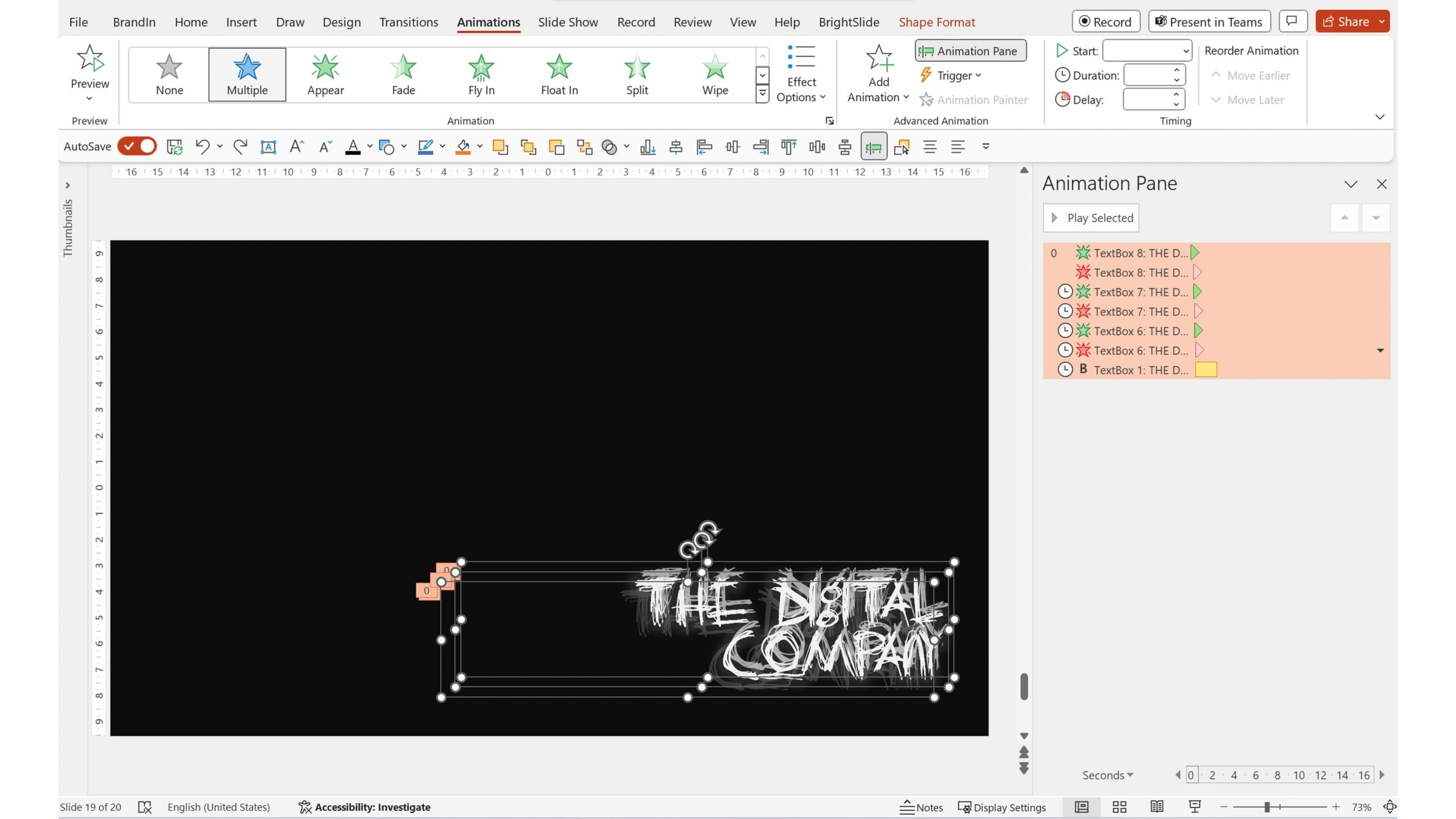
- PowerPoint design / PowerPoint animation
- Comments: 2
Create a stunning title slide sure to impress even the harshest critic by following this easy PowerPoint tutorial from one of our expert designers.

As a presentation designer, I am constantly on the lookout for inspiration and new ways of thinking visually. A good presentation should certainly be many things, chief among them: eye-catching, and compelling. One way we can achieve this is with interesting graphics and visuals. The right visuals actually add to what we’re trying to say and help the viewer enjoy and understand the narrative rather than just sit through it.
One of my favourite forms of ‘presentation’ is movies. Okay, that might be a stretch! But I’m talking specifically about the title credits of a movie. Title credits prepare the audience for what’s about to come in the film, they sometimes even reflect the plot of the story. Typography, photography, sound, collage and countless other methods have all been used to open up a film.
Just like movies, presentations have to have powerful openings. In fact we think this is so important, we regularly give a masterclass on how to do it well. There are lots of lessons we can learn from great movie title sequences about creating great presentation openings, and there’s no better master of the art than Mr. Saul Bass. In this post I’m indulging in two of my favourite things, talking about the important role Saul Bass played in the development of the movie title sequence as an art form, and playing with fun design in PowerPoint.
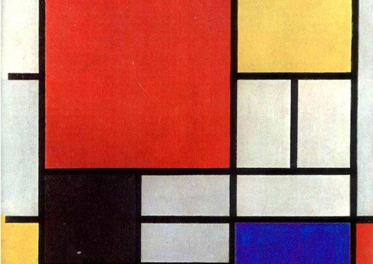
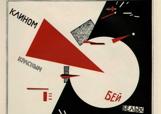
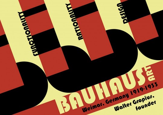
Saul Bass was an American graphic designer and movie producer/director, born in New York in 1920. His graphic design style was heavily influenced by Swiss Typography, Russian Constructivism, and the Bauhaus movement, all of which were based on a design ethic of bold colours, simple geometric shapes and form, silhouettes and efficiency.
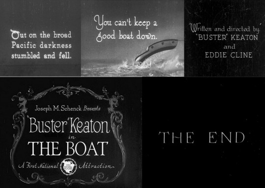
Before Saul Bass came on the scene, the opening credits of films looked and acted very differently. They mainly consisted of simple black and white chalk boards listing the cast and crew. These were sometimes accompanied by static background imagery and illustrations. There were no animations, and no real thought given to the idea of setting up the premise of a film.
Here are some examples of what title credits looked like in the 1920’s, 30’s and early 40’s, predominantly from ‘silent’ movies.
Saul Bass had different ideas. He said:
‘‘For the average audience, the credits tell them there’s only three minutes left to eat popcorn. I take this ‘dead’ period and try to do more than simply get rid of names that filmgoers aren’t interested in. I aim to set up the audience for what’s coming; make them expectant ’’
Now, title sequences can be like music videos in terms of scope and scale. To illustrate this point, let’s look at the work of two notable directors with whom Bass collaborated.
Alfred Hitchcock was a master of suspense and the psychological thriller genre; arguably one of the most iconic directors of all time. Hitchcock’s M.O. in terms of ‘presenting’ to an audience-was always abstract form and imagery – which is probably why he worked so well alongside Saul Bass. A presentation can really benefit from strong, bold colours and – particularly – photography. Adding a flood fill photograph into the background of a slide can really give it that wow factor – it brings a presentation to life. Bass used these little tricks to great effect in his sequences for Hitchcock, blending film and still photography together seamlessly.
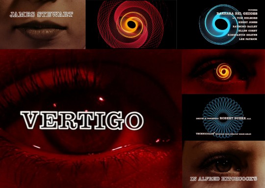
The first title sequence here, is that of Vertigo: a dream-like thriller set in San Francisco, about a private detective who falls for a beautiful, suicidal woman he is hired to trail. In this sequence the shapes in the titles relate to the human eye and the workings of the inner mind. The hypnotic spirals create a dizzying sensation, representing the main characters’ loss of control, and subsequent vertigo later in the film.
Now do it in PowerPoint!
This is a simple one to recreate in PowerPoint. Start with a dark slide background – you can change the colour of the slide background by right clicking on a slide and selecting Format Background. Then select a stock image which matches the vibe of the original title sequence. Increase the transparency of the image in the Picture Format tab so it will better blend into the scene and make any title text more readable.
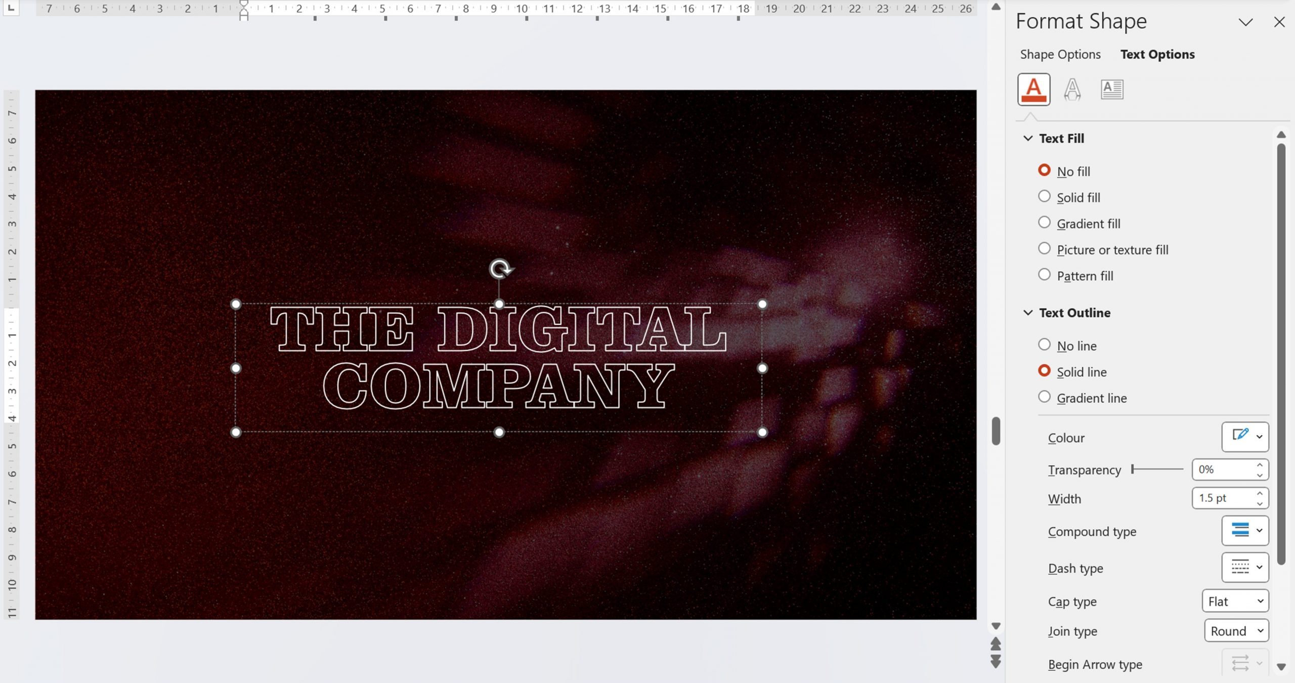
Next add your text. Adjust the text spacing to smaller than usual to represent the feeling of the retro movie titles. You can do this with BrightCarbon’s free PowerPoint design and productivity add-in BrightSlide. Select the text, right click and then select Live Character Spacing.
When you’re happy with the text style, right click again and choose Format Shape, then Text Options. Remove the fill and add the text outline.
Animation-wise, it’s pretty simple. I added a Fade and slow motion path to the background image and then a Zoom animation to the text.

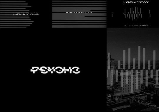
The next sequence is from Psycho – maybe Bass’ most famous title sequence. The film is about a schizophrenic- killer with a split personality, who dresses in the guise of his mother, in order to lure young women into his motel. In the title sequence the narrative is reflected by the grey horizontal and vertical lines shooting across the screen, which become jagged and juxtaposed.
Now do it in PowerPoint!
To imitate the Psycho title card, we’re going to create a glitch-like effect in PowerPoint. First, select a dark background colour, not true black but something very close to imitate the old analogue feel.
You can use websites like WhatTheFont to search for fonts, similar to, for example, the one used in titles of Psycho. Then adjust the spacing again with BrightSlide to get the style you want.
Add a rectangle in the middle of each of your rows of text. Before doing all the next steps, copy the rectangles you’re created – we’ll need them soon! Then select the text and shapes on your slide and navigate to the Shape Format tab.
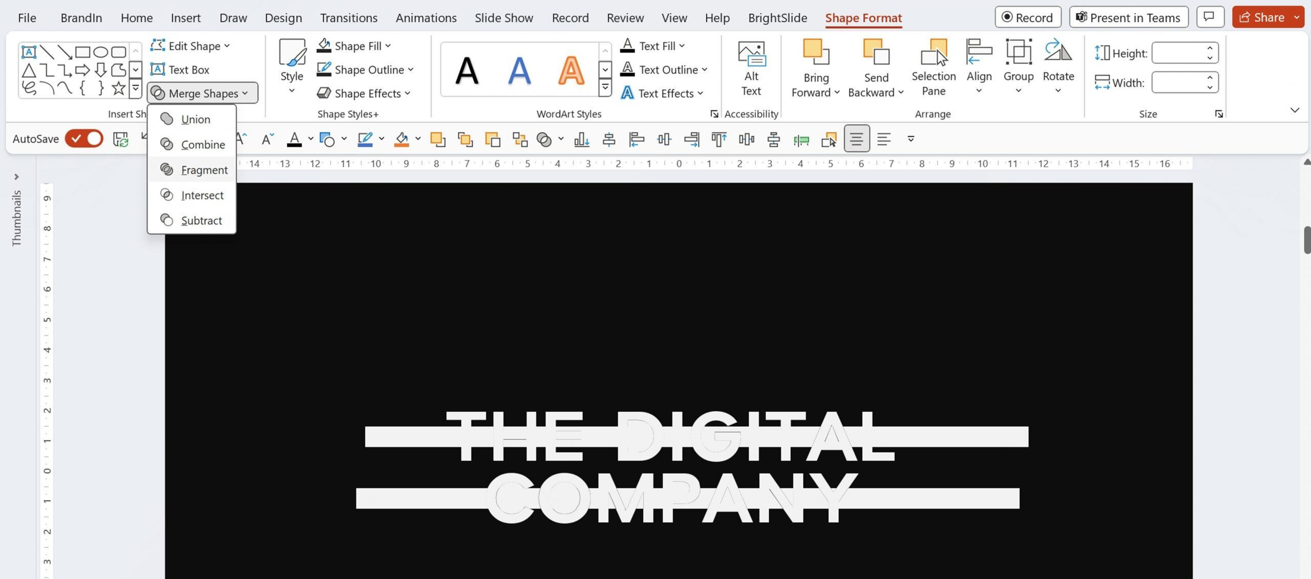
Under Merge Shapes, choose Fragment. Next, delete everything outside of the text. Your text is now sliced into three rows. Group each of the three rows together – this will be your base for animation.
You already can create some cool-looking glitch effects with what you have.

But, if you want to animate, paste the rectangles you copied before and make sure they are in the same place. Drag the shapes so they are the same width as the slide, and create a pattern like in the original titles.

Add a Fly In animation to one half of the text groups, as well as to the stripes. Adjust the delay of the animation to create movement variety. Watch the original sequence to see how variety adds impact. Then add a Fly In effect to the rest of the text and set it to enter form the opposite side. Animate the lines to Fly Out with it, and don’t forget the variety! Use the Start After Previous setting to make animations play one after another. That might all sound a bit complicated so check out the finished product to see how everything works together!

Martin Scorsese
Scorsese has filmed some of the most iconic movies of the last four decades, and is famous for his tough, gritty crime dramas and thrillers. For Scorsese’s title sequences, Bass used bold typography, imagery, and sound.
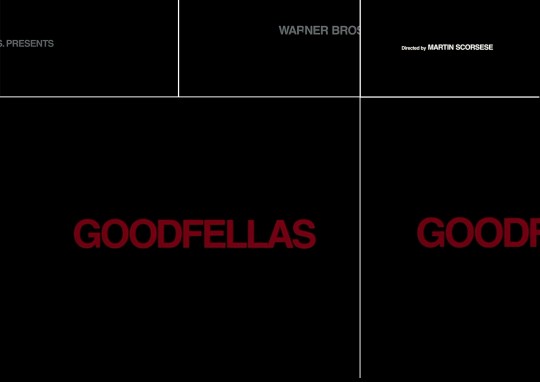
Goodfellas is a film about the violent, turbulent life of three members of the mafia across two generations. In this title sequence, the narrative is reflected by a simple black background with white upper case credits hurtling across the screen at a rapid rate. The titles are short, sharp and frantic – which reflects the dangerous and glamorous gangster lifestyle the characters are involved in.
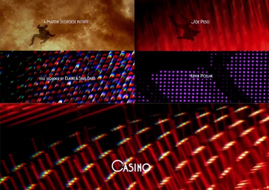
Casino is another Mafia film, but this time focuses on the glitzy casinos of Las Vegas. This narrative is reflected by photography and computer animation. The exciting title sequence shows the main character being blown up by a car bomb and hurtling through a vivid fireball. This then blends into the vibrant lights of the Las Vegas strip. Phew!
Bass’s work has a huge influence on modern design. Here are two of my favourite examples of modern day title sequences that have been heavily influenced by Bass.
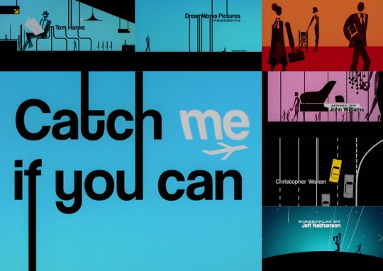
Catch Me If You Can is a crime caper directed by Steven Spielberg, about an FBI detective pursuing a con artist across the world. The title sequence uses bold colours and simple imagery. It depicts the detective chasing the suspect across the globe in various locations.
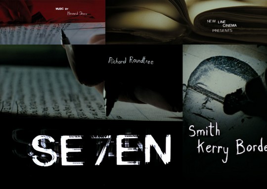
The final sequence is from David Fincher’s psychological thriller Se7en, about a two police officers hunting a sadistic serial killer who murders his victims through the use of the seven deadly sins. The narrative is reflected in these titles through the use of jittering photography and montage – showing the killer preparing his demented notebooks. The type and credits animate in a sinister way, magnifying the underlying feeling of discomfort.
Now do it in PowerPoint!
There’s a few PowerPoint tricks we can use to recreate this look and feel – mostly animation and experimentation. Here’s a quick guide. Once again, start with a dark background a font that stands out.

Select the text box, then go to Format Shape and choose Text Options. You’ll see there are all sort of extra effects like glow and transparency. Unfortunately, we can’t animate all those parameters, but all we need is a quick flash.
Copy and paste your text box a few times and add some of these effects. We have a few with different transparencies and one with the glow effect. Then make them flash onto the screen with the help of simple Appear/Disappear animations. I also found that the Flash Bold animation effect (for text) works really well here, so I added it on top. Experimentation is the name of the game here!
Then, for the final touch I added a stock film tape image again with Appear/Disappear animations.

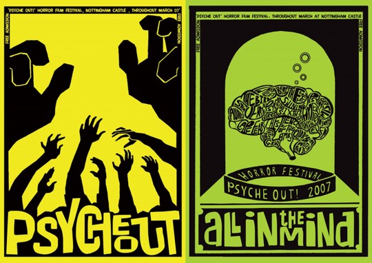
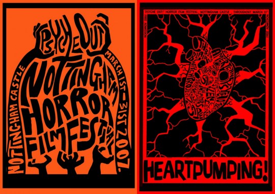
Bass’ visionary work in title credits not only affected generations of filmmakers, but also generations of designers. From a personal point of view, Saul Bass has been a huge influence on my design and I’ve created several pieces over the years that reflect his approach, including this piece that I created for a Horror festival back in 2007.
There is a wealth of knowledge to be mined from these title sequences, particularly in relation to presentations and how we set up our audience. Without the exploits of innovators like Bass, the art of presentation would not be what it is today. If you want some inspiration for your next visual presentation, check out the work of Mr. Bass himself. Oh, and you now have an excuse to re-watch all your favourite movies!
Leave a commentCreate a stunning title slide sure to impress even the harshest critic by following this easy PowerPoint tutorial from one of our expert designers.
A PowerPoint template is the foundation on which polished and professional presentations are built. We interview BrightCarbon’s new Templates Lead, Gemma Leamy, and pick her brains on the ideal process for creating robust PowerPoint templates.
It's Christmas! After a late night with too much eggnog and brandy snaps we set ourselves a challenge to see who could come up with the wildest PowerPoint Christmas card! So it's the day after the night before, and through blurry eyes we can reveal our efforts...
Join the BrightCarbon mailing list for monthly invites and resources
Tell me more!I did not think it was possible for an external team to get our message so quickly and accurately. You got our messages better than we did, and delivered presentations that were slick and really effective.
Guy Shepherd Bouygues