
DON’T: Treat your corporate presentations like they are a comic-strip
One of the biggest mistakes people make when choosing stock photos is trying to find images that perfectly and specifically encapsulate everything they want to say. When your stock image is a literal representation of your text, you risk your slide looking more like a comic- strip than a sales pitch or one of your corporate presentations.

DO: Use images that have emotional or narrative value
Choose photos based on the value they can bring to your slide. Whatever your content, it’s likely that you’re trying to tell your audience a story. Your images should reflect this without being too specific. It can be helpful to think in terms of emotion (how do you want your audience to feel?) and tone (what mood are you trying to create?). Once you have done this, it will be easier to find an image that speaks to your overall message.

DON’T: Go straight to Google Images
Finding images through a search engine might seem like the quickest and easiest option, but it isn’t the most effective solution. Most images that come up when you search the internet aren’t royalty free, meaning that you could inadvertently steal them.
Most search engine images come from all over the web and don’t have guaranteed image quality. You could end up with low resolution images that pixelate when resized, or unoriginal, overused images that have little impact on your audience.
If you are going to use a search engine, you can use the advanced search features to filter the image results by Creative Commons license. To learn more about this, read our guide to using Creative Commons.

DO: Consider using free alternatives in your corporate presentations
Premium stock websites offer millions of royalty free images upon subscription, with a range of price plans for different budgets (check out our Shutterstock vs. iStock post if you’re struggling to choose!). But if you aren’t prepared to pay, there are some free alternatives for high quality imagery. One option is Creative Commons, as mentioned earlier. Another option is to use online resources like Splitshire.com, Gratisography.com and Unsplash.com, which provide free, high-resolution photos with no registration or subscription required. On websites like these, images are contributed by professional photographers and often don’t feel like your typical stock photography. They are a great option for those who want to steer clear of using comic-strip style images as mentioned above.

DON’T: Expect images to do the work for you
So, you’ve found the perfect image. It’s high quality, reflects your brand and enhances your message. But an image alone isn’t enough to make your corporate presentations shine – you can’t simply right click, insert image and expect it to do the hard work for you.
Think about how the image affects the overall look and feel of your slide.
Should it be flood fill or only cover part of the slide?
Will it clash with or complement your colour scheme?
Where do you want your text to sit?
Take a look at our Easy Design Hacks for some tips on keeping slides with images looking professional.
DO: Get creative!
You don’t have to leave your image as it is, either. There are some easy ways to edit images within PowerPoint to help achieve your desired effect, so you can avoid choosing over-edited stock images and make small changes yourself.
Blur: If you want to overlay text, or draw attention elsewhere, it can sometimes be effective to blur your image. Select the image and go to the ‘Format’ tab. Within the ‘Adjust’ tab, go to ‘Artistic Effects’. From here, select ‘Blur’. Here I’ve placed a rectangle with text on top of my blurred image, and increased its transparency to help my text stand out.

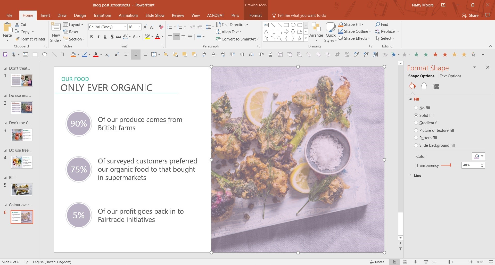
Colour overlay: Adding a colour overlay is an easy way of making your image fit in with your colour scheme. Insert a rectangle to fit perfectly over your image and fill it with a colour from your colour palette. Right click the rectangle and select ‘Format shape’. From here select ‘Fill’ and use the slide bar to adjust the transparency level. This will create a soft hue over your chosen image.
Want to make more magic with beautiful images? We’ve got loads of incredible resources to help you get to grips with using images in PowerPoint:
Image crop to zoom video resource
PowerPoint Morph Tutorial #1: The morph magnifying glass
And, if you’ve used one too many pics and your PowerPoint file is getting bloated check out our post on reducing picture size.


Muy buena información, gracias.
Great tips! Thanks Natty!