
- PowerPoint design
- Comments: 2
Learn how to automatically generate total values for your graphs and charts using PowerPoint’s Combination Chart option.

When designing presentations it can be easy to get swallowed up by the desire to exercise that design trick you’ve been dying to use, or to use white space in a quirky designer-y way; it is, after all, part of the nature of a designer to create interesting, beautiful things. What can be tricky, however, is to keep in mind how a person might absorb the information onscreen. This is where it is essential to understand visual hierarchy.
Sexy slides might impress your audience, but if they’re not learning anything from them, the slides are pretty useless. The most useful thing you can do as a designer is to reinforce the presenter, designing with people in mind, by organising and introducing information in such a way that you lead the audience on a journey through the slide. You give them all the information they need in manageable, ordered steps. Failing to do so can lead to missed or misinterpreted information. Disaster.
Visual hierarchy is the organization and prioritization of content as a means to communicate a message.
When building slides it’s down to you to build the path that the audience will tread. You can do this by considering how people absorb information; western cultures, for example, read left to right and will often look to the top left as a starting point when reading information. Bolding sections or adding colour can show importance if used correctly, and will give the audience a point at which to begin reading. Take a look at the visual below:

Imagine each of these circles is a piece of information on a slide. Which piece of information did you look at first? Which is most important? Did you look top-left as if continuing reading, did you look to the centre, or did your eyes move constantly across the information? Such an effect could be frustrating and highly unhelpful to an audience. They would soon lose interest if they struggled to take in information. Now, take a look at the example below:

Where were your eyes drawn? Chances are, you looked at the green circle first or noticed its prominence, at least. By making this shape stand out you’ve given a visual clue as to the importance of this information, or to a starting point from which to move through the slide. The grid formation also helps create harmony and order, which allows the audience to take in the information in an easier, logical method.
When dealing with text, similar principles apply. Take the two slide examples below:
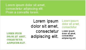
The first example combines different fonts, colours, formatting, and has no logical reading order. Slide 2, on the other hand, sets out a clear heading by using a larger, bold font. Sub-points and sub-sub-points are made clear with smaller fonts and an indentation from the title. Humans’ brains are wired to make sense of everything we see by finding order and pattern (our desire to find such meaning in our surroundings is why we see clouds in the shape of animals, or portraits of Elvis in our toast). A person’s brain would spend so long trying to determine the relationships and order between the information in slide 1 that they wouldn’t take much, if any, information in. By designing slides to present information clearly, an audience needn’t divert brainpower away from absorbing a presentation’s message. For more typography tips, check out our blog post.

Size is probably the easiest and simplest factor in determining hierarchy in design. A viewer’s eye is also likely to be drawn to bigger elements on a slide first, which gives you the freedom to arrange elements on a slide away from a traditional ‘title-top-left’ structure. Bear in mind that bigger objects demand more attention, so try to design with the idea that ‘bigger = more important’.
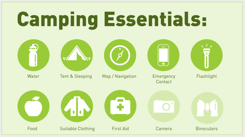
As we’ve already seen, adding colour can create a visual hierarchy. Colour intensity or shade can give an idea of how important certain elements are. For example, on this slide it is clear that the Camera and Binoculars are less essential than the other equipment listed as they are faded back.
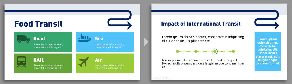
Colour can also create unity throughout a presentation, both in terms of visual identity (which makes a presentation easier for an audience to follow), and by recalling themes or key ideas. For example, if you were designing a slide deck about worldwide food distribution you could use a bright blue for elements referring to overseas transit. Learn how to change the colour themes in PowerPoint here.
Using the same colour for related information later in the slide allows the audience to understand the nature of the information before reading the content which can prepare the brain to make connections and reinforce ideas previously learned.
When working it with colour it is important to bear in mind that up to 10% of your audience could have some form of colour blindness. We’ve written a blog post about how to pick colours and colour combinations that will make your slides clear to everyone.
Colour isn’t the only tool you can use to create visual hierarchy within your presentation. An audience reads how elements are placed within space, and in building your slides you can design sections and sub-sections by visually grouping images, text or icons within the space. Placing elements within close proximity tells the audience that they are related, while separation creates negative space that indicates they are not.
How tightly you group elements or groups, and how far you spread them is a handy skill to visually show relevance, links and association.
Numerous elements of similar style, position, and scale create a harmony and a rhythm that an audience will acknowledge and will understand to be a closely linking relationship. Repetition not only makes slide navigation easier for an audience, but also allows you to visually group or distinguish elements.

Breaking repetition signifies a difference between elements and the audience can safely assume the new element is unique. For example, in the slide about the visual hierarchy created makes it clear that the final graphic element is different from the rest.
So there we have five ways you can bring order to your slides. By ensuring you give your audience visual clues and play with size, colour, proximity, and repetition to communicate hierarchy you can make your presentation more digestible and enjoyable. With these tips under your belt you can design slides that make a little more sense; slides that lead the audience in a logical order and inform them effectively. For more minimalist design expertise, read this blog post on restricting your design elements to make your design cleaner and easier to understand.
Getting visual hierarchy right in infographics is also really important. Have a look at some of the experts who have done it well on Information is Beautiful.
Leave a commentLearn how to automatically generate total values for your graphs and charts using PowerPoint’s Combination Chart option.
We have compiled 50 presentation quotes and categorized them into 10 themes so that you can easily find a quote that resonates with your message, be it in a sales presentation, keynote speech, or training deck. All the quotes include references and attributions, so that you can sail through compliance and get on with creating a stunning presentation!
February 14th is around the corner, so the BrightCarbon team have crafted three bespoke Valentine's day cards: all built in PowerPoint!
Join the BrightCarbon mailing list for monthly invites and resources
Tell me more!We have worked with BrightCarbon for over 5 years, across a number of healthcare divisions, where they have been a very important part of our bid programme, supporting numerous awards of new contracts.
Sarah Appleton Brown Practice Plus Group


Dear Bright Carbon team,
I’m creating a lesson for trainers about good and bad slide design and I’d like to use some examples illustrated in your blog post . Is that OK for you? I’ll of course give you credit.
Best,
Beatriz
Hi Beatriz, What an honour! Yes, of course it’s fine to use examples with attribution.
Good luck with the lesson.